Use Standard List Controllers
Learning Objectives
After completing this unit, you’ll be able to:
- Explain what a Visualforce standard list controller is and how it's different from a standard (record) controller.
- List three actions provided by the standard list controller that are different from a standard controller.
- Display a list of records using a standard list controller on a Visualforce page.
- Define pagination, and be able to add it to a Visualforce page.
Introduction to the Standard List Controller
The standard list controller allows you to create Visualforce pages that can display or act on a set of records.
Displaying a list of records is a fundamental behavior of almost all web apps. Visualforce makes it extremely easy to display a list of records of the same type, using just markup, no back-end code. The secret, as usual, is the standard controller, in this case, the standard list controller.
The standard list controller provides many powerful, automatic behaviors such as querying for records of a specific object and making the records available in a collection variable, as well as filtering of and pagination through the results. Adding the standard list controller to a page is very similar to adding the standard (record) controller, but with the intent of working with many records at once, instead of one record at a time.
Display a List of Records
Use the standard list controller and an iteration component, such as <apex:pageBlockTable>, to display a list of records.
The standard (record) controller makes it easy to get a single record loaded into a variable you can use on a Visualforce page. The standard list controller is similar, except instead of a single record, it loads a list, or collection, of records into the variable.
Because you’re dealing with a collection, instead of an individual record, you need to use an iteration component to display them. An iteration component works with a collection of similar items, instead of on a single value. An iteration component loops through its collection, and for each record, generates some output based on a template you provide as part of the component markup. This sounds complicated in words, but you’ll understand it quickly when you read the markup.
The markup for using the standard list controller is almost identical to using the standard, one-record-at-a-time controller. To make it obvious, the primary differences are highlighted in bold in the following sample.
- Open the Developer Console and click File | New | Visualforce Page to create a new Visualforce page. Enter ContactList for the page name.
- In the editor, replace any markup with the following.
<apex:page standardController="Contact" recordSetVar="contacts"> <apex:pageBlock title="Contacts List"> <!-- Contacts List --> <apex:pageBlockTable value="{! contacts }" var="ct"> <apex:column value="{! ct.FirstName }"/> <apex:column value="{! ct.LastName }"/> <apex:column value="{! ct.Email }"/> <apex:column value="{! ct.Account.Name }"/> </apex:pageBlockTable> </apex:pageBlock> </apex:page> - Click Preview to open a preview of your page that you can look at while you make changes. A new window should open, showing the standard Salesforce page header and sidebar elements, and a list of your contacts.

Using a standard list controller is very similar to using a standard controller. First you set the standardController attribute on the <apex:page> component, then you set the recordSetVar attribute on the same component. The standardController attribute sets the object to work with, just like with the standard controller. The recordSetVar sets the name of the variable to be created with the collection of records, here, {! contacts }. By convention, this variable is usually named the plural of the object name.
<apex:pageBlockTable>is an iteration component that generates a table of data, complete with platform styling. Here’s what’s going on in the table markup.
- The value attribute of
<apex:pageBlockTable>is set to the variable loaded by the standard list controller,{! contacts }. This is the list of records that <apex:pageBlockTable> will work with.
- For each record in that list, one record at a time,
<apex:pageBlockTable>assigns that record to the variable named in the<apex:pageBlockTable>’s var attribute. In this case, that variable is namedct.
- For each record,
<apex:pageBlockTable>constructs a new row in the table, using the row defined by the set of<apex:column>components within the body of<apex:pageBlockTable>. The<apex:column>components, in turn, use thectvariable that represents the current record to pull out the field values for that record.
- Outside of the loop,
<apex:pageBlockTable>uses the fields in the<apex:column>components to create column headers, by looking up the label for each field.
That’s a lot to take in, and iteration components are tricky to understand the first time. The best thing you can do right now is to try creating your own. Choose the fields you want displayed in the table. Look up the different attributes for <apex:pageBlockTable> and <apex:column>, and experiment until you feel comfortable. You might also try using some of the other iteration components, such as <apex:dataList> or even <apex:repeat>.
Add List View Filtering to the List
Use {! listViewOptions } to get a list of list view filters available for an object. Use {! filterId } to set the list view filter to use for a standard list controller’s results.
The standard list controller provides a number of features you can use to alter the display of the list. One of the most powerful is list view filters. You create list view filters declaratively, using clicks instead of code, and the standard list controller lets you use any defined list view filter on the page.
- Wrap the entire
<apex:pageBlock>in an<apex:form>tag. To change the list view filter for a standard list controller, you need to submit the new value back to the server. The standard way to perform this submit is using a form created using the<apex:form>component.
- In the
<apex:pageBlock>tag, add the following attribute.id="contacts_list"This gives the<apex:pageBlock>a “name” that we can use for a cool Ajax effect, which we’ll explain in a bit.
- After the opening
<apex:pageBlock>tag, and above the<apex:pageBlockTable>, add the following markup.The full code for your page should look like this.Filter: <apex:selectList value="{! filterId }" size="1"> <apex:selectOptions value="{! listViewOptions }"/> <apex:actionSupport event="onchange" reRender="contacts_list"/> </apex:selectList>A new filter control appears above the list.<apex:page standardController="Contact" recordSetVar="contacts"> <apex:form> <apex:pageBlock title="Contacts List" id="contacts_list"> Filter: <apex:selectList value="{! filterId }" size="1"> <apex:selectOptions value="{! listViewOptions }"/> <apex:actionSupport event="onchange" reRender="contacts_list"/> </apex:selectList> <!-- Contacts List --> <apex:pageBlockTable value="{! contacts }" var="ct"> <apex:column value="{! ct.FirstName }"/> <apex:column value="{! ct.LastName }"/> <apex:column value="{! ct.Email }"/> <apex:column value="{! ct.Account.Name }"/> </apex:pageBlockTable> </apex:pageBlock> </apex:form> </apex:page>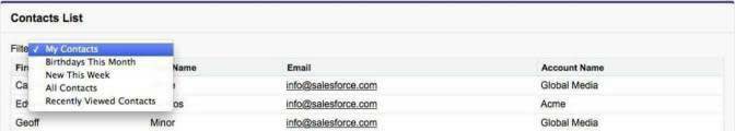
- Select a different filter from the menu. What happens to the contact list?
You should notice two things when you make a new selection from the Filter menu you just created. First, the list of records changes when you choose a new filter. (You might need to try a couple of different options, some list views will present the same records when using the sample data in a standard DE organization.)
Second, and more subtle, is that the list is updating without reloading the whole page. This “Ajax” effect is courtesy of the reRender="contacts_list" attribute on the <apex:actionSupport> component. The combined effect of the component and the reRender is to update only the part of the page named in the reRender attribute. Since you added the id="contacts_list" to the <apex:pageBlock>, when the action completes, only the <apex:pageBlock> is updated—without reloading the full page.
The full lifecycle for the new features on this page goes something like this.
- When the page loads, the
<apex:selectList>builds a menu of available filters, by getting the list from the{! listViewOptions }expression.listViewOptionsis a property provided by the standard list controller.
- When you choose a new option from the menu, the
onchangeevent is fired by the<apex:actionSupport>component.
- When the
onchangefires, the page submits back the new list view selected, by submitting the new item to thefilterIdproperty, set in the<apex:selectList>.
- When the property is updated, the page gets a new response from the server, with a new collection of matching records in the contacts variable.
- But because
<apex:actionSupport>specifies rerendering only a portion of the page, the page is updated using Ajax—asynchronous JavaScript—instead of by a full page reload.
The net effect is that you get complex, sophisticated behavior by adding just a few lines of markup.
Add Pagination to the List
Use the pagination features of the standard list controller to allow users to look at long lists of records one “page” at a time.
The features you’ve developed so far are very nice, and work well with the short list of records that are provided as sample data in a Developer Edition organization. But what happens when you have a real organization, with hundreds or thousands—or even millions—of records? Looking at them all on one page doesn’t work very well!
In fact, the standard list controller by default only shows the first 20 records that match your filter criteria, if any. How can you let people access more than those first 20 records, or perhaps more records per page than just 20?
The answer is pagination. This is a standard web app user interface element, which lets you move forward and backward through a long list of records a “page” at a time, usually using Next and Previous links. You can add this to your page using the standard list controller, as well as conveniences such as a progress indicator and a menu to change the number of records per page.
- Below the contact list
</apex:pageBlockTable>, add the following markup.This creates an HTML table that will hold the three pagination controls you’re going to add.<!-- Pagination --> <table style="width: 100%"><tr> <td> <!-- Page X of Y --> </td> <td align="center"> <!-- Previous page --> <!-- Next page --> </td> <td align="right"> <!-- Records per page --> </td> </tr></table>

- Replace the
<!-- Page X of Y -->comment line with the following markup.Page: <apex:outputTextvalue=" {!PageNumber} of {! CEILING(ResultSize / PageSize) }"/>
This adds a progress indicator to the list, indicating which page the user is viewing, and how many others there are. If you’re trying this in a DE organization, it probably says “Page 1 of 1.”
- Replace the
<!-- Previous page -->and<!-- Next page -->comment lines with the following markup.This markup provides Previous and Next links on the page. The markup covers two possibilities: when there are more records to view in a given direction, then the link is active; and when there aren’t more pages in a given direction, the link is disabled.<!-- Previous page --> <!-- active --> <apex:commandLink action="{! Previous }" value="« Previous" rendered="{! HasPrevious }"/> <!-- inactive (no earlier pages) --> <apex:outputText style="color: #ccc;" value="« Previous" rendered="{! NOT(HasPrevious) }"/> <!-- Next page --> <!-- active --> <apex:commandLink action="{! Next }" value="Next »" rendered="{! HasNext }"/> <!-- inactive (no more pages) --> <apex:outputText style="color: #ccc;" value="Next »" rendered="{! NOT(HasNext) }"/>
- Replace the
<!-- Records per page -->comment line with the following markup.This markup provides a menu for changing the number of records per page. Here we’ve only added an option to display fewer records on a page. Select “5” from the list, and see what happens to the list, and the other controls.Records per page: <apex:selectList value="{! PageSize }" size="1"> <apex:selectOption itemValue="5" itemLabel="5"/> <apex:selectOption itemValue="20" itemLabel="20"/> <apex:actionSupport event="onchange" reRender="contacts_list"/> </apex:selectList>
The results are a list page that has quite a few features that are provided by the standard list controller.

In the progress indicator, three properties are used to indicate how many pages there are: PageNumber, ResultSize, and PageSize. The last two are actually used in a formula expression, which rounds the number off to the nearest integer. This prevents the indicator from saying something nonsensical, such as “Page 2 of 1.6.”
In the pagination controls, the <apex:commmandLink> components reference two action methods provided by the standard list controller, Previous and Next. The result is a link that performs the Previous or Next action.
But what’s this rendered attribute, with expressions such as {! HasPrevious }? This is how Visualforce enables you to show components conditionally, that is, depending on the result of a Boolean expression. Here the page markup is referencing Boolean properties provided by the standard list controller, HasPrevious and HasNext, which let you know if there are more records in a given direction or not. By using the expression in the rendered attribute, you can show or hide the results of that component on the page. This is how the Previous link is grayed out when you first load the page, but becomes active if you move forward by clicking the Next link.
The records per page selection menu uses an <apex:selectList>, which you used earlier, but instead of calling a controller method to get the menu values, we simply use <apex:selectOption> elements for the desired values. Again the <apex:actionSupport> tag causes the menu to fire its action whenever the selected value changes, and again it uses reRender="contacts_list" to update only the <apex:pageBlock>. The new part here is that the <apex:selectList> sets the standard list controller’s PageSize property.
Tell Me More...
The standard list controller provides many features that are common in web apps, many more than have been covered here.
For example, in addition to the Previous and Next actions, which move backwards and forwards one page at a time, there are also First and Last actions that go to the beginning or end of the list of records.
Behind the scene of your markup, the standard list controller is based on the StandardSetController Apex class. You can read more about it, and all the features it provides, in the Lightning Platform Apex Code Developer's Guide .
There’s a small elephant in the room with the examples we created here, and its name is sorting. It’s often desirable to have a default sort order for a list, and also to have sort-affecting column headers that let you change the sort order on the fly. The simple truth is, you can’t affect the sort order using Visualforce alone. Although the amount of additional Visualforce markup and Apex code required to support sorting and clickable column headers isn’t enormous, it does require custom code. See the additional resources for some starting points.
Resources
-
Standard Controllers
-
Standard List Controllers
-
StandardController Class Apex
-
StandardSetController Class Apex
-
Create a Custom List View in Salesforce Classic
-
“The Standard Controller,” in Visualforce in Practice
-
“The Standard List Controller,” in Visualforce in Practice
-
Twitter Bootstrap and Visualforce in Minutes
-
apex:outputLink component
-
apex:repeat component