Style FlexCard Elements
Learning Objectives
After completing this unit, you’ll be able to:
- Describe features of the Style panel.
- Describe how to enable Style panel element responsiveness.
- List examples of FlexCard styling.
Features of the Style Panel
You configure the look and feel of a FlexCard by styling individual elements and the fields within elements. Using the Style panel, we design backgrounds, text, and borders, and adjust heights, widths, and the spacing inside and between elements. There are also specific style options available for the following elements.
- Action
- Datatable
- Field
- Icon
- Menu
- Toggle
The Style panel is made up of these sections.
| Section | Description |
|---|---|
|
Alignment |
Update the padding, margin, and text alignment of an element. |
|
Appearance |
Configure the color, background, and border of an element. |
|
Custom Styles |
Create and apply custom classes, and add inline styles to an element. |
|
Custom CSS |
Save style settings on a FlexCard element as a custom style to use on multiple elements of a FlexCard. |
|
Dimensions |
Set the height and width, and configure the responsiveness of your element. |
So let’s get to stylin’, shall we?
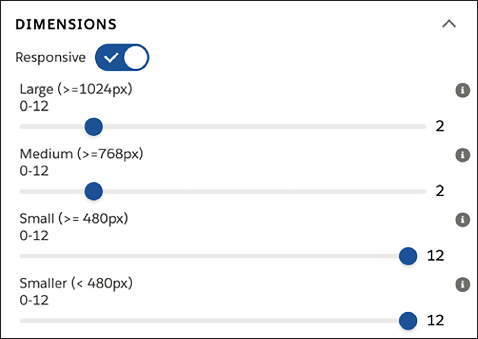
Enable Responsiveness
Enable Responsiveness on elements to set the widths to change as the width of the visible area of a page (the viewport) changes. The responsive sizing of elements is a mobile-first approach. Sizing starts at the smallest visible viewport breakpoint and is continuously applied upwards until the next wider breakpoint overrides it. The default width becomes the width of the smallest viewport breakpoint.
Examples of FlexCard Styling
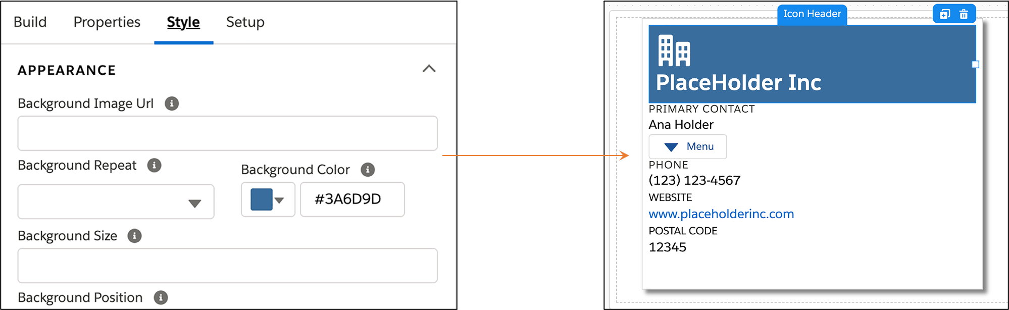
Unstyled FlexCard elements will look cluttered on the canvas. The following example shows the “after styling” of account data in a FlexCard. Here’s how the Account Details block in this FlexCard is styled.

Title Background Color
The background color of this block element is set in the APPEARANCE section of the Style panel.
Alignment and Dimensions
In the following example, there are two issues to note in the first image.
- The Menu is awkwardly positioned within the same column as the fields.
- The fields below the Menu are bunched together.

And there are two improvements to note in this image.
- The Menu is more clearly positioned in a different column from the fields.
- The fields below the Menu are more clearly spread out.
To fix these issues, you can do two things.
- Change the width of the Primary Contact and Menu elements so both appear on the same line.
- Change each Text element’s padding type and size, and margin type and size.
Width
The FlexCard canvas is a 12-column grid. The width of an element is 1 to 12 parts of this grid. When you drag a field element onto the canvas for the first time, its default width is 12 columns. If you want to position other fields on the same line, you need to adjust the widths. For example, a field element that is 6 columns wide takes up 50% of the available horizontal space, so you can make 2 field elements that are 6 columns wide appear on the same line. If you then change one of the field elements to a width of 7, the fields display on 2 separate lines again.
In the example above, the width of the Primary Contact field element is changed to 7 and the width of the Menu element is changed to 4.
Padding and Margin
Add padding to create space between the boundary of your element and the contents inside your element. The Around padding type allows you to add padding on all sides of the content at once.
Add margins between the adjacent elements on your FlexCard to create space around the container of a FlexCard element. The Around margin type allows you to add space around the entire element.
In the example above, the Margin Type is changed to Left and the Margin Size to Small. The Padding Type is changed to Around and the Padding Size to X-Small. After these changes were made, the style was saved and then applied to the other elements.
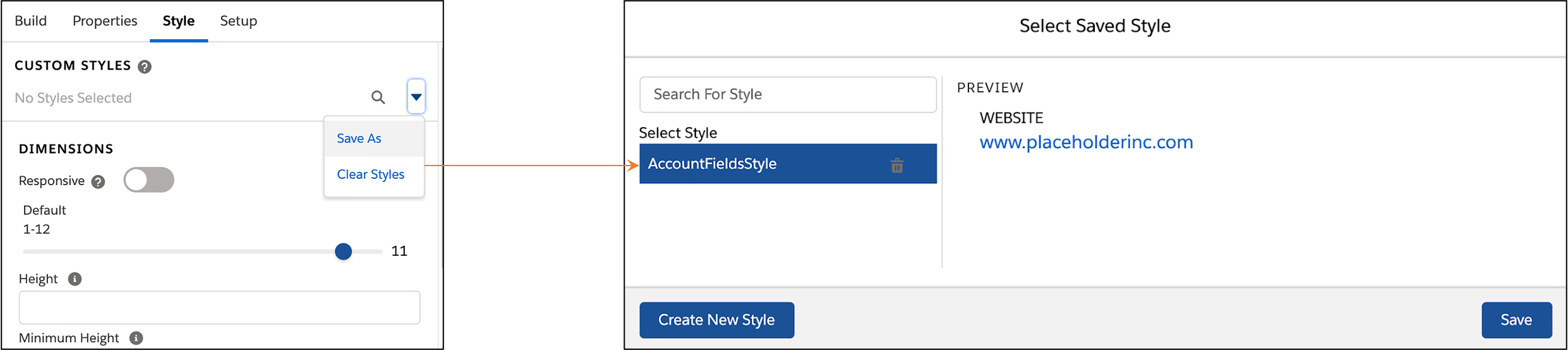
Save and Apply Styles
Save styles in a FlexCard to reuse on other elements in the FlexCard. Save the style as a custom style in the Style panel, then apply the saved style to other elements of the same type.
Saved styles are only available within the FlexCard. You can only save the styling that you’ve done within the Style panel, not any styling done in the Properties panel of the element.
You’ve brushed up on FlexCard basics, learned the ins and outs of the Data Source Wizard, and discovered how to add data and style your FlexCards. Remember, FlexCards are chock full of contextual info that provides an at-a-glance, 360-degree view of customers. And they’re just as their name suggests—flexible!