Create a Report and Dashboard
Learning Objectives
In this project, you’ll:
- Create a report and a dashboard to show how embedding works.
- Embed the dashboard in a Lightning Home page.
- Embed the report on the Account Details page.
Accessibility
This unit requires some additional instructions for screen reader users. To access a detailed screen reader version of this unit, click the link below.
Open Trailhead screen reader instructions.
Introduction
The Sales VP at Ursa Major Solar wants his team to stay on top of the daily sales pipeline and keep tabs on all of Ursa’s major industry segments.
To help keep the pipeline at the forefront, he asks Maria, the company’s Salesforce admin, to customize both the Home page that sales reps see when they sign in to Salesforce and the Account Details pages.
Create a Report

To set things up, Maria creates a report that includes a chart and also creates a dashboard. Later she embeds the dashboard in the Home page and the report chart in the Accounts Detail page.
- From the App Launcher, find and select the Sales app.
- Click the Reports tab, then click New Report.
- From the Select a Report Type menu, search for and select Opportunities, and then click Start Report.
- With the report builder open, click Filters to open the Filters pane. Click the Close Date filter, set the range to All Time, and click Apply. This action makes all the available data visible. You can always reset the filter so it’s more restrictive or add other filters at a later time.
- Click Outline to open the outline pane. Groups are required to generate charts from a report, so we’ll add a couple of row groups. Under Group Rows, click into Add group. Search for and select Industry. Then search for and add Stage. The order in which the groups are listed affects the way that information is displayed in charts. Make sure that Industry is listed first. If not, drag to rearrange it.
- Now that you have added groups to the report, the Add Chart icon is activated above the report. Click the icon to add a chart to the report, then refresh the preview.
- Click Save & Run.
- Name the report
Opportunity Stages.
- Click Select Folder and then click New Folder.
- Enter
My Opps Folderas the folder name, and then click in the Folder Unique Name field to accept the default unique name.
- Click Save to save the folder settings.
- Select the new folder and click Select Folder.
- Click Save to save the report in My Opps Folder.
Maria now has a report that shows the pipeline stages for the company’s industry markets. The report chart can be embedded directly in another page and can serve as a data source for the dashboard she’s about to set up.

Create a Dashboard
Maria can now create a dashboard to reveal data that she wants to highlight on the Home page.
- Click the Dashboards tab, then click New Dashboard.
- Name the dashboard
Opps Pipeline.
- Enter
Pipeline Summaryfor the description.
- Click Select Folder.
- To embed a dashboard in another page, the dashboard must be stored in a shared folder.
- Click Created by me and then click New Folder.
- Enter
Opps Dashboardsas the folder name.
- Click in the Folder Unique Name field to accept the default unique name.
- Click Save to save the folder settings.
- Select the new folder and click Select Folder.
- Click Create to save the dashboard and open the dashboard designer.
- Click + Widget and select Chart or Table.
- Select the Opportunity Stages report that was created earlier and click Select.
- Verify that the Opportunity Stages horizontal bar chart is selected. Leave the other settings in default mode. The options for the Y axis are based on the groupings that were set up in the Opportunity Stages report. Click Add to add the widget.
- Add one more widget. Choose the same report, but this time select the donut chart. Scroll down on the left and change the title to
Opportunity Industries. Click Add.
- Drag the donut chart so it is to the right of the bar chart.
- Click Save to save the dashboard and then Done to leave the dashboard editor and display the completed dashboard.
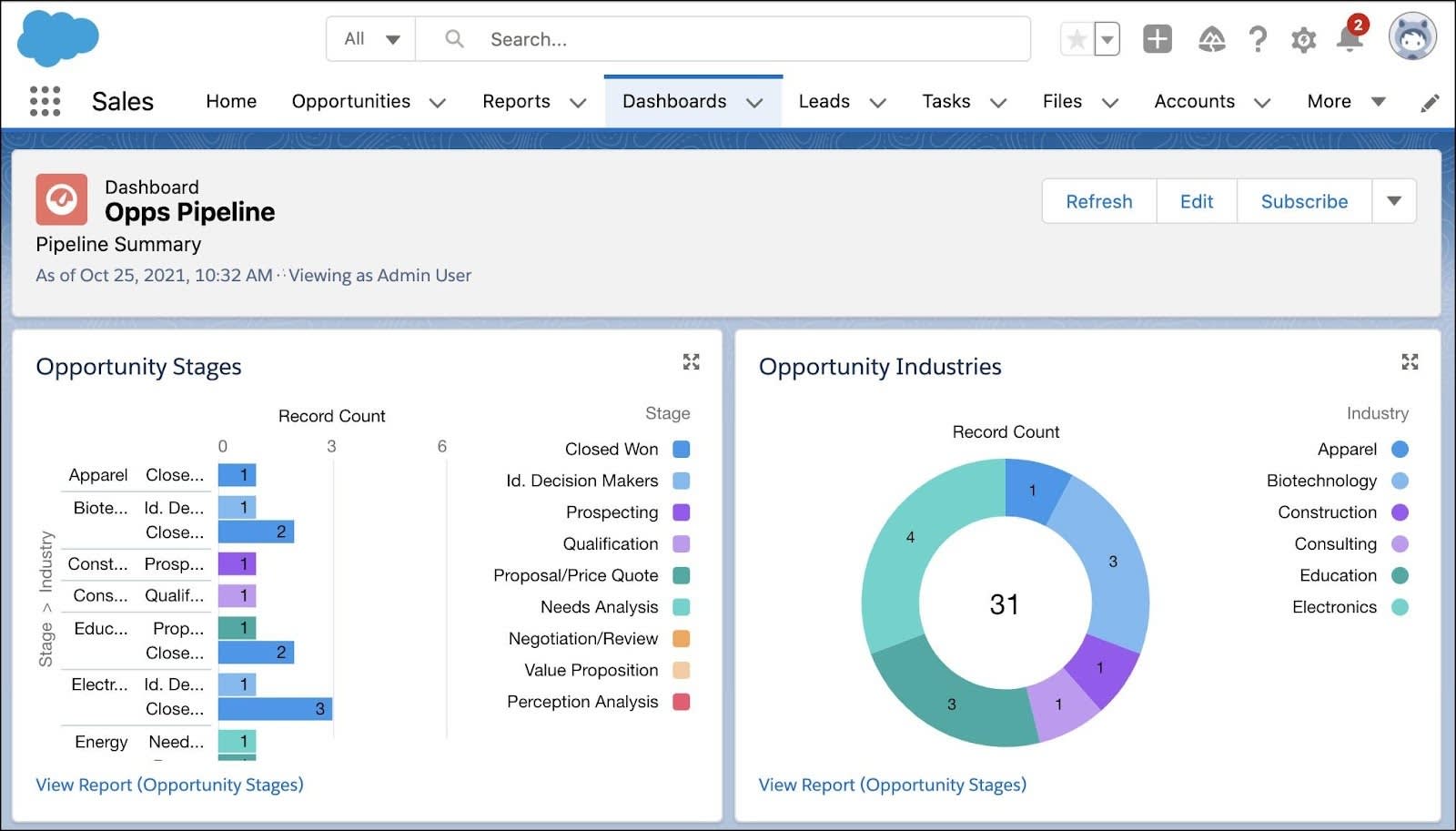
Maria now has a report and a dashboard and is ready to create the custom pages with the embedded visualizations.
Resources
-
Salesforce Help: Build a Report in Lightning Experience
-
Salesforce Help: Embed Dashboards on the Home Tab and in Lightning Apps