Understand Universal Process Notation
Learning Objectives
After completing this unit, you’ll be able to:
- Describe Universal Process Notation (UPN).
- Name the components of a business process map created using UPN.
Introduction to UPN
Let’s dig deeper into business process mapping.
You already know that business analysis is a key part of a Salesforce professional’s job. It follows that the results of the business analysis need to be documented, which is where the business process map comes in. A business process map ensures that everyone is aligned and forms a baseline for improvement. If a picture is worth a thousand words, a good business process map is worth 10 thousand.
There’s more than one way to document a business process. Maybe you’ve heard of flow diagrams, flow charts, Unified Modeling Language (UML) diagrams, value stream maps, Business Process Management Notation (BPMN), or SIPOC (that’s shorthand for supplier, inputs, process, outputs, and customers). These methods range from very simple to very complex. BPMN, for example, has a 538-page user manual.
In this module, we’re going to use Universal Process Notation (UPN). UPN is a simple, engaging diagramming notation that’s applicable across industries, at companies of all different sizes, and for processes at every level of complexity. If you’re used to drawing flowcharts, it might seem pointless to learn a new notation. But UPN has plenty of benefits.
A UPN diagram:
- Encapsulates every level of a process, from a top-level overview down to detailed, actionable diagrams.
- Can be viewed online and embedded within apps.
- Can be created collaboratively.
- Can have a broad or narrow scope.
- Supports regulatory and compliance considerations.
- Provides context for metrics and management decisions.
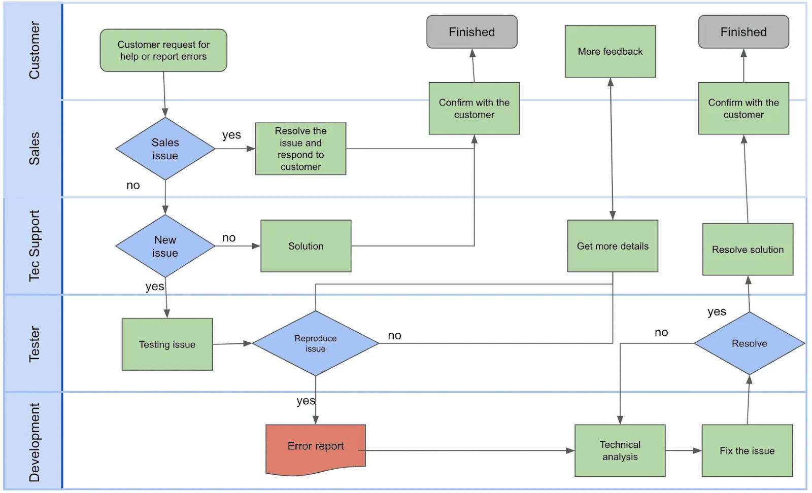
Flowchart v. Process Map
This flowchart describes a relatively simple process. It has symbols of different colors, arrows, and swim lanes.
Now let’s look at the same process, diagrammed using UPN. It’s tighter (there are fewer symbols), less ambiguous, and you can read it from left to right.
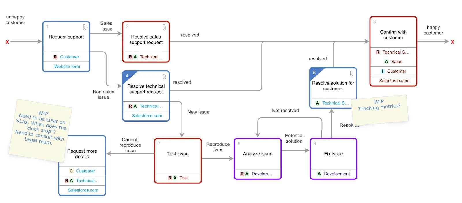
A process mapped using UPN answers, “Who needs to do what, when, why, and how?” at a glance.
A Closer Look at UPN
Let’s take a closer look at the diagram above.
-
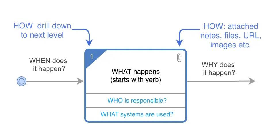
Activity box: A verb phrase labels each activity box.
-
Resource: A resource in each activity box designates the who. Resources are tagged with RACI (responsible, accountable, consulted, and informed). Some teams choose to indicate who is “supporting” the work using a RASCI model.
-
Line with text: Lines with text connect every activity box to another box and represent the handoff between steps.
-
Attachment: Attachments provide documents, metadata, or metrics in the context of the process.
-
Decision: Several lines coming out of an activity box with line text explaining the flow represent a decision, simplifying the diagram.
-
Drill down: Any activity box can drill down to a lower-level diagram.
The diagram is made up of activity boxes. Each box tells you how something is done, when it happens, and why. You can also drill down and add attachments for context.
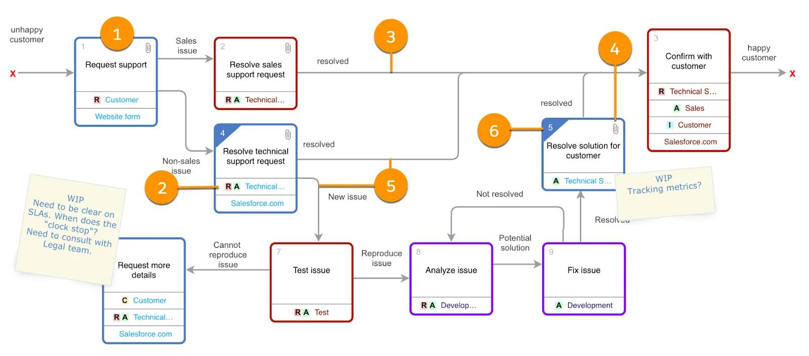
Let’s look at a specific example from the process map above.
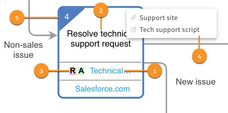
The first thing to notice is the who and the what: A technical support agent (1) is resolving a technical support request (2). The agent is tagged with R and A (3), which indicates that they’re responsible for and accountable for this activity. The paperclip (4) indicates that there are additional resources for this activity, in this case the support site and technical support script. The shading on the other corner (5) indicates that you can drill down to another level of detail for this activity. Finally, the arrows leading into and out of the box show what leads to this activity and what happens after it’s done.
Because a process map is a hierarchy of diagrams, you can drill down to see more detail. As a result, you can keep each diagram to 8–10 boxes while still describing a broadly scoped or complex process. There’s no limit to the number of levels you can go down.
Keep these principles in mind as you map a business process using UPN.
- Aim for no more than 8–10 activity boxes on a screen.
- You can drill down from an activity box to the next level of detail.
- You can attach supporting information to an activity box.
- Access rights determine who can view and edit the diagram.
- You can see change history at the diagram level.
It’s not hard to create a great process diagram. You just need to follow the notation and ask yourself three questions as you are mapping. In the next unit, we go over what the right questions are.