Explore and Visualize Connections Across Your Data
Learning Objectives
After completing this unit, you’ll be able to:
- Use the relationship graph to identify how records are connected through predefined hierarchical and nonhierarchical relationship types.
- Filter and control the relationship graph to focus on the connections that matter most.
- Manage records and inspect relationship attributes directly from the relationship graph.
Introduction
NovaBridge Procurement has been using Supplier 360 SaaS for 6 months and the supplier hierarchy is now populated with dozens of records. The procurement director wants a weekly review: Where does each key supplier sit in the hierarchy? And what other organizations, contacts, or subsuppliers are connected to a given record—even outside the hierarchy structure?
Maria has two tools to answer both questions: the hierarchy view for structured parent-child context and the relationship graph for a free-form visual exploration of all connections. In this unit, she uses the relationship graph to make sense of NovaBridge’s growing data network.

Use the Relationship Graph
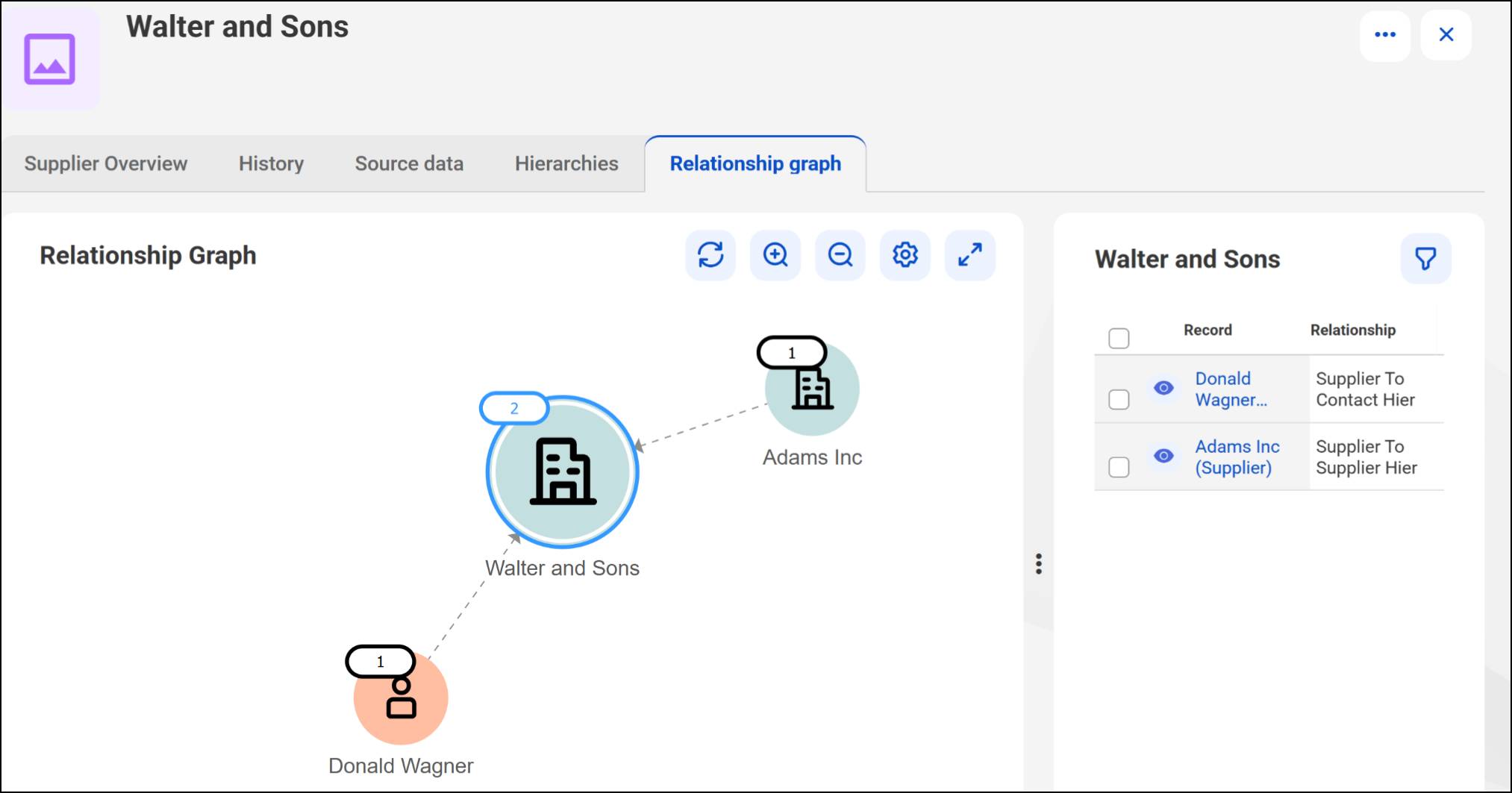
Maria opens the Walter and Sons supplier record and clicks the Relationship Graph tab. The canvas loads with Walter and Sons at the center and connection lines radiating to related records. Every node on the graph represents a record—a supplier, a contact, or a subsupplier—and every line represents a relationship between them.
The graph can also be opened directly from a hierarchy instance. From the Walter and Sons Supply Chain hierarchy page, Maria clicks the Relationship Graph icon on any node to open that node’s graph in context. This is especially handy when she’s already working inside a hierarchy and wants to quickly investigate a specific record’s broader connections without navigating away.
From here, Maria can click any node to progressively expand its own connections. Each click reveals the next layer of relationships—subsuppliers, contacts, and peer organizations—building outward from the center.
Filter by Business Entity and Relationship Type
When the graph gets crowded, Maria opens the Filter Relationships dialog box and selects specific business entities—for example, showing only Contact records and hiding all Supplier nodes. She can also filter by relationship type, narrowing the view to show only Supplier-to-Contact relationships and hiding Supplier-to-Supplier ones. These filters work together: If Maria isolates all contacts connected to Walter and Sons through a specific relationship type, that gives her a focused snapshot of that slice of the network.

Inspect Relationship Attributes on the Graph
This is where the relationship graph goes beyond. Maria clicks the connector line between Walter and Sons and Adams Inc. A detail panel opens and shows the relationship type (Supplier to Supplier) and any attribute values configured for that connection, such as delivery terms or contract status. This connector-click view makes it easy to audit relationship details directly from the graph, without navigating away to the record.

Isolate Nonhierarchical Connections
The graph can show both hierarchical parent-child lines and nonhierarchical peer connections at the same time, which can make it hard to read. To focus on only the peer connections, Maria opens the Filter Relationships dialog box and clears the Show hierarchical relationships check box. The hierarchy-based lines disappear, leaving only the nonhierarchical associations. This clean view is useful when Maria needs to answer questions like: What peer-level organizations is Walter and Sons associated with, independent of the hierarchy?
Control Visibility from the Relationships Panel
In the relationships list panel, Maria can toggle individual connections on or off the canvas using the Show on Canvas or Hide on Canvas icon that gives her precise control over what’s visible without changing any underlying data.
Show and Hide Relationship Labels
By default, the relationship graph shows labels on the connector lines—the relationship type name, such as Supplier to Contact or Supplier to Supplier. When the graph is dense and the labels overlap, Maria can toggle them off. She opens the graph settings and clears the Show relationship labels option. The lines remain, but the text labels disappear, making the visual much easier to read. She can turn labels back on whenever she needs to confirm a specific relationship type.
Manage Records Directly from the Graph
The relationship graph goes beyond viewing—Maria can take action on records directly from the canvas. When she hovers over a node, an actions menu appears. From here, she can open the record’s detail page, edit the record, or navigate to its own relationship graph. This means Maria can investigate a supplier’s full network, spot an issue on a child record, and jump straight to that record without ever leaving the graph view.
Put It All Together
In this unit, Maria used the relationship graph to visualize all connections—hierarchical and nonhierarchical—for the Walter and Sons supplier record. She opened the graph from both the record’s tab and directly from a hierarchy node. She expanded the network progressively, filtered the graph by business entity and relationship type to focus on specific data, toggled relationship labels on and off for clarity, and inspected relationship attributes.
Maria also used the Show or Hide on Canvas controls to further refine what’s visible and took action on records directly from the graph. Together, these tools give her a complete, flexible picture of how records are connected across NovaBridge’s data network.