Monitor Agent Metrics and Scores
Learning Objectives
After completing this unit, you’ll be able to:
- Navigate to Agent Analytics in Agentforce Studio.
- Identify the dashboards, tabs, filters, and dimension views available in Agent Analytics.
- Interpret metrics on the Overview and Performance Insights tabs.
What’s Agent Analytics?
Agent Analytics provides visualization and drill-down tools that help you identify and investigate meaningful trends and patterns across all your agent sessions. Explore different levels of detail, from highly granular data to aggregated insights and trend analysis of agent performance over time.
Launch Agent Analytics in Agentforce Studio
Director of Business Intelligence at Coral Cloud Resorts, Alex Wu, is eager to check up on his newly deployed Excursion Booking agent in Agent Analytics. He decides to learn how to use the app so that he’s prepared to investigate the results as the data is collected.
- From the App Launcher, search for and select Agentforce Studio.
- Select Agents.
- In the Explorer, under Observe & Optimize, select Analytics.
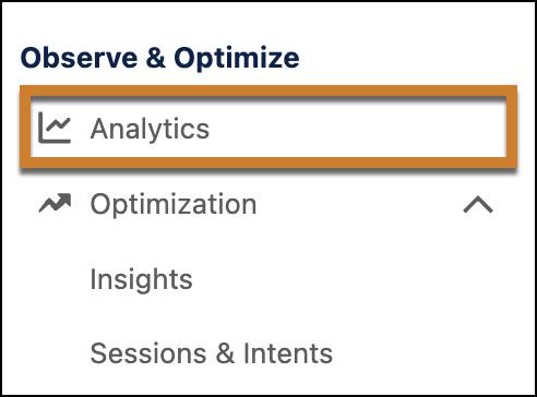
The Observe & Optimize section includes:
-
Analytics: Opens the performance dashboards for the selected agent app.
-
Sessions & Intents (expand Optimization): Opens a table of individual sessions for transcript auditing, intent comparison, and tagging.
Navigate the Agent Analytics Dashboard
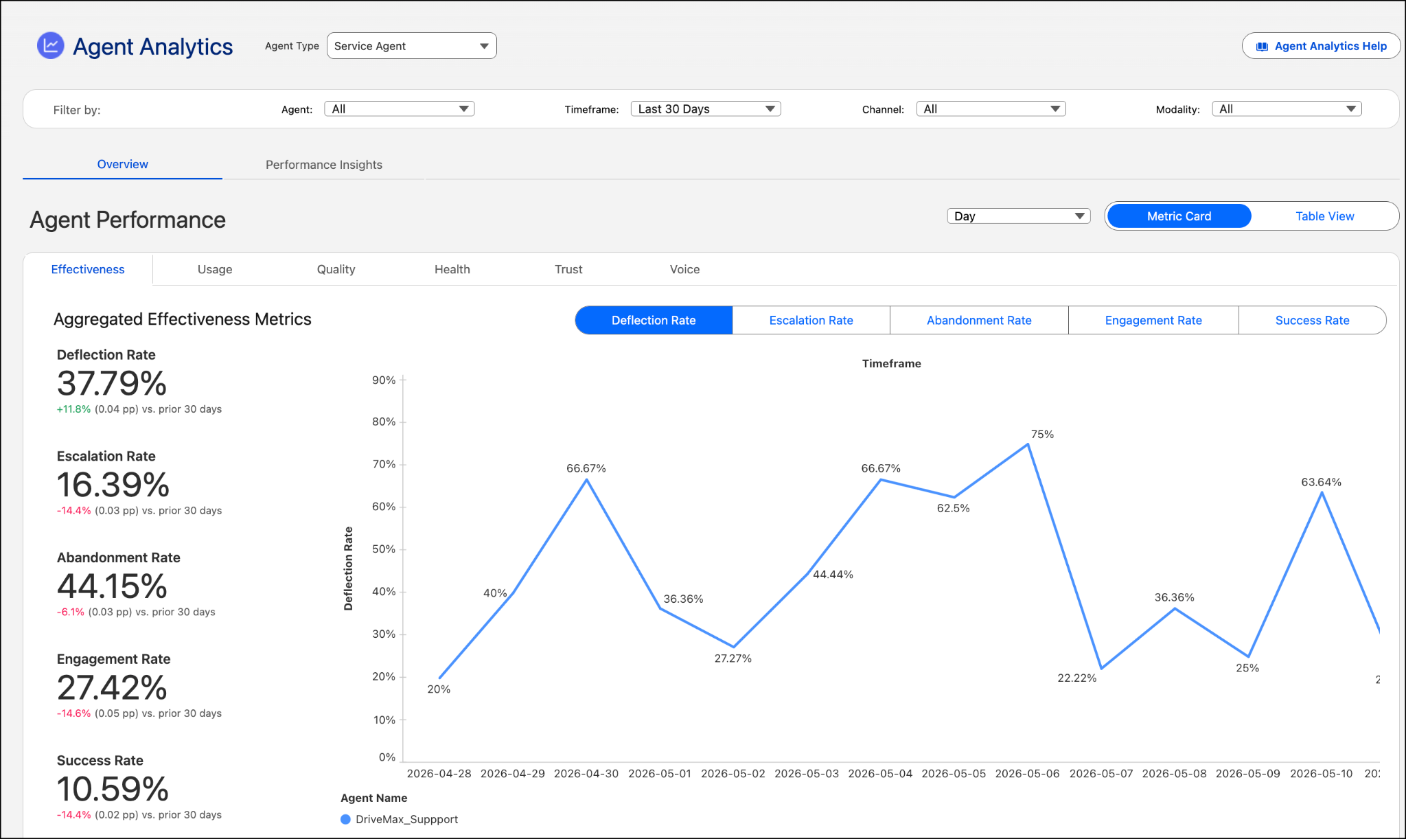
After you select the agent type, the Agent Analytics dashboard displays metrics for that agent type. Dashboards are powered by Tableau Next. Metrics can vary by agent type. Here’s an example dashboard for a Service Agent.
Filter the Dashboard Data
The filter bar scopes the data that’s displayed on the dashboard. Filtering focuses your visualization on just the area you want to explore: all agents or a specific one, the time window to display, channels, and modality (for example, text, voice, or both).

Explore Agent Performance
The Overview tab shows you headline KPIs, period-over-period trend cards, and outcome charts. Start here to get a high-level picture and aggregated agent performance metrics at a glance.

Dimension Tabs
Analytics data are categorized by dimension. Select a dimension tab, such as Quality or Health, to view its KPI set and charts.
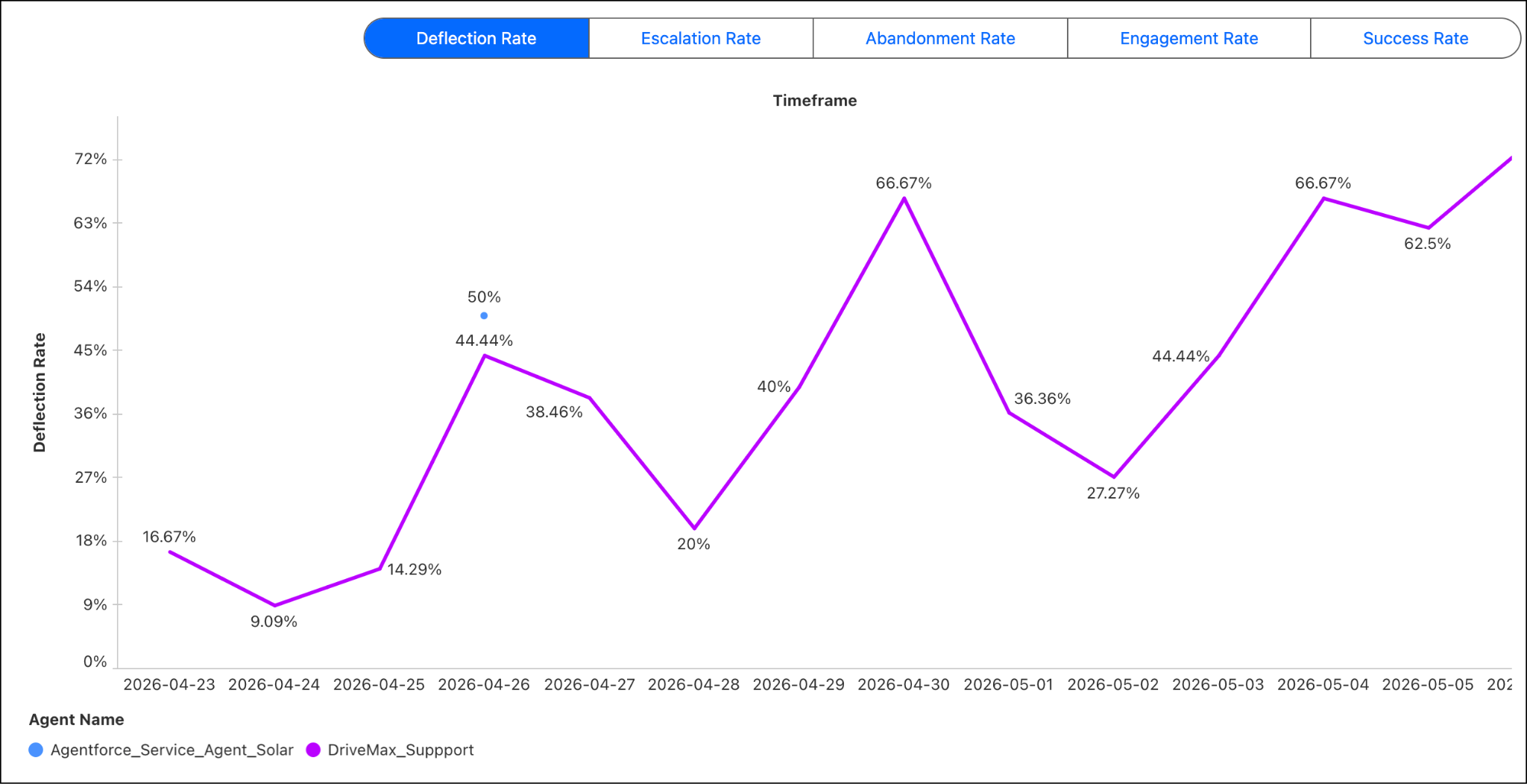
Explore Effectiveness Metrics
Select the Effectiveness tab to see KPI cards with period-over-period change indicators. You’ll see a multi-agent trend line chart and a Session Outcome stack bar chart.
-
Deflection Rate: Share of sessions that ended without escalation to a support representative or another agent
-
Escalation Rate: Share of sessions that escalated to a support representative or another agent
-
Abandonment Rate: Share of sessions that timed out or ended without engagement (default timeout: 2 hours)
-
Engagement Rate: Share of sessions in which the user received a reply tied to an agent-triggered action. A session is counted as engaged only when at least one action was triggered
-
Success Rate: Share of interactions that included action steps and completed without errors
-
Task Resolution Rate: Share of sessions evaluated as fully resolved by the Trust Layer Task Resolution detector
Further down the page, notice the aggregated statistics for session outcomes in a stacked bar chart.

-
Deflected: Ended at user’s request (user resolved)
-
Escalated: Transferred to a customer service representative or a different agent
-
Abandoned: Timed out or dropped
-
Ambiguous: Could not be classified clearly
Toggle Between the Metric Card and Table View
Select Metric Card to view the tile layout (large cards with graphics and details). Select the metric to change the graph.
Select Table View to explore a compact table layout, which shows all metrics at once.

Change Trend Chart Granularity
The Date Filter changes the granularity (Day/Week/Month) of the charts.
Explore Usage Metrics
Select the Usage tab to see usage metrics.
-
Unique Sessions: The number of distinct sessions recorded within a defined timeframe. A session includes the entire exchange between a user and an agent.
-
Unique Interactions: The number of distinct user and agent interactions recorded within a defined timeframe. One interaction is considered as a user’s request plus an agent’s response.
-
Unique Users: The number of distinct users interacting with the agent within a defined timeframe.
-
Average Interactions Per Session: The average number of interactions per session.
Explore Quality Scores
Select the Quality Scores tab to see dimension scores generated by an external LLM evaluator.
Score |
Scale |
What It Measures |
|---|---|---|
Quality Score |
1–5 |
Overall relevance of the agent’s response to the user’s request |
Answer Faithfulness* |
0–1 |
How closely the response adheres to grounded source data (knowledge base articles) |
Answer Relevance* |
0–1 |
Relevance of the response to the user’s question |
Context Relevance* |
0–1 |
Whether the agent retrieved the correct data source to answer the question |

Explore Health Metrics
Select the Health tab to review agent health metrics.
-
Error Rate: Percentage of interactions in which the agent encounters an error in processing or responding
-
Session Duration (seconds): The session duration in seconds
-
Agent Interaction Latency (seconds): The time it takes the agent to respond to the user’s request
Explore Trust Metrics
Select the Trust tab to explore evaluations in the Einstein Trust Layer.
-
Adherence Response Rate: Percentage of responses where instruction adherence meets the high-adherence threshold.
-
Average Agent Toxicity Score (0–1): Average toxicity detector score for agent output—lower is better.
Voice Metrics
Select the Voice tab to see voice metrics.
-
Interruption Rate: Percentage of interactions with interruptions.
Explore Performance Insights (Breakdowns)
The Performance Insights tab lets you compare performance across segments—which subagents, intents, or actions are driving good or bad outcomes. Use this tab to investigate which segments are underperforming.
- Select the Performance Insights tab.
- In the Breakdowns panel, choose a segment type: Subagents, Intents, or Actions.
- Use Select Subagent (or the equivalent selector) to filter to a specific segment, or leave it set to All.
- In Select Metric, choose the measure you want to compare.
- Review the horizontal bar chart. Each row represents a segment (for example, a subagent like Billing & Payments or Order Status), with the bar length representing the metric value and color coding indicating performance level (green=favorable, orange/red=needs attention).
This example shows subagents grouped by Unique Sessions, with Average Quality Score selected as the comparison metric. Each agent lists its subagents (Billing & Payments, Order Status, Returns & Refunds, and so on) alongside bar charts showing both session volume (blue bars) and quality score (green/orange bars).

Explore User Sentiment in the Employee Agent Dashboard
In the Employee Agent dashboard, choose User Satisfaction to see counts of positive user feedback (thumbs up) and negative user feedback (thumbs down). Both metrics show multi-agent trend lines so you can track sentiment over time across agents.
Alex Investigates Agent Performance in Agent Analytics
Two weeks after deploying the Excursion Booking Agent, Alex Wu opens Agent Analytics to check progress toward his goals of deflecting 50% of inquiries and reducing escalations to 50%. He wants to get a baseline understanding of how the agent is performing in production.
- Alex logs in to Agentforce Studio.
- He navigates to Observe & Optimize | Analytics.
- He selects the Service Agent type and changes the Timeframe in the Filter Bar to the Last 30 Days.
On the Agent Performance tab, he immediately reviews the Effectiveness dimension tab.
-
Deflection Rate: 38% (below the 50% goal)
-
Escalation Rate: 42% (close to target but needs improvement)
-
Abandonment Rate: 27% (concerning - this means over 1 in 4 users are giving up)
-
Engagement Rate: 58%
-
Success Rate: 71%
Alex studies the Aggregated Effectiveness Metrics trend chart, which shows all four metrics over the 30-day period. He notices the abandonment rate (orange line) has been climbing steadily during the past 2 weeks, while the deflection rate (blue line) has plateaued. The Session Outcome stacked bar chart at the bottom reveals that abandoned sessions (red segments) increased significantly during weekends, particularly showing spikes on March 15–16 and March 22–23.
Drilling into Performance Insights
Alex switches to the Performance Insights tab to identify which parts of the agent are causing abandonments. In the Breakdowns panel, he selects:
-
Segment type: Subagents
-
Metric: Deflection Rate
The horizontal bar chart displays performance for each subagent:
- General FAQ: Green bar (deflection rate ~65%)
- Water Activities Booking: Orange bar (deflection rate ~32%)
- Land Tours Booking: Green bar (deflection rate ~58%)
- Pricing Information: Yellow bar (deflection rate ~45%)
Alex changes the metric to Abandonment Rate and sees:
- Water Activities Booking: Red bar (abandonment rate ~38%)
- General FAQ: Green bar (abandonment rate ~8%)
- Land Tours Booking: Yellow bar (abandonment rate ~15%)
What Has Alex Learned?
The Water Activities Booking subagent is significantly underperforming. It has:
- The lowest deflection rate among all subagents
- The highest abandonment rate (38% versus average of 27%)
This subagent handles scuba diving and snorkeling bookings—the resort's most popular and profitable excursions. The high abandonment rate means potential revenue is being lost.
From here, Alex writes a list of things to do.
- Investigate the instructions in the Water Activities Booking subagent. Identify possible improvements that could result in better outcomes.
- Look at Quality scores for this subagent to understand response relevance. How well does the agent understand the user’s intent? How well does it return relevant results?
- Check Health metrics (latency) to see whether slow response times are contributing to abandonment.
- Schedule a meeting with the excursion desk manager to discuss what common questions guests ask that might not be getting answered by the Excursion Booking Agent.
Alex discovers and fixes an ambiguous instruction in the Water Activities Booking subagent. Then he tests a new version of the agent in Agentforce Testing Center, deploys it, and monitors its performance for the next few weeks. He’s rewarded for his efforts with higher deflection rates and lower abandonment rates that align with his business goals.
Up Next
What if the numbers underperform his goals? Alex can drill deeper into the data. Using Sessions & Intents, he can examine individual Water Activities conversations and investigate other possible patterns and causes. On to the next unit!