Work with List Views
Learning Objectives
After completing this unit, you’ll be able to:
- Find and switch between list views.
- Create list views.
- Apply filters to focus list views on specific records.
- Edit records and fields from list views.
- Visualize data with list view charts.
- Create a workflow board with Kanban.
Lay of the Land of List Views
From working in Salesforce Classic, you know that list views are a great way to sort, prioritize, and analyze the records that are most important to you. As you’d expect, your existing list views are waiting for you in Lightning Experience. Let’s take a peek at the more powerful options in the new interface for creating, editing, and consuming your data (donut charts, anyone?) from lists.
You continue to access list views from object home pages. Here’s an example of how the same list view for Leads looks in both interfaces. At first glance, things don’t seem too different.
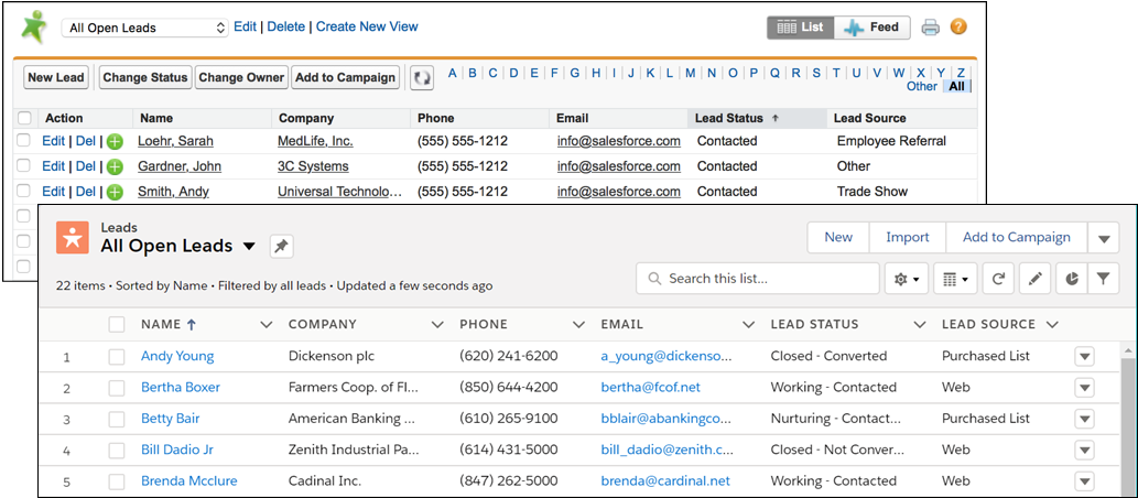
The All Open Leads list view in Salesforce Classic (with the green leads icon in the upper-left corner) and in Lightning Experience (with the orange leads icon).
But taking a closer look, notice the new set of controls on the right side of the list view? This is where much of the list view magic happens in Lightning Experience.
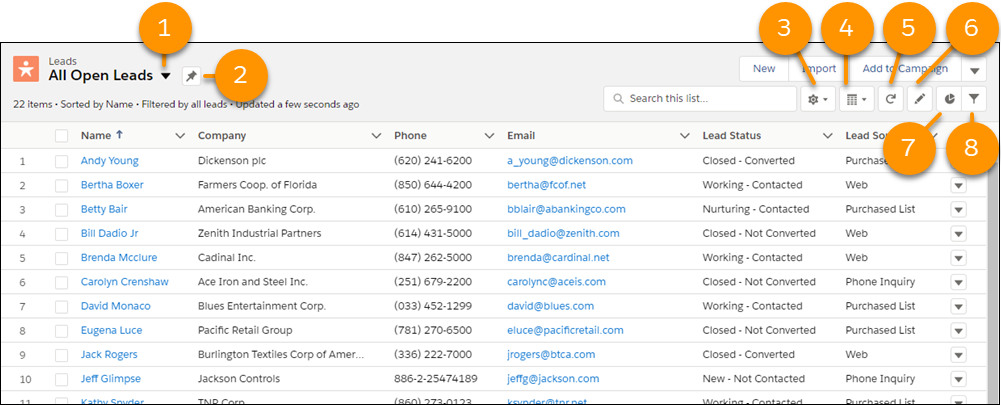
List View dropdown menu (1) Click  to access your list views. Pin list icon (2) Click
  to pin a list view. A pinned list is the default list view for that object. A
  icon indicates a pinned list. To pin a different list, select a different list view and pin it instead. List View Controls menu (3) Click
  to access list view actions, including creating, renaming, cloning, and sharing them. You can also choose which fields to show in a list and editing filters that you’ve applied. Layouts icon (4) Click
  to toggle between displaying lists in the standard table view (
  ) or the Kanban view (
  ). The icon changes to match the selected view. Kanban is a workflow visualization tool. We talk about Kanban in a bit. When working with task lists, you can also use split view (
  ) to see all of your tasks on the left side of the page, plus the details for a selected task on the right. Refresh icon (5) Click
  to get a fresh view of a list more quickly than doing a full page reload. Edit icon (6) Click
  to update fields in your list. You move to the first editable field in the list. Edited fields are highlighted in yellow to remind you to save your changes. Charts icon (7) Click
  to transform list data into simple and easy-to-understand pictures that show things like percentages, totals per account, ratio of dog lovers to cat owners, and other useful information. Filter icon (8) Click
  to narrow or expand the records that appear in a list view by adding, modifying, or removing filters.
And here are a few other Lightning Experience-only improvements we think you’ll appreciate.
- Tired of seeing only part of each field in a list view? It’s easy to wrap text in list view columns. Select Wrap text or Clip text at the top of the list view column.

- Tired of clicking through multiple pages for long list views? List views in Lightning Experience display on a single page! Even better, you can quickly find any record in the list using your browser’s Find on this Page option.
Recently Viewed Landing Page
Unless you pin a different list view, every time you navigate to an object’s home page, you see a summary of your recently viewed records.

This summary is similar to the Recent section at the top of object home pages in Salesforce Classic. Unlike with list views, you can’t filter, clone, or apply other actions to this landing page. The fields you see are determined by your admin.
Tip
In Lightning Experience, the list view dropdown menu always defaults to the Recently Viewed summary instead of saving the currently selected list view for future visits. If you want a specific list view to load as your default, pin it. You can also make the list view a favorite, or add it directly to your navigation bar.
Each object also has a Recently Viewed list view that you can filter. It’s the list that includes the object in its name, such as Recently Viewed Leads or Recently Viewed Opportunities. Select it from the list view dropdown menu.

A New List View for You
In Lightning Experience, create a list from the List View Controls menu (  ). Select New to start from scratch (or use Clone to leverage an existing list).

Just like in Salesforce Classic, when creating a list view in Lightning Experience you assign a name, add filters, and pick the fields to show. But the setup flow occurs in stages now. As a result, you see the actual list view as you add filters, so you can check the results of your choices in real time.
Filtering Makes Perfect
You know that filters are at the heart of crafting list views that show you just the records that meet your criteria. Let’s take a closer look at adding filters to a list view in Lightning Experience. As we mentioned, applying filters is an automatic part of the process when creating list views. You can also modify filters for an existing list view by clicking the  icon. In either case, the filter pane opens next to the list view.

To illustrate the power of this new layout, let’s look at an example. Say you want your All Open Leads list view to track all leads from the Chemicals sector. Check out this video snippet to see how you make it so in Lightning Experience.
Voila! You now have a list view that shows you just the leads you want to focus on. Very nice.
Pick the Columns That Appear in List Views
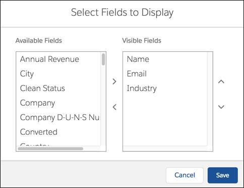
Don’t stop with filters. See only the record details that matter to you by choosing and ordering the fields that appear as columns in list views. In Lightning Experience, make these decisions by clicking Select Fields to Display in the List View Controls menu (  ).
).
Edit Records on the Fly
You can still edit all of a record’s details from list views. Find the Edit option in a record’s action menu.

And same as in Salesforce Classic, you can update many of a record’s fields right in a list view. Hover over fields to see which ones are editable (  ) and which ones can’t be modified (
  ).
).
But editing fields inline is streamlined and more natural in Lightning Experience. To appreciate this change, let’s first review how inline edit works in the classic interface.

Inline edit in Salesforce Classic: Double-click an editable field, enter data in the popup window, then click Save. You have to repeat each of these steps for every field you need to update.
Now let’s enjoy how much faster inline editing is with Lightning Experience.

Inline edit in Lightning Experience: Simply click an editable field, type data right into the field, and press Return. Update as many fields as you want. Quickly breeze around a list using the tab key and arrow keys on your keyboard. Click Save once when you’re finished.
The Mass Appeal of Mass Inline Editing
Need to make the same update to multiple records? Here’s another feature that we think is better in Lightning Experience: editing multiple fields on a list view at the same time.
Let’s look at an example to see how this works. Say you had a great quarter, successfully converting several leads. You can easily update the status for all of these leads with just a few keystrokes.
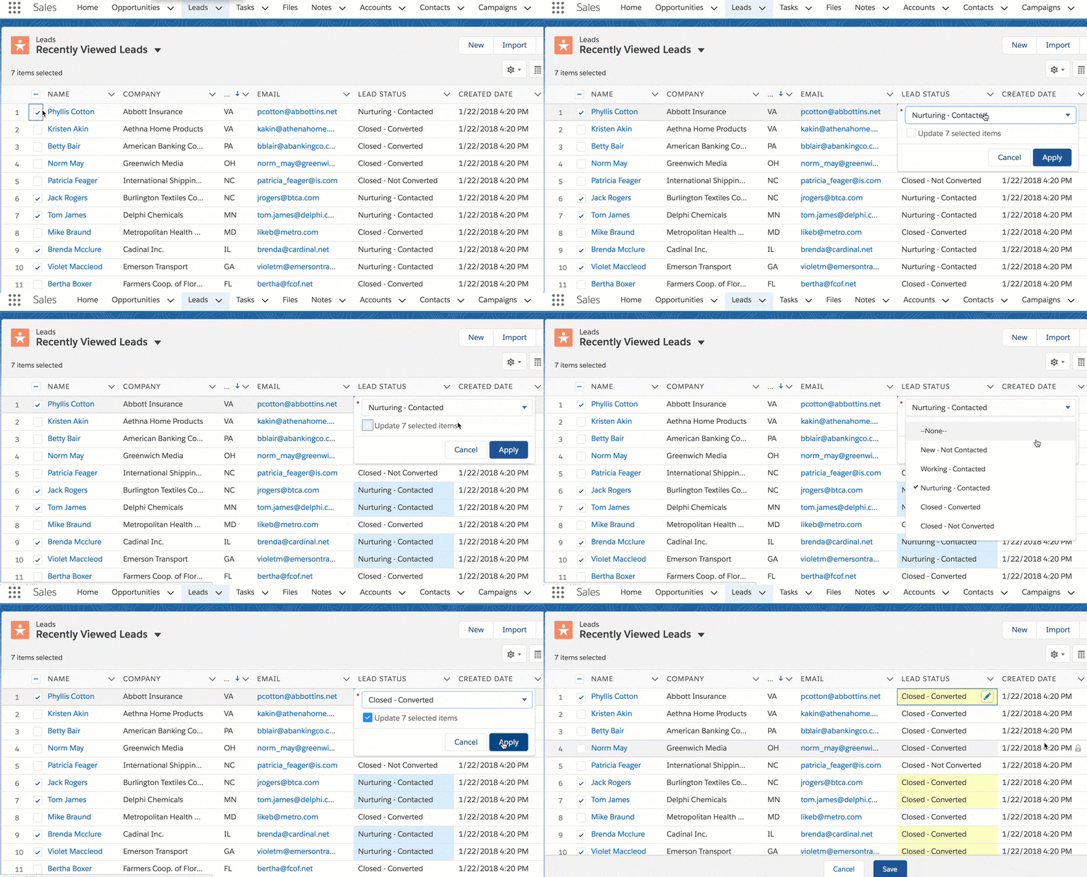
In a list view, select all of the leads that you converted. Edit just one of the record’s Lead Status fields, select Closed - Converted, then select to apply the change to all of the leads. Save all your changes at once. Easy-peasy.
Tip
Same as in Salesforce Classic, inline editing and mass inline editing is available only if the list view you’re working with is limited to a single record type.
Visualize Your Data with List View Charts
You know the saying that a picture is worth a thousand words? Sometimes a visual representation is the best way to nail an insight, draw a conclusion, or otherwise understand what your data is telling you. For example, say that you want to know which accounts represent the most overall value in the pipeline to make sure you’re focusing on the right opportunities. With list view charts in Lightning Experience, you can easily see the answer.
Let’s see for ourselves by looking at a donut chart. From the All Opportunities list view, click  . In the Charts panel, click
  and select New Chart.
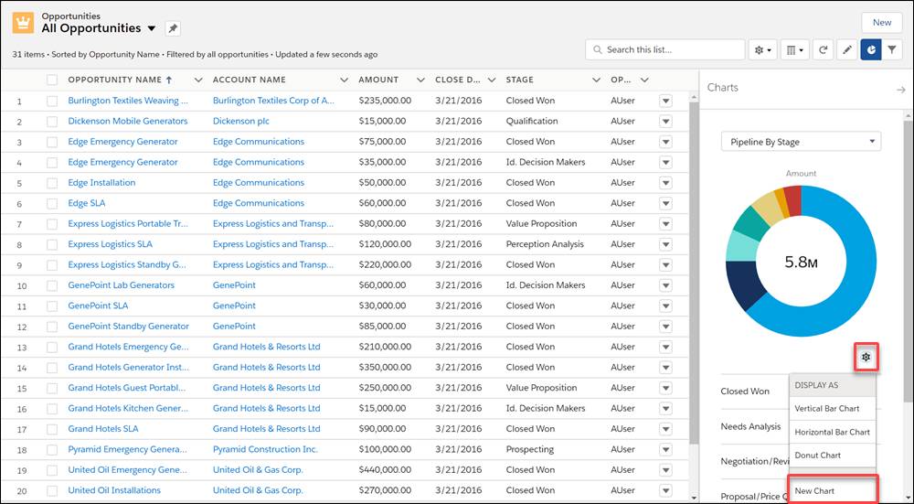
Give the chart parameters.
- Chart Name: Pipeline Total Value
- Chart Type: Donut Chart
- Aggregate Type: Sum
- Aggregate Field: Amount
- Grouping Field: Account Name
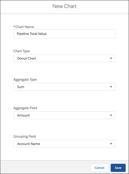
The aggregate type specifies how the field data is calculated: by sum, count, or average. The aggregate field specifies the type of data to calculate. The group field labels the chart segments.
Save your selections and presto! A colorful donut chart that instantly identifies the most lucrative accounts in the pipeline.
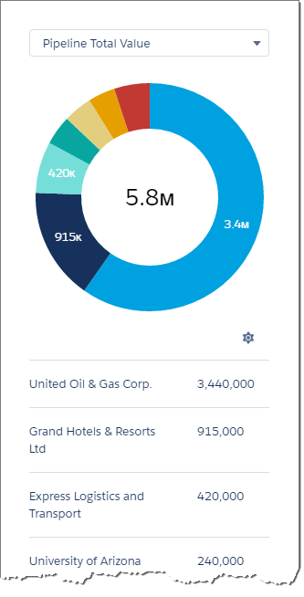
You can visualize list view data in three types of charts: vertical bar, horizontal bar, and donut. Cycle through all the options to see which format works best for your purposes.
You can create charts for any list view that you have permission to see, except for the Recently Viewed landing page on object home pages.
Try an Alternate Point of View with Kanban
In Japanese, Kanban is a billboard or sign. In Lightning Experience, it’s a board where a list view’s records are organized as cards in columns, making it a snap to visually track and update work. Kanban view is typically available for objects that have standard list views, like Accounts, Cases, and Opportunities. There are endless possibilities for tracking your work this way. A couple of examples: make sure all cases move from new to closed, or monitor your progress pushing deals through each stage of the sales process.
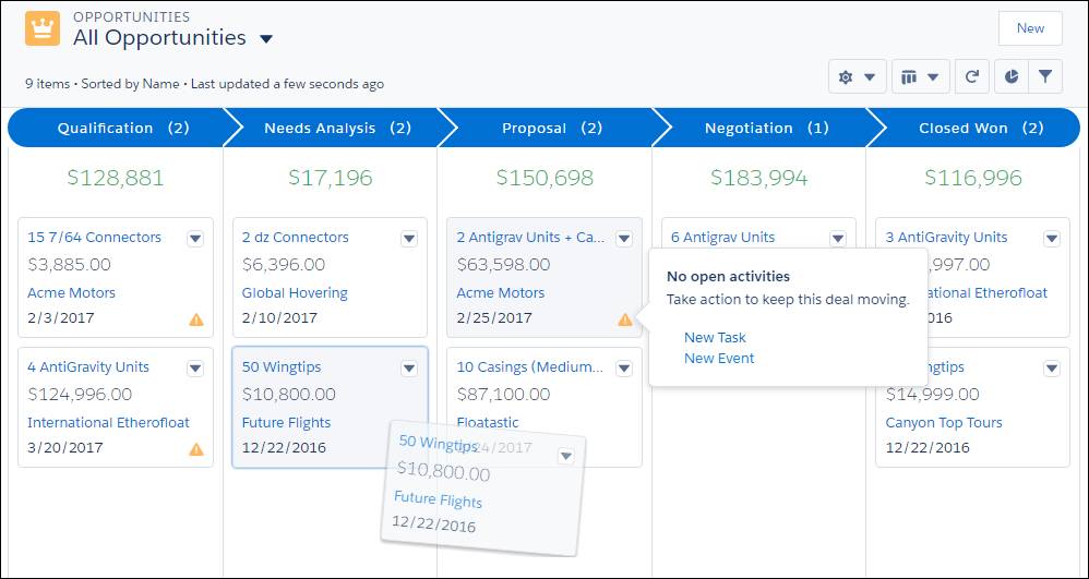
The records in the Kanban view are based on the list view you’re currently using. You can switch any list view to Kanban view (but not the Recently Viewed landing page). Click  to toggle a list view to Kanban view. The icon changes to
  .
.

Kanban organizes the list’s records into columns. You decide the fields that are used to create these columns the first time you switch a list view to Kanban view.
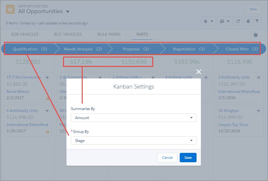
- Select a numeric or currency field to summarize, or select None to remove the summary from the Kanban view. For example, for opportunities, you can see the total value of all opportunities in a column. Or you could see the total number of products included in each opportunity, to see what’s coming up in the pipeline.
- Columns are created based on your selection in the Group By field. For example, track records by stage or group them by owner.
If you customized the fields that appear in the list view, the same fields appear in the cards in the Kanban view. Similarly, any filters that you applied to the list view are also in effect for the Kanban view. If these settings aren’t right in this context, you can easily adjust them using the same steps we talked about for list views. Just remember that these new changes stay in effect if you toggle back to the list’s table view.
Tip
Does your org use multiple record types for some or all of your objects? If yes, the Kanban view has separate tabs for each record type.
Now here’s the fun part. When you’re ready to update a record’s status, it’s as easy as dragging the record’s card to the correct column. For example, as you work through your list of open leads, drag lead cards to the appropriate status. See it in action with this video snippet.
Stay on Top of Deals with Alerts
Let’s look at how the Kanban view helps you stay on top of your deals with opportunity alerts. An alert appears as a yellow triangle on an opportunity card, letting you know that something needs your attention.
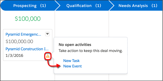
There are three types of alerts: overdue tasks, no open activities, or no activity for 30 days. Click the triangle to take the necessary action right from the card.
List Views in Action
Here’s a little video to help bring all the cool Lightning Experience list view features we just talked about to life. It’s not too long so you don’t need popcorn. Enjoy!
Resources
- Trailhead: Lightning Experience Customization
- Salesforce Help: Explore Object Tabs
- Salesforce Help: Customize Your Data View
- Salesforce Help: Create or Clone a List View in Lightning Experience
- Salesforce Help: Update Records Inline from a List View in Lightning Experience
- Salesforce Help: Display a Visual Summary with Kanban
Important
While you work through the hands-on challenge, make sure that you’re logged in to your Trailhead Playground. Using your playground ensures that you aren’t changing data in your production org. To open your playground, click Launch in the Hands-on Challenge section.