Build with Components
Learning Objectives
After completing this unit, you’ll be able to:
- Explain what the grid system does.
- Demonstrate intentionality in using components.
- Articulate the value of styling hooks.
Layouts and the Grid
You’ve got an understanding of what SLDS 1 is all about, and the four elements that comprise the system. Now it’s time to get building!
Let’s start with layouts. Layouts are the most fundamental part of any design composition, big or small. The SLDS 1 grid system can help you achieve pretty much any layout you can think of. Understanding how to use the grid system is your first key to unlocking great user experiences.
Mobile First
The SLDS 1 grid system is a CSS framework (based in CSS Flexbox) that offers a flexible, mobile-first, device agnostic layout system. That’s kind of a mouthful, so let’s boil it down: With the SLDS grid system, you can create awesome layouts on any device, and any platform, all with the mobile-first methodologies in mind.
What do we mean by mobile first?
Mobile first is the concept of building your interfaces first with the smallest viewport in mind, and then scaling your design up at certain breakpoints to respond to larger screens.
For SLDS, this means adding sizing class prefixes for those breakpoints. SLDS utilizes small, medium, and large keywords to designate responsive breakpoints for mobile, tablet, and desktop.
Sizing Class |
Responsive Breakpoint |
Intended For |
|---|---|---|
.slds-size |
default |
mobile |
.slds-small-size |
>= 480px |
mobile/tablet |
.slds-medium-size |
>= 768px |
tablet/desktop |
.slds-large-size |
>= 1024px |
desktop |
As always, looking at some code will help make things clearer. Here’s the bare minimum code you need to use the SLDS grid.
<div class="slds-grid">
 <div class="slds-col">
  <p>Main Content Goes Here</p>
 </div>
</div>
You’re right: That snippet doesn’t offer much real-world utility. But, it’s the right place for us to start looking at how the grid works.
The grid system is composed of at least two structural elements.
- The grid container, which utilizes the
slds-gridclass (first line of code).
- Its child element,
slds-col(second line). A grid container can have multiple child columns. Adding multiple children, each with aslds-colmodifier class, is how we unlock the power of the grid system.
Let’s make our grid a bit more life-like by adding a second column to the layout.
<div class="slds-grid">
 <div class="slds-col">
  <p>Main Content Goes Here</p>
 </div>
 <div class="slds-col">
  <p>Sidebar Content Goes Here</p>
 </div>
</div>
On a mobile device, the output would look something like this, with two columns of content side by side.
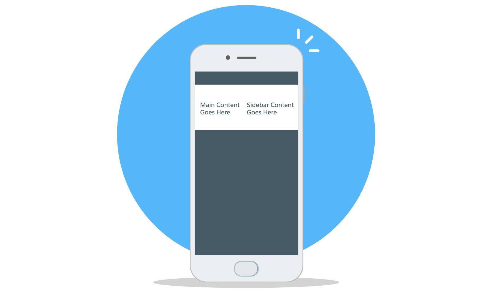
OK! That’s a baby step closer to something we might actually want to build. But it’s kind of cramped on a mobile device. This is where responsive design helps out.
First, let’s add the class slds-wrap on the grid element where we want a row-based break in the content. We also need to set the default sizing for the columns by adding the class slds-size_1-of-1.
<div class="slds-grid slds-wrap">
 <div class="slds-col slds-size_1-of-1">
  <p>Main Content Goes Here</p>
 </div>
 <div class="slds-col slds-size_1-of-1">
  <p>Sidebar Content Goes Here</p>
 </div>
</div>
Next, let’s add additional sizing classes to support desktop layouts.
Note that the SLDS 1 grid system is divisible into 12 columns, but the class names also pare down, so declaring sizes such as “eight of 12” and “four of 12” is equivalent to declaring a more parseable “three of four” and “one of four.” Use the divisor (from one to 12) that makes the most sense for your needs. Just be sure that the total of the sizing dividends (the first number) add up to the divisor (the second number) for all of the responsive rows that you want to create in our grid.
We’ll use the large sizing class declarations we spoke about at the beginning of this section and double-check that our sizing dividends (3 and 1) add up to match our divisor (4):
<div class="slds-grid slds-wrap">
 <div class="slds-col slds-size_1-of-1 slds-large-size_3-of-4">
  <p>Main Content Goes Here</p>
 </div>
 <div class="slds-col slds-size_1-of-1 slds-large-size_1-of-4">
  <p>Sidebar Content Goes Here</p>
 </div>
</div>
Here’s how it looks on desktop and mobile layouts.

And there’s so much more you can do with the SLDS 1 grid system, including:
- Responsive column reordering (handy with complex layouts)
- Grid nesting
- Alternate layouts
- Right to left
- Top down/bottom up
- Alignment modifiers, and more
This TDX 2018 talk goes in-depth on grids—it’s well worth a watch.
Blueprints, Components, and LWCs
As you recall from Unit 1, blueprints are one of the four key elements that SLDS 1 is based upon. Component blueprints are framework agnostic, accessible HTML and CSS used to create components.
First things first: Be intentional about building new components. Follow this guide to decide when to build a new component.
- Use an existing LWC component reference from the component library
- If no base component can be customized appropriately, create a new component starting from a blueprint
Among the many reasons to use preexisting components is that we’ve baked accessibility into our components. Blueprints provide good recommendations for accessibility but also require additional development to make them fully accessible. Accessibility is a critical part of any development work, so be intentional about any and all customizations or composing you do. Trailhead Accessibility modules are a great place to learn more. We want your brilliant designs and productivity-boosting workflows to benefit as many people as possible!
Use Lightning Web Components
LWCs are the easiest way to bring your layouts to life with interactive UX components like buttons, form inputs, toggles, and more. See Lightning Web Components on the Salesforce Developer website.
Let’s look at LWC in action by adding a few elements to our layout. We’ll render a tabset in the main area, and a card in the sidebar. And we don’t even need to write any code to do it—we just copy and paste from the online documentation.
Here’s the tabset component (<lightning-tabset>) pasted into our example code.
<div class="slds-grid slds-wrap">
 <div class="slds-col slds-size_1-of-1 slds-large-size_3-of-4">
  <lightning-tabset>
   <lightning-tab label="Item One">
    One Content !
   </lightning-tab>
   <lightning-tab label="Item Two" title="2nd tab extended title">
    Two Content !
   </lightning-tab>
   <lightning-tab label="Item Three">
    Three Content !
   </lightning-tab>
  </lightning-tabset>
 </div>
And the card component (<lightning-card>):
<div class="slds-col slds-size_1-of-1 slds-large-size_1-of-4">
 <lightning-card title="Hello">
  <lightning-button label="New" slot="actions">
  </lightning-button>
  <p class="slds-p-horizontal_small">
   Card Body (custom component)
  </p>
  <p slot="footer">Card Footer</p>
 </lightning-card>
</div>
Voilá! Interactive interface elements, rendered in a responsive layout, just like that.

Customizing Components with Styling Hooks
We mentioned the best practice of customizing base component LWCs to suit your needs before composing new components of your own. Styling hooks are how that customization happens.
Styling hooks use CSS custom properties which make it easy to customize component styling and express your brand. Within the world of LWCs and SLDS, styling hooks enable customization for Lightning Components in an elegant and supported fashion.
Here’s a quick example using a button.

The normal (default) button doesn’t use any styling hooks, just an empty CSS class selector, so it renders as white text on a blue background—the default button style.
.my-css  {
  /**
   * No styling hooks
  */
}
The SLDS styled button (.slds-button) uses styling hooks to define the properties that can be modified. By adding this custom class to the base component, and defining the new values, the hooks give our styled buttons a custom purple background to express our brand.
.my-css {
    --slds-c-button-brand-color-background: #BB00F
    --slds-c-button-brand-color-background-hover: #8700B
    --slds-c-button-brand-color-border: #BB00F
    --slds-c-button-brand-color-border-hover: #8700B
}
Of course, styling hooks aren’t limited to button colors! See Styling API and styling hooks on the SLDS 2 website.
Composing Your Own Components
There will be times when you need an interface item you can’t find in the Lightning Components Reference—even after taking customization options into account. Times like these were made for composing your own components.
If you want to get hands-on and try composing your own component, we recommend getting started with these two examples:
First, watch this video of the Building Custom UI Components talk given at Dreamforce 2019. The first half of the video actually walks through the layout example from earlier in this unit. The latter portion of the talk adds interactive functionality to the layout by way of a custom component based off of the SLDS component blueprint for a scoped notification. There’s too much content to re-create here, but it’s a great, easy-to-follow example of composing a custom component.
Once you’ve wrapped your mind around that, check out another of our favorites: The Welcome Mat. A welcome mat is a series of unordered items a user can click to learn about a thematic topic. Ours was composed using other blueprints from SLDS. The modal uses a grid to split content into two sections: the informational left pane with text headings and progress bar, and the actionable right pane using media objects and icons. The tiles in the right pane can be used to trigger walkthroughs, modals, videos, or navigate users to specific URLs. The welcome mat component documentation includes a base version, multiple variant examples, and complete code and CSS class documentation. Check it out, copy and paste the code into your editor, and start experimenting with modifications. Or use the mat as inspiration for your own custom component. The different variants of the mat will show you how to use different methods to change your own components.
Speaking of best practices, our third and final unit covers SLDS best practices and troubleshooting. Onward!
Just remember our rule: Be intentional when building new components.
Resources
- Salesforce Lightning Design System 1: SLDS Blueprint Overview
- Video: Grids Talk from TDX 2018
- Salesforce Lightning Design System 2: Styling API
- Salesforce Lightning Design System 1: SLDS Component Blueprint—Scoped Notifications
- Salesforce Lightning Design System 1: SLDS Component Blueprint—Welcome Mat