Build a Flexcard to Show External Country Information
Create a Flexcard for Country Details
Now that you have a Flexcard for order information, you create and set up another to show the customer country details fetched from an external data source.
- Click
 , then find and select Flexcards.
- Click New.
- On the New Flexcard window, enter these details.
- Name:
CustomerCountryDetails
- Title:
CustomerCountryDetails. This field auto-populates the text from the Name field.
- Theme: Lightning
- Author:
Developer
- Name:
- Click Save.
The Flexcard opens in Flexcard Designer in a new tab. An Active state element is already added by default. Let’s set up the Flexcard: We give it a title and add details about the country, such as its capital, flag, Google Maps link, and so on.
Configure the Country Flexcard Title
First, add styling to the Flexcard state background.
- Click anywhere on the Active State element.
- In the Properties panel, click the Style tab.
- Under the Appearance section, for Background Color, enter
#DEF9F3.
Next, add a text element for the Flexcard title.
- In the Flexcard designer, drag a Text element from the Display category in the Elements panel and drop it in the Active state Flexcard element. The Properties panel opens.
- In the Properties panel, under the Element Details tab, for Element Name, enter
CountryFlexcardTitle.
- In the edit text area, remove Edit Me! text and enter
Customer Country Details.
Now let’s style the element and its content.
- Select the Customer Country Details text in the text area.
- Go to Block Type, then Headings, then Heading 2.
- While the text is still selected, click
 .
.
- Select
 and
and  as shown here.

- In the Properties panel, click the Style tab.
- Under the Appearance section, enter these details.
- Border Type: Top, Right, Bottom, and Left
- Border Width:
1
- Border Color:
#03B4A7
- Border Type: Top, Right, Bottom, and Left
- Under the Alignment section, enter these details.
- Padding Type: Top
- Padding Size: x-Small
- Click
 .
.
- Padding Type: Top
Your Flexcard title element is now ready.
Add Country Information
Add a text element for country information.
- Drag a Text element from the Display category and drop it after the CountryFlexcardTitle element.
- In the Properties panel, under the Element Details tab, for Element Name, enter
CountryDetails.
- In the edit text area, remove Edit Me! and enter
Country Name: {CountryName}.
- Select the entire text and click
 .
.
- Click Font Size and select 14pt.
- Select only the Country Name: text and select
 .
.
- Click after the {CountryName} text and press Enter or Return.
- In the text area, enter
Capital: {Capital}.
- Select the entire text.
- Click Font Size and select 14pt.
- Select only the Capital: text and select
 .
.
- Similarly, enter
Region: {Region}in the next line after Capital: {Capital} and style it as done for the previous texts.

Let’s style the CountryDetails element.
- Click the CountryDetails element.
- In the Properties panel, click the Style tab.
- Under the Dimensions section, drag the Default slider to 6.
- Under the Alignment section, enter these padding details.
- Padding Type: Around
- Padding Size: x-Small
- Click
 .
.
- Padding Type: Around
Your country information element is ready.
Show the Country Flag
Next, add an image element to show the country flag.
- Drag an Image element from the Display category and drop it beside the CountryDetails element.
- In the Properties panel, under the Element Details tab, enter these details.
- Element Name:
FlagImage
- Image Source:
{FlagUrl}
- Size: Small
- Element Name:
- In the Properties panel, click the Style tab.
- Under the Alignment section, enter these padding details.
- Padding Type: Around
- Padding Size: x-Small
- Click
 .
.
- Padding Type: Around
Awesome! It’s time to add timezones now.
Add Timezones
Add a text element to show the country’s timezones.
- Drag a Text element from the Display category and drop it after the FlagImage element.
- In the Properties panel, under the Element Details tab, for Element Name, enter
Timezones.
- In the edit text area, remove Edit Me! and enter
Timezones: {Timezones}.
- Select the entire text and click
 .
.
- Click Font Size and select 14pt.
- Select only the Timezones: text and select
 .
.
- In the Properties panel, click the Style tab.
- Under the Alignment section, enter these padding details.
- Padding Type: Around
- Padding Size: x-Small
- Click
 .
.
- Padding Type: Around
You’re done with the country timezones element. Let’s configure the Google Maps link and the Flexcard data source.
Configure the Google Maps Link
Add an action element to show a Google Maps link for the country.
- Drag an Action element from the Display category and drop it after the Timezones element.
- In the Properties panel, under the Element Details tab, enter these details.
- Element Name:
GoogleMaps
- Element Label:
View On Google Maps
- Element Name:
- Change the image for the action.
- For Icon, click
 .
.
- In the Select an icon window, for Icon, enter
map.
- Select the map icon and click Save.
- For Icon, click
Now, set up the Action section to configure the Google Maps URL and style the element.
- Click
 beside Action in the Properties panel.
- Under the Action section, for Target Page URL, enter
{GoogleMapsUrl}.
- In the Properties panel, click the Style tab.
- Under the Action section, for Label > Color, enter
#0176D3.
- Under the Alignment section, enter these padding details.
- Padding Type: Around
- Padding Size: x-Small
- Click
 .
.
- Padding Type: Around
Last but not the least, you configure the Flexcard data source.
Configure the Country Details Flexcard Data Source
Your Flexcard has all of the necessary elements, but it needs data to make them come to life. Let’s add a data source to it.
- In the Flexcard designer, click
 to open the Setup panel. The changes you make in the Setup panel are saved only when you click Save & Fetch in step 7.
- Under the Datasource section, for Data Source Types, select Integration Procedures from the dropdown.
- For Integration Procedure Name, find and select Order_ProcessOrder.
- Under the Input Map section, click + Add and enter these details.
- Key:
OrderId
- Value:
{recordId}
- Key:
- Click + Add again and enter these details
- Key:
actionType
- Value:
'fetch'
- Key:
- Under Test Parameters, enter these details to test whether your Flexcard is fetching the data.
- Key:
recordId
- Value: Enter the record Id of the order with Order Number 00000101. When you open the 00000101 order, you can find the record Id in the URL as shown in this sample image. The record Id in your Developer Edition org will be different.
- Key:

7. Click Save & Fetch. The Test Results window opens.
8. Click the JSON tab in the Test Results window. The Flexcard fetches all the order and external country data.
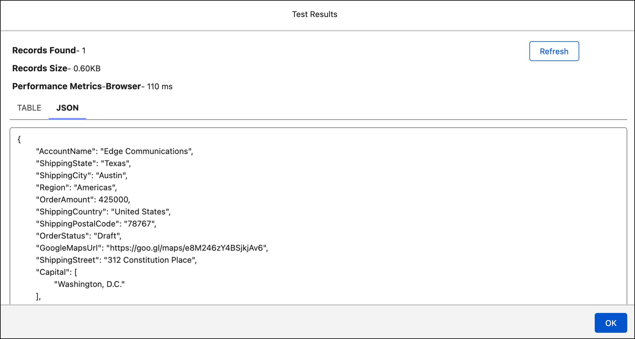
9. Click OK in the Test Results window.
10. Click Activate.
You did great! Here’s how the Customer Country Details Flexcard looks like.

You’re just a few more steps away from completing this badge!
What’s Next
In this unit, you learned how to build and configure a Flexcard to show country information. With this second Flexcard, you now have all the Flexcards for the customer service rep’s dashboard.
In the next unit, you add the Flexcards to the order page layout and verify the results.