Create Widgets in the HXL Playground
Learning Objectives
After completing this unit, you’ll be able to:
- Identify the three core building blocks of HXL.
- Use the HXL Playground to investigate the available components and create widgets.
- Understand how to vibe code a widget.
HXL Building Blocks
Now that you understand what HXL is and when to use it, let's explore the core building blocks that make HXL work: Lightning types, components, widgets, and channels.
Lightning Types
You can think of Lightning types as blueprints for your data. They define what information your widget displays and how that information should look across different channels. Lightning types come in two flavors.
-
Primitive types handle basic data like dates, currency, phone numbers, and percentages.
-
Complex types represent structured data like a person (with name, title, and contact info) or an address (with street, city, state, and postal code).
When you create an Agentforce action, you use Lightning types to define the inputs your action accepts and the outputs it returns. This ensures consistent data handling across all surfaces where your widget appears.
Components
Components are the UI building blocks—buttons, tables, text fields, and more—that you compose together to create your interface. Think of components as toy bricks: each one has a specific purpose and appearance, and you snap them together to build something larger. HXL provides a library of prebuilt components that work natively on every supported surface, so a button looks and behaves like a native button whether it appears in Slackbot, ChatGPT, or Claude Desktop.
Widgets
Widgets bring it all together. A widget is a complete, composed UI made up of multiple components. It's the full experience you deploy to different surfaces such as a dashboard showing sales metrics, a form for submitting support tickets, or a table displaying inventory levels. You define your widget once, and HXL handles translating it into native payloads for each surface.
A widget is a UI that you define declaratively, in JSON. Unlike other frameworks—such as Lightning Web Components (LWC), which require framework-specific implementations—widgets let you describe what the UI should be, and HXL handles how it's rendered on each surface. You define the UI once in JSON, and HXL abstracts away the underlying surface-specific implementation so you don't have to implement that part yourself.
Channels
A surface (also channel) is anywhere your widget can appear: Agentforce Employee Agents, Slackbot, ChatGPT, or Claude Desktop. The last three use custom MCP servers to render your widget.
These building blocks work together in a workflow. Your Lightning type defines the data structure, components create the visual elements, and your widget composes those components into a complete interface that can render on any surface.
These concepts might seem abstract right now, but they'll click once you start building in the HXL Playground. Let's dive in!
Explore the HXL Playground
The HXL Playground is an interactive, browser-based tool where you can learn about HXL components and build widgets visually.
Access the HXL Playground at https://www.headlessexperiencelayer.com.
The playground has three main pages, accessible from the top navigation bar.
-
Components: An interactive catalog of all available HXL components. Browse components by category, inspect their configurations, and preview how they render on each surface.
-
Widgets: The composition workspace where you build complete widgets by combining components. Create new widgets from scratch or from templates, preview them across surfaces, and save your work locally.
-
Tutorials: Step-by-step lessons that teach HXL concepts, from creating a simple text block to building a complete widget.
Browse and Inspect Components
The Components page is your component reference. The left sidebar organizes components by category—each category shows a component count and can be expanded or collapsed. Use the search box at the top to filter components by name.
When you select a component from the sidebar, the main area splits into two panels.
- The Component Editor panel shows the component’s configuration as JSON. Edit the configuration and watch the preview update automatically.
- The Surface panel shows a live rendering of the component. Use the toggles to see how the same component renders on Agentforce, Slackbot, ChatGPT, and Claude Desktop.
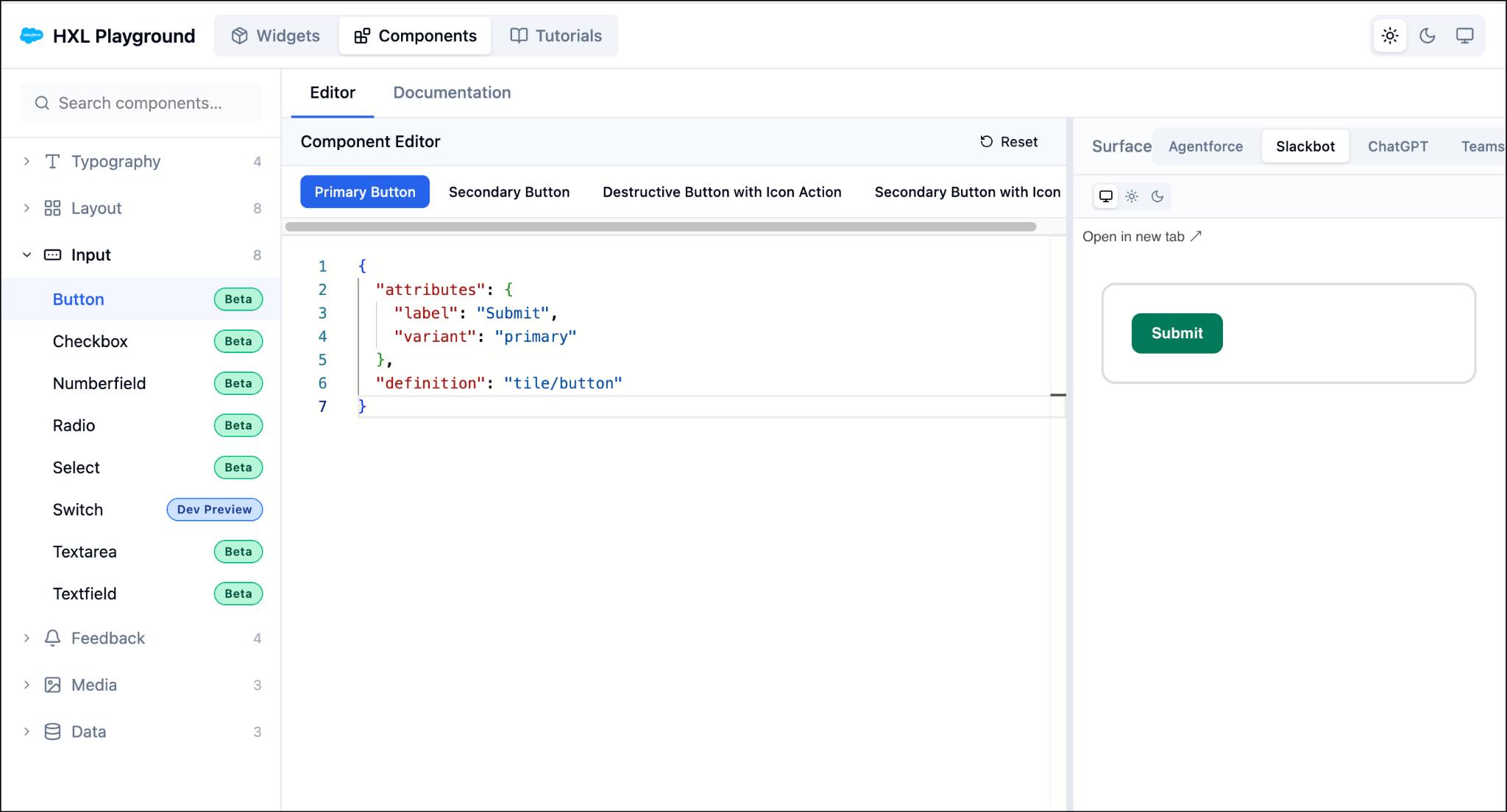
Each component page includes examples showing common composition patterns and variants. These examples are your starting point. You can copy and adapt them in your own widgets to speed up development and ensure consistency.
Build Widgets
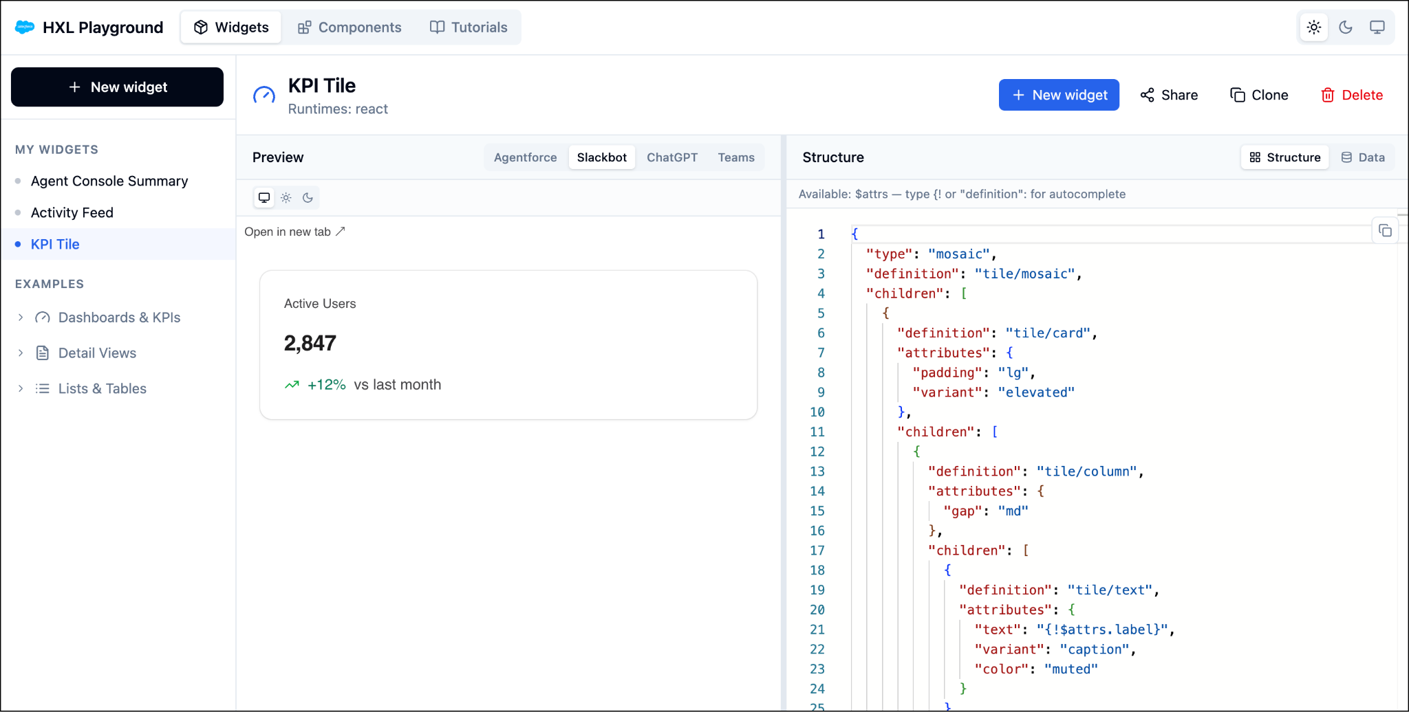
The Widgets page is where you compose components into complete widgets. The left sidebar organizes your work.
- Click New widget to create a widget from scratch or from a template.
-
My Widgets lists the widgets you've created. They’re saved locally in your browser's storage, so they persist between visits on the same device.
-
Examples provides prebuilt widgets demonstrating dashboards, tables, forms, and other patterns.
When you open or create a widget, the main area shows a live preview next to the JSON editor. Use the toggle above the preview to render your widget on different surfaces, and verify it looks correct everywhere.
Let’s create a widget!
- Navigate to the HXL Playground home page, and select Start Building.
- On the Widgets page, click New widget at the top of the sidebar.
- Choose your starting point.
-
From a template: Select a ready-made widget from the template library to use as your foundation.
-
Blank Widget: Start from scratch with a blank widget, and build it component by component. The new widget opens in the editor under My Widgets, with a live preview beside it.
-
From a template: Select a ready-made widget from the template library to use as your foundation.
- Edit the widget's JSON structure in the Structure panel. The preview updates automatically as you work.
Widgets (under My Widgets) save automatically to your browser’s local storage as you edit them. No manual save required.
Nice! You've created your first widget. See the Headless Experience Layer Developer Guide for more information about using the HXL Playground to build widgets.
Work with Widgets
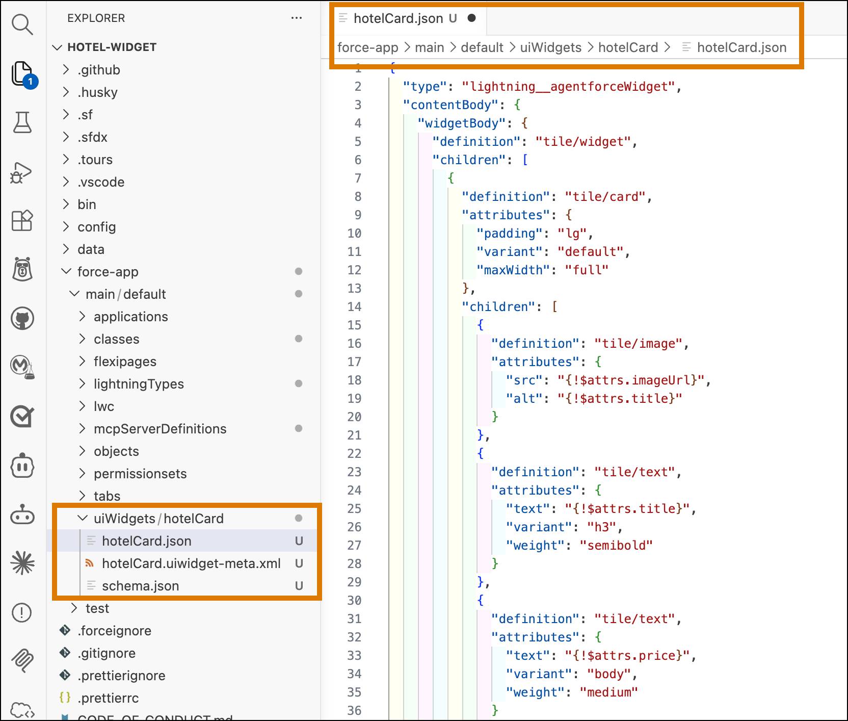
Once you’re satisfied with the widget you built in the HXL Playground, copy the JSON from the editor and paste it into your widget bundle’s JSON composition file. In your Salesforce DX project, the composition file is located at:
force-app/main/default/uiWidgets/<widgetName>/<widgetName>.json
This screenshot shows VS Code with an open hotelCard.json widget composition file in a DX project called hotel-widget.
Vibe Code Your Widgets
Prefer to describe what you want rather than build it manually? You can use Agentforce Vibes to create widgets through natural language prompts. Just describe your widget in plain English, and Vibes generates the code for the Lightning types, HXL widgets, and Apex classes.
Open Agentforce Vibes in VS Code, then describe what you want to build. Here are some example prompts to get you started.
Create a widget that displays a customer’s recent orders in a table with columns for order number, date, total, and status.
Build a support ticket form widget with fields for subject, priority, description, and a submit button.
Make a dashboard widget showing three cards: total revenue, active customers, and pending orders.
Agentforce Vibes generates the widget JSON and custom Lightning type definition based on your prompt. You can then refine the results through follow-up prompts and deploy it to your org when you’re satisfied.
For the full workflow on wiring up your vibed widgets with Apex actions and configuring them for different surfaces, see the Headless Experience Layer Developer Guide.
Now that you've explored the playground and learned how to build widgets—whether through hands-on composition or vibe coding—you’re ready to create rich, multisurface experiences with HXL.