Add a Map Chart
A Map Is Worth a Thousand Words
Using a waterfall chart, you've established that there are many opportunities out there just waiting to be moved along the pipeline to closing. But where exactly are those opportunities located? Knowing this will help your company decide where to focus its efforts and expend resources.
For this, you'd like a visualization that neatly ties together the number of opportunities with their location. Your company's sales and distribution network runs at the state level, so a map of the United States would be a perfect way to communicate location and potential sales. You'll be able to do this using the pipeline dataset and a map chart. Make sure the Product Pipeline USA dashboard is open before you start.
- In the header navigation, click Analytics Studio.
- In the Browse tab, filter by Datasets and further refine the search results by selecting Created By Me.
- From the search results, click the ProductPipelineUSA dataset to create a new lens. (Be sure to click the dataset and not the dashboard.)
- Click the Bars plus button, then choose State to group the rows by state.
- Click Count of Rows, choose Sum for the aggregate function, and then choose Pipeline Amount as the field for the Bar Length.

- Click
 to clip the lens to the dashboard designer. In the modal that appears, locate the Display Label field, type
 State_1, and click Clip to Designer.
- To see your new query, you must return to your active project. Click the Product Pipeline USA dashboard tab at the top of your browser to return to the dashboard designer canvas. If you previously closed the tab, go to the Analytics Studio Browse tab, locate your Product Pipeline USA dashboard, and click Edit.
- Drag the waterfall chart down to make room for the map chart, then click outside the chart to reveal the query again.

- Drag the query called State_1 from the right sidebar onto the canvas to recreate the bar chart.
- Adjust size of the bar chart—drag the sizing handle on the right side to make the chart fill the entire width of the canvas.
- With the bar chart selected, choose the Map chart from Chart Type.
 In our case, the default map isn't the one we want—we'll change that.
- Click out of the Chart Type area to hide the chart types.
- Scroll down and click the Map section to expand the map options.
- In the Map Type list, choose US States.
- Scroll back to the top of the Widget section and in the Title field enter
Geographic Distribution of Opportunities.

- Click Save and then click Save to save the dashboard.
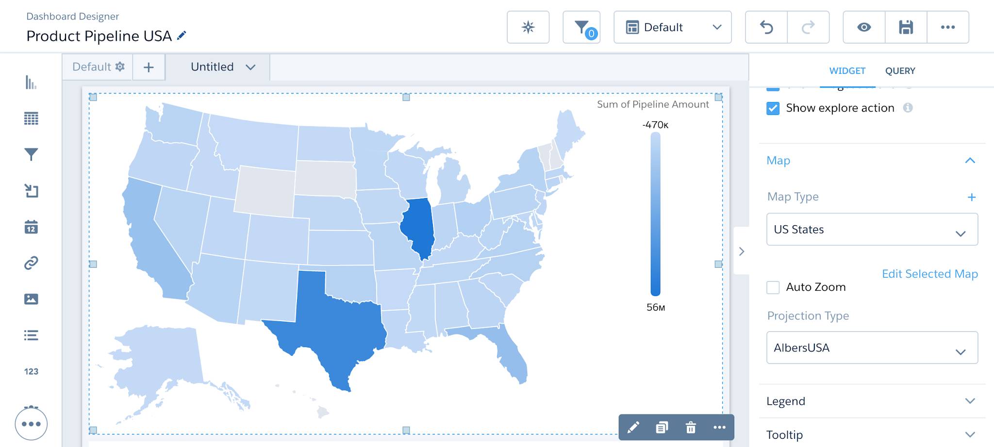
You've now got a dashboard with 2 separate charts. The newest one, the map chart, tells you that most of your opportunities are in Illinois and Texas, followed by California and Florida. This can help answer some questions, such as where your company should be adding resources. It might also cause you to ask some questions you didn't know you had, such as why there aren't more opportunities on the East Coast.
We're nearing the end of our work. All we have left is to create a visual comparison of the different products by opportunity values.