Use Customer Lifecycle Analytics
Learning Objectives
After completing this unit, you’ll be able to:
- Navigate survey response dashboards.
- Explain how Einstein Discovery can improve customer analytics.
- Explain the information on the customer satisfaction and NPS scorecards.
Show Off the App
Maria is now ready to reveal the Survey Response Insights app to Shinje. She wants to show the key dashboards and scorecards which Shinje will be tracking.
Out of all the prebuilt dashboards, Ursa Major Solar is going to use these two:
- Response Distribution
- Response Analysis
Response Distribution Dashboard
The Response Distribution Dashboard contains multiple charts. Each provides a different perspective on the responses received. Maria informs Shinje that he can use filters like Survey and Time Period to view data for each survey and across time periods.
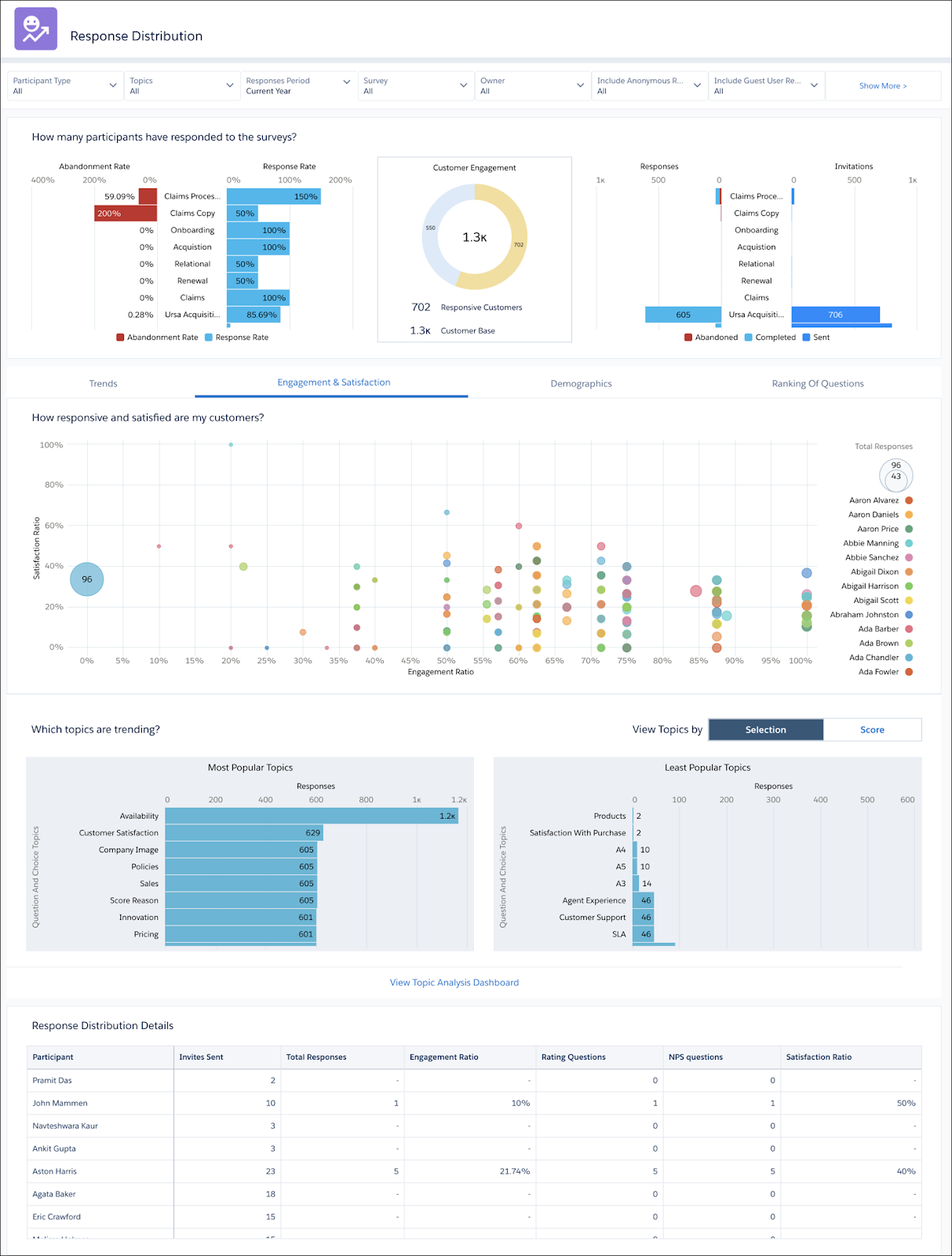
Customer Engagement
The Customer Engagement pie chart compares the number of customers who have responded to surveys against the total number of customers.
How Many Participants Have Responded to the Surveys?
This section of the dashboard contains two bar graphs, each displaying a couple of things about all the active surveys in your org. The first one gives a percentage breakdown of the number of participants who have abandoned a survey midway and the number of people who have submitted the response to a survey. The second one compares the number of survey invitations that have been sent out against the number of participants who have responded or abandoned the survey midway.
Trends Tab
This is a line graph that shows the trends for the number of responses received during the selected time period for each active survey.
Engagement & Satisfaction Tab
This one shows the engagement and satisfaction ratios of all the customers who have responded to one or more surveys. The graph also lists all your customers, and you can check the ratios for each individual customer.
Demographics Tab
This one has three sub tabs, and each of them shows the distribution of responses, engagement ratio, and satisfaction ratio by:
- Geography
- Gender
- Age
- Trend by Gender
In the Response Distribution by Geography section, Maria clicks Arizona to give Shinje a glimpse of what people across age and gender think about Ursa Solar Major in their home state.
Ranking of Questions Tab
This tab displays the lowest rated NPS and Rating questions by response count and score provided by participants.
Response Distribution Details
This report provides information about the responses received for every type of question apart from text.
Response Analysis Dashboard
The Response Analysis Dashboard provides a detailed analysis of each question across all the question types.
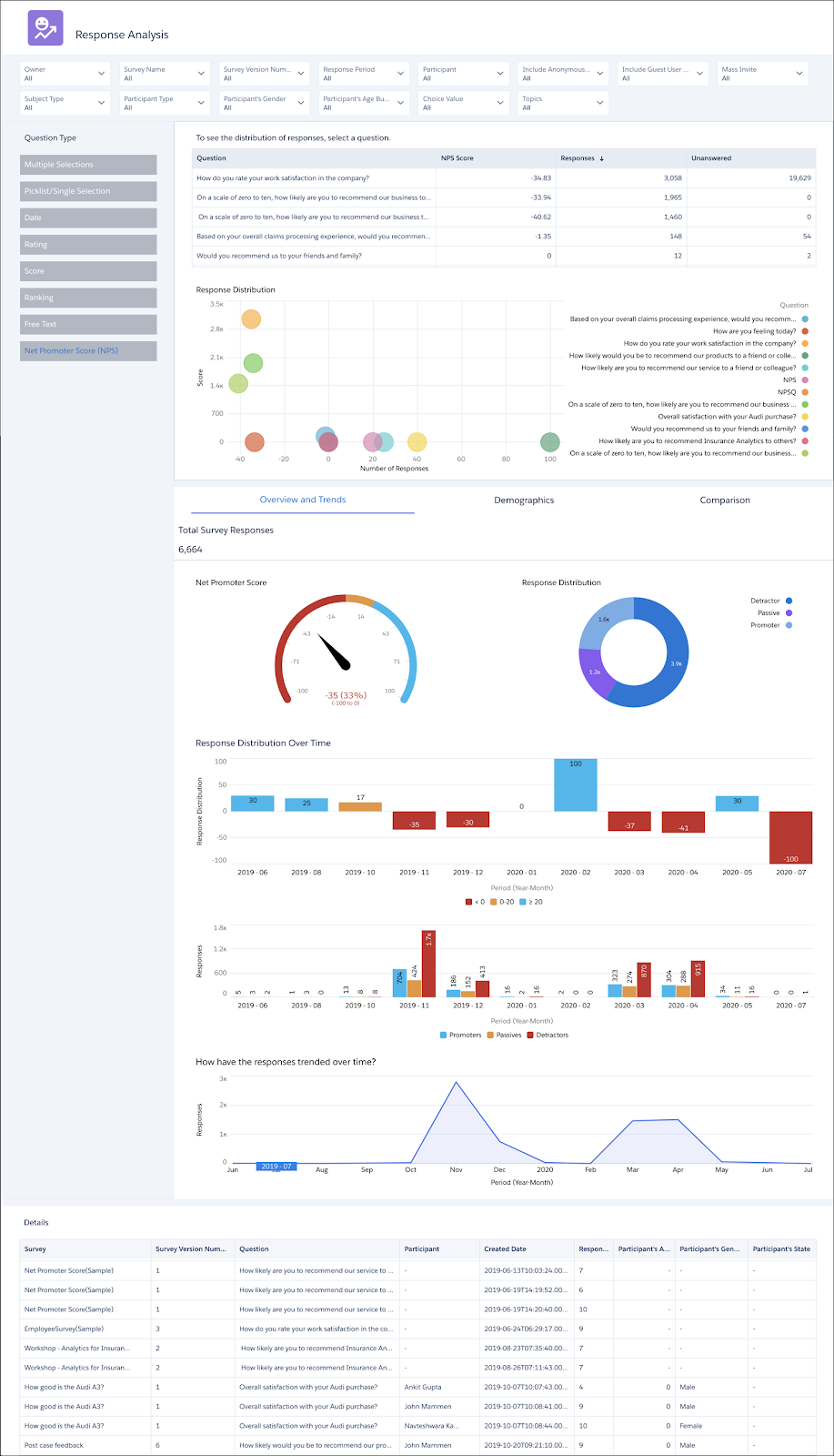
On the dashboard, Maria can select a question type, and also select one or more questions she wants to see the detailed analysis for. Let’s have a look at what the dashboard has to offer for each question type.
Multiple Selection, Picklist, and Single Selection
View the analysis of one or more questions by:
- Most and least selected answer choices by number and percentage
- How each of the answer choices has trended over the last year
- Demographic distribution of answer choices
- Comparison of responses
Date
This is pretty similar to the previously mentioned question types. View the analysis of one or more questions by:
- Most or least selected dates by number and percentage
- How each selected date has trended over the last year
Rating and Score
The analysis for these two question types is a bit more detailed. Here you will find:
- Distribution of responses across rating or score, and count of responses
- The minimum, maximum, and average rating or score for one or more questions
- The number or percentage of participants who responded with the same rating or score
- The changes in the rating or scores over time
- Demographic distribution of ratings and scorees
- Comparison of responses
Ranking
This offers a deep focus on how each ranking item has fared over time. View by:
- Count of participants who provided a specific rank to each ranking item
- Average rank of each ranking item
- How the average of each ranking item has trended over time
- Rank provided to each ranking item by number or percentage
- Demographic distribution of rankings
Free Text
This one is fairly simple: View response submission trends for one or more questions. Also use the Survey Response Details table to view the responses provided by each participant.
Net Promoter Score
Net Promoter Score has the most number of graphs representing a variety of data.
- NPS for one or more questions
- Count of the detractor, passive, and promoters
- How the NPS trended over time by responses and response distribution
- How the response submission rates have trended over time
- Demographic distribution of scores
- Comparison of responses
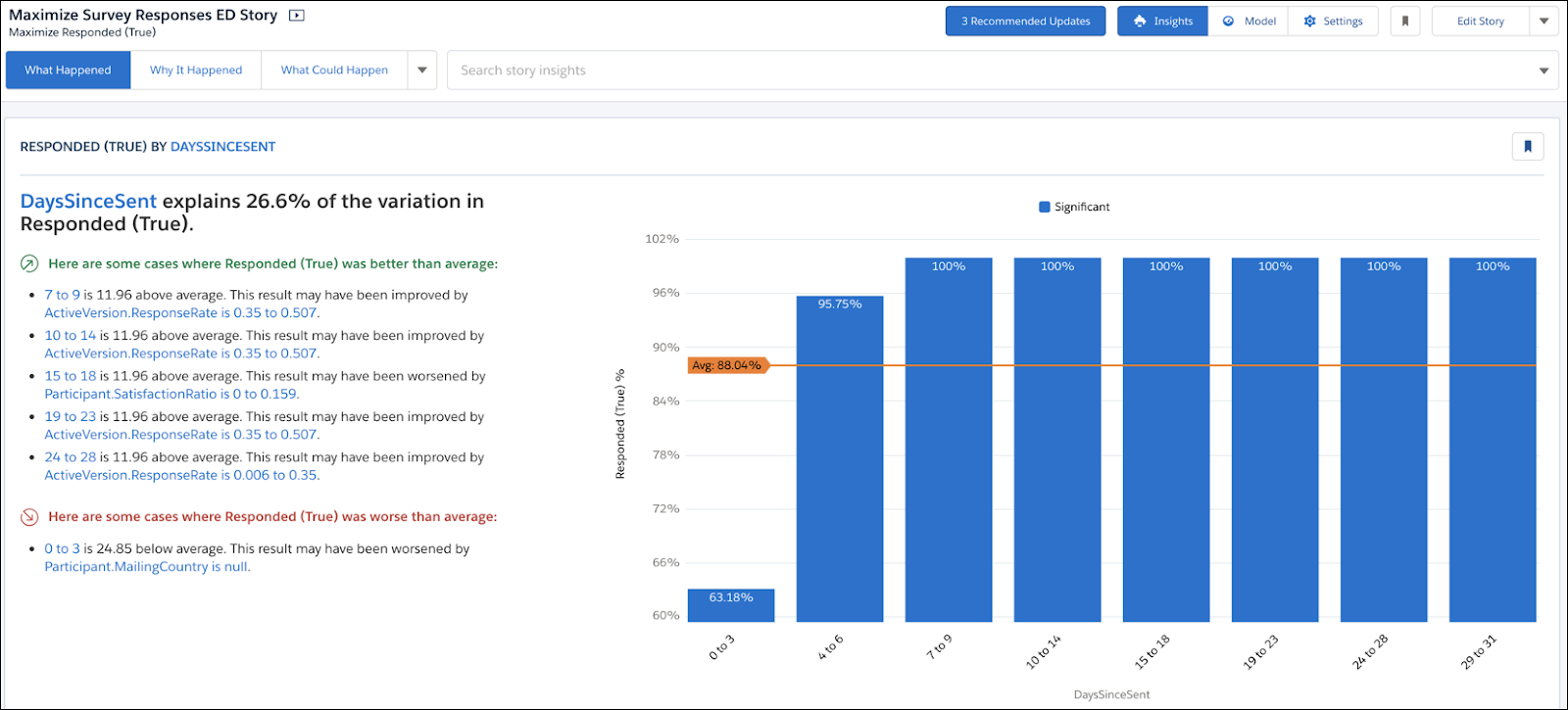
Meet Einstein Discovery, Your Data Scientist
Having glanced at the dashboards, Shinje is keen to learn more about what tips the Einstein Discovery story can provide to improve response rates. He switches to the Stories tab, and clicks the Maximize Survey Responses ED Story.
Shinje is pleasantly surprised, the story not only provides suggestions but also provides information on what is going well. So he clearly knows what needs to improve and what doesn’t require close attention.
One of the key things it suggests is when to send a survey to improve its response rates.
Understand the Customer Satisfaction Scorecard
After explaining the two dashboards and the Einstein Discovery story to Shinje, Maria swiftly moves to the Customer Satisfaction scorecard on the Case records.
The scorecard is easy to read. It provides two scores, the latest customer satisfaction score and the average customer satisfaction score across all case records. The scorecard also lists the question for which the customers are providing a score.
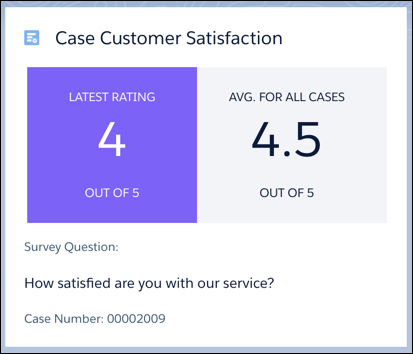
This scorecard helps Shinje track the performance of each service agent and the health of the overall service organization. This also helps the service agents as they can understand a little bit more about the customer based on the latest score.
Understand the NPS Scorecard
Finally, Maria moves to the final piece of her Customer Lifecycle Analytics implementation, the NPS scorecard for contacts.
Similar to the customer satisfaction scorecard, this one provides the latest NPS score provided by Ursa Major Solar, and the average NPS score provided by all the contacts. The scorecard also lists the question based on which the customers are providing the NPS score.
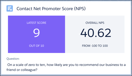
Using these scorecards, Shinje gets a good understanding of what each individual customer thinks about the company and learns more about how the customers have scored the company over time. He can then figure out which customers require extra attention at any given point of time.
Understand the People Satisfaction Scorecard
Finally, Maria moves to the final piece of her Customer Lifecycle Analytics implementation, the satisfaction scorecard for employees. This scorecard also provides two scores, the latest satisfaction score of the employee and the average satisfaction score of all employees.
Tying It All Together
Using the dashboards and the scorecards, Maria automated the process of updating and viewing analytics around survey responses. Now she doesn’t need to worry about creating new reports and dashboards every time a new survey is sent out.
Additionally, Shinje has access to real-time data on how each survey is performing, which questions are working well, and which ones need to be rethought. He also has the Einstein Discovery suggestions by his side to help improve response rates. And he has data around how service agents are performing, what the customer thinks about Ursa Major Solar, and the satisfaction scores of employees.