Learning Objectives
After completing this unit, you’ll be able to:
- Determine when and how to build a density map.
- Add visual detail to a density map.
You can create maps in Tableau that reveal patterns or relative concentrations that might otherwise be hidden due to overlapping marks on a map. One common map type for this is a density map, also called a heatmap.
When to Build a Density Map
Density maps are most effective when analyzing location data with a large number of data points that can't be distinguished at a map's current zoom level. Tableau creates density maps by grouping overlapping marks and color-coding them based on the number of marks in the group.
Basic Density Map Building Blocks
Location |
Data |
|---|---|
Columns shelf |
Longitude (continuous dimension, longitude geographic role assigned) |
Rows shelf |
Latitude (continuous dimension, latitude geographic role assigned) |
Detail |
One or more fields with many underlying data points |
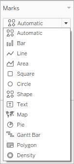
Mark type |
Density |
Connect Your Tableau Public Account
If you haven’t already, or if your Tableau session has expired, log in to your Tableau Public account in the Playground window to the right. If you don’t already have a Tableau Public account, sign up for one now, and be sure to activate your account before starting this interactive unit. You can find more detailed instructions here.

How to Build a Density Map
- In the window to the right, you should see the Tableau Build and Analyze Maps workbook in Tableau Public for Trailhead.
- In the Data pane, expand the Alternate Fuel Stations table and double-click ZIP. The Latitude and Longitude fields are added to the Columns and Rows shelves, and a point map is created.
- From Measures, drag EV DC Fast Chargers and drop it on Color on the Marks card.
- On the Marks card, change the mark type to density by selecting the dropdown menu to the right of Automatic and select Density.
Your basic density map is created.
Add Visual Detail to a Density Map
Format the color, intensity, opacity, and size of your marks to help you analyze the data on your density map.
You can adjust the color and color effects by selecting Color on the Marks card. You can adjust the size of the marks by selecting Size on the Marks card.
Click each tab to learn more about each effect.
For this tutorial, change the background map style to Dark, the color palette to Density Orange Light, the color intensity to 75%, and the Mark size to 60%.
Analyze a Density Map
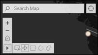
There are many ways you can explore and interact with map views. You can zoom in and out, pan, and select marks with the view toolbar, and even search for locations worldwide with map search.
Zoom around the map to analyze your data. Density maps have no fixed or constant display and will always recompute as you zoom.
Select marks to see information about them in the tooltips that appear. You can also view underlying data or filter selected marks from a view. When you select marks in the view, all other marks are dimmed to draw attention to the selection.
You can see the total count of Marks in the view at the bottom-left corner of the viz.
Use the View Toolbar to Search, Zoom, and Pan
The view toolbar provides zoom controls and a pan tool that lets you see different areas of a zoomed view. Select each icon to see what each control does.
In this unit, you learned how to build density maps to show trends and concentrations in areas. You can see where there are hubs of level EV DC Fast charging stations. It would be helpful to know if these hubs corresponded to the concentrations of EV owners, too. In the next unit, you learn how to build a layered map, which is a map with two sets of geographic data overlaid on top of one another.