进行时间序列、排名、部分和整体以及名义比较
学习目标
完成本单元后,您将能够:
- 描述时间序列、排名、部分和整体以及名义比较。
- 了解用于这些比较的最佳图表类型和做法。
名义比较
“名义”(Nominal) 这个词源于拉丁语中的“名字”(Name)。进行名义比较时,您是在比较类别。用于名义比较的属性是二维位置、色调和形状。
条形图
在上一单元中,您了解了条形图的长度可以很好地区分定量值。当通过条形图比较类别时,您可以使用二维位置属性和条形图长度来比较类别。单个条形之间明显的空间和条形的顺序有助于比较不同类别由条形长度所表示的数量值。专门对有序变量进行排名或排序可以显示数据中的重要模式。


巧妙地表示类别
比较类别时,可以使用颜色(或色调)和形状属性来区分类别。


上面的第一张时间序列折线图使用颜色来区分城市。第二张散点图使用形状区分产品类别。
时间序列
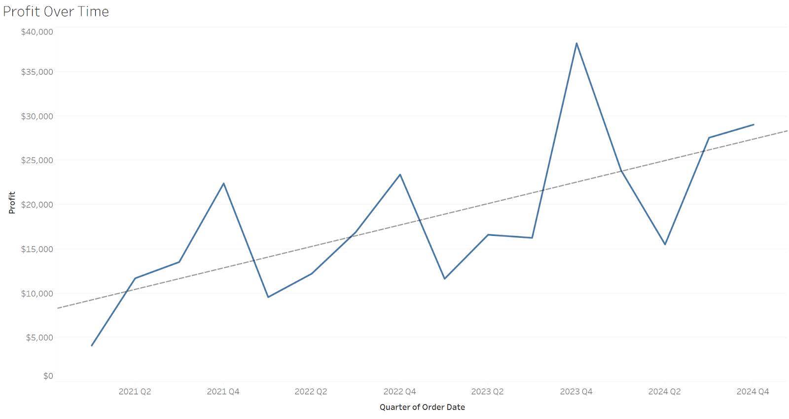
时间序列图表通过时间间隔比较定量值。折线图可以帮助您了解模式和趋势随时间的变化情况。
折线图
折线图是用来显示时间序列的最常见图表,也是查看一段时间内的模式和趋势的最佳方式之一。例如,在这张折线图中,您可以很容易地跟踪利润随时间的变化。

除了连接图表中每个数据点的折线图之外,您还可以在时间序列图表中添加趋势线。趋势线可以帮助您看到度量的总体趋势和方向,并帮助您做出指导性决策。下面,折线图中的趋势线显示了利润随时间增长的模式。
垂直条形图
当需要突出各个值而不是整体趋势时,垂直条形图对于时间序列比较很有用。在下面的垂直条形图中,图形的焦点是第二季度较低的值,而不是整体趋势。

箱型图
箱形图通过显示中位数(箱中间的线)、第 25 和第 75 百分位数(箱的两端)和单个数据点来显示分布。多个箱形图可用于比较随时间的分布。

排名
显示不同类别间排名比较顺序值(降序或升序)的图表。显示排名比较有许多方式。
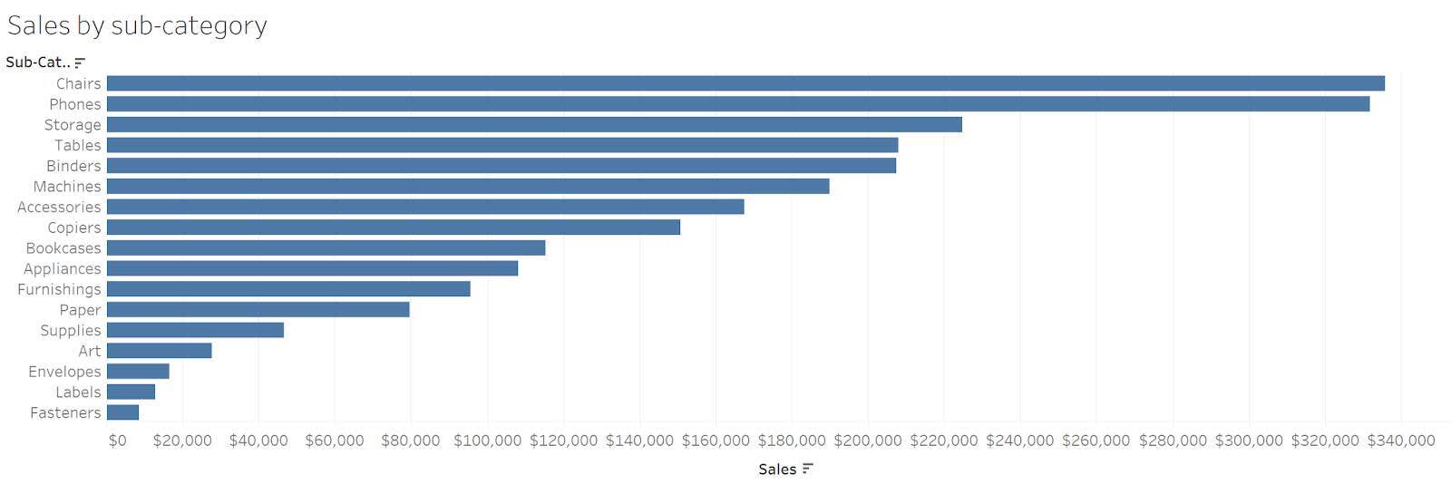
条形图
最常用于排名比较的是条形图。条形图强调数值的独特性。按升序或降序对条形图进行排序,可以对值进行排序。在下面的示例中,您可以看到子类别椅子 (Chairs) 具有最高的值,桌子 (Tables) 和粘合剂 (Binders) 之间的差异很小,桌子排名在粘合剂之上。
显示排名比较的其他图表
为了正确解释,条形图的基准必须始终为零。在无法使用零基准的情况下,您可以使用点图。端点不是条,而是点。查看成对的值时,可以连接点以突出显示成对值之间的差异。
在这篇博文中,Lisa Charlotte Muth 介绍了如何用点图显示国家年龄中位数排名。点图不要求轴从零开始。

在排名随时间变化的情况下,凹凸图通过允许每个类别的线条跟随排名随时间的变化来显示排名。在 Tableau Public Matt Chambers 绘制的凹凸图中,“其他颜色”(other colors) 类别从 2000 年的排名第三开始,随着时间的推移排名不断变化,直到 2005 年到 2015 年排名第十。

部分和整体
在部分和整体比较图表中,数值以整体的比例表示,通常以百分比表示。
堆叠条形图
最常用于显示整体和部分关系的是条形图。堆叠条形图将每个条形图分成其组成部分。这些部分可以显示为百分比、计数或特定的度量。下面的示例显示了三个堆叠条形图,显示按运输模式和比较细分市场划分的销售情况。
第一张图中的 y 轴表示销售额。第二张图中的 y 轴表示占总额的百分比。第三张图中的 y 轴显示了每个细分市场的百分比。单个标签允许读者查看百分比所代表的销售额,并给出上下文。在呈现百分比时,重要的是给出上下文并分享百分比所代表的计数或度量。


饼图
大多数数据可视化从业者都遇到过“饼图大辩论”。在第二单元中,您了解过,与感知大小差异相比,通过长度属性感知值差异要容易得多。在饼图中使用大小属性时,很难看到大小上的微小差异。在下面的示例中,很难区分饼图中的小扇区,但是使用条形图便可以轻松区分细微的大小差异。

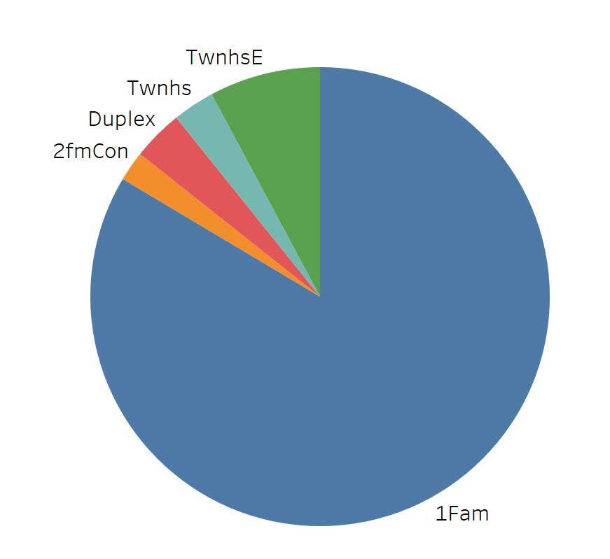
有些情况下饼状图是更好的选择。当扇区非常少,并且不需要区分细微差异时,饼图可能是有效的。当您要展示的类别恰好占整体的一半 (50%) 时,饼图更易读。

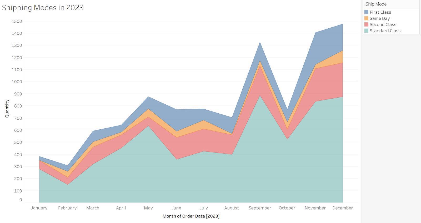
面积折线图
面积折线图可以帮您回答有关随时间变化以及部分和整体变化情况的问题。当显示部分和整体随时间的变化时,颜色和面积大小用于显示部分和整体的时间序列折线图。在下面的示例中,您可以看到标准类 (Standard Class) 运输模式是一年所有月份中最常见的类型。
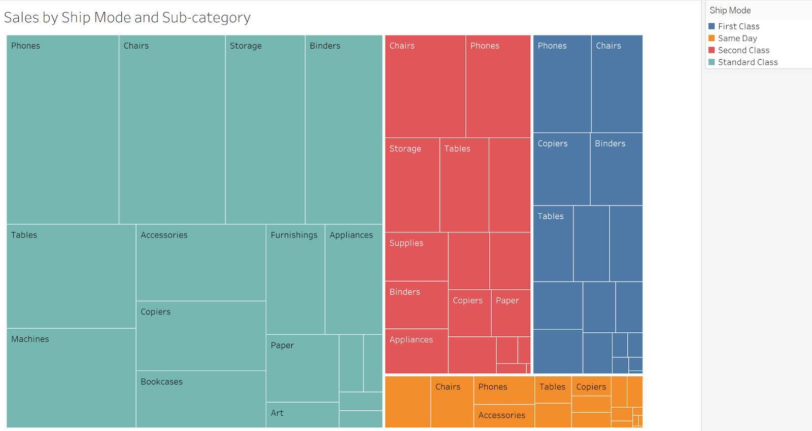
树图
对于大型分层数据集,树图可以在一个图中显示嵌套的类别。下面的示例显示了每种运输模式下子类别销售的部分和整体比例。由于树图使用大小属性来显示差异,因此读者可能难以进行比较。当比较各个子类别很重要时,小的多个条形图提供了另一种选择。请参阅使用树图可视化数据了解更多信息。
资源
- Tableau 博客:箱须图
- Storytelling with Data 博客:什么是点图?
- Trailhead:识别误导性图表指南
- Tableau:如何发现误导性图表,检查列表
- Tableau:饼图
- Tableau:数据对话:是否使用饼图
- Trailhead:数据分布
- Datawrapper 博客帖子:我周围都是老人
- Tableau Public:2000-2015 年北美新车颜色流行度
- Data + Science 博客:使用树图可视化数据