Review and Interpret Data Quality Results
Learning Objectives
After completing this unit, you’ll be able to:
- Navigate to the data quality results for a technical asset.
- Interpret a data quality score and identify which rules contributed to it.
- Describe how data quality results are linked to governance policies.
Data Quality in CDGC
Profiling tells you the shape of your data. Data quality rules tell you whether it meets your organization's standards.
Cloud Data Governance and Catalog (CDGC) generates data quality scores when rules—defined as rule templates and run as rule occurrences—run against the data elements in your catalog. The results appear in graphical formats on the asset page, making them easy for everyone to interpret.
Arif is preparing for a high-priority customer outreach campaign and needs to confirm that the email addresses in the Customer_Details table are valid before his team starts sending communications. Angela helps him navigate to the data quality results for the Email column.
Where to Find Data Quality Scores
Data quality scores are available in three locations on an asset page.
-
Overview tab: A composite score donut chart is in the Data Quality panel. This is the average data quality value across all rule occurrences for the asset's data elements.
-
Data Quality tab: Select this tab to review the full breakdown such as Dimensions Latest Scores, Rules Against Target, and the Total Rule Occurrence table.
-
Lineage tab: Enable Overlays to review data quality scores directly on the lineage diagram, and review quality across the data flow from source to destination.
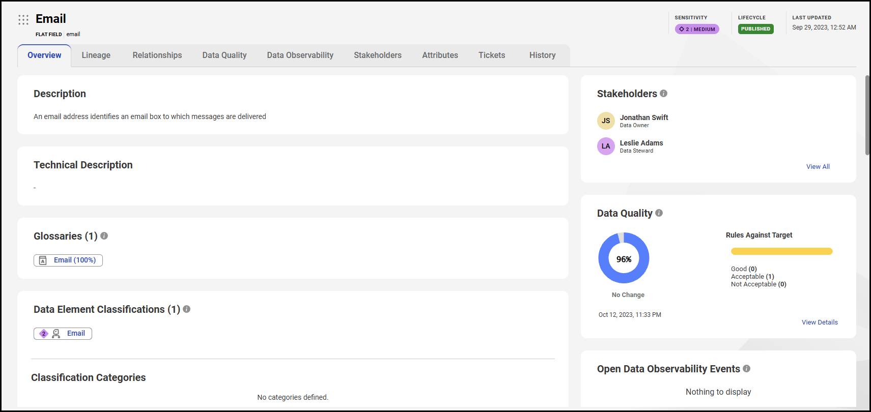
Angela opens the Email flat field from Customer_Details and opens the Data Quality panel in the Overview tab. She notices a composite score of 96% displayed as a donut chart.
The Composite Score
The composite score is the average value of all data elements that are represented by the asset. For example, if a table's four columns score 94%, 86%, 78%, and 82%, the composite score is the average percentage—94 + 86 + 78 + 82) / 4 = 85%.
In the donut chart, Angela notices the date of the last rule run and an indicator that signals whether the score has increased or decreased since the previous run. The Email field has held steady at 96%—a good sign.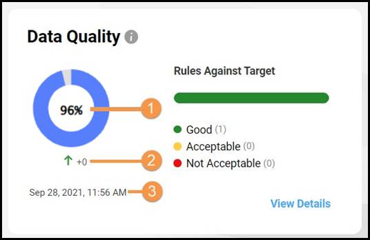
Good, Acceptable, and Not Acceptable Scores
Each data quality rule template includes a Target value and a Threshold value. These define three acceptance bands.
-
Good (green): Score is at or above the target
-
Acceptable (amber): Score falls between the threshold and the target
-
Not Acceptable (red): Score falls below the threshold

Angela selects View Details to open the Data Quality tab. In the Rules Against Target panel, there’s a Validity rule flagged as Acceptable. The target is set to 100 and the threshold to 85. Because the email field scored 96%, it falls between those two values—acceptable, but not yet at the gold standard.
She reassures Arif—the email data passes the validity check, but there's a small percentage of addresses that are malformed. It's usable for the campaign, but the data owner should be notified.
Rule Occurrences—Understanding What Contributed to the Score
A rule occurrence is the individual instance of a data quality rule run on a single data element. In the Total Rule Occurrence table in the Data Quality tab, Angela checks the following for the email field.
Rule |
Dimension |
Score |
Rows Passed |
Rows Failed |
|---|---|---|---|---|
DQ-Email-Validity |
Validity |
96% |
96 |
4 |
This tells Arif that out of 100 email rows, 4 failed the validity rule, which means the failed rows don't follow a correct email format. The rule checks format, not whether the addresses are real.
Angela selects the rule occurrence name to open its Score tab. Here they review:
- A donut chart for this specific rule occurrence.
- A Score Trend chart showing how the score has changed across multiple runs.
- The acceptance status (Acceptable).
- A preview of the 4 failed rows showing the specific malformed email addresses.
Arif notes the failed rows and flags them for correction before the campaign launches.
Data Quality Dimensions
CDGC organizes rules into data quality dimensions, each representing a specific aspect of data quality.
Dimension |
What It Measures |
|---|---|
Validity |
That the values are the right format |
Completeness |
That all expected values are present |
Accuracy |
That the values correct and meaningful |
Consistency |
That the values are entered consistently across records |
Timeliness |
That the data is current enough to be used |
The Dimensions Latest Scores panel on the Data Quality tab includes the aggregate score for each dimension. Angela selects Validity to confirm it's the only dimension with an active rule on the email field—and it's the one contributing to the 96% score.
How Data Quality Results Are Linked to Governance Policies
For Arif, a 96% score is useful—but Angela shows him the bigger picture. In CDGC, data quality results don't exist in isolation. Each rule template links to a Primary Glossary asset—a business term that represents the concept being measured. That business term in turn links to the technical columns that hold the actual data.
For the Email field, the rule template is linked to the Email business term, which is part of Infiwave's Customer Data governance domain. When the email validity score drops below the threshold, CDGC sends a notification to Angela as a stakeholder. Now the governance team can trace the issue directly back to the policy that defines how a valid email address should be constructed.
This means data quality scores are more than just numbers. They're evidence of whether governance policies are working. A score trending downward signals that a process is breaking down, that a source system change has affected data quality, or that a rule needs to be updated.
Angela documents the 4 failed rows in a comment on the Email asset and tags the data owner. Arif now knows that the Customer_Details email data is 96% valid and there are 4 failed rows. The governance team can trace the score back to the policy, and has a specific action to take.
Resources
- Informatica Documentation: Data Quality Scores (login required)