Ver las variables en visualizaciones
Objetivos de aprendizaje
Después de completar esta unidad, podrá:
- Describir los distintos usos de las variables cuantitativas y cualitativas en una visualización.
- Utilizar variables en una visualización.
En la unidad anterior, aprendió que las variables pueden ser cualitativas o cuantitativas y se organizan como campos o columnas en conjuntos de datos. Pero ¿cómo se utilizan estas variables al visualizar datos?
Las variables cuantitativas y cualitativas se utilizan de forma diferente en las visualizaciones.
- Las variables cuantitativas son los elementos de datos que puede calcular. También se pueden agregar (la suma y media son dos ejemplos de agregación). Por ejemplo, en una visualización que muestra las ventas para una región, las ventas son una variable cuantitativa.
- Las variables cualitativas establecen el nivel de detalles en la visualización. Se pueden utilizar para categorizar, segmentar y revelar los detalles de sus datos. Por ejemplo, en una visualización que muestra las ventas para varias región, las regiones son una variable cualitativa.
Descripción de visualización
Para ilustrar el efecto de visualizar solo una variable cuantitativa (campo) o de visualizar una variable cuantitativa y una cualitativa (campo), vamos a echar un vistazo a las visualizaciones que muestran la suma total de ganancias para los distintos productos de una empresa.

La visualización de la izquierda incluye solo una variable cuantitativa, la suma (o el total) de las ganancias de una empresa. Puede ver que la empresa generó un total de ganancias de más de 1,4 millones de dólares. La visualización de la derecha incluye una variable cualitativa (Categoría), de manera que puede ver el total de ganancias de forma segmentada en tres categorías de producto: mobiliario, suministros de oficina y tecnología.
Ejemplo: utilizar variables en una visualización
Ahora que ya sabe cómo funcionan las visualizaciones, echemos un vistazo a cómo las variables cuantitativas y cualitativas pueden revelar información más profunda basada en datos en las visualizaciones. Utilizamos un conjunto de datos que contiene información sobre una franquicia de una empresa ficticia. Vamos a examinar las variables en los datos y, después, exploraremos algunas visualizaciones que utilizan variables cuantitativas y cualitativas.
-
Examinar las variables
Vamos a examinar algunas de las variables.
Categoría, Prioridad de pedido, Método de envío y Subcategoría son variables cualitativas. Profit (Ganancias), Sales (Ventas) y Shipping Cost (Coste del envío) son variables cuantitativas.

-
Analizar con más detalle las variables cualitativas
Tómese un momento para ver los valores a nivel de fila en las variables cualitativas.
Categoría y Subcategoría contienen nombres de valores sin ningún rango u orden implícito. Estas son variables nominales.
Prioridad de pedido y Método de envío contienen valores que implican un rango u orden lógico. Estas son variables ordinales. Esta distinción será importante cuando exploremos visualizaciones.
-
Ver la visualización antes de agregar las variables cualitativas
Empezamos con una visualización que solo contiene una variable cuantitativa y muestra los costes de envío promedio.
-
Ver las visualizaciones con variables nominales agregadas
Las variables cualitativas agregan más detalles a las visualizaciones.
Vamos a empezar por las variables nominales. Al agregar la dimensión Categoría, el coste medio de envío ahora está segmentado por categoría de producto. Se puede ver que la categoría de producto Tecnología tiene el coste medio de envío más alto.
La visualización de la derecha es aún más detallada, ya que se ha agregado la variable nominal Subcategoría. Ahora podemos ver que, aunque Technology (Tecnología) tenía el promedio más alto de costes de envío por categoría de producto, Tables (Mesas) tiene el promedio más elevado de costes de envío por subcategoría de producto.
-
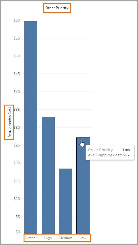
Ver una visualización con una variable nominal agregada
Ahora, vamos a ver qué sucede cuando exploramos otra visualización con una variable ordinal para analizar el coste medio de envío según la Prioridad de pedido.
¿Qué ha podido observar? Sorprendentemente, los pedidos de prioridad baja tienen un coste medio de envío más alto que los pedidos de prioridad media.
-
Ver una visualización con una segunda variable ordinal agregada
Agregar una segunda variable ordinal permite analizar el coste medio de envío por Prioridad de pedido y Método de envío.
¿Qué ha podido observar? Sorprendentemente, para los pedidos de prioridad media, los pedidos con envío premium tienen un promedio de costes de envío más elevado que los pedidos que se envían el mismo día.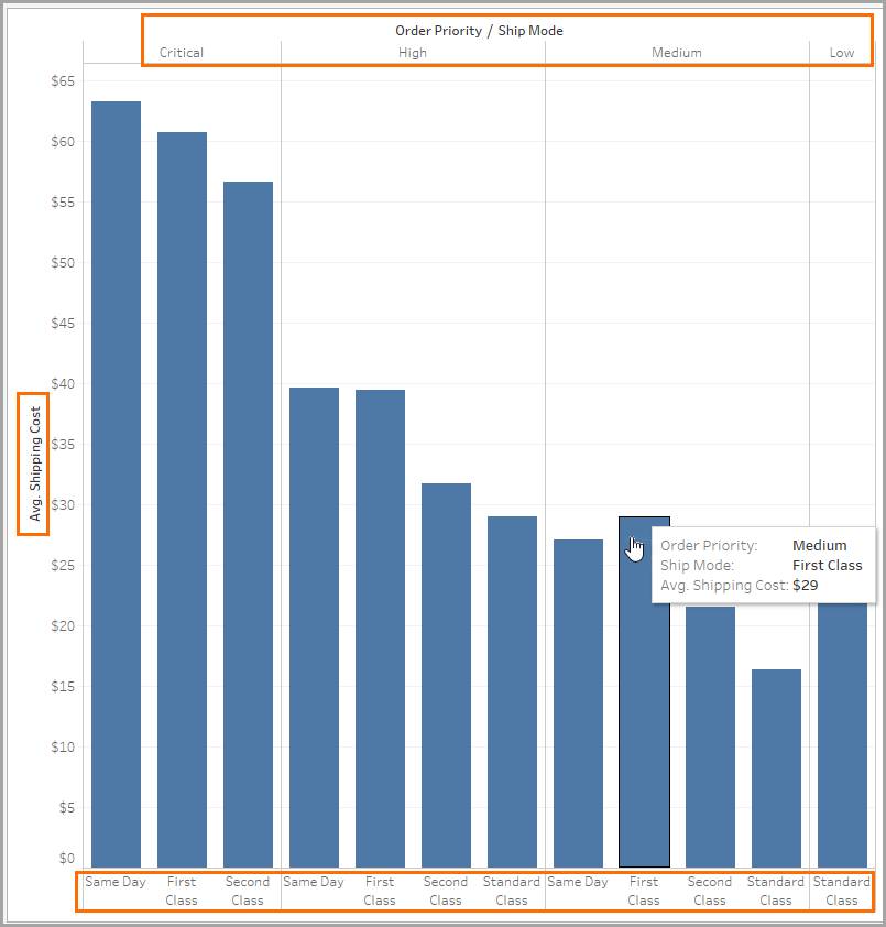
En este módulo, ha examinado cómo se pueden clasificar las variables en cuantitativas, cualitativas, discretas y continuas. También ha explorado algunas visualizaciones con una variable cuantitativa y con variables cualitativas tanto nominales como ordinales. Ahora sabe cómo utilizar variables en una visualización.
Recursos
- Libro: Lane, David M. Introduction to Statistics. Online Statistics Education: An Interactive Multimedia Course of Study, 2020.
- Ayuda de Tableau: Dimensiones y medidas, azul y verde