Break Down Block Kit
Learning Objectives
After completing this unit, you’ll be able to:
- Explain what each block type does.
- Explain what block elements are.
- Explain what surfaces are.
Block Kit Breakdown
You’ve built a Slack app and now you want it to deliver amazing interactions, engaging your users and helping them get their jobs done. This is where Block Kit comes in.
Block Kit is a UI framework for Slack apps that can help you create more interactive and captivating messages within Slack. It offers a balance of control and flexibility when building experiences in Slack. Customize the order and appearance of information and guide users through your app’s capabilities by composing, updating, sequencing, and stacking blocks—reusable components that work almost everywhere in Slack.
In this unit we identify the various reusable blocks that can help you create more meaningful and rich messages. We discuss what blocks are available and where those blocks can live.
Know the Block Types
Blocks are components that can be combined to create visually rich and compellingly interactive messages. There are many different types. The following block types are usually referred to as layout blocks. They are typically used to format the visual aspects of a Block Kit message or surface. We talk more about surfaces later in this module.
| Block type | What it does | Where it's available |
|---|---|---|
|
Actions |
Holds interactive elements. |
Modals | Messages | Home tab |
|
Context |
Displays message context, which can include both images and text. |
Modals | Messages | Home tab |
|
Divider |
Splits different blocks inside a message. |
Modals | Messages | Home tab |
|
File |
Displays a remote file. |
Messages |
|
Header |
Displays a plain-text block in a larger, bold font. |
Modals | Messages | Home tab |
|
Image |
Holds images. |
Modals | Messages | Home tab |
|
Input |
Collects information from users. |
Modals | Messages | Home tab |
|
Section |
Combines block elements. |
Modals | Messages | Home tab |
Now that you’ve identified how to lay out a message with various block types, you can find ways to upgrade your message’s interactivity using block elements.
Add Block Elements for More Interactivity
Block elements are other types of visual components that exist within section, context, input, and actions layout blocks. They include components like buttons, date pickers, multiselect menus, overflow menus, plain-text input, radio buttons, checkboxes, select menus, and time pickers. They can collect information from a user, be a trigger to open a link, or even kick off a complex workflow.
Block Kit Surfaces
Think of surfaces as places where your robust messages can be posted or exist. Surfaces include messages, modals, and your app’s Home tab. Almost all of the layout blocks can exist in all three of these surfaces except for the file block, which can only live in a message.
These surfaces allow you to reach a user in various ways. Messages and modals can be used to collect feedback or assist a user through a workflow. The Home tab can display unique user data or be a hub of information that needs to be referenced frequently. All of these surfaces are touch points for a user to interact with your app. You control what information and data is passed between your user and your app.
Once you add an interactive component to your Slack app, you’ve opened a new door of user-triggered interaction.
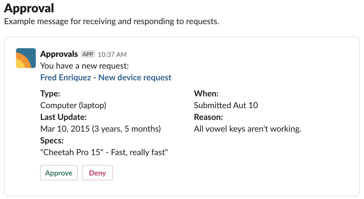
For example, you can make approvals as simple and easy as reviewing request details and pressing a button within the same message.

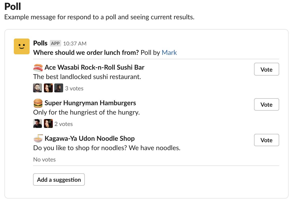
You can also start a lunch poll that lists restaurant options, how many votes have been cast for each, and an alternative to make a suggestion.

You’ve learned about the different layout blocks and block elements. In the next unit you learn how to compose messages using Block Kit Builder. You also take a look at how these messages communicate while in Slack.