Explore Key Flexcard Features
Learning Objectives
After completing this unit, you’ll be able to:
- Explain key Flexcard features, including the standard Flexcard Designer, flyouts, states, conditions, and context variables.
- Describe how to embed Flexcards in Omniscripts and other Flexcards.
Powerful Features for Design and Interaction
Omnistudio Flexcards offer several key features for building user interfaces in Salesforce. In this unit, you learn about these features in detail.
New Standard Flexcard Designer
With the standard Flexcard designer, you get a fresh, clean, and intuitive UI. The designer is a declarative, WYSIWYG (What-You-See-Is-What-You-Get), drag-and-drop tool that you use to build and activate interactive Flexcards quickly, without writing code. You can preview and test your Flexcard design using the handy Preview feature within the designer. The standard designer enables faster Flexcard activation.
A Simplified User Interface
Flexcards consist of Block elements for arranging collapsible data. Here’s an image of a Flexcard in the designer. The header in blue is a block element that consists of an image and text element.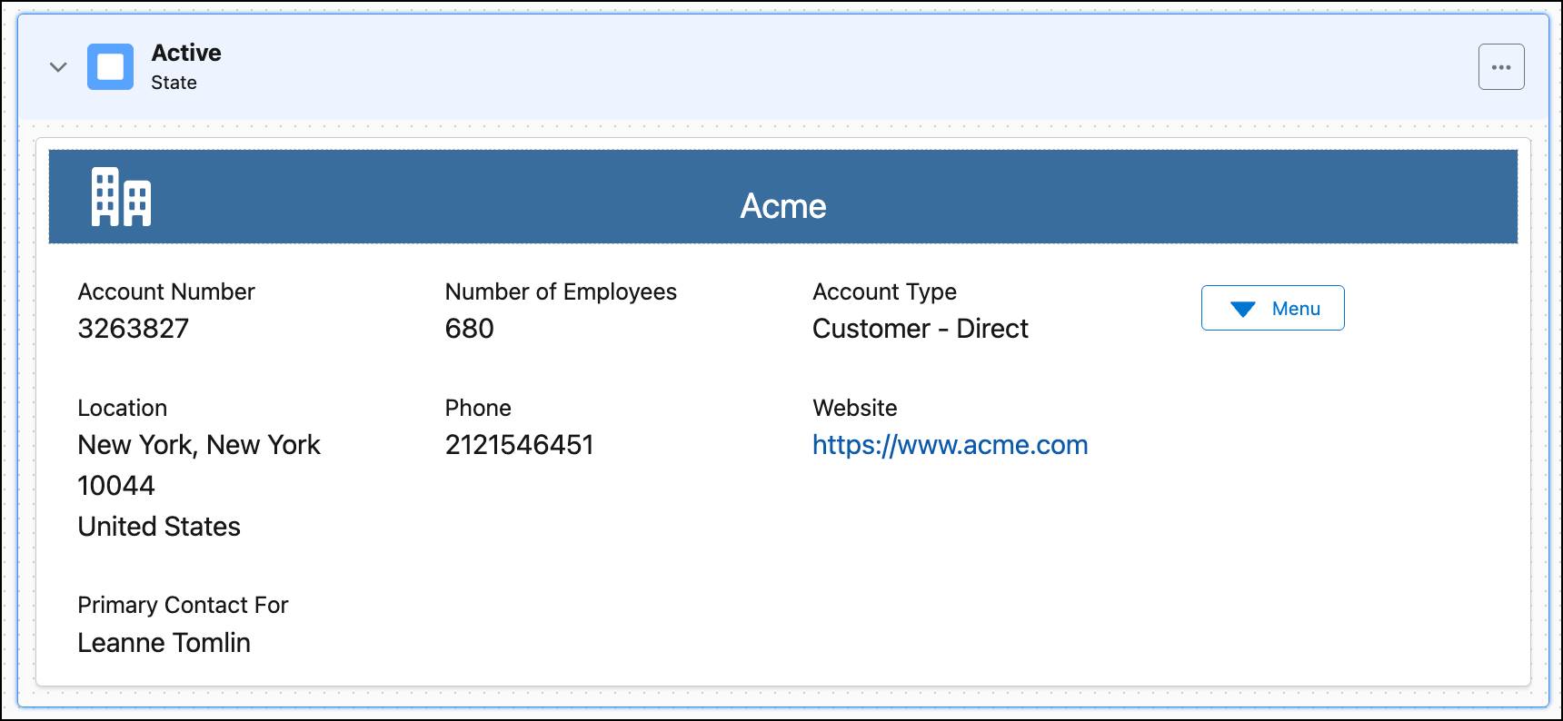
The Menu element displays a list of actions as a dropdown menu, while the Action element runs useful actions when the user clicks the text or icon. The block elements, collapsible menus, and actions have a clean look, minimalist look.
Flyouts
Flyouts present additional information from a Child Flexcard, Omniscript, or custom Lightning web component (LWC) in a popover or modal window when a user clicks an action on a Flexcard. Flyouts are great for showing less frequently needed data, keeping the main Flexcard uncluttered.
As the example image shows, when you click the Update Contact link in the contact Flexcard, the Update Contact Information modal flyout opens.

The flyout’s data source—how it gets its information—only runs when you open a flyout, optimizing performance by not loading extra data unnecessarily.
Flyouts come in two types.
- A modal flyout is a dialog box that appears in the center of the screen, obscuring the content behind it with a transparent overlay.
- A popover flyout is a small, contextual window that appears next to a specific element on the page.
Select the Flexcart type that works best for the user experience you’re designing.
States
Flexcard states define what users can see and do on a Flexcard, adjusting the UI based on specific conditions. A single Flexcard can have multiple states. For example, imagine a plan or subscription with three possible statuses: active, past due, and nonexistent. To cater for each status, define a Flexcard with three different states.
The diagram shows how a single Flexcard can change based on different conditions.
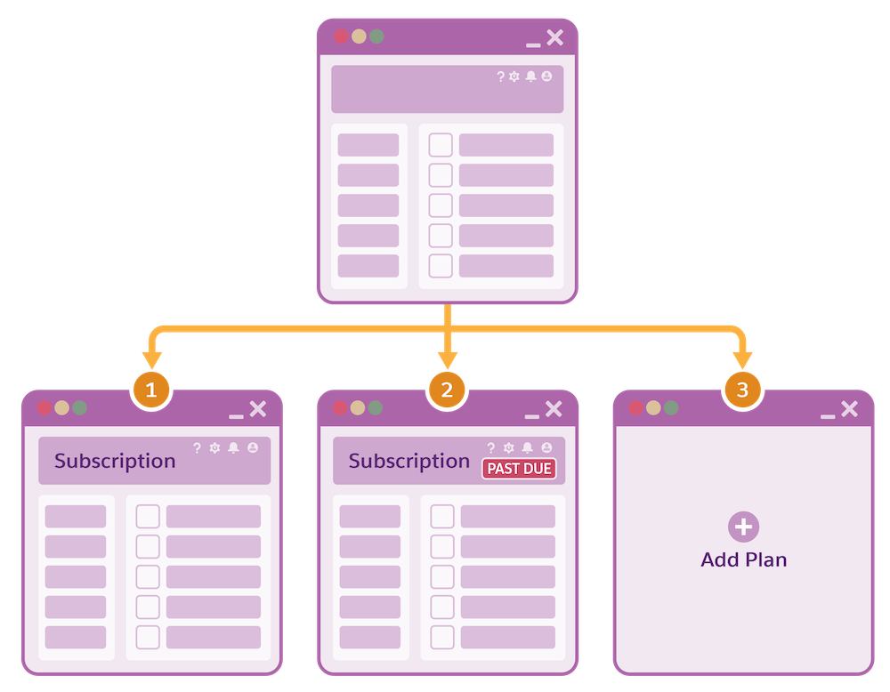
In this case:
- Card 1 appears if the plan is active.
- Card 2 appears with an additional indicator if payment is past-due.
- Card 3 appears if the subscriber currently doesn’t have this plan, with the option to add it.
States can vary for different profiles and permission sets, such as for a manager or sales rep. You can also use Flexcards to change the state if a feature is enabled that requires different fields or actions. For example, when a rep is using Industries CPQ to create a quote, the Flexcard can detect if the customer is enrolled in a loyalty program. If they are, the card can automatically switch to a different state, displaying new information like the customer’s loyalty tier and point balance. It can also show new actions such as applying a specific loyalty discount. This streamlines the quoting process and prevents the rep from having to manually find and apply these benefits.
Conditions
Conditions dynamically control the visibility of states, blocks, and even individual fields in a Flexcard. Use conditions to tailor the user experience based on specific criteria. For instance, user profile security levels can function as conditions. This means that different user profiles, such as those for a sales rep or customer service rep, can see different options for the same Flexcard.
Context Variables
Context variables in Omnistudio Flexcards are dynamic placeholders that help you access and use information relevant to the Flexcard’s current requirement or condition. Context variables fetch information that can change depending on the situation, such as the currently viewed record, the logged-in user, or parameters passed to the Flexcard.
To provide context to data sources, actions, and other components, you can add global and local context variables to a Flexcard. These variables work as bridges, bringing in data from various sources without hardcoded values.
Flexcards in Other Flexcards and in Omniscripts
You can embed Flexcards in other Flexcards using the child Flexcard element in the designer, a capability that makes Flexcards modular and reusable. You can also launch a child Flexcard from an action element. To include multiple data sources in one Flexcard, embed child Flexcards with data sources. There’s no limit to how many child Flexcards you can embed; they just have to be active.
In the example screen, a child Case Number Flexcard is an element in a parent Cases Flexcard.

The child displays case details and actions. Without it, the parent contains only a Cases dropdown menu and a Create Case action.
You can also embed a Flexcard Lightning web component inside an Omniscript, which means the Flexcard displays as part of a guided interaction. This image shows the HMO 25 Flexcard embedded in one of the steps of an Omniscript guided process.

The embedded Flexcard displays medical plans that the user compares before selecting one as part of the interaction.
Performance and Scalability
Flexcards boost performance through efficient data handling. They use server-side processes like Integration Procedures and Data Mappers to reduce network calls and speed up page loading. Data caching is another benefit of Flexcards. And for scalability, Flexcards are reusable and modular. You can build a single card once and deploy it in many different places, meaning that Flexcards can be shared by multiple users and UI components.
What’s Next
In this unit, you discovered the key features of Omnistudio Flexcards. In the next unit, explore the standard Flexcard designer and the various elements you use to build Flexcards.