Analizar las perspectivas de sus datos
Objetivos de aprendizaje
Después de completar esta unidad, podrá:
- Explicar que es una perspectiva de datos.
- Definir los tipos de perspectivas de datos que Einstein Discovery genera.
- Explorar las perspectivas de datos e interpretarlas.
¿Qué son las perspectivas de datos?
Una perspectiva es un hallazgo en sus datos. Cuando crea una versión del modelo, Einstein Discovery analiza detalladamente sus datos y genera perspectivas basadas en su análisis.
Einstein Discovery genera perspectivas inmediatas que son imparciales, objetivas y estadísticamente relevantes. El sistema utiliza gráficos y explicaciones con datos precisos para facilitar la ingesta e interpretación de las perspectivas. Las perspectivas le ofrecen un punto de partida para investigar la relación entre las variables explicativas de su modelo y su objetivo. Su labor consiste solamente en ir de una perspectiva a otra hasta encontrar aquella que sea más relevante para el resultado que quiere mejorar.
Tipos de perspectivas de datos
Einstein Discovery genera estos tipos de perspectivas.
Tipo |
Descripción |
|---|---|
Descriptivas |
Derivadas de datos históricos mediante el análisis descriptivo y estadístico. Las perspectivas descriptivas muestran qué ha pasado en sus datos. |
Diagnósticas |
Derivadas del modelo. Las perspectivas diagnósticas muestran por qué ha pasado. Las perspectivas diagnósticas son aún más detalladas y le ayudan a entender qué variables son las que impulsan de manera más significativa el resultado empresarial que está analizando. Nota: El término por qué se refiere a un patrón de datos fuerte, no necesariamente a una relación causal. |
Comparativas |
Derivadas del modelo. Las perspectivas comparativas explican la diferencia en la variable de resultado al comparar dos subgrupos específicos. Con las perspectivas comparativas, aísla factores (categorías o depósitos) y compara su impacto en el resultado con otros factores o con los promedios globales. Einstein Discovery muestra gráficos de cascada para ayudarle a visualizar estas comparaciones. |
Ver perspectivas de datos
En el panel izquierdo de navegación, haga clic en Data Insights (Perspectivas de datos). Einstein Discovery muestra la pantalla de perspectivas de datos.

- El resumen del modelo (1) muestra el objetivo del modelo, el total de filas analizadas, el promedio del resultado y cualquier diferencia con la versión anterior. El botón Explore a Variable (Explorar una variable) cambia de panel de variable.
- El panel de variables (2) muestra el listado de variables explicativas de su modelo y su correlación con el resultado, empezando con la que tiene la correlación más alta. Cuanto mayor sea la correlación, expresada como un porcentaje, más fuerte será la relación estadística. En nuestro modelo, la variable Opportunity Type (Tipo de oportunidad) es la que mayor correlación tiene con las oportunidades ganadas, seguida de Lead Source (Origen del candidato) e Industry (Sector).
- Los paneles de resumen de la perspectiva (3) muestran los impactos positivos y negativos en la variable del resultado. En nuestro modelo, el índice de oportunidades ganadas más alto es cuando el origen del candidato es Partner Referral (Referencia del socio) y Opportunity Type (Tipo de oportunidad) es New Business / Add On (Nueva empresa / Agregar). El índice de ganancias más bajo se da cuando Opportunity Type (Tipo de oportunidad) es Existing Business (Empresa existente) y el importe está por debajo de 21 810. En este caso, el índice de ganancias observado es de 0,8 %, lo que significa que solo se han ganado 8 oportunidades de 1000.
Continuaremos echando un vistazo a los diferentes tipos de perspectivas que Einstein Discovery ha creado. En esta unidad, vamos a tratar las perspectivas descriptivas, diagnósticas y comparativas.
¿Qué son las perspectivas descriptivas?
Las primeras perspectivas que vamos a tratar son las descriptivas. Las perspectivas descriptivas son las perspectivas principales. Nos dan una descripción general de qué factores son los que contribuyen al resultado, en base a un análisis estadístico de su conjunto de datos. Einstein Discovery utiliza gráficos de barras para mostrar las diferencias, tendencias y significancia de los valores.
Desplácese hasta el resumen de perspectivas para ver la primera en el listado de perspectivas descriptivas. Las perspectivas se ordenan por significancia estadística. Las principales perspectivas son las que mayor impacto tienen en el resultado del modelo.

Cada perspectiva tiene:
- Un título (1) de lo que se ha medido
- Un gráfico (2) que expresa visualmente los resultados
- Un texto explicativo (3) que describe los resultados e interacciones con otras variables en el conjunto de datos
Como le ha dado un objetivo a Einstein (aumentar las oportunidades ganadas), cada perspectiva indica si algo "es mejor" o "es peor" en relación a ese objetivo. Un círculo verde con una flecha indica una condición que le acerca a su objetivo. Un círculo rojo con una flecha indica una condición que lo aleja de su objetivo.
Esta perspectiva le muestra que, de todos los tipos de oportunidades, New Business / Add On (Nueva empresa/complemento) es el que tiene el índice de ganancias más alto, mientras que Existing Business (Empresa existente) es el que lo tiene más bajo.
En el gráfico, pase el cursor por encima de una de las barras para ver una ventana emergente que muestre los detalles subyacentes.
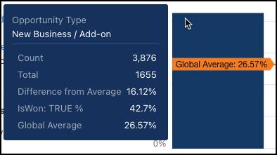
En el texto explicativo, si desliza el cursor por un hipervínculo, se resalta la barra correspondiente del gráfico de un color distinto. 
Si quiere, puede desplazarse hacia abajo para revisar otras perspectivas descriptivas del listado.
Profundizar en una sola variable (perspectivas de primer orden)
Para filtrar el listado de perspectivas, haga clic en Opportunity Type (Tipo de oportunidad) en el panel de variables.

El listado de perspectivas muestra las perspectivas asociadas solamente con Opportunity Type (Tipo de oportunidad). El selector de filtro encima de la perspectiva muestra la variable que está analizando.

La primera perspectiva del listado muestra cómo Opportunity Type (Tipo de oportunidad) está relacionado con el resultado. Muestra un resumen de todos los valores asociados con la variable. Las perspectivas descriptivas también se conocen como perspectivas de primer orden, porque analizan cómo una variable (Opportunity Type [Tipo de oportunidad]) explica la variación en la variable del resultado (IsWon TRUE [Verdadero]).
¿Qué son los subgrupos (perspectivas de segunda orden)?
Desplácese hasta la siguiente perspectiva de la lista. 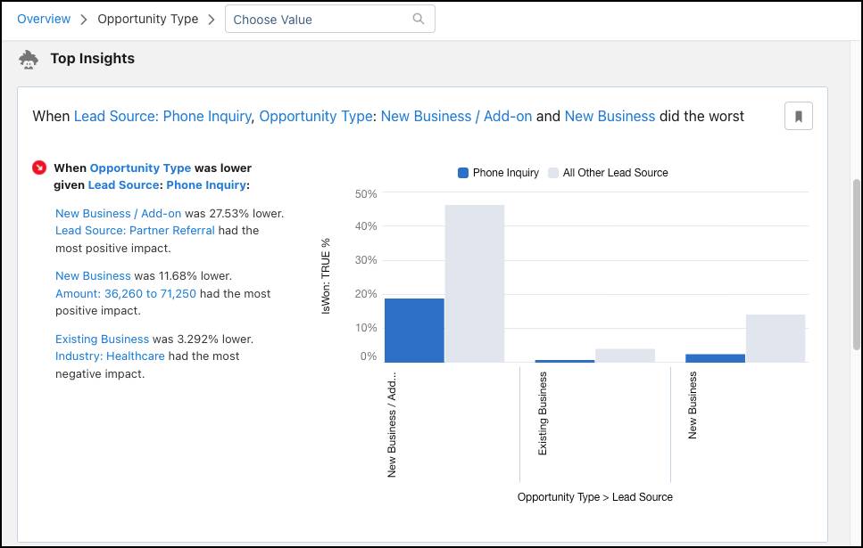
La perspectiva muestra cómo una combinación de variables (subgrupos) están asociadas con la variable del resultado. En este ejemplo, se destaca el origen del candidato Phone Inquiry (Consulta telefónica) porque su desempeño es peor que el de los otros orígenes del candidato, en particular cuando se trata de una oportunidad adicional. El gráfico muestra la magnitud de la comparación entre Phone Inquiry (Consulta telefónica) (columnas azules) y los demás orígenes del candidato (columnas grises) en Opportunity Type (Tipo de oportunidad). ¿Cuál es la perspectiva? Las llamadas en frío no son la manera más efectiva de generar nuevos negocios.
Si quiere, puede desplazarse hacia abajo para revisar otras perspectivas de la lista. Ahora, veamos de qué tratan las perspectivas diagnósticas.
¿Qué son las perspectivas diagnósticas?
Mientras que las perspectivas descriptivas le dicen lo que ha pasado, las perspectivas diagnósticas le dicen por qué ha pasado. Las perspectivas diagnósticas le ayudan a profundizar en los factores que llevaron a un resultado. Einstein Discovery extrae las perspectivas diagnósticas del modelo que produce durante su creación. Einstein utiliza gráficos de cascada para visualizar las perspectivas diagnósticas.
Nota: Recuerde que el término por qué se refiere a un patrón de datos fuerte, no necesariamente a una relación causal.
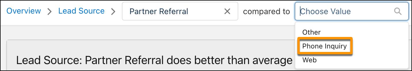
Para ver las perspectivas diagnósticas, seleccione una variable (Lead Source [Origen del candidato]) del panel de variables y después, desde Choose Value (Seleccionar valor), seleccione un valor para la variable (Partner Referral [Referencia del socio]).

Einstein muestra un resumen del rendimiento del valor seleccionado. 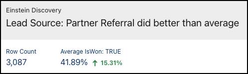
A continuación, Einstein muestra la perspectiva de diagnóstico para cuando el origen de un candidato es Partner Referral (Referencia del socio). 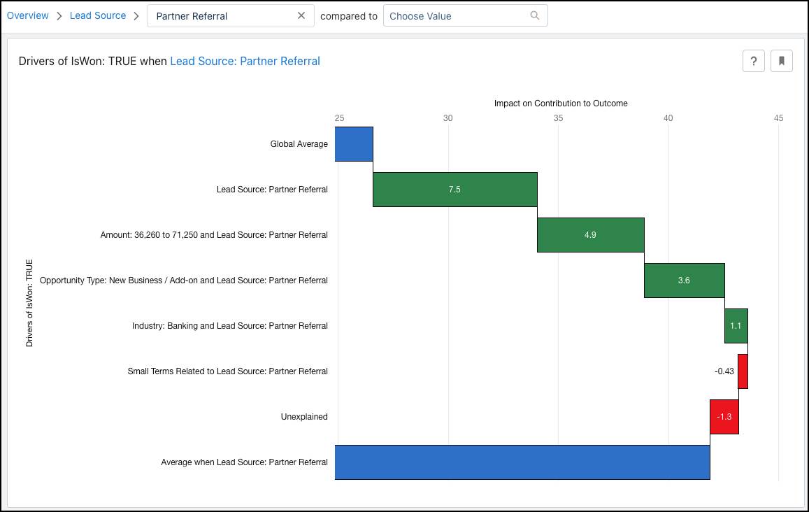
Este gráfico de cascada incluye mucha información. Veamos el caso de uso paso a paso.
Comencemos por las barras azules.
- El primero es Global Average (Promedio global) o el promedio de todas las variables y valores.
- El último es Average (Promedio) o el promedio de la variable y el valor seleccionados. Le muestra la diferencia en comparación con el promedio global (el efecto neto).
Ahora, veamos las barras verdes y rojas del medio. Estas barras son las Specific Drivers (Fuerzas específicas), o los efectos individuales, que indican cómo están asociados los factores individuales o grupos de factores con el resultado. Las barras verdes representan una mejora, mientras que las rojas indican un empeoramiento.
-
Small Terms Related (Términos menores relacionados) es la suma de todos los efectos de todos los términos que interactúan con la selección y que no aparecen en ninguna de las barras anteriores. Existen muchos factores que impactan en el resultado de la variable seleccionada. Los gráficos no pueden mostrar todos ellos. Solo lo hacen con aquellos que tienen más impacto. Los demás impactos se agrupan en Small Terms Related (Términos menores relacionados). Esto se hace específicamente para diferenciarlos de estos dos grupos.
-
Unexplained (Inexplicable) cuantifica la cantidad de impactos que este modelo no ha sido capaz de atribuir a las diferentes fuerzas. Las fuerzas en las perspectivas diagnósticas en conjunto son la diferencia entre el resultado observado cuando Lead Source (Origen del candidato) es Partner Referral (Referencia del socio) y el promedio global. Tenga en cuenta que estas fuerzas se generan a partir de un modelo predictivo y que ningún modelo es perfecto. Si Unexplained (Inexplicable) diese 0, significaría que el modelo siempre predijo perfectamente el índice de ganancias cuando Lead Source (Origen del candidato) es Partner Referral (Referencia del socio), lo que sería poco realista y significaría que el modelo está sobreajustado.
Existen otras muchas cosas que podríamos aprender aquí (intente pasar el cursor por encima de los factores para ver todas sus puntuaciones), pero es el momento de pasar a las perspectivas comparativas.
¿Qué son las perspectivas comparativas?
Las perspectivas comparativas son un caso especial de perspectivas diagnósticas. Recuerde que una perspectiva diagnóstica desglosa la diferencia entre un subgrupo específico y el promedio global en factores contribuyentes. Una perspectiva comparativa tiene la misma función, pero lo hace entre dos subgrupos diferentes. Einstein Discovery extrae las perspectivas comparativas del modelo que produce. Einstein Discovery muestra gráficos de cascada para ayudarle a visualizar estas comparaciones.
Para ver las perspectivas comparativas, seleccione una variable (Lead Source [Origen del candidato]) del panel de variables. En Choose Value (Seleccionar valor), seleccione una categoría para la variable (Partner Referral [Referencia del socio]) y luego escoja una segunda categoría (Phone Inquiry [Consulta telefónica]).
Einstein muestra la perspectiva comparativa. 
Profundicemos en alguna información de esta pantalla.
- El título (1) indica la categoría que tiene mayor impacto positivo en el resultado.
- El resumen (2) muestra de qué forma está correlacionada cada categoría con el resultado y expone las diferencias entre ellas.
- El subtítulo (3) describe exactamente lo que se ha comparado.
- El gráfico de cascada (4) le muestra las diferencias principales entre dos categorías.
- Promedio cuando Lead Source (Origen del candidato) es Phone Inquiry (Consulta telefónica) (barra superior azul)
- Promedio cuando Lead Source (Origen del candidato) es Partner Referral (Referencia del socio) (barra inferior azul)
- Factores cuando Phone Inquiry (Consulta telefónica) tiene mejor desempeño (barras rojas)
- Factores cuando Partner Referral (Referencia del socio) tiene mejor desempeño (barras verdes)
¿Qué más puedo hacer con las perspectivas?
Además de revisar e interpretar las perspectivas de los datos en su modelo, puede:
- Marcar como favoritas las perspectivas que quiere volver a revisar, y filtrar el listado de perspectivas para ver solamente las marcadas como favoritas.
- Filtrar las perspectivas asociadas con variables sensibles cuando esté analizando sus datos en busca de sesgos.
¿Qué es lo siguiente?
Ahora que ya conoce las perspectivas, el siguiente paso es implementar su modelo.
Recursos