Aprender a mostrar distribuciones de variables discretas
Objetivos de aprendizaje
Después de completar esta unidad, podrá:
- Definir qué es la distribución de datos.
- Distinguir entre distribuciones de frecuencia y proporción para variables discretas.
Introducción
Si ha completado el módulo Datos bien estructurados en la ruta Desarrollar su alfabetización de datos, habrá aprendido a organizar los datos en columnas (o campos) y filas. En los datos bien estructurados, cada variable (campo) tiene su propia columna y cada observación diferente de esa variable (valor) ocupa una fila distinta.
Las variables pueden ser discretas o continuas. Las variables discretas tienen valores independientes y distintos, mientras que las variables continuas tienen valores que forman un todo. Para obtener más información sobre las variables, consulte el módulo Variables y tipos de campos.
Al trabajar con datos, es posible que a veces desee visualizar distribuciones de un conjunto de datos. Una distribución muestra todos los valores de datos posibles y la frecuencia (recuento) con la que ocurren. En otras palabras, una distribución describe las veces que cada valor de datos se repite. La organización de una distribución varía según se trate de una variable discreta o continua. En primer lugar, vamos a ver las variables discretas.
Distribución de variables discretas
Al observar las distribuciones de variables discretas, puede ver la frecuencia (recuento total) o la proporción (porcentajes). Aquí tiene un ejemplo que hemos adaptado a partir de Online Statistics Education: A Multimedia Course of Study. Líder del proyecto: David M. Lane, Rice University.
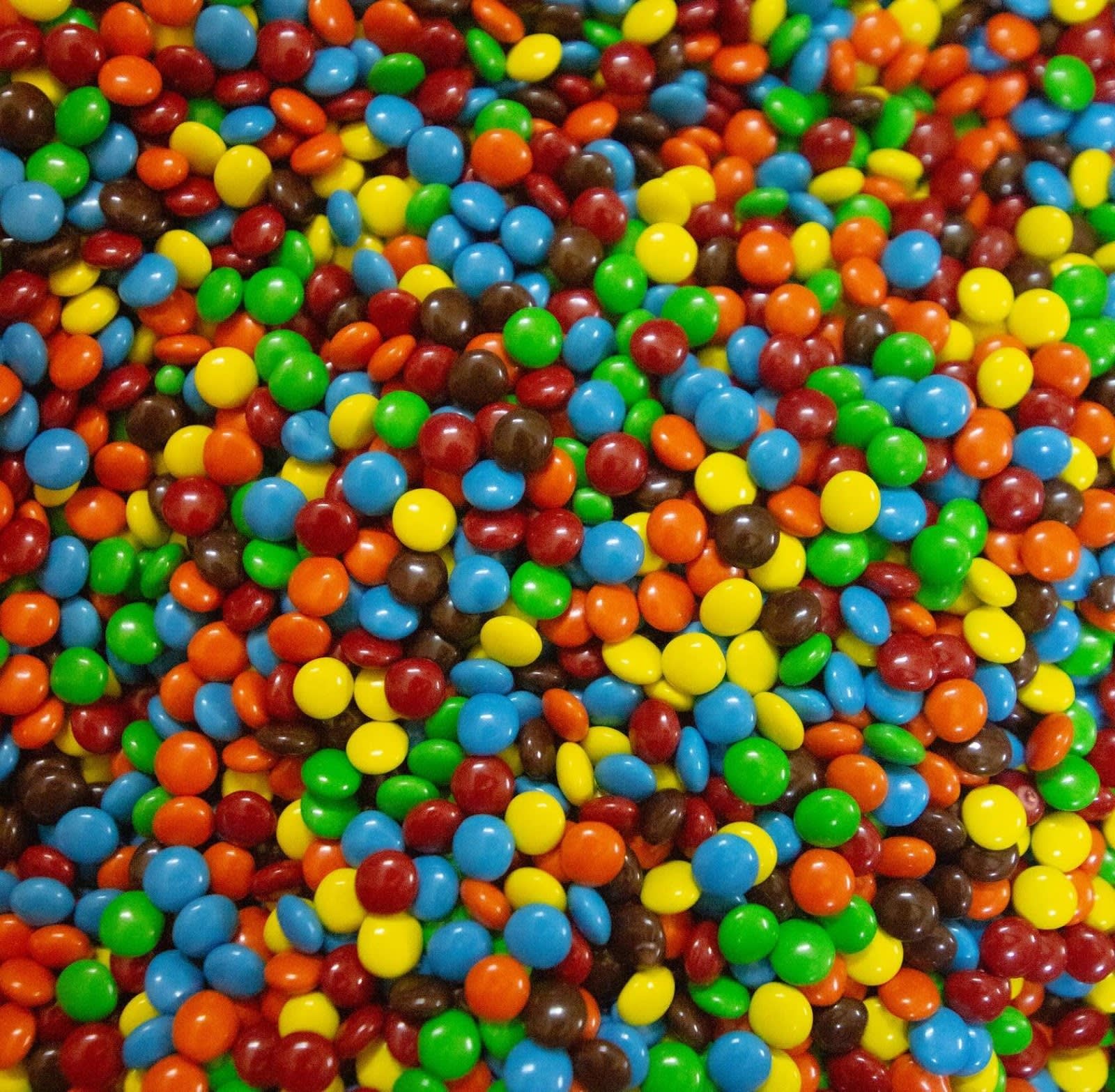
Distribución de la frecuencia de los colores de las golosinas
Imagine que tiene una bolsa de golosinas de seis colores diferentes. Piense en la variable color. Se trata de una variable cualitativa nominal, por lo que sabe que es una variable discreta.
Las variables discretas se pueden contar individualmente. Vacía la bolsa de dulces y realiza un recuento rápido. Como observa, de un total de 55 golosinas, hay 17 marrones, 18 rojas, 7 amarillas, 7 verdes, 2 azules y 4 naranjas.

El siguiente conteo muestra la distribución de la frecuencia de los colores de las golosinas de la bolsa o, en otras palabras, cuántas golosinas de cada color había en la bolsa.
Puede crear la siguiente tabla de frecuencia para describir la distribución.
Color |
Frecuencia |
|---|---|
Marrón |
17 |
Rojo |
18 |
Amarillo |
7 |
Verde |
7 |
azul |
2 |
Naranja |
4 |
Si lo prefiere, puede usar un gráfico para mostrar esta distribución de la frecuencia. Este gráfico lo hemos creamos con Tableau, nuestra plataforma de análisis visual.

Distribución de la proporción de los colores de las golosinas
La distribución de la frecuencia del ejemplo hacía referencia solo a la bolsa de golosinas. ¿Y si quisiera conocer la distribución de colores de todas las bolsas de este tipo de golosina?
El fabricante de golosinas proporciona cierta información, pero no aclara exactamente cuántas golosinas de cada color ha fabricado. En lugar de informar sobre la frecuencia (el recuento total de cada color que se haya producido), la empresa notifica las proporciones de cada color. Puede pensar en las proporciones como los porcentajes de cada color producido, expresados como decimales. Por ejemplo, las golosinas rojas tienen una proporción de 0,20; esto significa que el 20 % de las golosinas fabricadas son rojas.
Cada golosina es de uno de los seis colores disponibles, por lo que si suma las proporciones de todos los colores, el total es 1 (o 100 %).
Al gráfico que muestra estas proporciones se le llama distribución de la proporción. En el siguiente gráfico de barras, se muestra la distribución de la proporción de los colores de las golosinas o, en otras palabras, qué porcentaje representa cada color en el total de golosinas fabricadas.

Ponga a prueba sus conocimientos con tarjetas interactivas
¿Está listo para poner a prueba sus conocimientos sobre las distribuciones de frecuencia y proporción? Observe dos gráficos de distribución de una empresa que vende tres tipos de productos: mobiliario, suministros de oficina y tecnología. En la primera tarjeta, se muestra el porcentaje del número total de pedidos para cada categoría de productos. En la segunda tarjeta, se muestra el número total de pedidos para cada categoría.
Analice los gráficos. ¿Qué gráfico representa una distribución de la frecuencia y qué gráfico muestra una distribución de la proporción? Haga clic en la flecha hacia la derecha para pasar a la siguiente tarjeta y en la flecha hacia la izquierda para volver a la tarjeta anterior. Haga clic en las tarjetas para ver las respuestas correctas.
Ha aprendido los dos tipos de distribución de variables discretas: de frecuencia y de proporción. En la siguiente unidad, aprenderá a mostrar la distribución de valores continuos.
Recursos
- Sitio web: David M. Lane’s public domain work, Introduction to Statistics
- Ayuda de Tableau: Distributions and Outliers (Distribuciones y valores atípicos)