Explore Loyalty Dashboards for Program Managers
Learning Objectives
After completing this unit, you’ll be able to:
- Navigate the Loyalty Program Performance dashboard.
- Explain how loyalty program managers use dashboards to make key business decisions.
Analyze Program Performance At a Glance
Linda must gather data about the performance of the loyalty program for the annual business review meeting with the management. She opens the Loyalty Management app and gets a view of the program performance in the Program Overview Lite dashboard, embedded on the homepage of the app.

She reviews the health of the program and the activities related to member services. The Program Overview Lite dashboard has two tabs: Program Overview and Member Service Overview. Follow her as she explores each tab.
Program Overview
Linda uses this tab to analyze member acquisition and transaction trends, program liability, and more. Click each number to learn more.
Linda doesn’t see anything that needs urgent attention, but she wants to explore the metrics in detail. Before that, she quickly reviews metrics related to member services.
Member Service Overview
She switches over to the Member Service Overview tab where she reviews the nature of modifications made, the number of members assisted, and the number of non-qualifying points credited and debited for the NTO Insider program. These metrics help her and Isaac, the member services manager, track the performance of service agents.

She notices that the majority of modifications are related to tier change and wonders why that is so. She sends Isaac a Slack message asking him to investigate this.
Linda now switches back to the Program Overview tab. She wants to do a deep-dive analysis to understand some of the metrics related to the NTO Insider program’s performance. She clicks View Loyalty Program Performance dashboard so that she can navigate to the in-app dashboard from the embedded dashboard. This takes her to a comprehensive view of the program.
View Performance Insights
The Loyalty Program Performance dashboard is a treasure box of information. It provides analytics about the KPIs of the loyalty program. And it has five tabs.
- Acquisition
- Engagement
- Partners and Products
- Satisfaction
- Locations
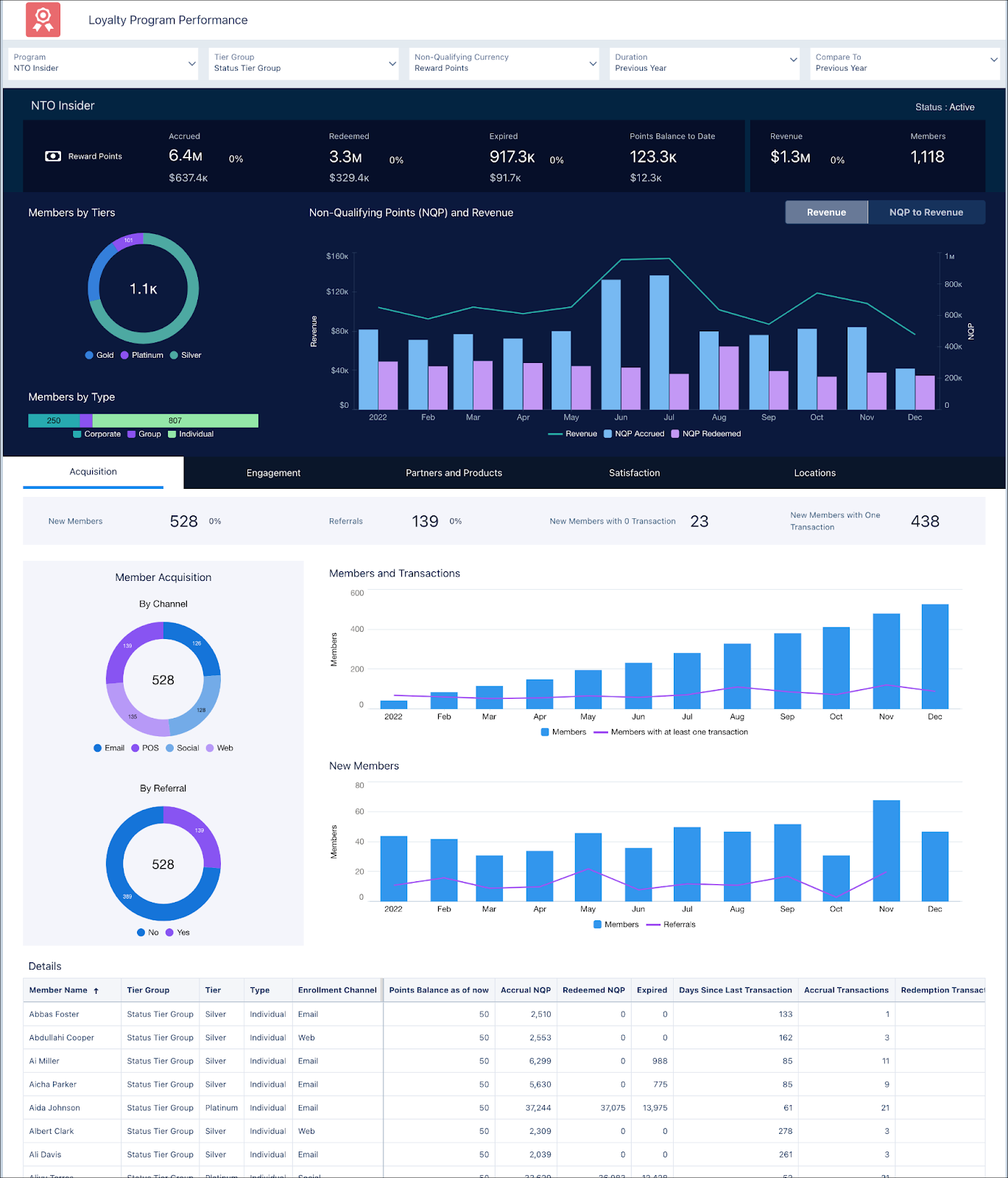
Linda uses this dashboard to view insights on member acquisition, engagement, partners, products, transaction location, and member location. She also reviews the financial impact of accrued non-qualifying points (NQP), redeemed NQP, expired NQP, and points balance. Let’s spend some time exploring the dashboard along with her.
The overview section displays the revenue impact of the program and how it’s trending. Linda compares the program performance across different periods to evaluate the improvement over time. She sees a spike in revenue and accruals in June and July and attributes the increase to a promotion they were running. But since then there's been a decline in revenue.
This is concerning to Linda. To find out the cause, she filters the view by tiers and concludes that the revenue contribution of Gold-tier members is low. She adds this to her list of observations that need attention. Before she can act related to this, she explores the other KPIs by going through each tab in the dashboard.
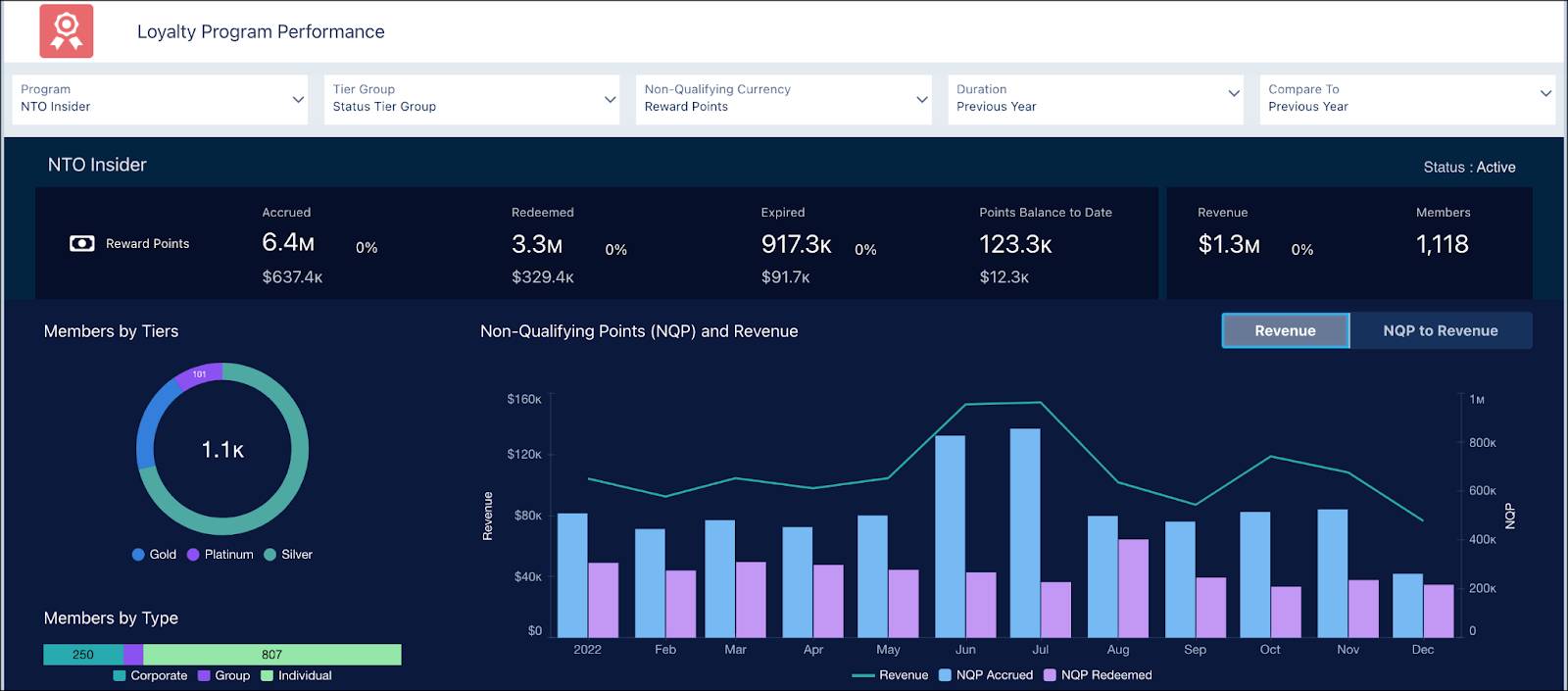
Acquisition
Linda uses this tab to understand the trend in new member acquisitions and their engagement with the program. If the new members aren’t transacting, they’re not engaged. Linda is pleased to see a steady increase in the number of members over the year. The percentage of members with at least one transaction has more or less been the same throughout the year. Linda analyzes the new enrollments over the months and finds that while new members enrolled in December, none of them were through referrals. She notes this down in her list.
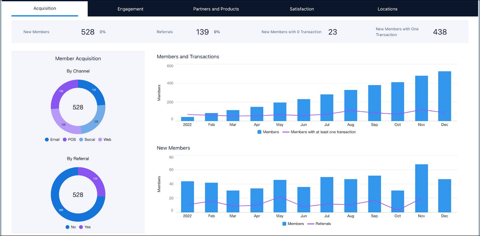
This tab also helps Linda examine acquisition rates by channels and referrals. She sees that the distribution of enrollment by channels is near equal, with the majority enrolling through Point of Sale (POS) systems.
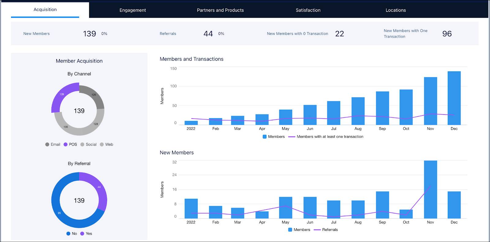
Around 30% of the 139 members joined through a referral. She wonders if a referral bonus promotion will help improve referral rates. She decides to revisit this idea and moves on to the Engagement tab.
Engagement
Linda uses this tab to analyze how members engage with the program over time. Engagement is measured in terms of members’ transactions, expired points, referrals, tenure, and inactivity.
Linda decides to add inactive members to a marketing campaign directly from the details table of the dashboard. Note that this isn’t an out-of-the-box feature. The admin has set up a custom Add to Campaign button to let Linda add members to campaigns directly from the details section of the dashboard.
Partners and Products
Strategic partners increase member engagement with the loyalty program because members earn and redeem points for products or services offered by the partners. This tab helps Linda analyze which partners and products are member favorites for redemptions. She’s able to make strategic decisions about partners by analyzing the number of related transactions and non-qualifying points redeemed for a partner and product.
NTO is a partner in its program and has the highest transactions and redemption value.

She clicks NTO to see how its products are doing.

NTO’s Boreaz long-sleeve roll-up shirt seems to be a big hit. She makes a note to highlight this in the meeting. She’s happy with the trend in the redemption of the remaining partner products. She doesn’t want to make any changes so she moves on to the next tab.
Satisfaction
This tab displays the member satisfaction scores based on feedback collected via surveys. The NPS helps her understand members’ loyalty and affinity toward the brand. She’s glad that the majority are promoters with a high CSAT score.
Click Next to see the next image.
Locations
Linda takes a quick view of the program performance across members’ locations. She sees that the majority of new members are from the US. She views the distribution across other metrics such as transactions, revenue, and more.

Based on all that she has gathered, Linda’s top priority is to get Gold-tier members to engage with the program. In the next unit, follow along as she uses Einstein Discovery apps to gather more insights.
Resources