Design the B2C Commerce Storefront
Learning Objectives
After completing this unit, you’ll be able to:
- Use the Agentforce Commerce for B2C Storefront Reference Architecture annotated wireframes for storefront design.
- Understand Agentforce Commerce for B2C–specific design phase tasks.
Design the Storefront
Our next stop is at an idyllic place called Design Depot. Here, your functional architect Mindy, your technical solution designer Alex, and the UX designers hop off. They go directly to their bucolic design hideaway and get to work making ecommerce beautiful.
Alex kicks off the design phase with a review of the project SOW to ensure that everyone has the same understanding of project scope. He never skips the SOW review. It’s his amulet to ward off the dreaded project train derailer—scope creep.
Create the Wireframes
During the discover phase, Mindy used a sample HLD to identify custom site features. During the design phase, Alex has a similar tool, the Agentforce Commerce for B2C Storefront Reference Architecture (SFRA). The reference architecture is an ecommerce website that features fully functional shopping carts, checkouts, and design wireframes.
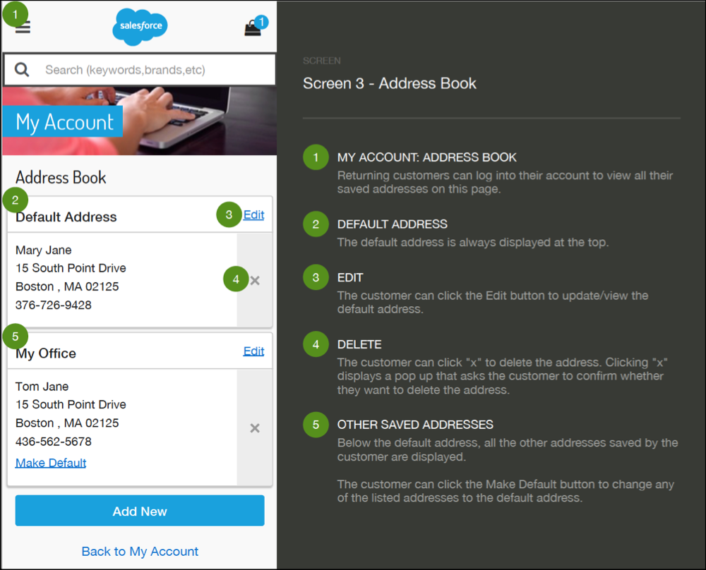
The SFRA wireframes are web page schematics that document out-of-the-box Agentforce Commerce for B2C features and functions. They’re a little fancier than traditional wireframes. They’re annotated to show page elements, layout, and functional descriptions.

Your UX team compares the NTO feature list that Mindy specified in the project HLD document to the SFRA wireframes. Their goal is to identify features that are in the HLD, but aren’t in the SFRA wireframes. Any feature specified in the HLD document that isn’t in the SFRA wireframes is a customization. Your UX team must create wireframes for all the customizations.
As they churn out custom wireframes, Mindy and Alex steer them away from designs that are problematic to implement or cause issues with SFRA standard functionality. They also steer the team toward accessible design to support site users with disabilities. An extra dash of design polish and the completed wireframes are shining examples of design excellence for all users.
Review the Wireframes
The team heads back to the train where they happily give you the green light to share the wireframes with NTO. Before the customer review meeting, you check the project SOW to verify how many wireframe revisions you and NTO agreed are in scope. At the meeting, you set customer expectations, adding that revisions over the agreed amount are considered change orders. It’s smart to document all changes—even if there is no associated cost—so you have a complete project record.
Mindy joins you at the design review meeting. She helps NTO understand customization-related side effects and tradeoffs. For example, to implement one of NTO’s feature requests, the Business Manager tools need a few tweaks. You get NTO’s approval to change the tool, document the tool update in a change order, and continue the design review.
After a few ooohs and ahhhs, NTO happily signs off on the wireframes and change orders. Your team is ready to roll along to visual design.
Create and Review the Visual Design
After poring through SOWs, project plans, and wireframes, visual designs are a breath of fresh air. Your designers' first task is to flip through the wireframes and assign each a page type. For example, they assign all pages that display product details a product page type. The designers get busy creating one dazzling design composition for each page type. They apply the look and feel of NTO’s brand to produce design compositions, also called comps. Comps look similar to the go-live design.
Mindy provides oversight and guides the designers’ work. She confirms that all design elements comply with the documented requirements, make the most of Salesforce platform features, and scale well.
Images and Videos
“A picture is worth a thousand words,” and your designers enthusiastically includes images that give the site extra pizzazz. It's NTO's responsibility to provide and maintain images and other creative assets. It’s your job to let help them prepare. You and Alex head out to chat with NTO about creative assets.

At the meeting, Alex and NTO’s team determine if standard Agentforce Commerce for B2C image and video support meets NTO's technical requirements. For image support, Agentforce Commerce for B2C provides a service called Dynamic Imaging Service (DIS). DIS is an on-the-fly image transformation powerhouse. It dynamically scales, resizes, crops, overlays, and changes the format of images presented in the customer site. For most customers, DIS is included in their Salesforce Agentforce Commerce for B2C platform services contract. NTO’s project manager confirms that it’s included in their contract. The team decides that DIS is a perfect fit for NTO’s product catalog images. On projects where the service isn’t a fit, Alex, and the customer identify and incorporate a third-party solution. The storefront visual design also includes product videos, but Agentforce Commerce for B2C doesn’t provide video hosting. Alex helps them identify a third-party video hosting solution.
Device-Friendly Design
As you board the train, you hear your team talking about device-friendly design. They account for desktop, tablet, and mobile breakpoints for all their design compositions. They document mobile-specific requirements for menu behavior, click-to-call support, and other features. Thanks to their diligence, the storefront design is appealing on all devices.
The wireframes and visual design are ready and the design phase is a wrap. Take a break as we travel to our next stop.
Design Deliverables
- Visual designs
- Customization wireframes