Present Your Content with Accessibility in Mind
Learning Objectives
After completing this unit, you’ll be able to:
- Identify the most common barriers to accessibility in digital content.
- Explain the design principles guiding the creation of accessible digital content.
- Use free online tools to check your own content for accessibility.
Designing your digital content to be accessible for all audiences can be a challenge, but there are several established principles for design and layout to help you as you work.
The more you use these best practices and the free online accessibility-checking tools linked in this unit, the sooner these modifications to promote accessibility will become second nature!
Design for Readability
One of the most important considerations is using design principles that enhance the readability of your copy—whether people will be reading it visually or listening via a screen reader or other assistive device. Here are the top things to consider when laying out your digital copy.
Review Copy Structure
Use appropriately coded headings and subheadings to organize and structure your content. (This means that the actual code on the pages designates your headers and subheaders; they are not just bolded, underlined, or in a different font size.) This not only helps your SEO efforts, but also makes it easier for users who are using assistive technologies, such as screen readers, to navigate through the page.

In addition to coding headings properly, you can also use text styling to differentiate headings from body text and make them stand out. This makes your content easier to scan for people who access it visually. Choose a font that’s readable for people with dyslexia, and keep it simple and consistent so you don’t make the page layout distracting.

Use bullet points or numbered lists to structure information in an organized and easy-to-follow way. This can be especially useful for users with cognitive or learning disabilities.
Code Forms Properly
When you’re creating a form that requires user input, all form fields should be appropriately labeled and annotated for screen reader access. Listen as Cala talks through several elements of a form that has been properly coded.
Here you will be able to hear Cala discuss what constitutes a well-coded form field.

Use Minimal Text in Graphics
When designing, it’s tempting to include stylized copy and headlines in your graphics, but doing this presents serious challenges to those with visual disabilities.
When there’s a large amount of text within a graphic, it can be more difficult for users to read and understand the content, particularly if they use assistive technologies such as screen readers.
Using alt text can lessen the impact of this, but it’s a better principle to keep copy out of your graphics whenever possible. If you do need to include text in a graphic, you should aim to use short, concise phrases or bullet points rather than long blocks of text.
Choose Appropriate and Accessible Fonts and Font Sizes
-
Font size: Using a font size that’s too small can make text difficult to read. It’s generally recommended to use a font size of at least 16 pixels for body text to ensure that it’s legible.
-
Font style: Some font styles are easier to read than others. Sans-serif fonts, such as Arial or Verdana, are generally easier to read on screens than serif fonts, such as Times New Roman or Georgia.
Design for Comprehension
Now that your content is formatted correctly, how can you use other design principles to enhance and speed comprehension for all audiences? Much of this comes down to how the content is laid out and organized on the page. Spacing, alignment, leading, and kerning are important design elements that can help promote accessibility in your content.
Here are some tips on how to use these elements effectively.
Use appropriate leading. Spacing between lines of text is called leading. The best text leading for accessibility is generally considered to be around 1.5 times the point size of the text. This allows for enough space between lines to make the text easy to read and reduces the risk of letters from different lines of text overlapping or appearing too close together. You should use enough leading to make the text easy to read, but not so much that it creates too much white space. Experimenting with different leading helps you find the right balance for your content.
Use kerning effectively. Kerning refers to the space between individual letters in a word. Kerning optimized for accessibility is generally just enough to create consistent spacing between letters, without gaps or overlaps. If you’re using a custom font, you may need to adjust the kerning manually. Many design programs allow you to adjust kerning and other text spacing parameters. You may need to work with a designer to choose and implement the most effective kerning.
Optimize your alignment. Text can be left-, right-, or center-aligned depending on the context and the preferences of your audience. Left-aligned text is generally easier to read, especially for users with reading difficulties, but centered text can be used effectively for short blocks of text or for headlines. Avoid using fully justified text as this can create areas of white space in the text block that are distracting for dyslexic readers or people with other reading disabilities.
By following these tips, you can create content that is more accessible and easier for users to comprehend, regardless of their abilities or reading level.
Design for Keyboard Navigation
Many users cannot or prefer not to use a pointing device like a mouse or tablet when navigating digital content. You should set your website up to be accessible using only keyboard navigation.
Ideally, a user should be able to determine exactly where they are on a page at any given time, and they should also be able to easily use the tab key to jump from one section to another in a logical progression.
The specifics of how to code a webpage for this type of accessibility needs to be handled by your website developer, but the main features to keep in mind are:
- Using the FOCUS style element to let users know where they are on the page
- Avoiding Keyboard Traps in your page, in which users cannot use TAB or SHIFT+TAB to move forward and backward
- Ensuring your forms can be submitted using only the keyboard
The easiest way to check for this is to go to your digital content or web page and try to navigate it yourself, using only the keyboard. Can you tell where you are on the page? Can you hit TAB to navigate to the next header or topic? Can any forms be filled out and submitted using the keyboard only? If not, it’s time to work with your web developer and make some updates!
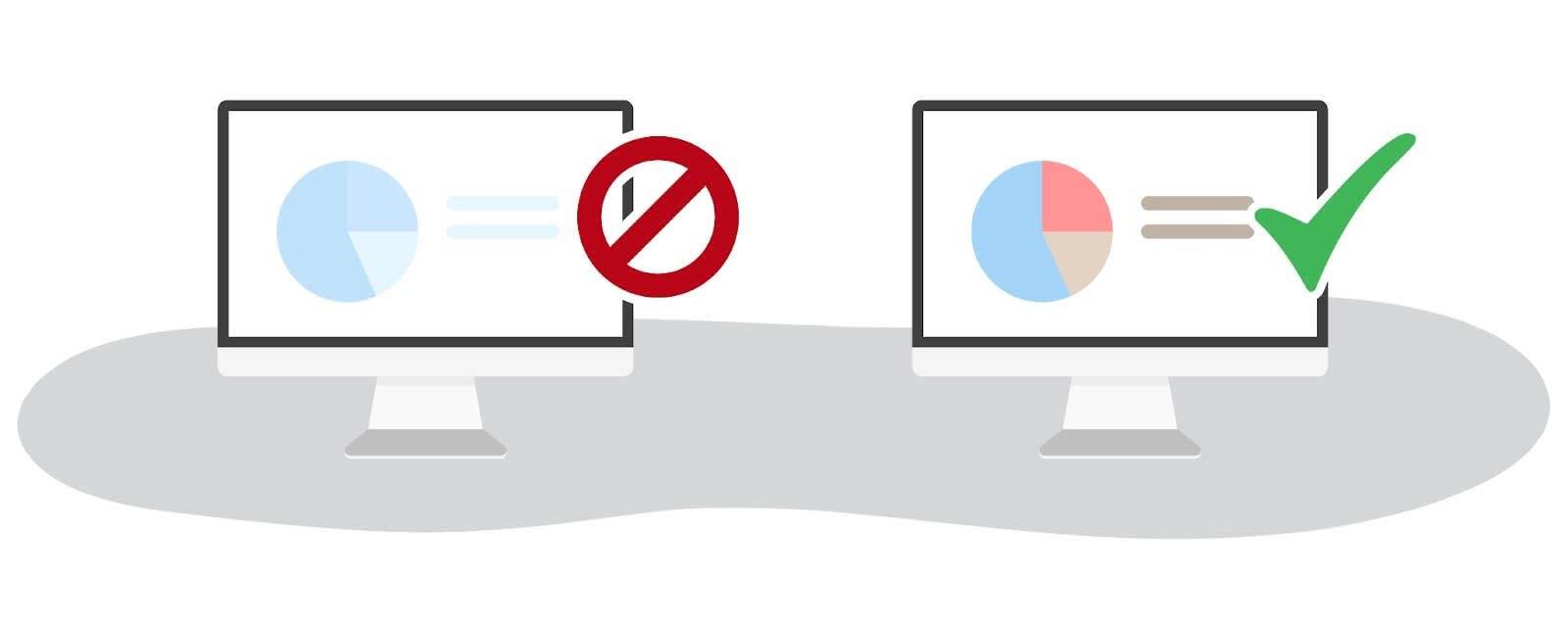
Use Color Appropriately
Color is a vital part of design. As a marketer, you’re used to using color as a key part of your brand identity. Color can help convey meaning, create visual interest, and guide the user’s attention. However, it’s important to choose color combinations that are accessible and easy to read, especially for users with visual disabilities or color blindness.
Here are some tips for choosing color combinations that are accessible.
-
Opt for high contrast. Choose colors that have a high contrast ratio, meaning the difference between the lightest and darkest colors is large. Your text and other elements will be easier to see and read, especially for users with low vision or other visual disabilities.
-
Avoid using similar shades. Don’t use colors that are similar in hue or saturation, as this can make it difficult to distinguish between different elements. Instead, use a range of distinct colors.
-
Consider color blindness. Approximately 8% of men and 0.5% of women are affected by some form of color blindness. To ensure that your color combinations are accessible to these users, use free online tools to check for sufficient contrast and avoid using color combinations that may be difficult for colorblind users to distinguish.
-
Use color sparingly. While color can be a powerful tool for adding visual interest, it’s important not to overuse it. Using too many colors can make the design appear cluttered and overwhelming, and can make it more difficult for users to focus on specific elements, especially neurodivergent users.
-
Use pattern and texture. Consider using color in conjunction with patterned or textured borders. While color alone should never be used to convey meaning, adding patterns to colored elements can help further distinguish them for people with colorblindness.
Double Check Your Work
There are several free tools available that you can use to check your online text for accessibility.
-
WebAIM’s Wave tool: This is a free online tool that checks web pages for accessibility issues. It provides a detailed report on any issues it finds, along with suggestions for how to fix them.
-
Lighthouse: This is a free, open-source tool that’s built into Google Chrome. It can be used to audit the performance and accessibility of a web page.
-
axe: This is a free browser extension that can be used to test web pages for accessibility issues. It’s currently available for Chrome and Edge.
-
Accessibility Insights: This is a free tool developed by Microsoft that can be used to test web apps and sites for accessibility issues. It’s available for use on Windows, MacOS, and Linux systems, and as a browser plug-in for Chrome and Edge.
-
Pa11y: This is an open-source tool that can be used to test web pages for accessibility issues. It can be run from the command line or integrated into a continuous integration workflow.
Using these tools, you can identify any accessibility issues with your online text and take steps to fix them. It’s also a good idea to regularly test your web pages to ensure that they remain accessible to a wide range of users.
Resources