Create a Report, a Report Chart, and a Dashboard
Track Your Progress
Now that you created your app and are tracking the resources you discover, you need to view a summary of your notes, links, and discoveries. Using point-and-click tools, you can build a simple report to track all of the websites, podcasts, blogs, events, and other resources you discover.
Make a Report
Reports in Salesforce help you keep track of important data. You can also display them as charts to visualize your data.
For our My Trailblazer Journey app, let’s create a report that shows our overall discoveries, organized by type.
- Click Reports.
- Click New Report.
- Under Category, click All.
- In Search Report Types, enter
Discoveriesand select Discoveries.
- Then, click Start Report.
- Click the Update Preview Automatically slider to switch it on.
- In Add column, enter
Linkand then select Link to add it to the report. Similarly add the Notes column.
- In Add group, enter
Typeand then select Type to create a grouping.
- Click Save and save the report as follows:
- Report Name:
New Discoveries Report - Description:
Summary of my career exploration discoveries.
- Click Save, then Run.
Well done! You have a report that shows a summary of what you’ve discovered in the Salesforce ecosystem. Now we can add a chart to help visualize our discoveries.
Add a Chart to the Report
Sometimes a picture really helps tell a story, and that’s where report charts come into play. Add a pie chart to show your discoveries by type.
- From your newly created New Discoveries Report, click
 to add a chart to your report.
- In the chart section, click
 to open the chart properties.
- Click
 and complete the Chart Attributes section:
- Chart Title:
Discovery by Type - Value: Record Count
- Save the report by clicking Save in the report header (or by clicking
 , and then Save).
Add the Report to a Dashboard
Report charts aren’t the only way to visualize your data. Add a simple dashboard to show your data with charts.
- Click Dashboards.
- Click New Dashboard.
- Create the dashboard:
- Name:
My Discoveries - Description:
My career exploration discoveries dashboard
- Click Create.
- Click
 to add a dashboard component.
- Then, select Chart or Table.
- Search for and click the New Discoveries Report, then click Select.
- Click
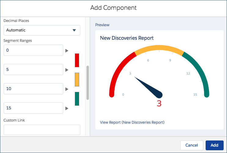
 to select the gauge component.
- Set the four segment ranges at 0, 5, 10, and 15. Click Add.

Now you have a gauge to track your research progress. Let’s add one more component.
- Click
 to add a dashboard component.
- Click Chart or Table again.
- Then, search for and select the New Discoveries Report, then click Select.
- Click
 to select the vertical bar chart component.
- Click Add.
- Drag the component so it’s next to the gauge component.
- Click Save and Done.
Now you can visualize your progress alongside the types of discoveries you’re making as you research opportunities in the Salesforce ecosystem.
Almost Done!
You created your custom object, custom fields, app, sample records, report, report chart, and dashboard.
In the final step, you learn how to use your app on the go. Let’s do it!