Input Data Using Forms
Learning Objectives
After completing this unit, you’ll be able to:
- Explain the essential requirements for a Visualforce form.
- Distinguish Visualforce form elements using the platform visual style from those that don’t.
- List four or more standard input form tags.
- Create a Visualforce form to edit and save a record.
Introduction to Visualforce Forms
Creating and editing data is a fundamental aspect of any app. Visualforce provides everything you need to easily create pages that can create new records, or retrieve a record, edit its values, and save the changes back to the database.
Here we’ll combine the standard controller with the <apex:form> component and a few easy to understand form elements to create a fairly sophisticated record editing page.
Create a Basic Form
Use <apex:form> and <apex:inputField> to create a page to edit data. Combine <apex:commandButton> with the save action built into the standard controller to create a new record, or save changes to an existing one.
A page that lets someone edit and update a record needs to do all of the following.
- Look up the record to edit and retrieve it from the database.
- Put the relevant record data on the page in an editing form.
- Receive a form submission with changed data.
- Validate the new values.
- Save valid changes back to the database.
- Provide appropriate messages to the person submitting the changes, whether the new data is saved successfully or if there are errors.
Visualforce does most of these things for you automatically when you use the standard controller and the <apex:form> component.
Let’s start with the basics.
- Open the Developer Console and click File | New | Visualforce Page to create a new Visualforce page. Enter AccountEdit for the page name.
- In the editor, replace any markup with the following.
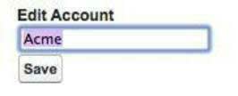
<apex:page standardController="Account"> <h1>Edit Account</h1> <apex:form> <apex:inputField value="{! Account.Name }"/> <apex:commandButton action="{! save }" value="Save" /> </apex:form> </apex:page> - Click Preview to open a preview of your page that you can look at while you make changes. A new window should open, showing a form with a single empty field in the body.
- In the preview window, add the ID for an account to the URL, and press ENTER. The URL should be something like this:
https://MyDomainName.lightning.force.com/apex/AccountEdit?core.apexpages.request.devconsole=1&id=001D000000JRBes
You should now see the name of the account in the form field.
This verifies that you’ve got the standard controller working and a valid record ID.
It might not look like much, but in a half-dozen lines of markup you’ve got a fully functional form for updating an account’s name. Give it a whirl!
These are the essential aspects of this form to understand.
- The page uses the standard controller for accounts, defined in the
<apex:page>component.
-
<apex:form>is a Visualforce component that packages everything inside it into something that can be sent back to the server as part of a page action. If you need to send data back to Salesforce, most of the time you’ll do it inside an<apex:form>.
-
<apex:inputField>creates an onscreen form field for the record data field that’s associated with it. You do this by providing an expression that references the relevant field in the value attribute. Here that expression is{! Account.Name }, which you should have no difficulty guessing is the account’s Name field.
- Finally,
<apex:commandButton>adds a button to the page’s user interface. This button fires an action when it’s clicked. In this case, the action is thesave()action method in the standard controller. Like with<apex:inputField>, you connect the<apex:commandButton>with its action by referencing the action method to be called in an expression provided to the<apex:commandButton>action attribute.
Add Field Labels and Platform Styling
Place form elements within <apex:pageBlock> and <apex:pageBlockSection> tags to organize and group them, and to have the form adopt the platform visual style.
Let’s revise your form so that it looks more familiar.
Inside the <apex:form> component, wrap the two form elements in <apex:pageBlock> and <apex:pageBlockSection>tags, so that your markup looks like this.
<apex:page standardController="Account">
	<apex:form>
		<apex:pageBlock title="Edit Account">
			<apex:pageBlockSection>
				<apex:inputField value="{! Account.Name }"/>
			</apex:pageBlockSection>
			<apex:pageBlockButtons>
				<apex:commandButton action="{! save }" value="Save" />
			</apex:pageBlockButtons>
		</apex:pageBlock>
	</apex:form>
</apex:page>
The styling for this version of the form is quite different! As with output components, when you use input components within <apex:pageBlock> and <apex:pageBlockSection> tags they adopt the platform visual styling.
- Below the account name field, add three more fields so that your markup looks like this.Now you have a more complete, realistic form to work with.
<apex:pageBlockSection columns="1">
    <apex:inputField value="{! Account.Name }"/>
    <apex:inputField value="{! Account.Phone }"/>
    <apex:inputField value="{! Account.Industry }"/>
    <apex:inputField value="{! Account.AnnualRevenue }"/>
</apex:pageBlockSection>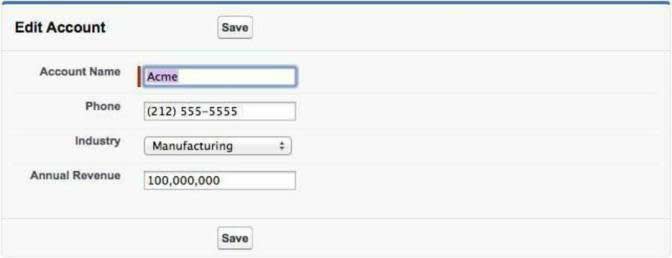
The <apex:inputField> component renders the appropriate input widget based on a standard or custom object field’s type. For example, if you use an <apex:inputField> tag to display a date field, a calendar widget displays on the form. If you use an <apex:inputField> tag to display a picklist field, as we did here for the industry field, a drop-down list displays instead.
<apex:inputField> can be used to capture user input for any standard or custom object field, and respects any metadata that is set on the field definition, such as whether the field is required or unique, or whether the current user has permission to view or edit it.
Display Form Errors and Messages
Use <apex:pageMessages> to display any form handling errors or messages.
Your page should provide useful feedback when things go wrong, such as when a required field is missing, or when a field value fails validation. The standard controller actually handles all of that for you. All you need to do is tell it where to put the messages on the page.
- Under the
<apex:pageBlock>tag, add the following line.<apex:pageMessages/> - Try deleting the account’s name, and saving the record with a blank name. Validation errors are displayed for the page.
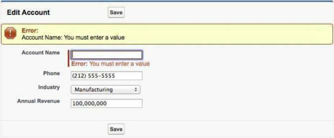
As you can see, <apex:inputField> displays errors for its own field, but for a longer form it’s a nice touch to list all of the page’s errors in one place at the top of the page.
The standard controller already collects all of the page’s messages when the form is processed. The <apex:pageMessages> component enables you to display those messages wherever you see fit.
Edit Related Records
Make it easy for users to edit related information by providing links to related records.
So far our forms have only edited one record at a time. More specifically, because they use the standard controller for the account object, the form can only make changes to account records.
That’s not always the most efficient workflow for users to use. While you can’t save changes to multiple object types in one request with the standard controller, you can make it easier to navigate to related records by offering links that perform actions such as edit or delete on those records.
- Below the existing closing
</apex:pageBlock>tag, add the following markup.A list of the account’s contacts appears below the account editing form.<apex:pageBlock title="Contacts"> <apex:pageBlockTable value="{!Account.contacts}" var="contact"> <apex:column> <apex:outputLink value="{! URLFOR($Action.Contact.Edit, contact.Id) }"> Edit </apex:outputLink> <apex:outputLink value="{! URLFOR($Action.Contact.Delete, contact.Id) }"> Del </apex:outputLink> </apex:column> <apex:column value="{!contact.Name}"/> <apex:column value="{!contact.Title}"/> <apex:column value="{!contact.Phone}"/> </apex:pageBlockTable> </apex:pageBlock>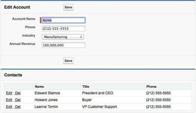
- Try clicking the Edit link for a contact. Where does the link take you? What happens when you save your changes, or click cancel on that page?
The <apex:pageBlockTable> component creates a table with a list of the account’s contacts. What’s new here is the column with the <apex:outputLink> components. These use an expression that references a global variable, $Action, and combines it with the contact’s ID inside the URLFOR() function. The result is a link to the contact’s edit or delete page, depending on the action referenced. This can be a very useful shortcut for users of this form.
Tell Me More…
There’s obviously a great deal more to learn about building useful, usable forms for your web apps.
For starters, Visualforce offers a dozen or so input components, not just <apex:inputField>. <apex:inputField> works well with the standard controller and for directly editing record data. For pages where you’re using your own custom controller code, or when form input doesn’t map directly to fields on a record, you’ll want to know about some of the others. Most of these components have names that begin with apex:input, and you can find them grouped together in the component reference. For select lists and radio button controls, look for the components with names that start with apex:select instead.
For user interfaces intended to be used on mobile devices, you’ll want to check out <apex:input>, which is designed to be used in HTML5 pages, and allows you to use a variety of features that make the resulting input user elements mobile friendly.
The code you wrote here made use of a number of actions provided by the standard controller for the page. We call these standard actions, and there are quite a few of them. There’s a core set that are available for all objects with standard controllers, but many of the built-in standard objects have additional actions you can use.
Speaking of actions, you were able to add actions to edit and delete existing related contacts. How can you add the ability to create new related contacts? It’s not quite as easy as creating a link using the create action, the way you did with edit and delete. This is because those actions worked on existing records, which already have a relationship to the associated account. But when you create a new record, you need to create that relationship yourself. That will require you to write some custom controller code of your own.
Resources
- Visualforce Developer Guide: Using Input Components in a Page
- Visualforce Developer Guide: Using Standard Controller Actions
- Visualforce Developer Guide: Valid Values for the $Action Global Variable
- Visualforce Developer Guide: Standard Controllers