Create and Customize Dashboards
Learning Objectives
After completing this unit, you’ll be able to:
- Explain the difference between reports and dashboards.
- Create a dashboard.
- Explain who can see which dashboards and data, and why.
Step Up Reporting with Dashboards
Reports make it easy for the staff at No More Homelessness (NMH) to access and visualize data to make it insightful and actionable. Dashboards take it one step further, by pulling data from multiple reports and displaying it all side-by-side in the same window. At a glance, you can see engagement, staff efficiency, and progress toward annual program and fundraising goals. With dashboards, it’s even easier to understand the story your data is telling about your programs, services, and fundraising efforts.
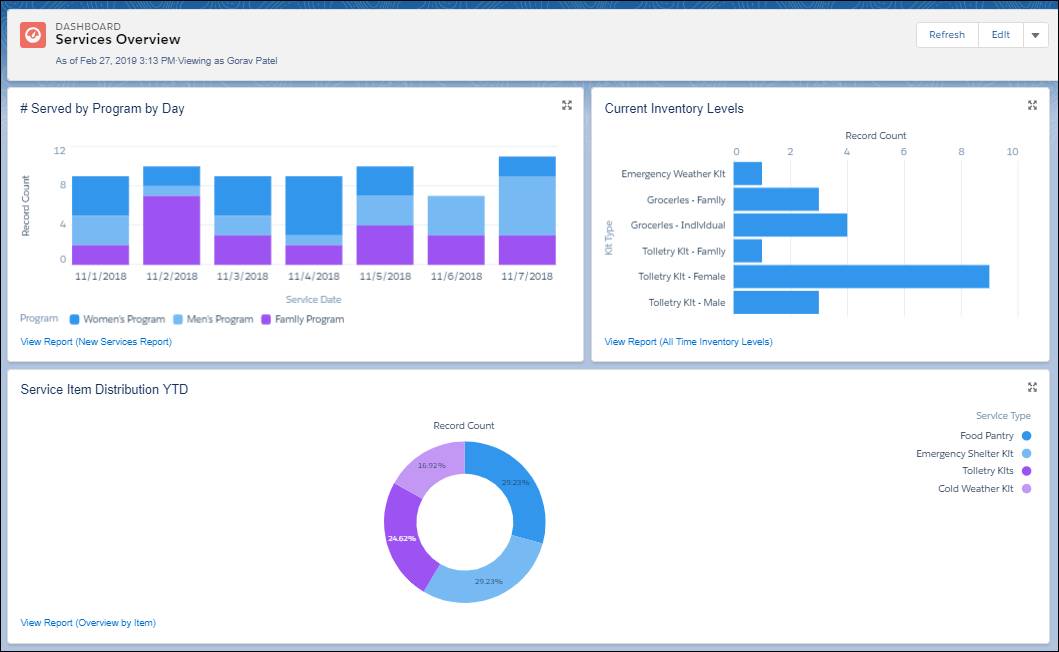
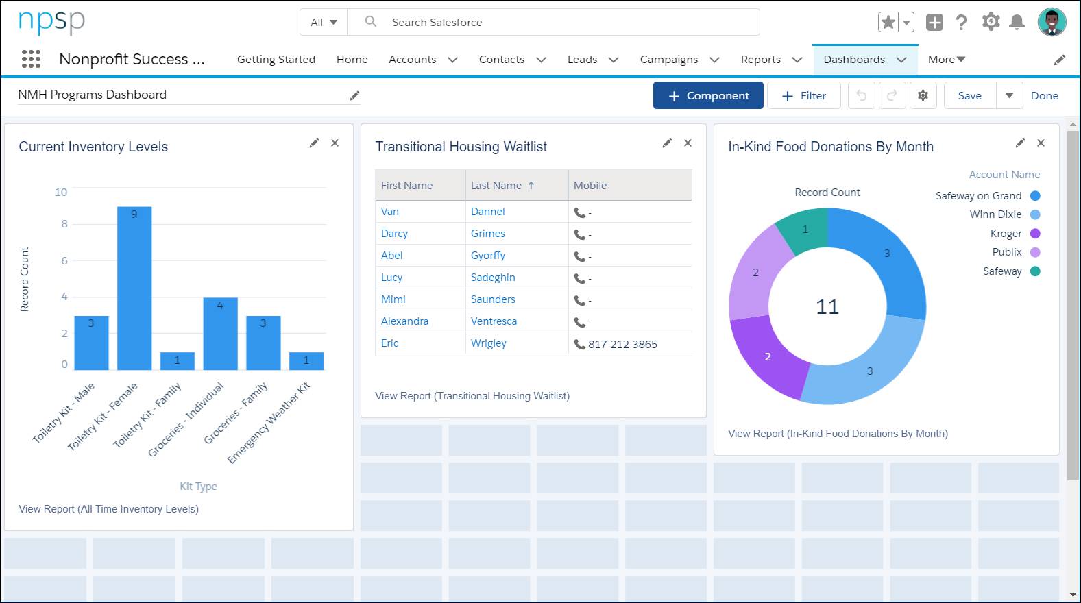
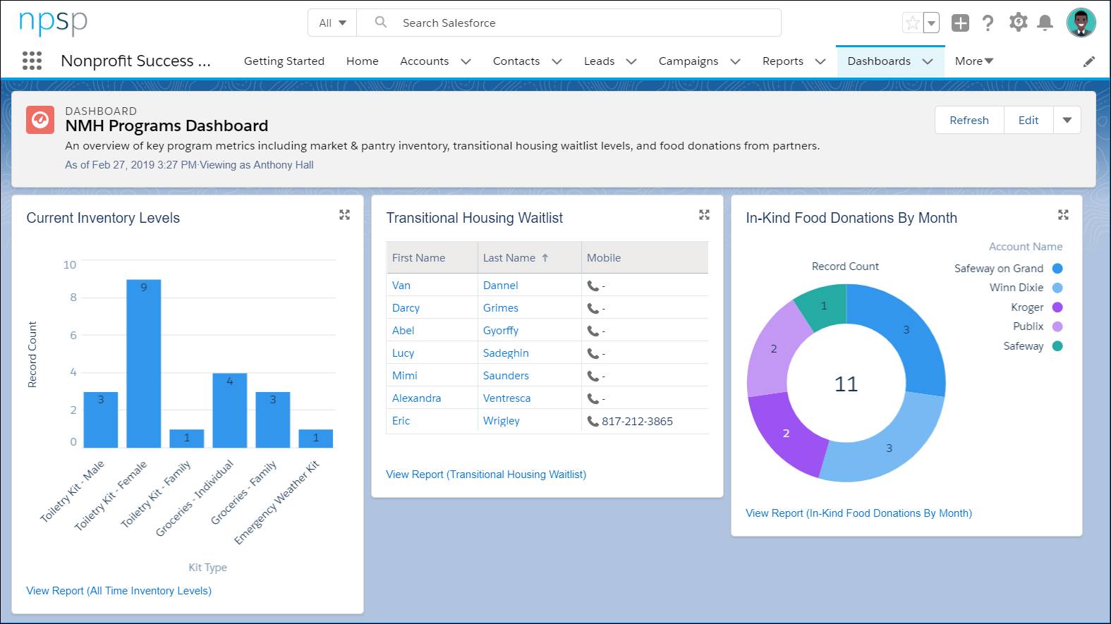
Here’s a sample dashboard within Nonprofit Success Pack (NPSP) that Gorav, the NMH Salesforce admin, created for the programs team. This features several different reports right next to each other, so program staff can consider multiple factors at the same time:
Like nearly everything in Salesforce, dashboards are fully customizable. They include only what you and your team want to include, and look exactly how you want them to look.
Access Dashboards
If your admin hasn’t customized your navigation bar to include a tab for dashboards, all you need to do to find something that’s not in the permanent navigation is to search for it in the App Launcher (  ). Dashboards can have their own tab, and individual dashboards can also be added to your home page and record pages. And, just like with reports, you can subscribe to dashboards.
Dashboard Component Types
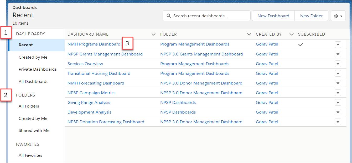
When you land on the dashboards page, you’ll see the dashboards landing page. It’s just like the reports page, and you can navigate through it the same way—using the menu options to sort for individual dashboards (1) or dashboard folders (2) with different sharing settings. To open a dashboard, all you need to do is click a title from the list (3).
Because a dashboard is like a collection of mini-reports, you can (potentially) see many different charts, graphs, tables, and gauges all grouped together on the page. Like a good box of chocolates that includes a key to decode which ones are nougat and which ones are coconut, here’s your guide to the variety you might see within a dashboard and when to use it.
| Component Type | Symbol | Use it when you need... |
|---|---|---|
| Chart |
       
|
A graphic representation of your data. Choose from several chart types—bar, line, scatter plot, funnel, and delicious donut. |
| Gauge |
 |
A single value that you want to show within a range of values. |
| Metric |
 |
One key value to display. |
| Table |
  |
A set of report data in column form. |
Create a Dashboard
Let’s rejoin Anthony Hall, NMH’s Program Manager, as he creates a dashboard to help him keep track of all the moving pieces he has his eye on. NMH already has reports in Salesforce, so Anthony can create a dashboard with an intuitive drag and drop interface. Let’s see how he does it:
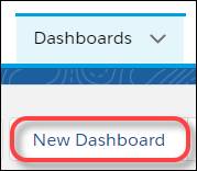
1. From the Dashboards landing page, click New Dashboard.
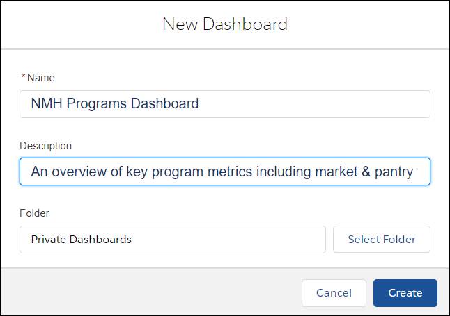
2. Name the new dashboard. Anthony calls his the “NMH Programs Dashboard,” adds a description, and keeps it in his Private Dashboards Folder. Click Create.
 3. Whoa! The page is now a grid. Those are just placeholders for arranging the dashboard components. Click +Component to insert a component.
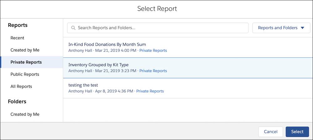
4. In the Select Report menu, find a report. Anthony chooses a report called Inventory Grouped by Kit Type. Click Select.
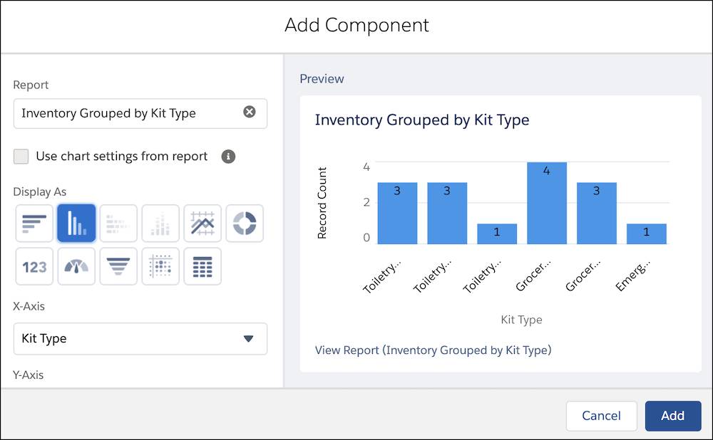
 5. In the Add Component window, select which component type to use. Anthony chooses a vertical bar chart. Click Add.
6. Looks good so far, but this is the key information for his dashboard, the chart that puts all other data in context, so he wants to make it bigger. To resize a dashboard component, click it and then drag the corners and sides to change how much space it takes up. You can also move a component to a different area on the page.
7. One component is not enough for a full dashboard, so Anthony’s going to add more components. He clicks +Component again and repeats the process. Anthony adds the Transitional Housing Waitlist report and the In-Kind Food Donations By Month Sum reports.
8. After all the components are added and sized, click Save.
This dashboard is already so helpful. Anthony can see who’s on the Transitional Housing waitlist, identify where the most food is being donated from for the food pantry program, and determine whether or not they’re low on supplies and need to take action.
 NPSP also comes with out-of-the-box dashboards. If you go to the Dashboards tab by clicking on Dashboards in the navigation bar and click All Folders on the left side, you’ll see the NPSP Fundraising Dashboards folder. For Sofia and the rest of the NMH development team, these dashboards are a huge win!
A Word About Who Sees What
Anthony created the NMH Programs Dashboard in a Private Folder and plans on using it to help keep himself informed, but dashboards can be shared with others in the same way reports can. Salesforce sets up the security settings for dashboards in a couple of different ways. An admin or dashboard creator can determine whether staff accessing a dashboard will see the same data or if the data displayed will be dynamic. That is, each user will only see data they are allowed to view, according to their security settings. This frees up the need to create separate dashboards for each user.
- Dynamic dashboards are typically used when a dashboard creator wants to show each user specific data, like personal fundraising results or number of open solicitations, without having to create multiple copies of a dashboard.
- Standard dashboards (with data that everyone sees) are typically used when a dashboard creator wants to show organization-wide data to a set of users, such as overall fundraising results or campaign performance.
So, keep in mind that the data you see in a dashboard may not be the same data as your colleagues see.
All Together Now
Congratulations! You’ve reached the end of this module. We’ve thrown a lot of information at you, and don’t worry if you didn’t absorb it all right away—Trailhead is always here whenever you need a refresh. You can revisit this module—or any others—any time you like, starting again at the beginning and following each step sequentially or dropping in on a specific unit if that’s all you need. When you feel like you’ve completely mastered this material, don’t worry, there’s still more to learn—and more trails to keep you on the right path.
Until next time, happy trails!