Maintain Your Platform User Experience Designer Certification for Summer ’24
Learning Objectives
After completing this unit, you’ll be able to:
- Prepare for SLDS Architecture updates.
- Customize the forms and buttons on your LWR site with new styling features.
- See improved contrast in focus states.
- Prepare for native shadow DOM updates to Lightning base components.
- Automatically style a store to match your brand.
- Design and launch a referral program in no time.
Maintain Your Certification
If you hold the Platform User Experience Designer certification, keep in mind that you need to complete this module by the due date to maintain your certification.
Interested in learning more about getting certified? Check out the Platform User Experience Designer certification.

Protect the Integrity of Your Certification
The quality of our certification exams and the value that they provide are our highest priority. Protecting the security and confidentiality of our exams is essential to providing our customers with certifications that are respected and industry-leading.
As a participant of the Salesforce Certification Program, you’re required to accept the terms of the Salesforce Certification Program Agreement. Please review the Salesforce certification exam-taking policies in the Salesforce Certification Program Agreement and Code of Conduct Trailhead Help article for more details.
Salesforce introduced great feature enhancements over the past year. Let’s take a look at some of the more important ones.
Prepare for SLDS Architecture Updates
Starting with the Summer ’24 Release, Salesforce is modifying the internal implementations of our Lightning components, Salesforce Lightning Design System (SLDS) styles, and custom properties to support future UI changes.
Prepare Your LWR and Aura Sites
We expect the SLDS Architecture updates to have little to no impact on your site customizations. However, if your site customizes Salesforce components by overriding their CSS, we recommend that you instead use supported techniques. Otherwise, your site can’t adopt future product innovations of the UI without experiencing visual regressions.
Where: This change applies to Aura and LWR sites accessed through Lightning Experience and Salesforce Classic in Enterprise, Performance, Unlimited, and Developer editions.
Confirm Your Components Use Supported Design System Customizations
If you customize your components or sites using supported techniques, we expect the SLDS Architecture updates to have little to no impact on your customizations. However, if your components use unsupported customizations, we recommend that you update them to use supported techniques to prevent visual regressions.
Where: These changes apply to Lightning Experience, Experience Cloud sites, and all versions of the Salesforce mobile app in all editions.
Why: At Salesforce, we’re constantly improving our UI architecture and planning for the future. For this reason, Salesforce can at any point change the internal implementation of UI components. Starting in the Summer ’24 release, we’re changing the internals of some UI components, which can change the rendered DOM. Don’t modify the DOM elements of Salesforce components via CSS or JavaScript or target SLDS classes in unit tests. See Salesforce Component Internals Are Protected.
If you customize Lightning pages or Experience Cloud sites by targeting Salesforce components and CSS styles that change with the architecture updates, some visual regressions are possible. Visual regressions can range from a UI component displaying a slightly different color to layout changes in your UI.
How: For information about supported and unsupported customization techniques, and how to update your site, see the SLDS Architecture Updates FAQ.
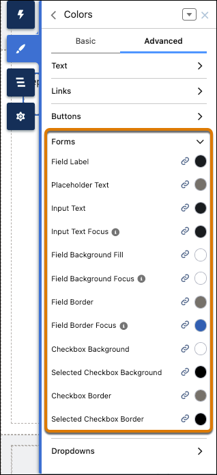
Customize the Forms and Buttons on Your LWR Site with New Styling Features
Show off your unique brand identity with a wealth of additional style properties for forms and buttons in Experience Builder. Specify the padding for input fields and buttons, the shape of checkboxes, the color of labels and input text, and more. Find these new style controls in the Theme section of Experience Builder.
Where: This change applies to LWR sites accessed through Lightning Experience and Salesforce Classic in Enterprise, Performance, Unlimited, and Developer editions.
How: In Experience Builder, go to Theme | Forms, and find new properties to:
- Specify the padding within fields.
- Determine the font family, font size, text styles, and spacing for field labels, captions, and input text.
- Set the shape and thickness of the borders around fields and checkboxes.
In Theme | Colors | Advanced, find new properties in the Forms section to specify colors for:
- Field labels, placeholder text, and input text, including a property to set the color of in-focus text
- Backgrounds for fields and checkboxes, including properties to designate the colors for in-focus fields and selected checkboxes
- Borders around fields and checkboxes
In Theme | Buttons, control the space above and below the text inside the button.

See Improved Contrast in Focus States
We’ve updated Salesforce Lightning Design System (SLDS) blueprints and Lightning base components with a new focus state styling that overrides the browser’s default focus state styling. The new styling appears as a dark blue line around the perimeter of the component. Depending on the component, this styling may be outset or inset. This change is turned on by default, and there’s no option to turn it off.
Where: This change applies to Lightning Experience in all editions.
Why: Web Content Accessibility Guidelines (WCAG) include criteria for non-text contrast and focus appearance. Meeting these guidelines means that all users can more easily see the content on any device or in any lighting conditions.
With the current focus state colors in Salesforce, users with low vision who use a keyboard or other assistive devices sometimes struggle to see which element is focused on. This update satisfies WCAG’s criteria for non-text contrast and makes it clear which element is focused on.
This image shows examples of the old focus state styling versus the new focus state styling.

Be Aware of Base Lightning Component Internal DOM Structure Changes for Future Native Shadow Support
Salesforce is preparing the base Lightning components to adopt native shadow DOM to enhance performance and comply with Web Components standards. These updates change the internal DOM structure. Ensure that your tests don’t rely on the previous internal structure of these components.
Where: This change applies to Lightning Experience and all versions of the mobile app in all editions.
Why: Salesforce continuously works to align the base Lightning components with web standards. This newest effort is part of our process for Lightning Web Components to support native shadow DOM in a future release (safe harbor). From Spring ‘23 to Summer ’24 release dates, 62 components were adapted to prepare for native shadow DOM.
In Summer ’24, these additional components were adapted to prepare for native shadow DOM.
lightning-buttonlightning-file-uploadlightning-formatted-namelightning-formatted-numberlightning-navigationlightning-progress-barlightning-progress-ringlightning-selectlightning-textarea
Salesforce documented that the internal component structure is protected. Salesforce may at any time redesign the internals of our components to improve performance, enhance functionality, and support accessibility. See Anti-Patterns for Styling Components.
To ensure that your tests are ready for the internal DOM structure changes, review your integration tests and selenium-based tests. Additionally, make sure that your component CSS follows best practices. For supported integration tests, use the UI Test Automation Model (UTAM) and UTAM Page Objects, which stay up to date with changes in component structure. For supported Selenium-based tests, see Working with Shadow DOM Elements Using Webdriver. For supported CSS styling, see Style Components with Lightning Design System in the Lightning Web Components Developer Guide.
Automatically Style a Store to Match Your Brand
No more having to enter your brand’s colors and fonts and upload your logo image! Instead, provide the URL to your existing site, and Commerce designs the store to match your brand.
Where: This change applies to B2B Commerce and D2C Commerce in Enterprise, Unlimited, and Developer editions.
How: From the Commerce Setup Assistant, click Brand the site and enter the URL.
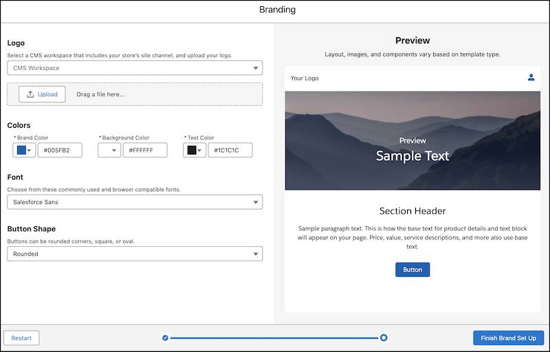
[Alt text: Screenshot of branding wizard where you can adjust settings.]
Commerce collects the colors, fonts, and logo and then designs the store to match your site. The brand elements are populated automatically on the new page. You can also adjust the imported settings.
Design and Launch a Referral Program in No Time
Bring your brand’s referral program plan to life with a few simple clicks. Create a referral program and design promotions that represent the brand’s identity. Marketing managers use a guided flow to style their marketing assets and to decide the promotion’s rewards and target audience. Each promotion contains a set of email templates and a widget that can be tailored to the brand’s requirements.
Where: This change applies to Lightning Experience in Enterprise, Performance, Unlimited, and Developer editions where Referral Marketing is enabled.
Who: To create a referral program and its promotions, you need the Referral Marketing permission set.
How: On the Referral Marketing app, create a referral program. On the Promotions related list, click New. Use the guided flow to create your referral program in four simple, guided steps.
-
Promotion Definition: Define the key attributes of the promotion.
-
Rewards and Audience: Select the promotion’s rewards, limits, and target audience.
-
Emails and Widget: Customize and activate emails and the Refer A Friend widget.
-
Summary: Review the advocates’ and referred friends’ journey in the promotion.

You’ve learned about some of the most important feature releases related to User Experience over the past year. Now it’s time to test your understanding of these topics and complete the exam to maintain your User Experience Designer certification.
Resources
- Salesforce Help: Prepare Your LWR and Aura Sites for Design System Architecture Updates
- Salesforce Help: SLDS Architecture Update FAQs
- Salesforce Help: Confirm Your Components Use Supported Design System Customizations
- Salesforce Help: Customize the Forms and Buttons on Your LWR Site with New Styling Features
- Salesforce Help: See Improved Contrast in Focus States
- Salesforce: Lightning Design System
- Salesforce Help: Be Aware of Base Lightning Component Internal DOM Structure Changes for Future Native Shadow Support
- Salesforce Help: Automatically Style a Store to Match Your Brand
- Salesforce Help: Brand a Commerce Store
- Salesforce Help: Design and Launch a Referral Program in No Time
- Salesforce Help: Design a Referral Promotion Using a Guided Flow