Estimate Probability
Learning Objectives
After completing this unit, you’ll be able to:
- Describe continuous distributions.
- Describe the characteristics of a normal distribution.
Introduction
The Data Distributions module shows that you can use a histogram to graph the distribution of continuous values. Now, let’s look at the concept of continuous distributions.
We won’t discuss the formulas used to complete the calculations mentioned in this unit, but a general familiarity with these concepts may be useful to you as you continue to explore, understand, and communicate with data.
Density Curves
The Data Distributions module explains how histograms can represent the distributions of finite samples of continuous variables. The height of each bar in the histogram is proportional to the frequency of the values within that bin. In other words, the higher the bar, the more frequently the data points from the sample are within that bin.

For example, the histogram above shows the distribution of stature, in inches, for 40 people. Clearly, this is a data sample with a finite number of data points. However, when you consider all the possible values of the continuous variable of stature, you see that it could vary widely. There are not enough hours in our lifetimes to create a histogram with bins of every possible stature value. This is true for any continuous variable.
Instead of using a histogram to represent every possible value for a continuous variable, we can use a continuous distribution. A continuous distribution looks like a smooth curve, also called a density curve. The density curve represents more than just the values in a particular sample. It represents all possible values, as well as their probabilities of occurrence or how likely the values are to occur.
When looking at histograms, we use the height of the bars to understand the number of data points occurring within that bin, or how frequently the data points are within that bin. However when we look at continuous distributions, we can’t interpret the height of a probability curve in that way.
Imagine data that contains every possible value for stature. It’s not meaningful to ask about the likelihood that someone stands at exactly 61 inches. With an infinite number of values, asking about 61 inches is as arbitrary as asking about the likelihood that someone stands at 61.002 inches or at 60.9997 inches.
Instead, we look at the probability within an interval, which equals the area under the curve within that interval.
The total area under the curve is 1, or 100% because there is a 100% probability that all possible values fall somewhere within the curve.

To summarize, here are some concepts to keep in mind when thinking about density curves.
- The total area under the curve is 100% or 1.
- They are continuous distributions that represent all possible data points at once.
- The y-axis represents the density of probability, which shows the chance of obtaining values near corresponding points on the x-axis.
Normal Distribution
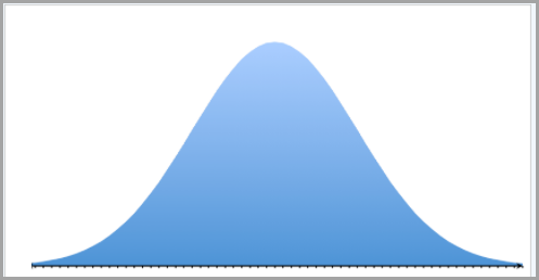
Now let’s focus on a special density curve, the normal distribution or normal curve. It has a symmetrical “bell” shape.
When you looked at the distributions of continuous variables graphed on histograms, you learned to describe a symmetrical distribution. If you folded a symmetrically distributed histogram in half, the two sides would match perfectly. In symmetrical distributions, the mean and the median are equal.
Just as with symmetrical distributions, in a normal distribution the shape is symmetrical, and the mean is also equal to the median.
Here are the major characteristics of a normal distribution.
- They are symmetrical around the mean.
- The mean and median are equal.
- The area under the normal curve is equal to 1.0 (or 100%).
- They are denser in the center and less dense in the tails.
- They are defined by two parameters, the mean and the standard deviation.
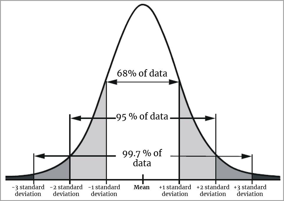
Look at the normal distribution shown on the curve above. In a normal distribution, 68% of the data falls between +1 and -1 standard deviations from the mean, and 95% of the data falls within -2 and +2 standard deviations from the mean. The short “tails” on both sides of the curve indicate that very few values (5%) will fall outside of -2 and +2 standard deviations from the mean.
Normal distributions with smaller standard deviations will have narrower and taller curves than normal distributions with larger standard deviations.
In this image, both normal distributions have a mean of 50. The taller curve has a standard deviation of 5, and the shorter curve has a standard deviation of 10.

The Usefulness of the Normal Distribution
In his book The Truthful Art, information designer and professor Alberto Cairo explains that “No phenomenon in nature follows a perfect normal distribution, but many approximate it enough as to make it one of the main tools of statistics.” Cairo continues, “If you know that the phenomenon you’re studying is normally distributed, even if not perfectly, you can estimate the probability of any case or score with reasonable accuracy.” In other words, the properties of the normal curve can be used to estimate the probability of a case or score with reasonable accuracy.
Population estimates are often derived from a sample because it’s rare that we can measure the entire population. If the sample represents the population, the normal curve is a useful estimation tool.

Confidence Intervals
When using the normal curve to make probability estimations on sample data, you can use confidence intervals to arrive at a margin of error.
Confidence intervals are an example of inference. Inference is the process of drawing conclusions about a population based on a sample of the data.

A confidence interval contains a population mean for a specified proportion of the time. For example, if you would like to have a confidence interval of 95%, that means that 95% of the intervals in your data will include the true mean.
The 95% confidence interval is derived by using the normal distribution where 95% of the data falls within -2 and +2 standard deviations from the mean.
Let’s consider an example adapted from David M. Lane’s chapter on confidence intervals in the online, public domain work, Introduction to Statistics.
Imagine you are interested in the mean (average) weight in pounds of 10-year-old children in the United States. You obviously can’t weigh every 10 year old, so, instead, you weigh a sample of 16 children and find that the mean weight is 90 pounds. This sample mean of 90 is a point estimate of the population mean, but it doesn’t give you a clear idea of how far the mean for the sample may be from the mean for the population. In other words, can you be confident that the mean weight for the entire US population of 10-year-old children is within 5 pounds of 90? You simply cannot know.
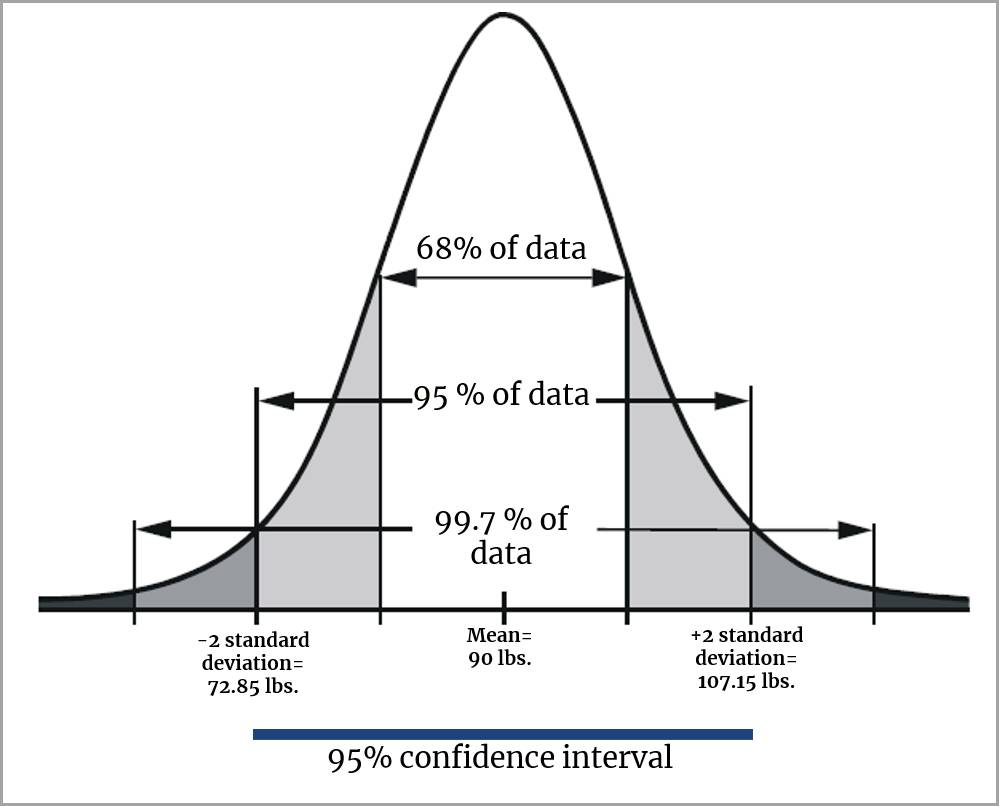
However, you can use a calculation (not discussed here) to arrive at a confidence interval of 95%. A 95% confidence interval would include mean weights between 72.85 and 107.15 pounds.
In other words, there is good reason to believe that the mean weight for the entire US population of 10-year-old children would fall between 72.85 and 107.15 pounds because, after taking repeated samples with the 95% confidence interval calculated for each sample, 95% of the time the intervals would contain the true mean.
This also indicates, however, that 5% of time, the intervals will not contain the true mean.
Real-World Examples in Seeing Uncertainty
Alberto Cairo, mentioned earlier in this unit, has written a number of blog entries describing real-world examples of how uncertainty has been represented (and misunderstood) in visualizations that illustrate hurricane paths. You can access a blog entry about misinterpreting forecasting maps for the 2019 Category 5 storm, Hurricane Dorian, in addition to other related topics in Alberto Cairo’s professional website.
You’re now familiar with continuous distributions, including the special shape of the normal curve. In the next unit, we examine the concept of hypothesis testing when using data samples.
Resources
- Website: Online Statistics Education by David M Lane: An Interactive Multimedia Course of Study, 2020
- Website: Alberto Cairo's professional website