Maintain Your User Experience Designer Certification for Summer ’22
Learning Objectives
After completing this unit, you’ll be able to:
- Display both the hamburger menu and the back button in the iOS Mobile Publisher App.
- Help users succeed with targeted prompts.
- Discover resources for admins in the Guidance Center for Admins.
- Use matrix questions to increase survey completion rates.
- Include your logo on surveys.
- Add section headers to flow screens.
- Work smoothly with usability enhancements in Experience Builder.
Salesforce Certification
If you hold the Salesforce User Experience Designer credential, keep in mind that you need to complete this module by the due date to maintain your certification. Another important part of maintaining your credential is ensuring your Trailhead and Webassessor accounts are linked.
Interested in learning more about getting certified? Check out the Salesforce Certified User Experience Designer credential.

Protect the Integrity of Your Certification
The quality of our certification exams and the value our credentials provide are our highest priority. Protecting the security and confidentiality of our exams is essential to providing our customers with credentials that are respected and industry-leading.
As a participant of the Salesforce Certification Program, you’re required to accept the terms of the Salesforce Credential and Certification Program Agreement. Please review the Salesforce certification exam-taking policies in the Salesforce Credential and Certification Program Agreement and Code of Conduct Trailhead Help article for more details.
Salesforce introduced a ton of great feature enhancements over the past year. Let’s take a look at some of the more important ones for this release.
Display Both the Hamburger Menu and the Back Button in the iOS Mobile Publisher App
Make the Mobile Publisher App navigation easier to use for iOS users by including both the hamburger menu and the back button in your site header. The back button is an iOS-specific feature. (Android apps have their own standard back button, provided by the Android operating system.)
By default, the iOS back button replaces the hamburger menu on all pages except the home page. But you can configure your iOS app to show both the hamburger menu and the back button on all pages.
How: In Experience Builder, go to Settings | Mobile Publisher | Configuration. To show both the hamburger menu and the back button for iOS apps, select Show hamburger menu when back button is displayed.
Where: This change applies to iOS Mobile Publisher Apps in Enterprise, Performance, Unlimited, and Developer editions.
Add Value for Users Through User Engagement
Help More Users Succeed with Targeted Prompts
More lower-level elements are now targetable using targeted prompts for In-App Guidance. You can target elements such as Einstein Search, Help, and Trailhead in the global header. Or, target action buttons in the Actions Ribbon on list views and record pages.
Where: This change applies to Lightning Experience in Essentials, Professional, Enterprise, Unlimited, and Developer editions.
How: To target a lower-level element, go to the In-App Guidance page in Setup, select the desired targeted prompt and choose the element you want.
Discover More Resources for the Guidance Center for Admins
Find the very latest Trailhead badges, videos, and other resources for Trailblazer Community, Account Engagement Lightning, success plans, Manufacturing Cloud, and more. Learn how to sync your progress with guidance sets.
Where: This change applies to Lightning Experience in Professional, Enterprise, Performance, Unlimited, and Developer editions. You can see applicable guidance sets only for the installed apps.
How: Access the Guidance Center for Admins by clicking the icon for Learning Paths in the global header. Although the learning panel is available to all users, only admins see a link to the Guidance Center for Admins. When you first click the Guidance Center inside the panel, you see a list of available resource sets with descriptions.
Why: To streamline and offer the latest information and guidance, new guidance sets were added and removed.
Here are some examples of guidance sets.
Connect with Trailblazer Communities: Communities are a powerful tool for you to connect and learn from your peers. Explore these recommendations to start engaging with fellow admins.
Get to Know Your Success Plan: Check out resources just for upgraded support experience subscribers.
Get Started with Admissions Connect: Get to know Admissions Connect with all of the resources that you need to make the most of your admissions process.
Get Started with Case Management: Case Management gives you a single view of your clients, services, and programs. Have all of the resources that you need to start your implementation and roll it out to your team.
Get Started with Manufacturing Cloud: Review suggested learning resources for setting up sales agreements and forecasts, rebate management, and more.
Get Started with Nonprofit Success Pack: Set up the Nonprofit Success Pack (NPSP) and solve for common nonprofit needs.
Solve Business Challenges with AppExchange: The AppExchange is a powerful resource for finding the right solution for your business needs. To get started, explore these free customer-favorite apps from Salesforce Labs.
Upgrade to Account Engagement Lightning: With Account Engagement's Lightning app, your sales and marketing teams can operate side by side on one platform. Check out these recommendations for a quick and easy upgrade.
Check out the complete list of guidance sets at Discover More Resources for the Guidance Center for Admins.
Enhance Participation with Salesforce Feedback Management
Increase Survey Completion Rates with Matrix Questions
Boost your survey completion rates by using matrix questions that allow participants to respond to multiple questions with the same set of choices. Create shorter surveys by grouping related questions and including one or more selection questions in a single matrix question. Participants can easily evaluate the common set of choices in a matrix question and complete surveys faster.
Where: This change applies to Lightning Experience and Salesforce Classic in Partner Developer, Enterprise, Performance, Unlimited, and Developer editions.
Who: The Matrix question type is available with Salesforce Feedback Management Starter and Growth licenses.
How: In the Survey Builder, click Add Question, and then select Matrix.

Increase Brand Awareness by Including Your Logo on Surveys
Add your company’s logo to surveys to demonstrate your brand identity. Including your logo promotes brand loyalty, increases survey responses, and improves completion rates.
Where: This change applies to Lightning Experience and Salesforce Classic in Partner Developer, Enterprise, Performance, Unlimited, and Developer editions.
Who: To add a logo in a survey, users need the Salesforce Feedback Management Starter or Growth license.
How: In the Survey Builder, select the Branding tab, and scroll down to the Logo section.

To upload a file with the logo, click Upload Logo (1). You can specify the alignment (2), background color (3), and background color opacity (4) of the logo.
Add Section Headers to Flow Screens
Use section headers to create a visual hierarchy to guide your users to the most important items on a screen. Sections with headers are collapsible and always open by default to make screen flow completion more efficient.
Where: This change applies to Lightning Experience and Salesforce Classic in Essentials, Professional, Enterprise, Performance, Unlimited, and Developer editions.
How: In a Screen element, add a Section component.

Select Include Header (1) and enter the header label (2).
Section headers guide the user and aid screen flow completion.
Work Smoothly with Usability Enhancements in Experience Builder
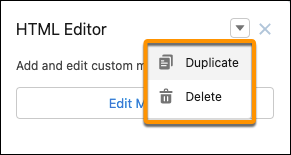
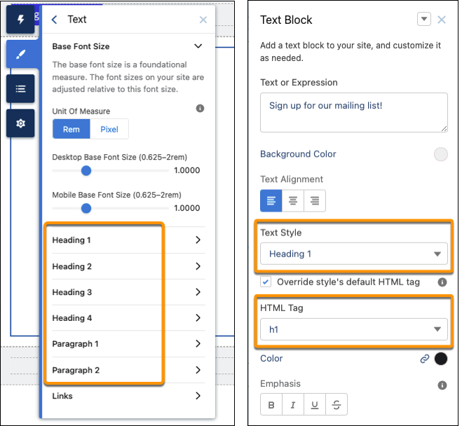
Experience Builder users now benefit from improved clarity and efficiency in the builder’s user interface. For Lightning Web Runtime (LWR) sites, a new dropdown menu in component property panels simplifies duplicating components. Revised labels clarify text styles in relation to HTML tags in LWR sites. And for improved readability, Experience Builder now uses the native sans serif font on your operating system.
Where: This change applies to Aura and LWR sites accessed through Lightning Experience and Salesforce Classic in Enterprise, Performance, Unlimited, and Developer editions.
- New dropdown menu and changes to text style labels appear in Experience Builder for LWR sites.
- Font enhancements appear in Experience Builder for Aura and LWR sites.
How: Component property panels in LWR sites feature a dropdown menu. Duplicate or delete the component with one easy click, just like in Aura sites.
In LWR sites, updated text style labels in the Theme panel more precisely indicate the relationship between each text element and its default HTML tag. For example, Extra Large Heading is now Heading 1, associated with the default HTML tag h1.
These label updates also appear in the property panel for the Text Block component. If you want to change the HTML tag for a particular text element, the revised labels present a preview of how the change translates visually on screen.
For users who work on Aura or LWR sites, Experience Builder has additional enhancements.
With both Aura and LWR sites, Experience Builder now uses the operating system’s default sans-serif font, just like Lightning Experience does. The default font for each operating system is designed for optimal legibility, making it easier and more comfortable for most users to read than the Salesforce Sans font.
Some styles in the Experience Builder user interface were also refreshed for improved legibility. For example, tab titles that were in all capital letters are now mixed case.

Resources
- Salesforce Help: Display Both the Hamburger Menu and the Back Button in the iOS Mobile Publisher App
- Salesforce Help: Configure App Navigation
- Salesforce Help: User Engagement
- Salesforce Help: Help More Users Succeed with Targeted Prompts
- Salesforce Help: Salesforce In-App Content in Lightning Experience
- Salesforce Help: Discover More Resources for the Guidance Center for Admins
- Salesforce Help: Salesforce Feedback Management
- Salesforce Help: Increase Survey Completion Rates with Matrix Questions
- Salesforce Help: Increase Brand Awareness by Including Your Logo on Surveys
- Salesforce Help: Add Section Headers to Flow Screens
- Salesforce Help: Work Smoothly with Usability Enhancements in Experience Builder
- Salesforce Help: Aura and LWR sites