Improve the Look and Feel of Your Screens
Learning Objectives
After completing this unit, you’ll be able to:
- Define a flow screen’s footer buttons.
- Divide a flow screen into multiple sections and columns.
- Configure a screen component to show only in certain conditions.
- Configure a screen component to accept only valid input.

In this module, you built a flow that asks support agents a lot of questions and then creates a case. It’s good, but we can improve it. We can make it better, stronger, faster… Or, at the very least, we can make it tidier, easier to use, and mindful of your data requirements. Let’s unlock your screens’ full flowtential!
Set a Screen’s Footer Buttons
Pyroclastic’s support agents are having some trouble when they run the Create Case for Contact flow. When they click Finish on the last screen, the flow unexpectedly restarts from the beginning, and they don’t know what to do. Sometimes they generate two new cases instead of one. After some troubleshooting and investigation, Flo discovers that the problem occurs when an agent clicks the Previous button on the final screen. Take a look at the flow again.
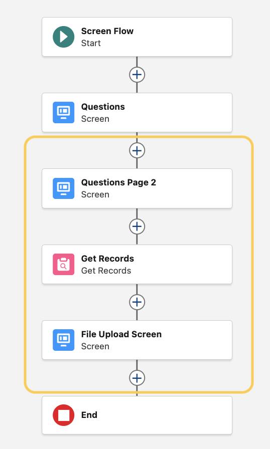
If a user clicks the Previous button, they return to the previous screen: Questions Page 2. When the user clicks Next to proceed, the flow runs the Create Case element a second time (which we don’t want)!
It’s best practice to make your flows as transparent and foolproof as possible. Remove unneeded buttons and give each button a label that describes what happens when a user clicks the button.
Let’s customize the buttons on the Questions Page 2 and File Upload screens, and hide that potentially hazardous Previous button on the File Upload screen.
- Open the Create Case for Contact flow.
- In the Questions Page 2 element, make sure no components are selected in the screen canvas.
- In the Screen Properties sidebar, click Configure Footer.
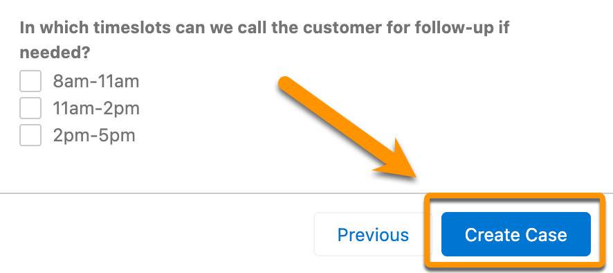
- For Next or Finish Button, select Use a custom label.
- For Next or Finish Button Label, enter
Create Case.
- Click Done.
- In the File Upload Screen element, make sure no components are selected in the screen canvas.
- In the Screen Properties sidebar, click Configure Footer.
- For Next or Finish Button, select Use a custom label.
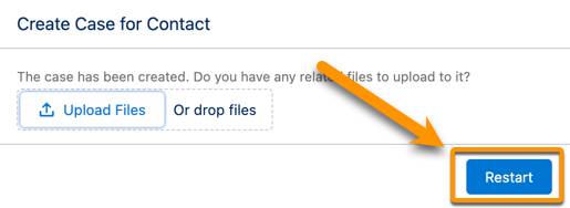
- For Next or Finish Button Label, enter
Restart.
- For Previous Button, select Hide Previous.
- Click Done and save the flow.
Now when the flow runs the Questions Page 2 screen, the Next button tells the user exactly what happens when they click it: the flow creates a case.
When the flow runs the File Upload screen, the Finish button has the clearer label Restart, and the Previous button is hidden.
Organize Components into Rows and Columns
Flo embedded the Create Case for Contact flow in the wider column of a contact Lightning page. Now the flow screen has a lot of unused white space. Plus, the second screen has quite a few questions, which take up a lot of vertical space. How can we use the screen space more efficiently?
The Section component splits a flow screen into multiple columns, allowing you to position components side by side and make use of that horizontal white space. In the Section component, you define the number of columns and the relative width of each column.
Add Section components to your screens to use that extra space.
Update the Questions Screen
- Open the Questions element.
- Drag Section from the Components sidebar to the top of the screen canvas.
- In the Section sidebar, click +Add Column.
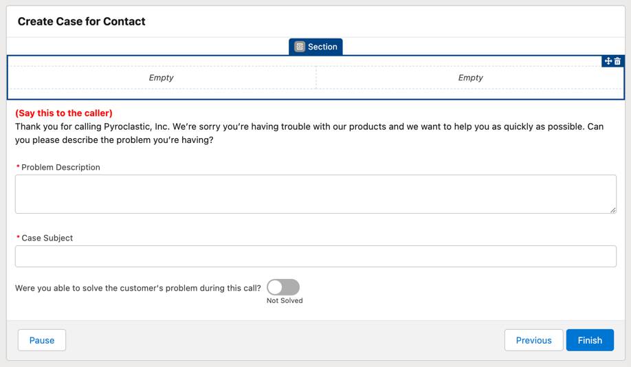
- Drag the SayThisText Display Text component to the first Empty column.
Green highlighting shows which section is active as you move over the canvas. Drop the component into the first column when it’s highlighted.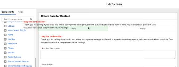
- Drag the Problem Description Long Text Area component to the first column, below SayThisText.
- Drag the Case Subject Text component to the second column.
- Drag the CloseCase Toggle component to the second column, below Case Subject.
Your screen canvas should look like this.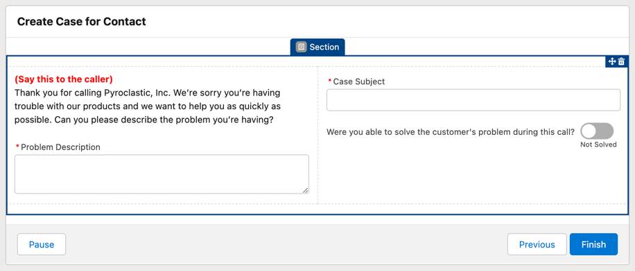
- Click Done.
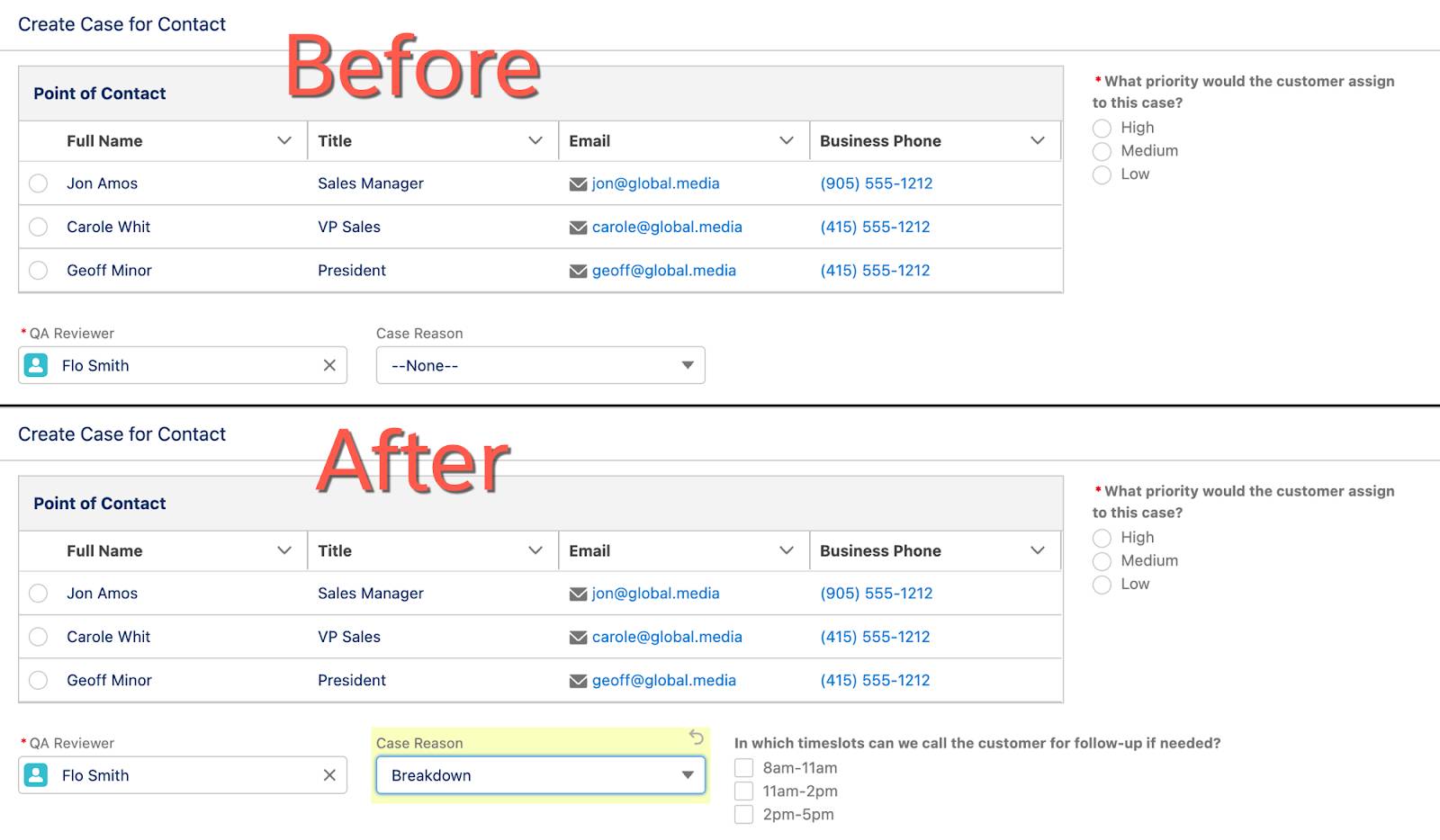
Update the Questions Page 2 Screen
- Open the Questions Page 2 element.
- Drag Section from the Components sidebar to the top of the screen canvas.
- In the Section sidebar, click +Add Column.
- Set Column 1 Width to 9 of 12.
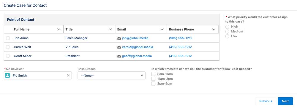
- Drag the Point of Contact Data Table component to the first column.
- Drag the What priority would the customer assign to this case Radio Buttons component to the second column.
- Drag another Section from the Components sidebar to the screen canvas, below the first Section component.
- In the Section sidebar, click +Add Column twice.
The second section has three columns now.
- Change the column widths to:
- Column 1 Width: 3 of 12
- Column 2 Width: 3 of 12
- Column 3 Width: 6 of 12 (Half Width)
- Drag the QA Reviewer Lookup component to the second section’s first column.
- Drag the Case Reason Record Field component to the second section’s second column.
- Drag the In which timeslots can we call the customer for follow-up if needed Checkbox Group component to the second section’s third column.
Your screen canvas should look like this.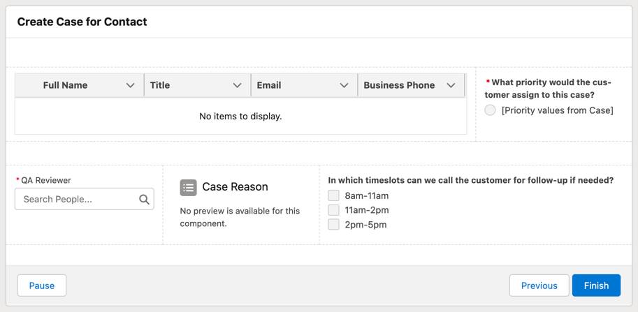
- Click Done and save the flow.
To see your newly arranged screens in action, save the flow and click Run. This screen is so aesthetically pleasing, you should call yourself Michelangeflow!
Control When Components Appear
Like Lightning page components, flow screen components support conditional visibility. When you add conditional visibility to a component, the flow displays the component only when the conditions you specify are present. These conditions can reference anything in the flow, including other components on the same screen.
Pyroclastic’s support agents don’t need to see follow-up time slots unless they select a Reason that’s likely to require follow-up. So let’s simplify the flow with a little conditional visibility.
- Open the Questions Page 2 element and select the CallbackTimes checkbox group component.
- Click Set Component Visibility.
- For When to Display Component, select All Conditions Are Met (AND).
- For Resource, select caseVar > Reason.
- For Operator, select Equals.
- For Value, enter
Equipment Complexity,Performance,Breakdown,Equipment Design,Other.
These values are all of the options for this picklist except Installation and Feedback. When you enter all the desired options separated by commas, Salesforce treats each value as a valid option. Alternatively, you can set When to Display Component to Any Condition is Met (OR) and add each viable option as a separate condition.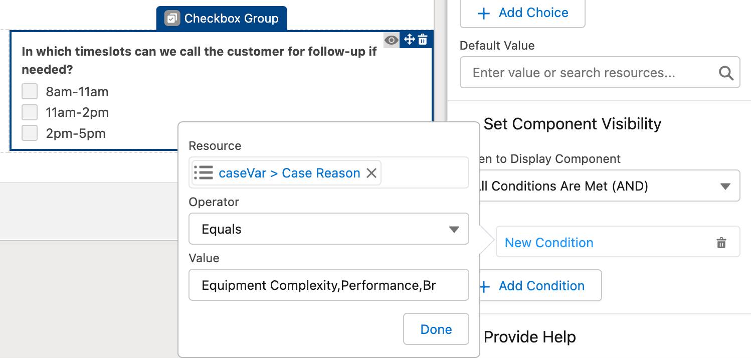
- Click Done in the popup.
- Click Done to close the screen element.
- Save the flow.
Now, when the Case Reason is set to a value other than Installation or Feedback, the CallbackTimes component appears. Change the Case Reason to Installation or Feedback, and the question disappears. Click the Run button, make your way to the second screen, and try it for yourself!
Improve Data Quality in Components
Pyroclastic’s support managers have one last request for the Create Case for Contact flow. Some case descriptions are too brief and don’t have enough information about the call. Flo asks you to implement a minimum character requirement on the description field.
Fortunately, you can add validation to screen components. It’s like adding a validation rule to each component. However, there’s one major difference.
- A validation rule fires when its formula returns TRUE.
- A screen component validation fires when its formula returns FALSE.
Let’s add a 20-character minimum to the Problem Description component.
- Open the Questions element and select the Problem Description component.
- In the properties pane, click Validate Input.
- For Error Message, enter
Please add more detail. - For Formula, enter
LEN({!ScreenDescription}) >= 20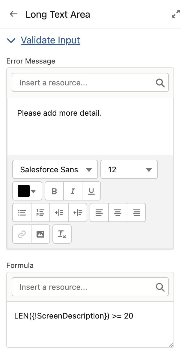
- Click Done and save the flow.
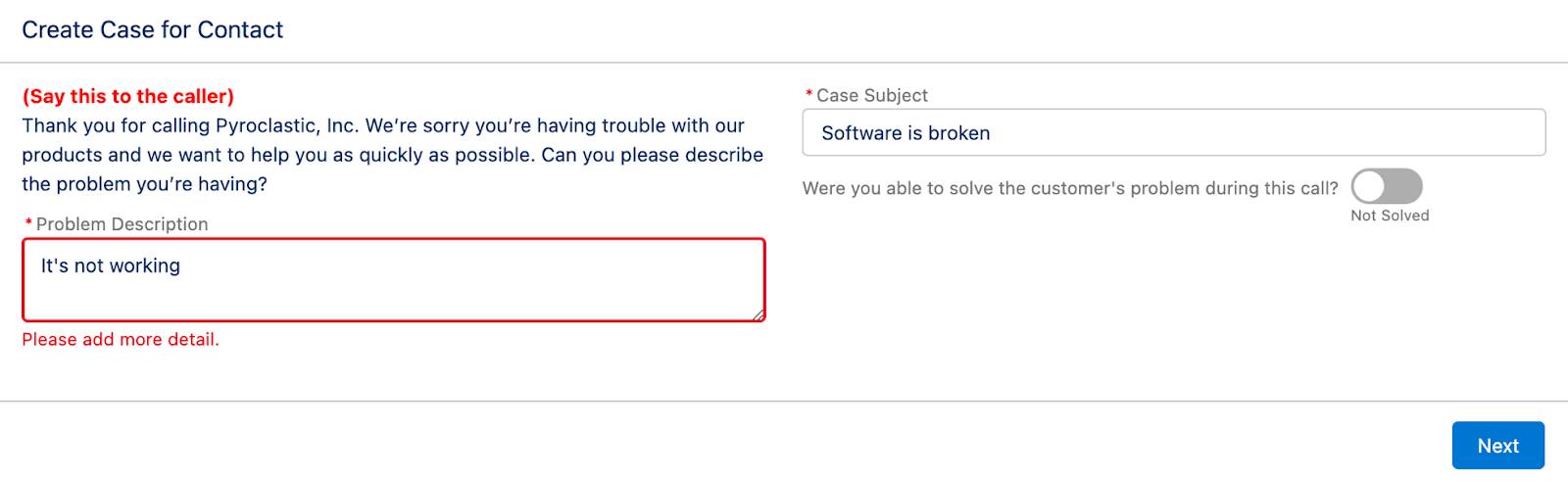
Now when a user enters a description with fewer than 20 characters, the flow displays the error message and prevents the user from proceeding until they add more text. Sure, it won’t ensure that they add relevant details, but it’s gentle encouragement that’s hard to ignore.
In this badge, you learned how to create a screen flow. Next, check out the Screen Flow Distribution badge to learn how to embed screen flows where your users need them.
Resources
- Salesforce Help: Flow Screen Output Component: Section
- Salesforce Help: Flow Conditional Visibility Considerations
- Salesforce Help: Validate User Input on Flow Screens