Question the Data
Learning Objectives
After completing this unit, you’ll be able to:
- Investigate the source of data and charts.
- Evaluate the trustworthiness of data and analyses.

Get to Know the Source
“Distrust any publication that doesn’t clearly mention or link to the sources of the stories they publish.” –Alberto Cairo, data visualization expert and author of How Charts Lie
Some of the images listed in this unit were used with permission from Alberto Cairo and taken from his book How Charts Lie: Getting Smarter about Visual Information.
From business reports to social media posts, it’s important to identify and evaluate the source of the data and charts that you encounter. Knowing the source is the first (and most important!) step in determining if a chart is misleading. Investigate the source by asking questions to get to the heart of who, what, where, when, and why the chart was created.
Topic to Investigate |
Purpose |
Questions to Ask |
|---|---|---|
Who |
To verify the source of the data and whether there are vested interests in producing the information or presenting it in a certain way. |
|
What |
To understand the type of data collected and how it was measured so you can verify the accuracy of the data presented. |
|
Where |
To evaluate the data collection methods used and further assess the source’s credibility and context. |
|
When |
To determine the relevancy of the data used based on when it was collected. |
|
Why |
To uncover any potential financial, political, scientific, philanthropic, or other motivations that might influence the objectivity of the data presented. |
|
To help you question the data, be sure to study the metadata, which is the data about the data. Read any accompanying documentation to gather useful insights from the metadata, such as when, how, and why the data was collected.
Review the Numbers
Are you familiar with the saying, “garbage in, garbage out”? The concept behind this common phrase is that the quality of any output is determined by the quality of the input. This idea applies to a wide variety of things, including data consumption. When you look at visualizations like charts that are based on inaccurate data (garbage in), you’re at risk of forming inaccurate conclusions and taking ineffective actions (garbage out). To help determine the quality and accuracy of the data presented in visualizations, review as much of the underlying numbers that you can.
Check the Summary Values
Charts are often accompanied by summary values that describe and summarize the underlying data. Summary values, also known as summary statistics, communicate high-level information about the data, often revealing meaningful insights worth consideration and further investigation. The table below will help you become familiar with common summary values.
Summary Value |
Description |
|---|---|
Sum |
Total of the values |
Count |
The number of values |
Mean |
Average of the numbers, calculated by dividing the total of the numbers (sum) by the number of values in the data set (count) |
Median |
The middle value in a data set in which the values have been placed in order of magnitude (smallest to largest) |
Mode |
The most frequent value |
Range |
The difference between the min and max |
Min |
The smallest value |
Max |
The largest value |
Check Rates and Percentages
Rates and percentages measure a relationship between values. For example, you may observe three out of every five attendees of a presentation sign up for a newsletter. You say ⅗ or 0.60 or 60% of attendees signed up for the newsletter. As you see in the next section, knowing the rate or percentage will often help you make better comparisons.
For example, an article headline said, “2,139 DACA recipients convicted or accused of crimes.” This could seem like a large number without context. However, if you view the rate or percentage, you see a new view. The same article shared that there are more than 800,000 DACA recipients. If you consider the rate or percentage, you get 2,139/800,000 or 0.003 or 0.3%! The percentage is a more informative value, and is not a large percentage of total recipients.
Watch for Insufficient Data
“No chart can ever capture reality in all its richness. However, a chart can be made worse or better depending on its ability to strike a balance between oversimplifying that reality and obscuring it with too much detail.” –Alberto Cairo, How Charts Lie
When reading charts, ask yourself whether sufficient data is included to provide a meaningful and accurate version of the story. In his book How Charts Lie, Albert Cairo explains how insufficient data can lead to drawing incorrect conclusions. To prove this point, Cairo refers to an article that said that the 2017 Tax Cuts and Jobs Act (TCJA) promised that the typical family of four would save $1,182 annually and he explains how that number wasn’t representing the whole story. To show a more complete story, Cairo described a histogram, a distribution of quantitative data that shows the data grouped into ranges.
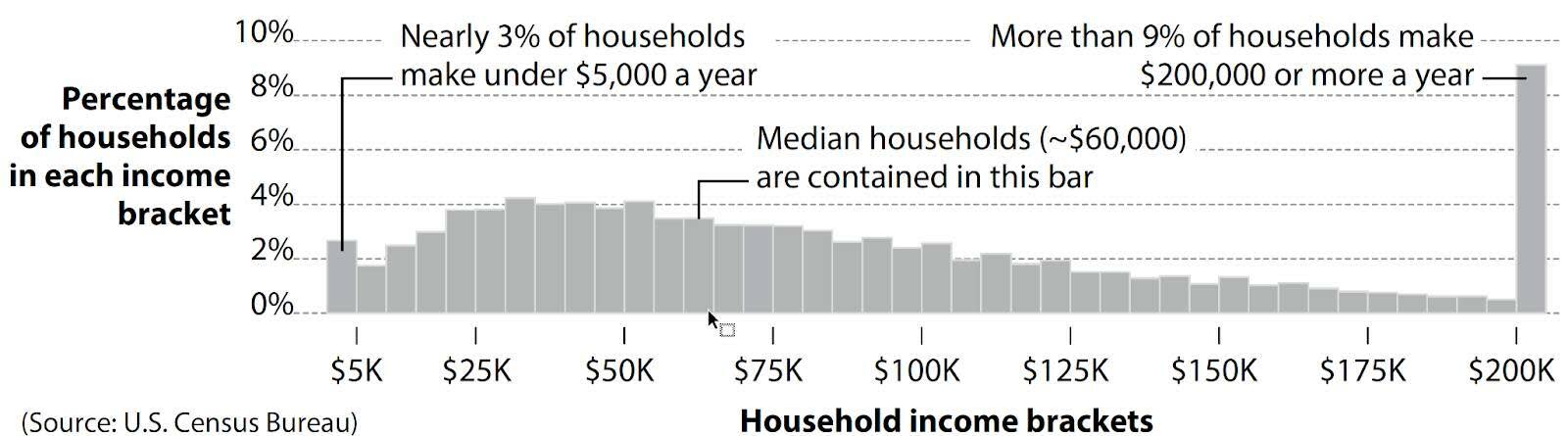
Let’s dig into why this number is an oversimplification by looking at the histogram. As you look at the data in the histogram, notice that there's a significant range of salaries represented. Due to this wide range, it'd be very challenging to determine a "typical" salary. There’s clearly a significant range of salaries in the US. While 3% of households made less than $5,000 per year, more than 9% earned more than $200,000. Discussing the average savings from TCJA is almost meaningless when it’s nearly impossible to compute an accurate “typical salary” in the first place.
In the next unit, learn the importance of using evenly sized intervals on axes.
Resources
- Trailhead: Data Literacy Basics
- Trailhead: Aggregation and Granularity
- Trailhead: Data Distributions
- Book: Alberto Cairo (2020): How Charts Lie: Getting Smarter About Visual Information, W.W. Norton & Company
- Book: Edward Tufte (2006): Beautiful Evidence. Graphics Press
- Tableau Site: Understanding and Using Histograms
- Book: Steve Few (2012) Show Me the Numbers, Analytics Press