Understand SLDS Best Practices
Learning Objectives
After completing this unit, you’ll be able to:
- List the three SLDS best practices.
- Explain how to troubleshoot problems with your code.
Three SLDS Best Practices
Now that you have a conceptual understanding of how SLDS works, you’re ready to start developing with Lightning. To help you get started, let’s go through three actionable best practices that you can use right now when working with SLDS.
#1: Customize Instead of Overriding
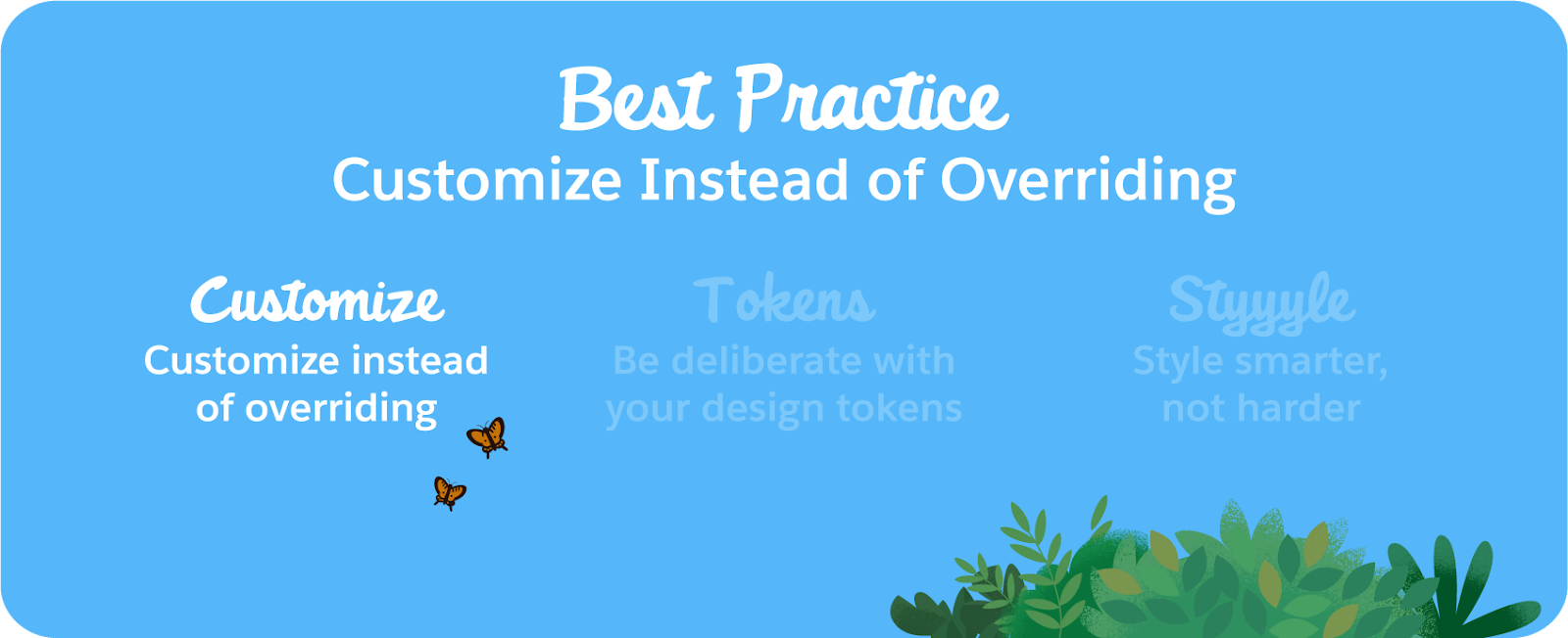
There will be times when you need to change certain aspects of SLDS , like colors, layouts, and spacing. When you do, be careful to not write custom CSS that cancels out SLDS styles. In other words, avoid adding one-off solutions that override the system instead of working with it.
NOTE: If you are writing custom CSS that cancels out the styling of the Lightning Design System, you are overriding instead of customizing.
Here’s an example of the wrong way and the right way to change the padding of an SLDS component. (Note: The technical details of this section cover Aura and platform-specific features that are different from Styling Hooks and LWC. The best practices, however, can be applied to both.)
.slds-foo-class { padding: 16px; }
.my-class .slds-foo-class { padding: 16px; }
.THIS .slds-foo-class { padding: 16px; }
.my-custom-class { padding: 16px; }
In the first line of code in each of these examples, we’ve overridden the padding of the SLDS component with our unique, one-off value of 16px. In the first three lines, we've explicitly overridden the SLDS class itself. In the last line, we've used our own custom class added to the component to change the value, instead of overriding the SLDS class.
You should do your best to leave the design system in a clean, pristine state. If you have no choice but to write custom CSS, abstract your styles out into a new selector.
That means less work for you, fewer one-offs, and smaller tech debt. Win — win — win!
#2: Be Deliberate with Design Tokens


When you use a design token, make sure the token fulfills the needs of that component’s property and scope. Pay attention to the token's scope to ensure you're not using another component’s token.
How about an example to illustrate what we’re talking about?
Imagine you have a component. It’s a card, and it needs to have a margin.
Because you’re awesome and have been embracing the design system, you know you’ll be using a design token, not a hard-coded value. Looking through all the design tokens available in your system, you find a token with the value you want: 1.5rem. You plug the token into your component, pat yourself on the back, and go on with your day:
.my-card {
 margin: var(--lwc-buttonSpacing);
}
But wait, something’s off. This token usage is actually incorrect.
The token used in this code snippet is called ‘button-spacing’. The prefix ‘button’ indicates that this token is scoped to buttons, but your component is a card. Which means you’re using a token that was exclusive to another component. If we don’t correct this, we’ll get unexpected regressions when the token’s value changes.
The following snippet shows a better way: Use a token with both the scope and value you need.
.my-card {
 margin: var(--lwc-spacingMedium);
}
This snippet leverages a primitive spacing token called spacing medium, which is not scoped to another component and has the value we need (again, 1.5rem).
That’s the gist of it: Be deliberate when you use tokens! The SLDS documentation goes into much more detail regarding token usage.
#3: Style Smarter, Not Harder

And our third and final best practice: Style smarter, not harder.
This is probably the one that most developers bang their head against. CSS is hard enough. Add the extra complexity of trying to write styles within a large, evolving system and issues are bound to arise. But if you adhere to a few core styling tips, you’ll soon be ahead of the curve and writing resilient, system-ready CSS.
Practice Good Hygiene
First up is practicing good CSS hygiene. A few rules of thumb (learn more at MDN!):
- Don’t use type selectors with classes, for example, h1.className { rules }. They raise your CSS specificity and create a dependency on your markup that’s likely to cause issues in the future.
- Avoid long, nested selectors. This is a major red flag that your CSS has specificity issues, and they’re only going to get worse unless you address them.
- Avoid the universal selector, for example, * { rules }. Its range is too broad, which makes it too unpredictable; you’re setting yourself up for styling conflicts.
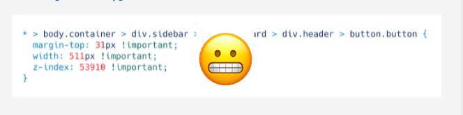
- Don’t use !important declaration as a hammer. Very rare exceptions notwithstanding, this is another red flag; if you’re using the !important declaration as a last resort, you need to diagnose why.
In other words, don’t write CSS like this! This is like the final boss of bad CSS.
Troubleshooting
Before we let you go, a word about what to do when things don’t work. Okay, not just one word, but a handy-dandy mini troubleshooting guide’s worth of words. If something’s amiss in your interface, you can use your browser’s built-in inspector to comb through the code.
Here’s what to do.
When you see an unexpected UI discrepancy, use the Inspector to evaluate.
- Look for SLDS classes (all SLDS classes start with the SLDS prefix. That is: .slds-foo).
- Check for CSS overrides. (This is any class without the SLDS prefix or one where a developer has overridden the prefix with .their-class .slds-button { new value }).
- If there are overrides, turn them off one by one to see if the UI of the component changes. This may solve your problem, If so, ask your team to remove the overrides.
- If you don’t find the problem is with SLDS (the developers built something bespoke), be sure they’re using the right tokens. You can look on the SLDS token page, inspect the values on the SLDS blueprint and see if it matches their value.
And finally, if you still have issues after going through those steps, don’t fret! Non-Salesforce employee designers can connect with the Salesforce Design Systems team in a few different ways (see the Resources section below for link):
- GitHub is a great place to add any “issues” you encounter with the code base itself.
- The Salesforce UX social-media account is the place to provide feedback on anything SLDS-related.
- And perhaps the best resource is the Design Trailblazers Community. Here’s where you can post questions, connect directly with fellow Salesforce designers, and keep up with the latest out of the Salesforce Design community.
Resources
- Developer Guide: Lightning Design System Code Issues Revealed by the SLDS Validator
- Developer Guide: Salesforce Lightning Inspector Chrome Extension
- Trailblazer Community Groups: Design Trailblazers Community
- External Site: MDN Web Docs: CSS Selectors
- Github: Salesforce UX
- External Site: Salesforce UX on Social Media