Use Histograms to Show Distributions of Continuous Variables
Learning Objectives
After completing this unit, you’ll be able to:
- Identify shapes of distributions for continuous variables.
- Describe how to use histograms to represent distribution of data.
In the previous unit, you looked at distributions for a discrete variable (the color of candy). You learned that discrete variables have values that are separate and distinct, whereas continuous variables have values that form an unbroken whole. In this unit, you explore distributions of continuous variables and how to use histograms to represent them.
The following example is adapted from the chapter on distributions in Online Statistics Education: A Multimedia Course of Study. Project Leader: David M. Lane, Rice University.
In a series of 20 trials, one of the authors recorded his response times in moving a cursor over a target. The variable “response time” is continuous, and, when time was measured in milliseconds, no two response times were the same.
The chart shows these response times, in milliseconds.
Trial |
Response times, in milliseconds |
Trial |
Response times, in milliseconds |
|---|---|---|---|
1. |
568 |
11. |
720 |
2. |
577 |
12. |
728 |
3. |
581 |
13. |
729 |
4. |
640 |
14. |
777 |
5. |
641 |
15. |
808 |
6. |
645 |
16. |
824 |
7. |
657 |
17. |
825 |
8. |
673 |
18. |
865 |
9. |
696 |
19. |
875 |
10. |
703 |
20. |
1007 |
Grouped Frequency Distributions of Response Times
Think back to what you learned about frequency distributions in the previous unit. If you represented the response time values in the table above in a frequency distribution, there would be 20 different values, each with a frequency of 1. Not very informative.
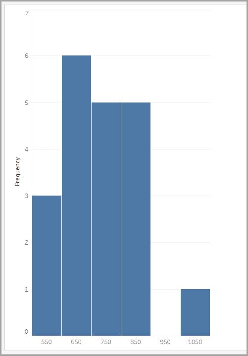
To solve this problem, you can create a grouped frequency distribution in which you tabulate response times falling within various equal-sized bins (ranges of values), as shown in the table.
Bin (in milliseconds) |
Frequency |
|---|---|
500–600 |
3 |
600–700 |
6 |
700–800 |
5 |
800–900 |
5 |
900–1000 |
0 |
1000–1100 |
1 |
You can show grouped frequency distributions graphically using a histogram. The labels on the x-axis are the middle values of the bin they represent.
We look at histograms in more detail a little later. First, let’s explore the different distribution shapes and what they can tell you about a histogram’s data.
Shapes of Distributions
Distributions come in different shapes. Distributions can be symmetrical, with the values evenly distributed around the center. Alternatively, they can have a positive skew with more values trailing to the right, or a negative skew with more values trailing to the left.
Imagine that you’ve measured the heights of people from three different groups, and you’ve created a histogram for each group to show the height distribution of people within that group.
The bin size is 2.95 inches, so people's heights are binned as 59–61.95 inches, 62–64.95 inches, and so on. (Tableau Desktop automatically created the bin size for us.)
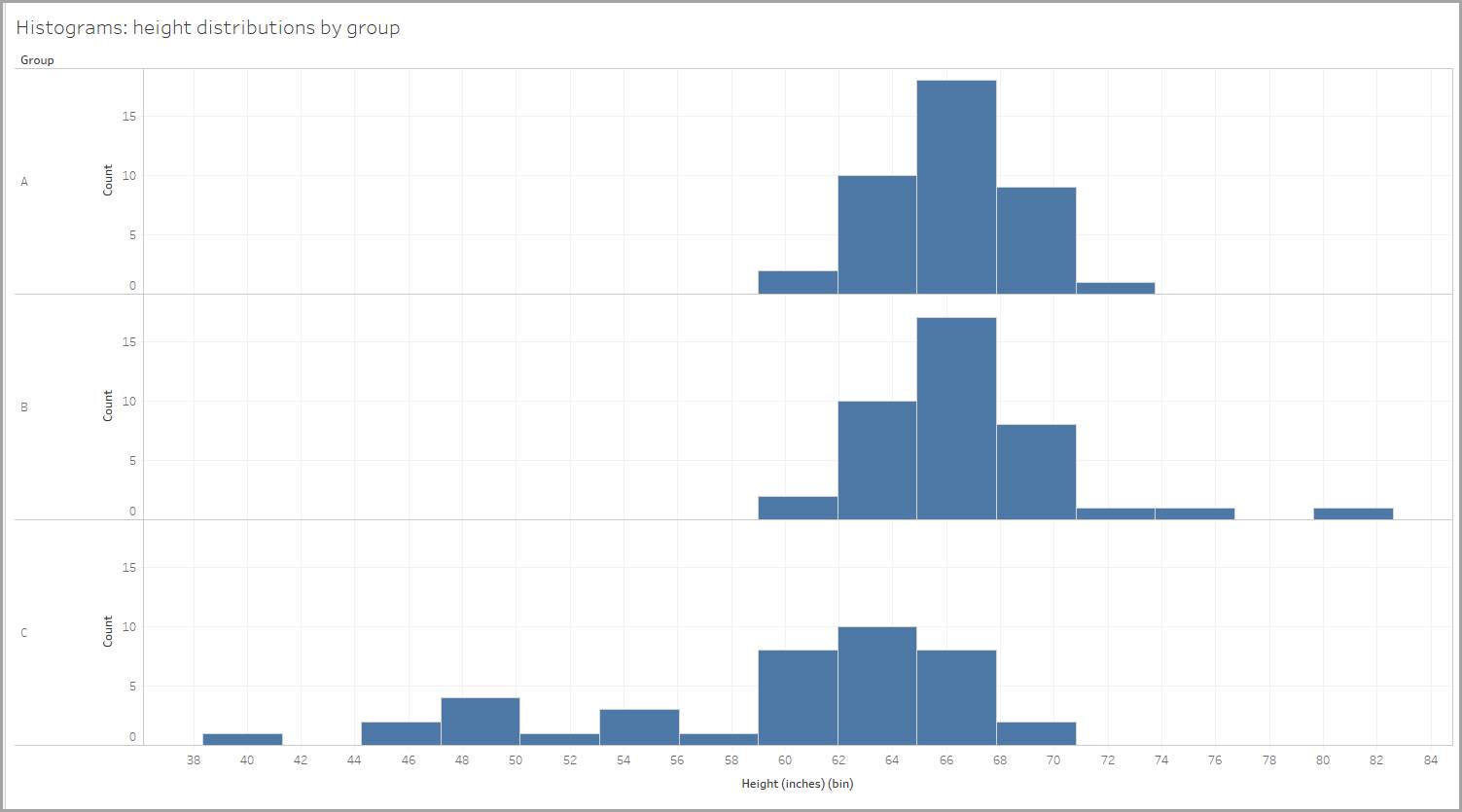
Let’s explore the shape of each distribution. In each of the distributions shown below, notice that the values of mean (average) and median (the middle value of the data points) determine the shape.
Symmetrical Distributions
In our example, the height distribution for one of the groups is nearly symmetrical. If you folded it in half, the two sides would come close to matching perfectly.
In a fully symmetrical distribution, the center of the data is both the mean (or average) and the median (the middle value of the data points) because these values are equal. The center of the data is represented by both values, and the spread of the data extends the same amount on either side of the center.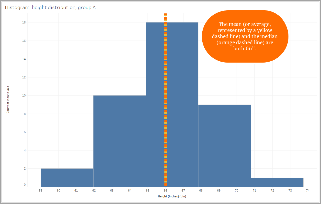
Positive Skew Distributions
Some distributions are not symmetrical. If the data in a distribution spreads out farther in the positive direction than in the negative direction, it’s a distribution with a positive skew. A positive skew is also called a right skew because the data stretches to the right. The right “tail” is longer. When a distribution is skewed positively, the median is less than the mean (or average).
For example, imagine a city whose residents include several billionaires. Those billionaires’ high incomes would skew the mean (or average) income for the city. The average income would look higher than is accurate. To truly reflect the economic health of all the city's residents, the median income would be the better choice.
Similarly, when looking at our height data, one group shows a positive skew due to the presence of three individuals who measured close to or taller than 72" (6 feet). Their tall heights make the mean higher. Using the median to get a picture of the group's height would be a better choice here as well.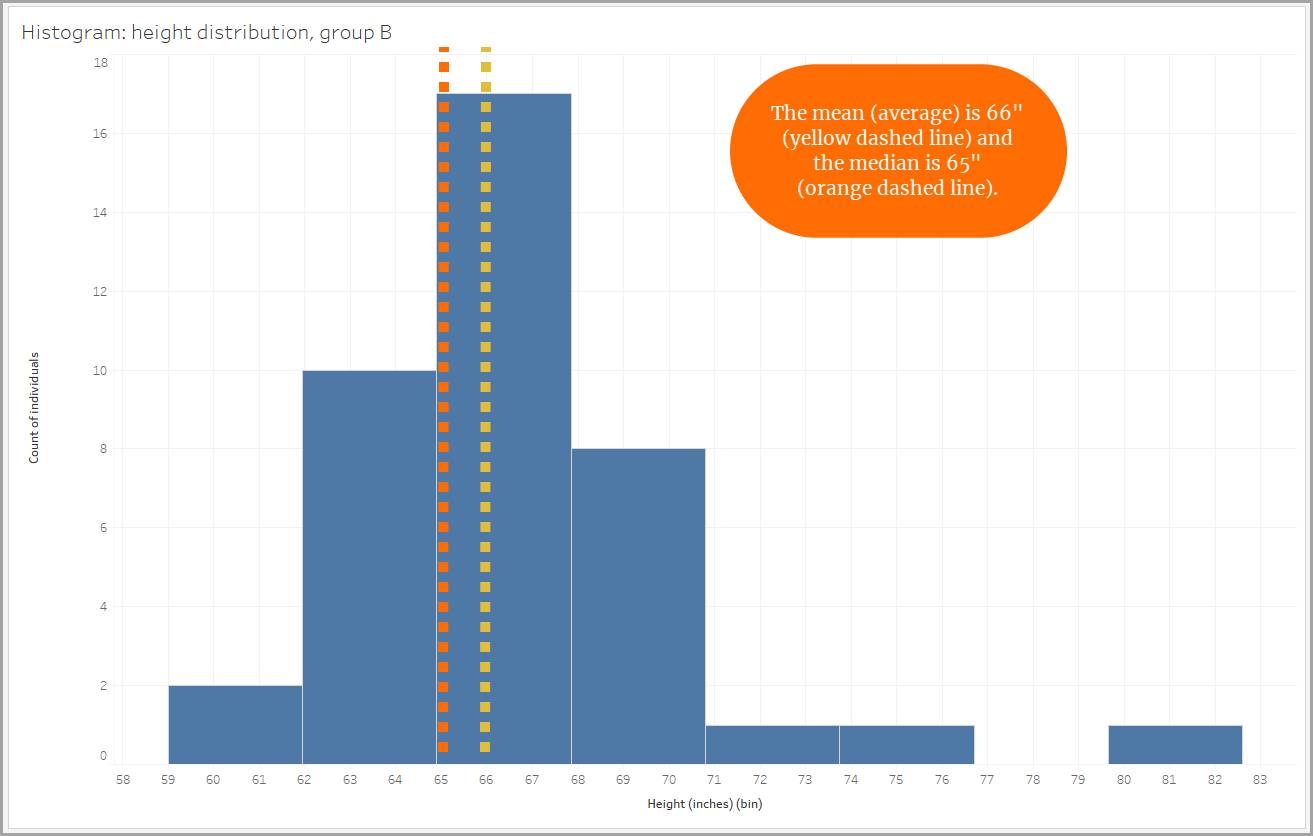
Negative Skew Distributions
Another asymmetrical distribution is a negative skew distribution. The data in a negative skew distribution spreads out farther in the negative direction than in the positive direction. A negative skew is also called a left skew because the data stretches to the left. The left "tail" is longer. When a distribution is skewed negatively, the median is greater than the mean (or average).
For example, imagine a class of 20 students. In this class, there are two students who never attended class nor completed any assignments. These two students earned a final grade of 0.0. Their 0.0 grades would skew the results of the mean (or average) grade earned for the class, thus making the average student performance look lower than is accurate. To truly reflect the students' success in this class, the median grade earned would be a better choice.
Similarly, when looking at our height data, one group shows a negative skew due to the presence of individuals who measured smaller than 60" (5 feet). Their smaller heights make the mean smaller.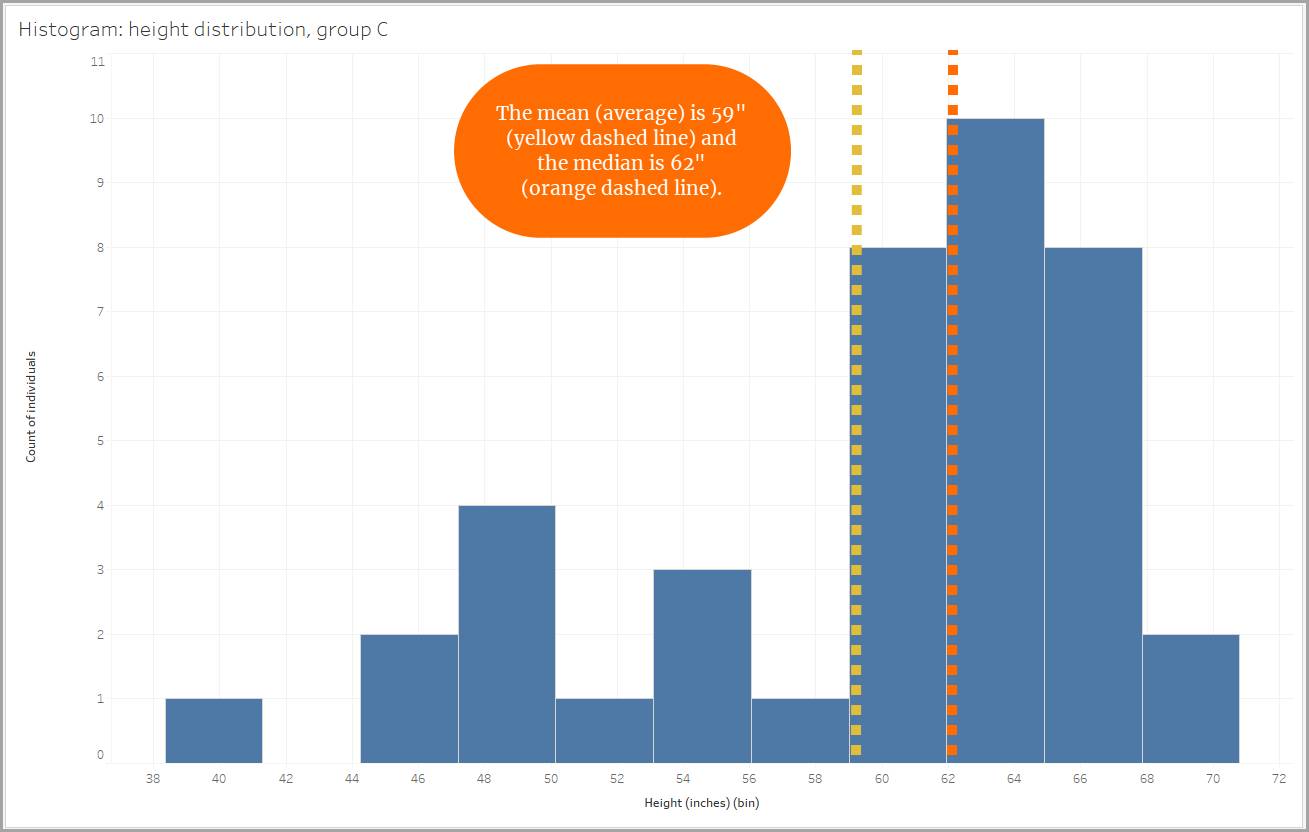
Histograms
All the charts you explore in this unit are histograms. A histogram looks similar to a bar chart, but it groups values for a continuous variable into equal-sized ranges, or bins.
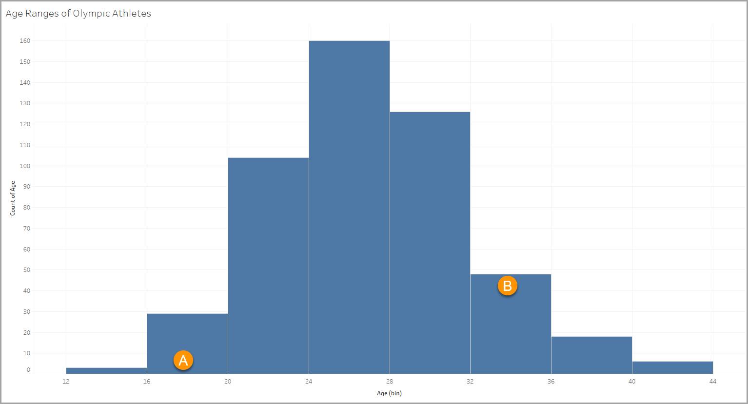
This histogram uses a data set with information about Olympic athletes. One of the variables in the data set contains ages for the athletes, from 18 to 90. The histogram allows you to see how the athletes break down into different age groups.
Bins
Each bin is defined by a four-year age range, such as 12–15, 16–19 (A), 20–23, 24–27, and so on.
Columns
Each column represents the count of items that meet the criteria of the bin (in this case the age range). In our example, there are 48 athletes in the 32–35 age range (B).
You’ve now taken a look at distributions for continuous variables organized as histograms. In the next unit, you learn about viewing distributions of continuous variables using box plots.
Resources
- Website: David M. Lane’s public domain work Introduction to Statistics
- Tableau Help: Build a Histogram