Use Box Plots to Show Distributions of Continuous Variables
Learning Objectives
After completing this unit, you’ll be able to:
- Describe how to use box plots to represent distribution of data.
- Create a box plot.
So far you’ve looked at a number of ways to see distributions of variables. In this unit, you learn about another important graph, called a box plot. Introduced in the 1970s by American mathematician John Tukey, box plots are a visually concise way of seeing and contrasting distributions of data.
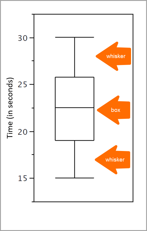
The boxes in a box plot show the middle 50% of the data. This data extends from the 25th percentile to the 75th percentile, with the median at the 50th percentile.
A percentile expresses how a score compares to other scores within the same data set. For example, you take a quiz to measure your level of introversion. By itself, your introversion score is difficult for you to interpret. You want to see how your score compares to others and to know the percentage of people with lower introversion scores than yours. This percentage is a percentile. If 65% of other test takers scored as less shy than you, your score is the 65th percentile.
To review, the box in a box plot shows the middle 50% of data, or the 25–75 percentile. But what about the data that falls outside of that? That’s where whiskers come in. Plotted outside the box, whiskers are vertical lines that end in a horizontal stroke. They provide insight about values that are not within that middle 50% of the data (the box), including outliers. Outliers can be understood as atypical and infrequent observations, or as values that have an extreme deviation from the center of a distribution.
We look at all these concepts in more detail later in the unit.
Create a Box Plot
The following box plot example is adapted from David M. Lane’s chapter on box plots in Online Statistics Education: A Multimedia Course of Study. Project Leader: David M. Lane, Rice University.
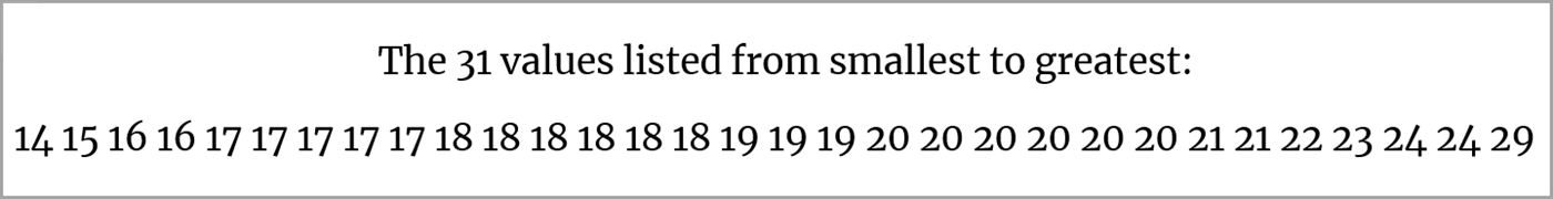
The author used an in-class experiment of 31 students. The students were each given a page of 30 colored rectangles, and their task was to name the colors as quickly as possible.
Their times, in seconds, were recorded as shown in the following table.
14 |
17 |
18 |
19 |
20 |
21 |
|---|---|---|---|---|---|
15 |
17 |
18 |
19 |
20 |
22 |
16 |
17 |
18 |
19 |
20 |
23 |
16 |
17 |
18 |
20 |
20 |
24 |
17 |
18 |
18 |
20 |
21 |
24 |
29 |
Let’s use this set of data to create a box plot. Here’s an overview of the steps you need to take to create one.
- Calculate the percentiles.
- Plot the box according to the percentiles.
- Determine the step size.
- Add the whiskers.
- Add the outside value.
Calculate Percentiles
Remember that the boxes in box plots extend from the 25th percentile to the 75th percentile of the data. The 50th percentile is drawn within the box. The bottom of the box (called the lower hinge) is the 25th percentile, and the top of the box (called the upper hinge) is the 75th percentile.
In the following steps, let’s use a number line to see the percentiles.
-
List the scores from smallest to greatest.
-
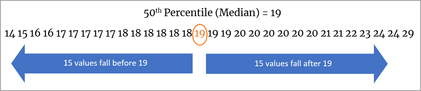
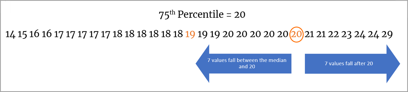
Determine the median, or the central value. The median value appears midway between the beginning and end of the sequence of numbers. For a sequence of 31 values, midway would mean that there are 15 values before the median and 15 values after it. Thus, the median value is 19.
-
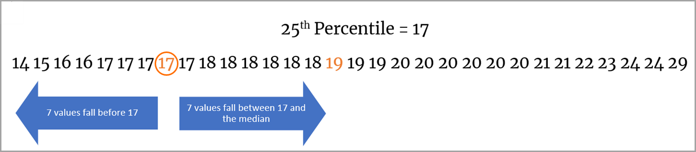
Determine the 25th percentile. The value of the 25th percentile appears midway between the beginning of the sequence and the median value. In our example of 31 values, this midway location has 7 values before it and 7 values between it and the median. Thus, the value of the 25th percentile is 17.
-
Determine the 75th percentile. The value of the 75th percentile appears midway between the median and the end of the sequence. For our list of 31 values, this midway location has 7 values between it and the median, and 7 values between it and the end of the sequence. Thus, the value of the 75th percentile is 20.
Plot the Box According to the Percentiles
Let’s plug in those values and plot the box.
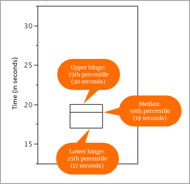
For our set of 31 scores, we determined that:
- The 25th percentile is 17.
- The 50th percentile (or median) is 19.
- The 75th percentile is 20.
So, you draw the box as follows.
- The 25th percentile (lower hinge) aligns with 17 on the y-axis.
- The 50th percentile (median) aligns with 19 on the y-axis.
- The 75th percentile (upper hinge) aligns with 20 on the y-axis.
The middle 50% of the data values appear in the box.

Determine Step Size
You now prepare to plot whiskers above and below the box to give additional information about the spread of data. Whisker placement is determined by steps, where a step is defined as 1.5 x IQR. IQR is the interquartile range.
This sounds complicated, but the IQR simply refers to the difference between the value of the upper hinge (75th percentile) and the value of the lower hinge (25th percentile). Remember, the middle 50% of the data values are in the box bounded by these values.
In our set of scores, the value of the upper hinge is 20, and the value of the lower hinge is 17. So, the IQR is 20 minus 17, or 3.
To determine our step size, multiply 3 (the IQR) by 1.5 to get 4.5 as our step size.
Add the Whiskers
To understand how to plot the whiskers, let's first look at some terms and how they apply to the scores in our example.
Where Do the Whiskers Go?
You can draw whiskers from the upper hinge to the upper adjacent value and from the lower hinge to the lower adjacent value.
Whiskers do not reach all the way to outside values. Instead, you represent an outside value with a small o, and a far out value with an asterisk (*).
For our scores data, the whiskers extend from the upper hinge value (20) to the upper adjacent value (24) and from the lower hinge value (17) to the lower adjacent value (14).
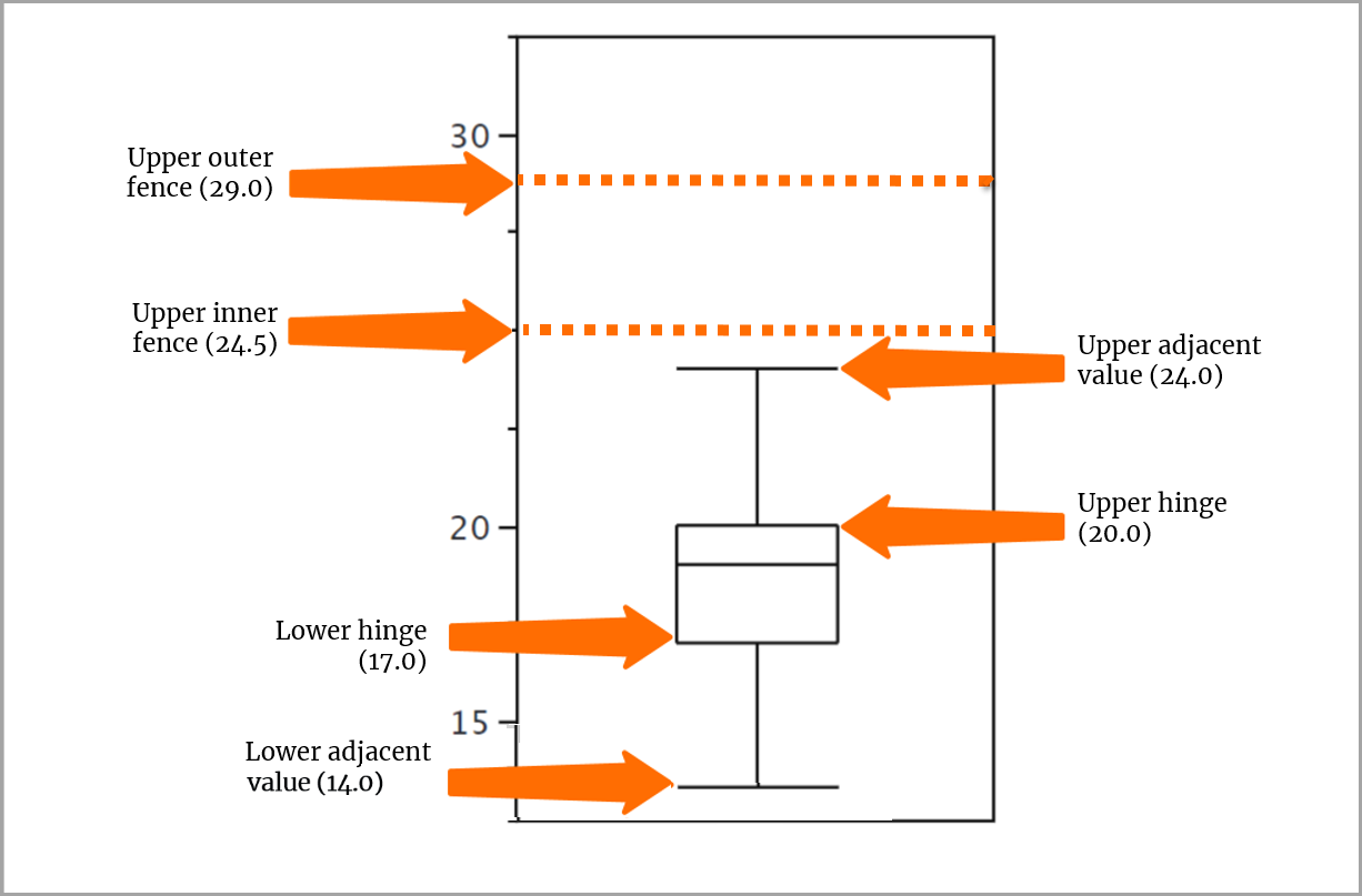
Add the Outside Value
A value beyond an inner fence but not beyond an outer fence is an outside value. We have one of these values in our set of scores, 29, which coincides with the value of the outer fence but is not beyond it. You use a small o to depict this value.
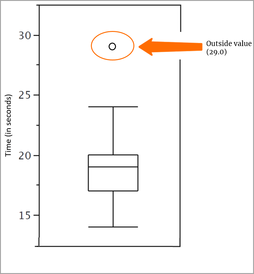
And with that, your box plot is complete!
Box Plots Versus Histograms
You may be wondering how box plots differ from histograms in showing distributions.
- Histograms use bins to plot the frequency of the values.
- In box plots, the middle 50% of the data appears in the box, and the outliers (if there are any) are plotted outside the whiskers.
To get an idea of how this looks, let's return to the data showing the shapes of distributions of people's heights. Compare how the data appears in a histogram and a box plot.
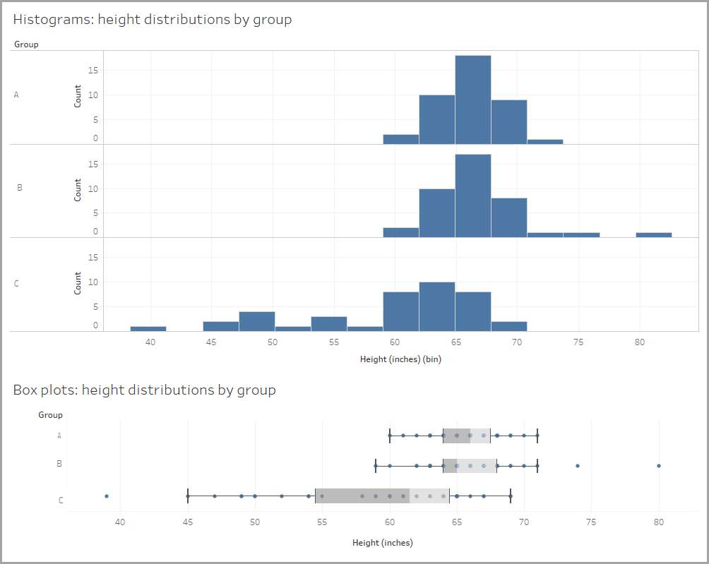
Note how much less space a box plot uses; this may make it easier to compare distributions. Three side-by-side distributions are easier to compare with box plots than with histograms. Let’s see some more examples.
You now have an understanding of how distributions can help you to explore, understand, and communicate with data.
Resources
- Website: David M. Lane’s public domain work Introduction to Statistics
- Tableau Help: Build a Box Plot