Learn How to Show Distributions of Discrete Variables
Learning Objectives
After completing this unit, you’ll be able to:
- Define data distribution.
- Distinguish between frequency and proportion distributions for discrete variables.
Introduction
If you completed the Well-Structured Data module in the Build Your Data Literacy trail, you learned how data is organized into columns (or fields) and rows. In well-structured data, each variable (field) is in its own column, and each different observation of that variable (value) is in a different row.
Variables can be discrete or continuous. Discrete variables have values that are separate and distinct, whereas continuous variables have values that form an unbroken whole. To learn more about variables, see the Variables and Field Types module.
When working with data, you may at times want to see distributions of a data set. A distribution shows all the possible data values and the frequency (count) of their occurrence. In other words, a distribution describes how many times each data value occurs. The organization of a distribution varies based on whether the variable is discrete or continuous. Let’s explore discrete variables first.
Distribution of Discrete Variables
When you look at distributions of discrete variables, you can see frequency (total count) or proportion (percentages). Here’s an example, adapted from Online Statistics Education: A Multimedia Course of Study. Project Leader: David M. Lane, Rice University.
Frequency Distribution of Candy Colors
Imagine you have a bag of candy that comes in six colors. Think about the variable color. This is a nominal, qualitative variable, so you know it’s discrete.
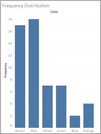
Discrete variables can be counted individually. You empty your bag of candy and perform a quick count. You see that, of 55 total candies, you have 17 brown, 18 red, 7 yellow, 7 green, 2 blue, and 4 orange.

This quick count gives you the frequency distribution of candy colors in your bag of candy, or, in other words, how many candies of each color were in your bag.
You can make the following frequency table to describe the frequency distribution.
Color |
Frequency |
|---|---|
Brown |
17 |
Red |
18 |
Yellow |
7 |
Green |
7 |
Blue |
2 |
Orange |
4 |
Alternatively, you can use a graph to show this frequency distribution. We created this one using Tableau, our visual analytics platform.

Proportion Distribution of Candy Colors
Our frequency distribution example concerned only your bag of candy. What if you want to know the distribution of colors for all the bags of this candy?

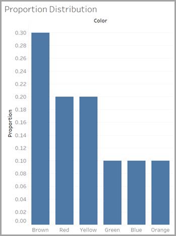
The candy manufacturer provides some information, but it doesn’t list exactly how many candies of each color it has ever manufactured. Instead of frequency (the total count of each color ever produced), the company reports proportions for each of the colors. You can think of proportions as the percentages of each color produced, expressed as decimals. For example, red candies have a proportion of 0.20, which means that 20% of the candies manufactured are red.
Every piece of candy is one of the six colors, so if you add together the proportions of all six colors, the total is one (or 100%).
A graph that shows these proportions is called a proportion distribution. The following bar chart shows the proportion distribution of candy colors, or, in other words, what percentage each candy color makes up of the total manufactured candy.

Test Your Knowledge with Flashcards
Ready to test your knowledge of frequency and proportion distributions? Take a look at two distribution graphs for a company that sells three types of products: furniture, office supplies, and technology. The first card shows the percentage of the total number of orders for each product category. The second card shows the total number of orders for each category.
Study the graphs. Which graph is a frequency distribution, and which graph is a proportion distribution? Click the right-facing arrow to move to the next card, and the left-facing arrow to return to the previous card. Click on the cards to reveal the correct answers.
You've learned about two types of distributions of discrete variables: frequency and proportion. In the next unit, you learn how to show distribution for continuous values.
Resources
- Website: David M. Lane’s public domain work, Introduction to Statistics
- Tableau Help: Distributions and Outliers