Learning Objectives
After finishing this unit, you’ll be able to:
- Add objects to a dashboard.
- Control the layout of objects in a dashboard.
Check: Connect Your Tableau Public Account
If you haven’t already, or if the playground has timed out, log in to your Tableau Public account in the Playground window to the right. If you don’t already have a Tableau Public account, sign up for one now, and be sure to activate your account before starting this interactive unit. You can find more detailed instructions in the Tableau Data Model.

You did a great job with those tweaks for the last viz. Are you ready to do it all three more times? Wait, what do you mean that doesn’t sound exciting? Well, OK.
Formatting can get a bit tedious, but it’s what elevates an otherwise meh viz to a real showstopper, and it’s not something you should neglect in the real world. But now that you’ve learned what sorts of things to look at—such as grid lines, borders, tooltips, labels, viz size—and how to do them, let’s skip the repetitive bits.
Control the Presentation Size
Dashboards are a way of combining multiple vizzes, but they can also be used for a single viz to give you more control over the presentation. You create a dashboard with multiple vizzes and also tweak the formatting to make sure the presentation is top-notch.
- Click New Dashboard in the bottom bar
 .
.
As a dashboard author, one of the first things to consider is the size. A dashboard embedded in a blog needs a very different design than one displayed on a huge screen during a presentation. By considering size first, you’re better able to avoid redoing layouts and formatting down the road, saving a lot of heartache.
- In the Size section of the left pane, open the dropdown that says Desktop Browser.
- Change the size to Web Page Embedded (800x800).
- In the Width box, set the width to
900.
- In the Height box, set the height to
700.- These dimensions were chosen to balance the embedded environment you’re working in with a usable finished dashboard. The Trailhead content pane can be collapsed to give more space to the authoring area. If your environment is too small to easily navigate around, consider using a larger screen for a better experience.
- These dimensions were chosen to balance the embedded environment you’re working in with a usable finished dashboard. The Trailhead content pane can be collapsed to give more space to the authoring area. If your environment is too small to easily navigate around, consider using a larger screen for a better experience.
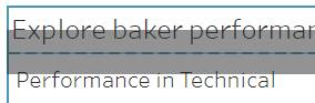
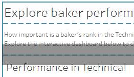
- Now add some content. From the Sheets section of the left pane, drag out the sheet Performance in Technical.
Add a Catchy Title and Call to Action
Think about coming to this viz and this dashboard for the first time. What is this data? What's going on? Give the dashboard a good title.
- At the very bottom of the left pane, check the box to Show dashboard title.
- Double-click in the dashboard where it says Dashboard 1 to open the editor.
- Replace <Sheet Name> with
Explore baker performance for the Great British Bake Off.
- Click OK.
- From the Objects area of the left pane, drag out a text box between the viz and the dashboard title.
- Don’t release the mouse button until the drop area is a gray box over a dotted blue line where you want it to go. Remember, if you make a mistake, the undo button is your best friend! You can always go back and try again if needed.
- Don’t release the mouse button until the drop area is a gray box over a dotted blue line where you want it to go. Remember, if you make a mistake, the undo button is your best friend! You can always go back and try again if needed.
- In the Edit Text dialog, enter the following. Leave the font as Tableau Book size 9.
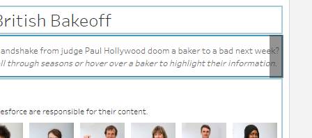
How important is a baker's rank in the Technical challenge? Does getting a coveted handshake from judge Paul Hollywood doom a baker to a bad next week? Explore the interactive dashboard below to decide for yourself. Use the filter to scroll through seasons or hover over a baker to highlight their information.
- Italicize the last sentence.
- Click OK.
Don’t worry about that filter or highlighting you just mentioned in the caption—you'll get there! One step at a time. For now, you’re just getting the basic building blocks in place.
Remove the Automated Legend
Legends are automatically added to the dashboard with the viz, but you don’t need them here.
- Click the color legend to select it and bring up its border (it will be gray).
- Click the X to remove that element from the dashboard.
- Repeat for the shape and size legends.
Add More Vizzes
Next add another viz.
- From the Sheets section of the left pane, find the sheet Meet the Bakers.
- You may need to hover in the Sheets section and scroll to find the sheet you want.
- You may need to hover in the Sheets section and scroll to find the sheet you want.
- Drag out Meet the Bakers like you did with the text box. Wait to release the mouse button until the drop area is a gray box between the text box and the Performance in Technical viz.
- Scroll to the bottom of the dashboard.
- Drag out a text box to the very bottom of the dashboard—be sure the gray drop area goes along the entire bottom of the dashboard. (It should look like a thin gray box just covering the axis values).
- In the Edit Text dialog, enter:
The Performance in Technical viz has a line for each baker. Yellow stars indicate Star Baker status. Vertical position is their rank in the technical challenge for that episode, with first place along the top of the chart. The x-axis is the episode number.
- If necessary, you can adjust the height of any element by clicking it to bring up the border and dragging the top or bottom to resize.
The structure of the show means each episode has fewer bakers. This leads to a decent amount of whitespace in the bottom-right corner of the line chart viz. You can float a small viz in that space to show which bakers got handshakes.
- At the bottom of the left pane, click the word Floating. This toggles the default behavior of sheets added to the dashboard from tiling to floating.
- From the Sheets section of the left pane, drag the sheet Handshakes out to that white space.
- Toggle back to Tiled.
If you think this looks messy, you’re not wrong. Let’s resize the viz and remove the legend.
- Click the Handshake legend (it has an icon and the number 1) to bring up its border.
- Click the X to remove the legend from the dashboard.
- Click in the Handshake viz to bring up its border.
- Click the dropdown arrow to open the menu, and select Fit | Entire View.
- Resize it to whatever size and location looks good to you. (Remember, we said dashboards involve some artistry!)
Add the Filter
Now let’s add that season filter hinted at previously. It goes to the right of the title and text box. But let’s test something. From the Object area of the left pane, click and hold Blank and drag it out to the right of the text box at the top of the dashboard.
There’s no way to get the drop area to only highlight an area to the right, is there? It looks like the blank spacer can go above or below the other elements. To make space to the right, build a layout that allows for horizontal tiling. Release the Blank object without adding it to the dashboard.
- Drag a Horizontal Container out between the title and the text box at the top of the dashboard. It should have a blue border—this lets you know it's a layout element.
- Click the How important… text box to bring up its border.
- Use the gray handle to drag that text box into the white space of the horizontal container. The drop area should be a gray rectangle that fills the space.
- Now add a Blank object to the right of that text box. The drop area might be a tiny little rectangle, but it goes where we want it to. Once you release your mouse button and drop the Blank object, it resizes.
Click into the blank space to bring up its border, then resize the left side so the text in the text box lines up with the end of the title. (It doesn’t have to be exact.) Now there’s a nice clear space to put our filter. But we’ll do that in the next unit when we build interactivity—and we’ll come back to that Tracking Star Baker viz, too.
- Rename the sheet. Double-click the sheet tab for Dashboard 1 and name it
Baker Performance