Make Time Series, Ranking, Part-to-whole, and Nominal Comparisons
Learning Objectives
After completing this unit, you’ll be able to:
- Describe time series, ranking, part-to-whole, and nominal comparisons.
- Understand the best chart types and practices to use for these comparisons.
Nominal Comparisons
The word nominal stems from the Latin word for name. When you make nominal comparisons, you’re comparing categories. Attributes that work well for nominal comparisons are 2D position, color hue, and shape.
Bar Charts
In the previous unit, you learned that the length of bar charts work well for distinguishing quantitative values. When comparing categories with a bar chart, you use the attribute of 2D position and length of the bar to compare categories. The distinct space between individual bars and order of the bars help compare quantitative values represented by the length of bars among categories. Ranking or ordering specifically for ordinal variables can show important patterns in the data.
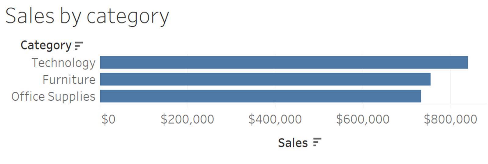
Encoding Categories
When comparing categories, you can use the attributes of color (or hue) and shape to distinguish categories.
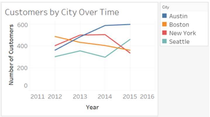
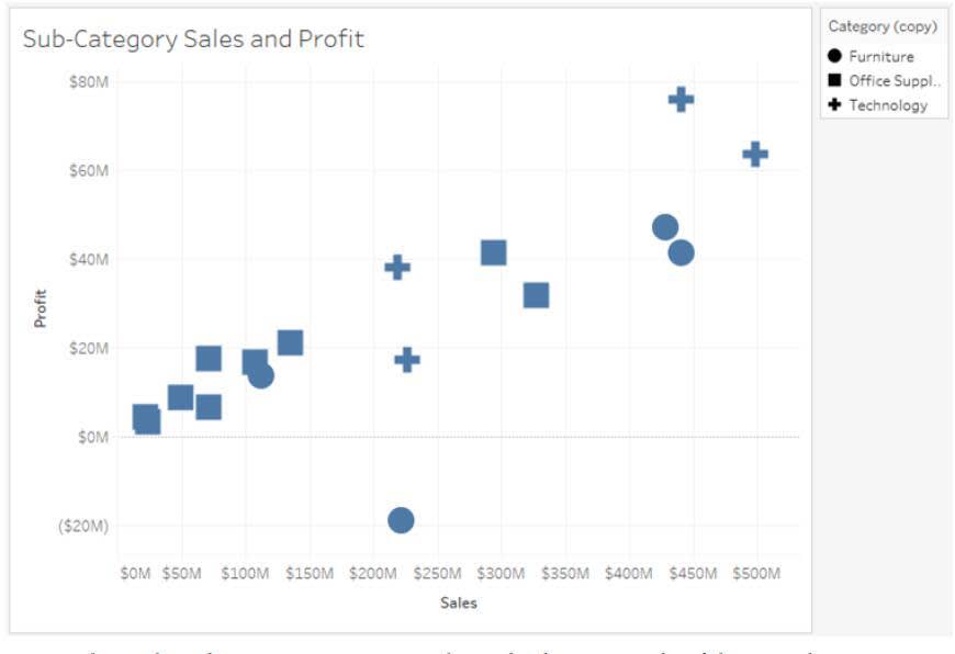
In the first image above, time series line chart, color is used to distinguish between cities. In the second image, scatter plot, shapes distinguish the product categories.
Time Series
Time series charts compare quantitative values through intervals of time. Line charts help you see patterns and trends through time.
Line Charts
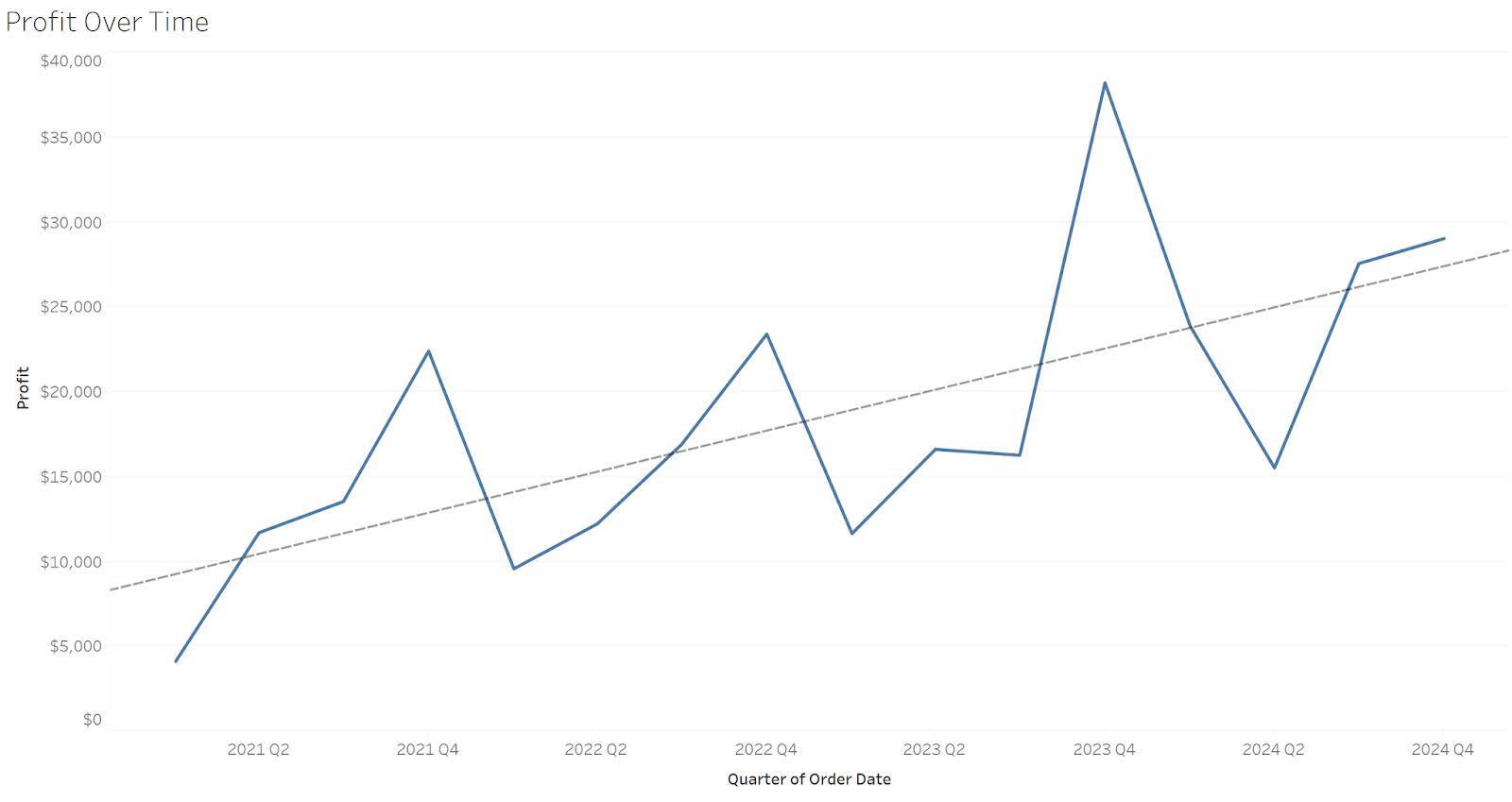
Line charts are the most common chart used to show a time series and are one of the best ways to see patterns and trends over time. For example, in this line chart, you can easily follow the profits over time.
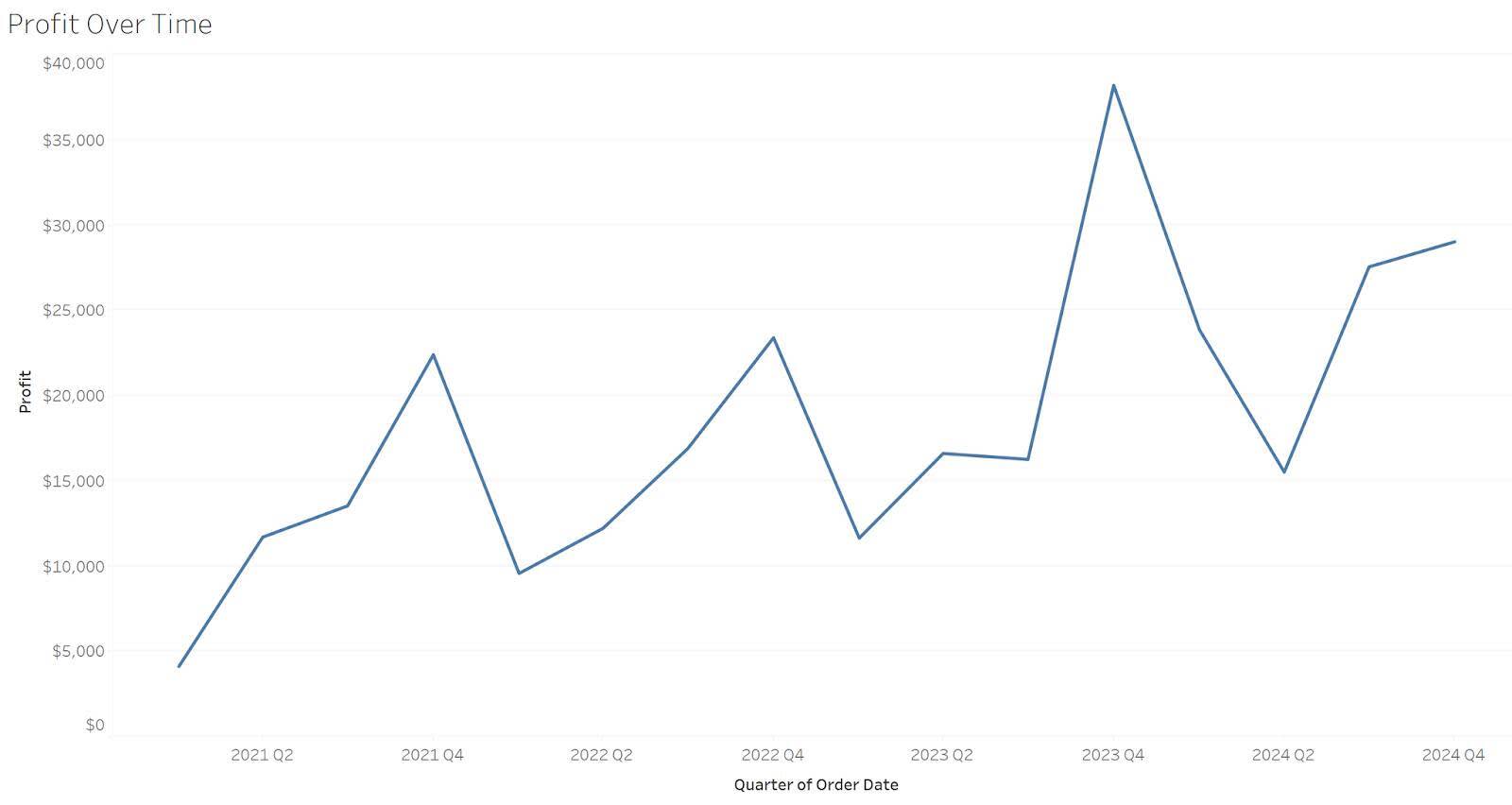
In addition to a line chart that connects each data point in the graph, you can add a trend line to your time series graph. The trend line can help you see the overall trend and direction of your measure and help make guidance decisions. Below, the trend line in the line graph shows a pattern of increasing profits over time.
Vertical Bar Charts
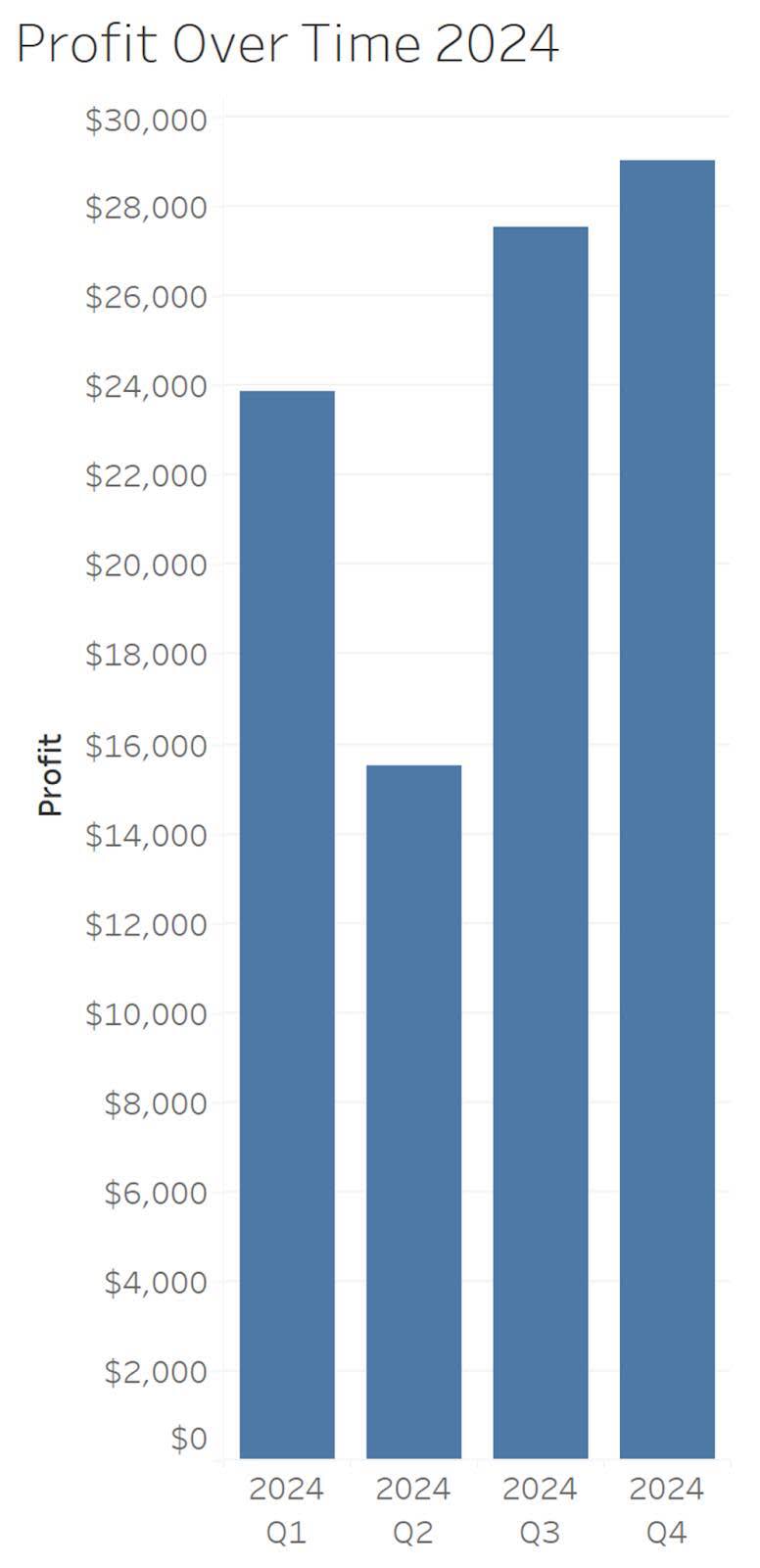
Vertical bars are useful for a time series comparison when it’s important to feature individual values instead of the overall trend. In the following vertical bar chart, the lower value in Q2 is the focus of the graph rather than the overall trend.
Boxplots
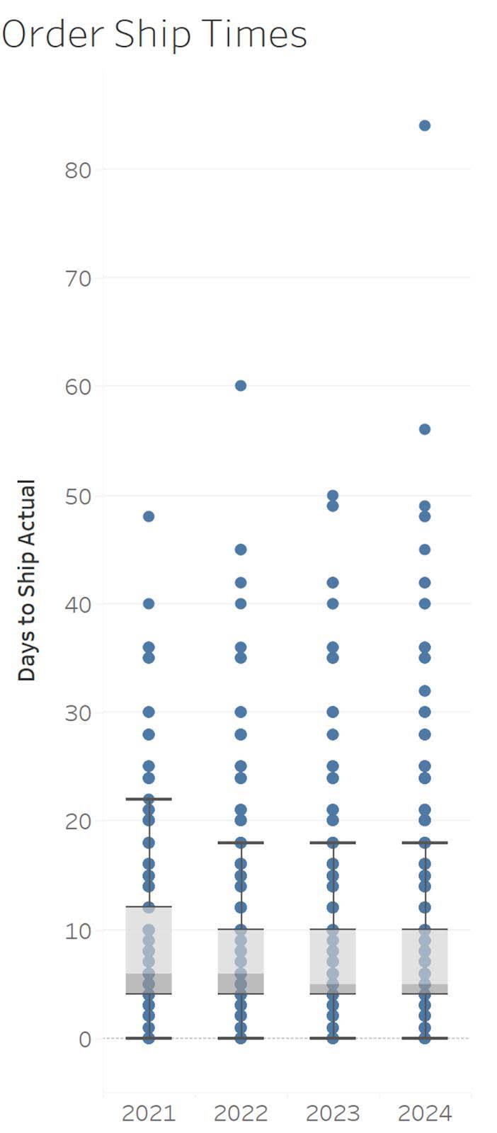
Boxplots display a distribution by showing the median (line in middle of the box), 25th and 75th percentiles (ends of the boxes), and individual data points. Multiple boxplots can be used to compare distributions through time.
Ranking
Charts that show ranking comparisons order values (descending or ascending) among categories. There are many ways to display ranking comparisons.
Bar Charts
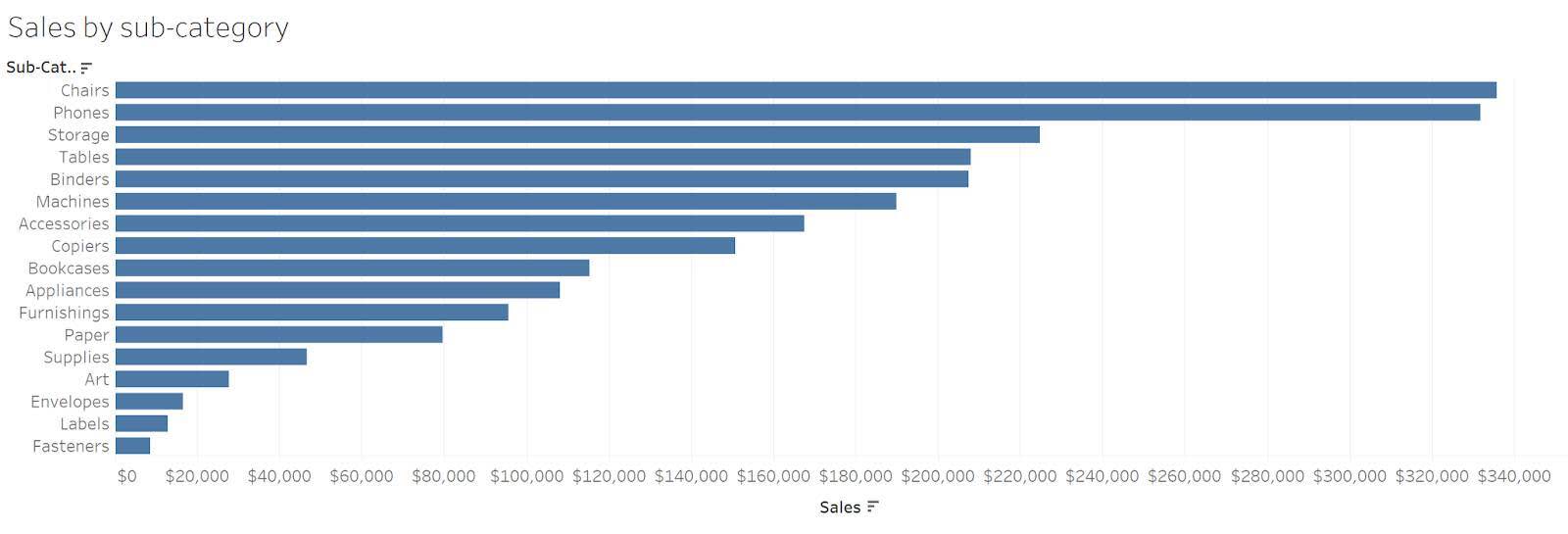
The most common chart to use for ranking comparisons is the bar chart. Bar charts emphasize the distinctiveness of the values. Sorting the bars by ascending or descending allows you to rank values. In the following example you can see that the subcategory of Chairs has the highest value and the small difference between Tables and Binders with Tables ranking above Binders.
Other Charts to Show Ranking Comparisons
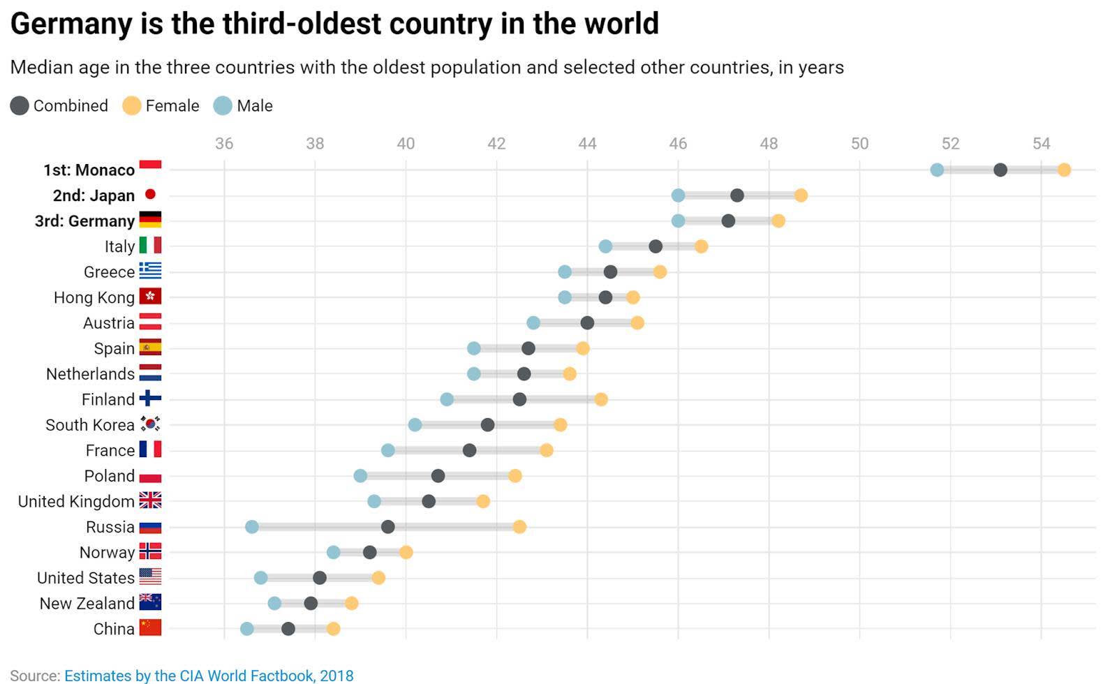
To be interpreted correctly, bar charts must always have a baseline of zero. In instances where having a zero baseline isn’t possible, you can use dot plots. Instead of a bar, the endpoint is replaced with a dot. When viewing paired values, the dots can be connected to highlight the difference between the paired values.
In this blog post, Lisa Charlotte Muth describes how a dot plot can show country rankings by median age. Dot plots don’t require the axis to start at zero.
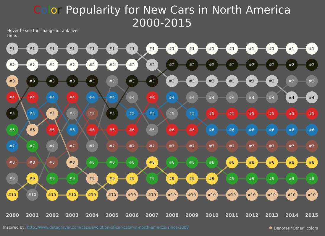
In situations where rankings change over time, a bump chart displays the rankings by allowing lines for each category to follow the ranking over the change in time. In the bump chart by Matt Chambers from Tableau Public shown here, the category “other colors” starts at a ranking of third in 2000 and switches rankings over time until landing in tenth place 2005 through 2015.
Part-to-Whole
In part-to-whole comparison charts, values are shown as a proportion of the whole, often as percentages.
Stacked Bar Charts
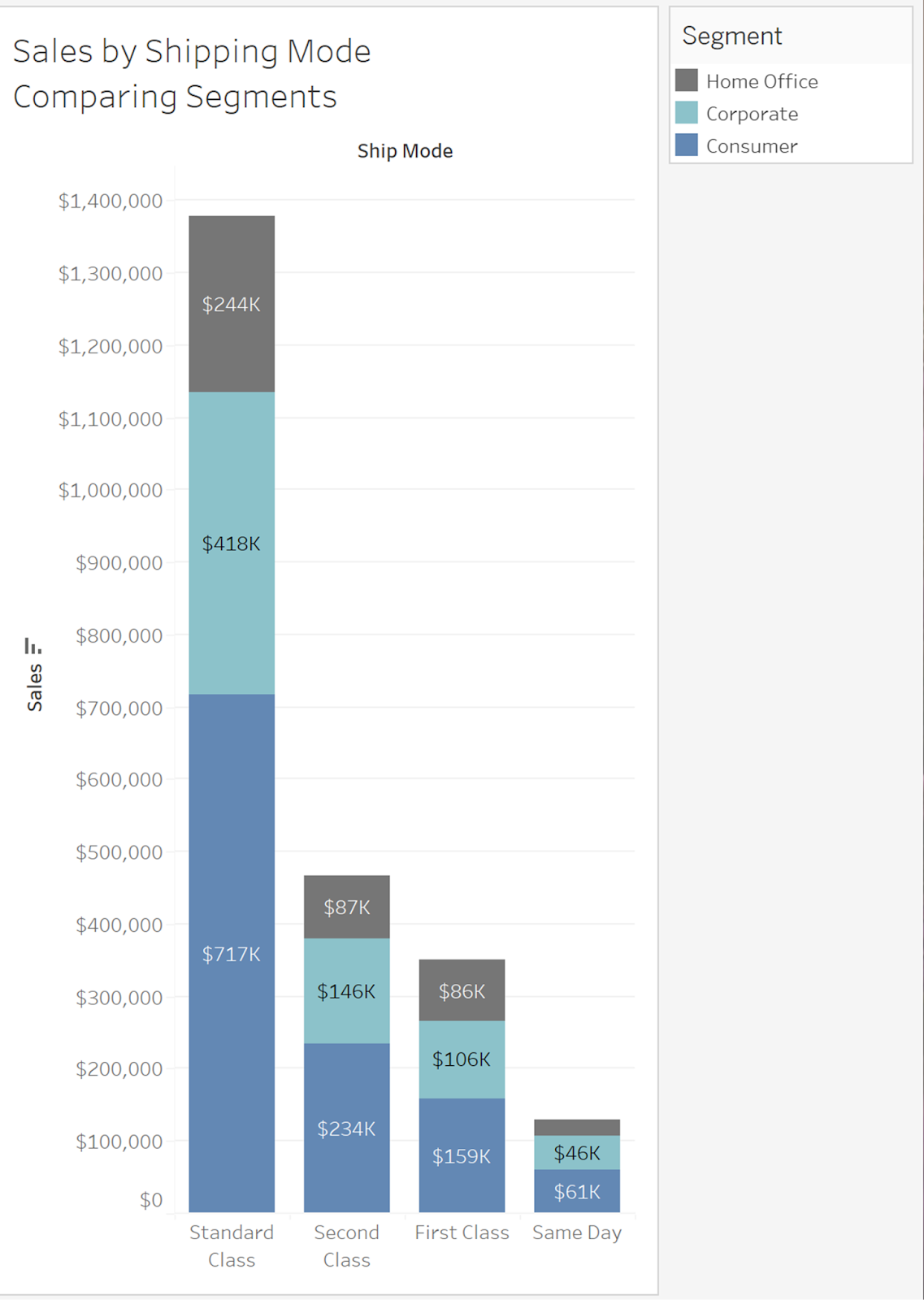
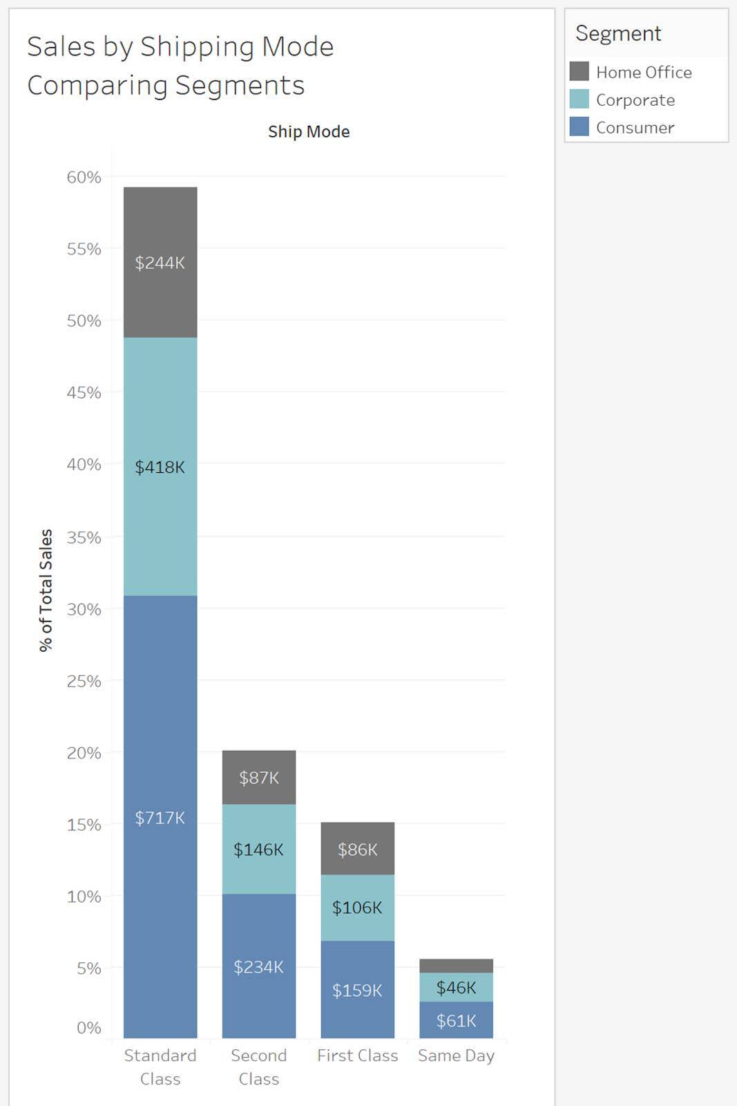
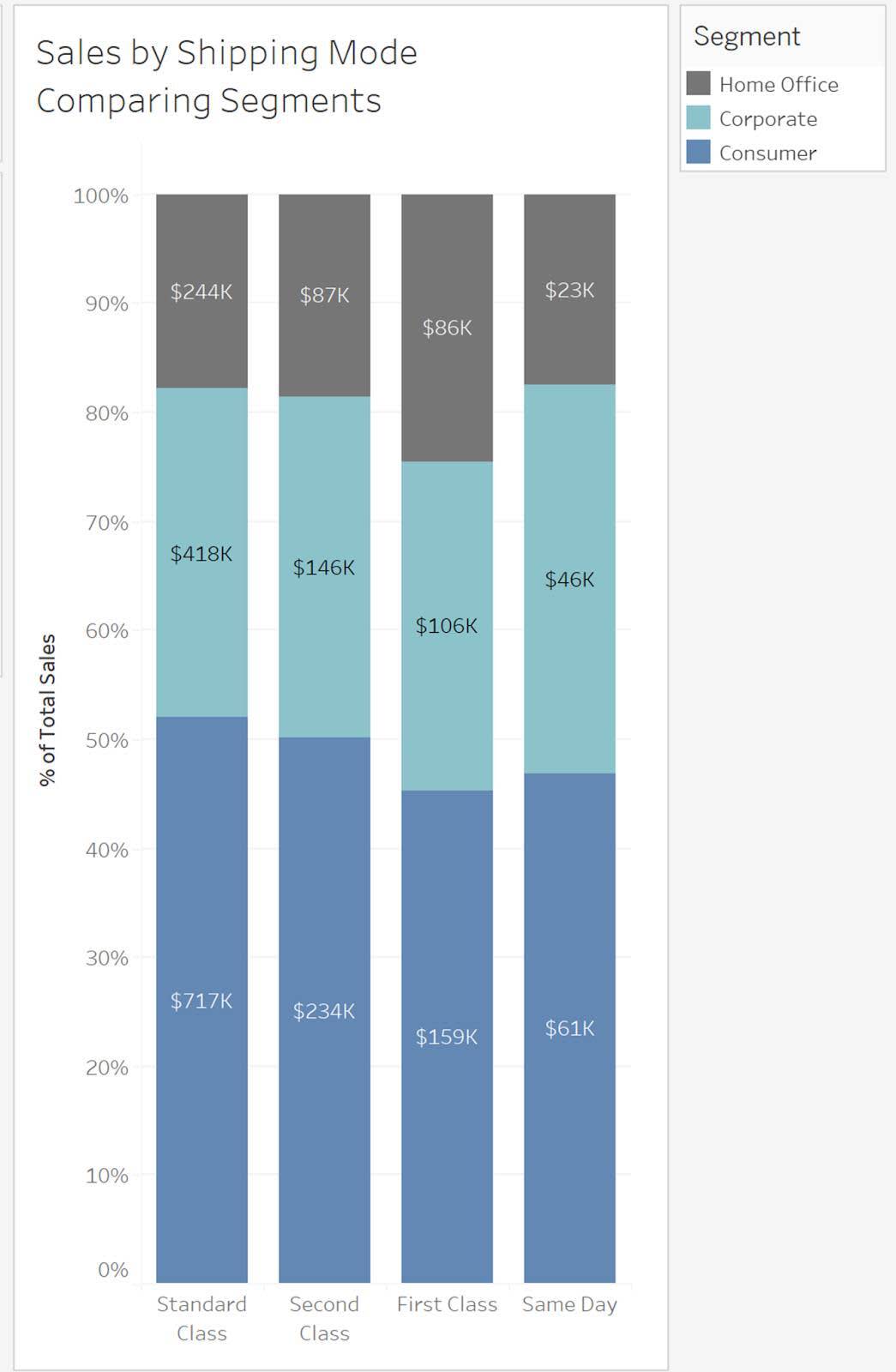
The most common chart to display part-to-whole relationships is the bar chart. Stacked bar charts split up each bar into its component parts. The parts can be shown as percentages, counts, or specific measures. The next examples show three stacked bar charts showing sales by shipping mode and comparing segments.
The y-axis in the first chart shows sales. The y-axis in the second chart shows percent of grand total. The y-axis in the third show percent of each segment. Individual labels allow the reader to view sales values that the percentages represent, giving context. When presenting percentages, it’s important to give context and share counts or measures that the percentages represent.
Pie Charts
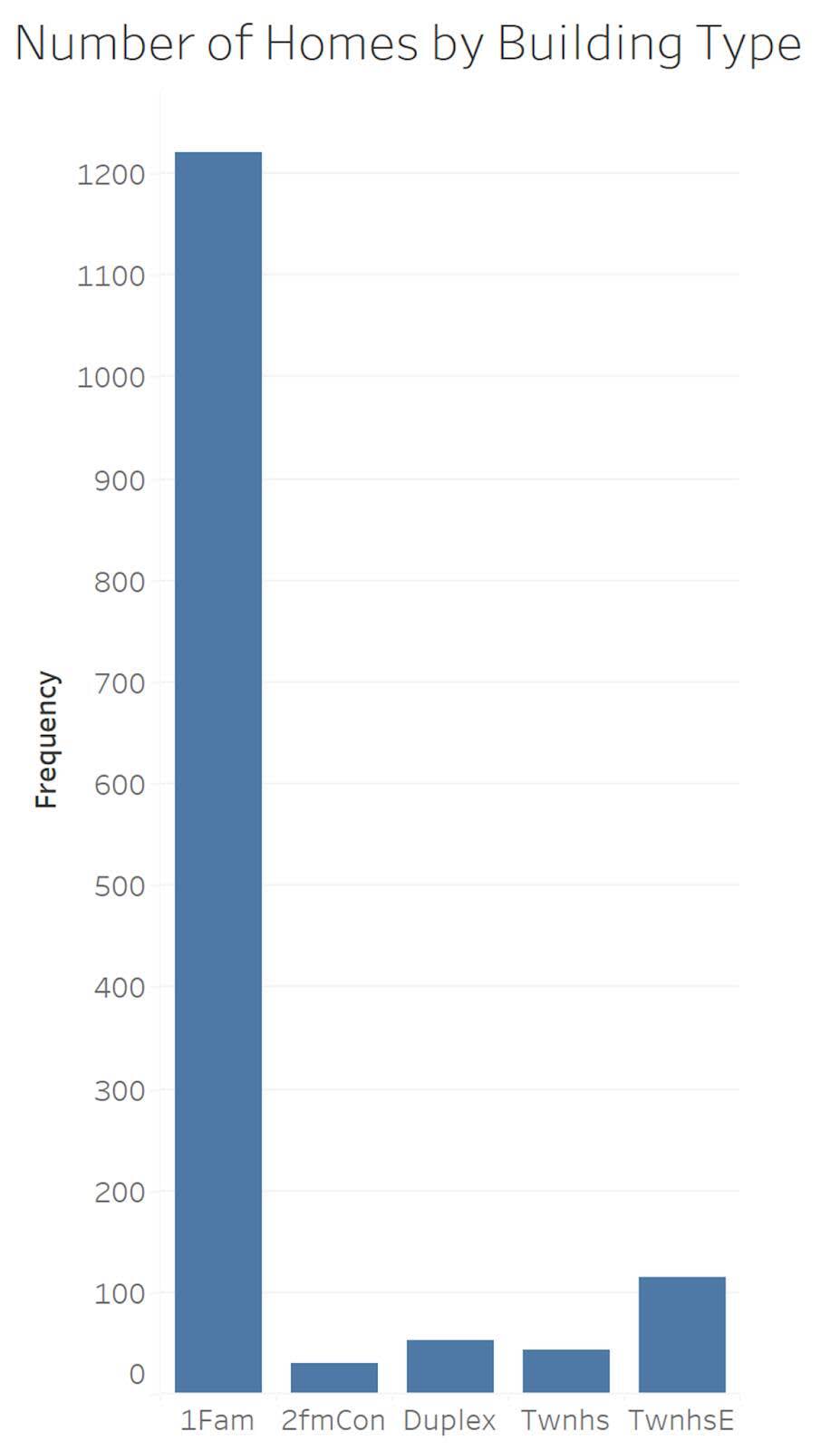
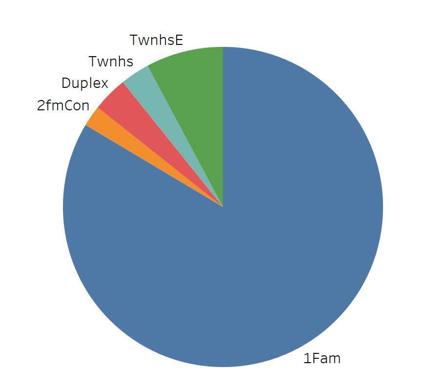
Most data visualization practitioners have encountered the “great pie debate.” In the second unit, you learned that the length attribute makes it much easier to perceive value differences than to perceive size differences. When using the size attribute in a pie chart, it can be difficult to see small differences in size. In the following example, it’s hard to distinguish the small pie slices in the pie chart, but very easy to distinguish small size differences when using the bar chart.
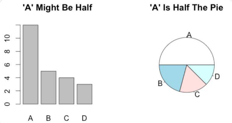
There are a few instances when a pie chart is the better choice. When there are very few slices and there isn’t a need to distinguish small differences, a pie chart can be effective. When you’re showing a category that has exactly half (50%) of the whole, a pie chart is easier to read.
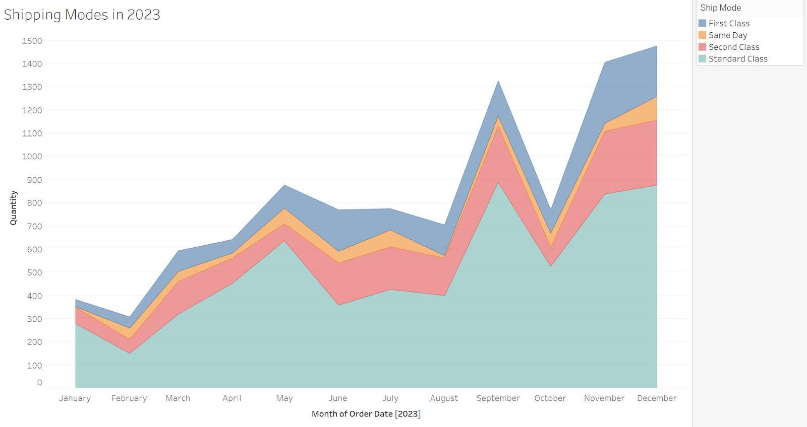
Area Line Charts
The area line chart lets you answer questions about change over time and part-to-whole. When showing part-to-whole over time, color and area size are used to show part-to-whole with a time series line chart. In the following example, you can see that the Standard Class shipping mode was the most common type in all months of the year.
Tree Maps
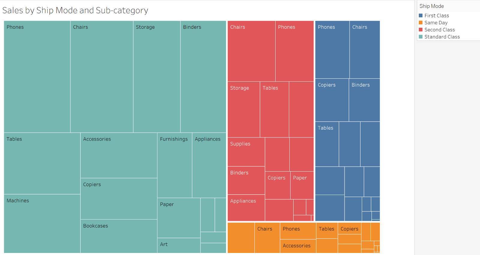
For large hierarchical data sets, tree maps can show nested categories in one graph. The next example shows the proportion of subcategory sales as a part-to-whole for each shipping mode. Since tree maps use the size attribute to show differences, the reader may have difficulty making comparisons. When comparing individual subcategories is important, small multiple bar charts provide an alternative. See Using Treemaps to Visualize Data to learn more.
Resources
- Tableau Blog: Box and Whisker Plots
- Storytelling with Data Blog: What is a dot plot?
- Trailhead: Guidelines to Recognize Misleading Charts
- Tableau: How to Spot Misleading Charts, A Checklist
- Tableau: Pie Charts
- Tableau: Data Dialogues: io Pie Chart or Not to Pie Chart
- Trailhead: Data Distributions
- Datawrapper Blog Post: I’m surrounded by old people
- Tableau Public: Color Popularity for New Cars in North America 2000-2015
- Data Plus Science Blog: Using Treemaps to Visualize Data
