Create Custom Components
Learning Objectives
After completing this unit, you’ll be able to:
- List the ways to add components to a Salesforce Commerce store app.
- Explain how prebuilt custom Salesforce Commerce Components work.
- Explain how to use Salesforce Commerce APIs for custom components.
- List the steps to create a custom component.
Salesforce Commerce Components
The Salesforce Commerce app comes with standard components that are part of the store template. Commerce merchandisers, like Taylor Givens, use them to set up customer experiences. Wei Leung, Ursa Major Solar developer, wants to build custom components, such as headers, footers, and banners for the store app to give Taylor a lot more flexibility.
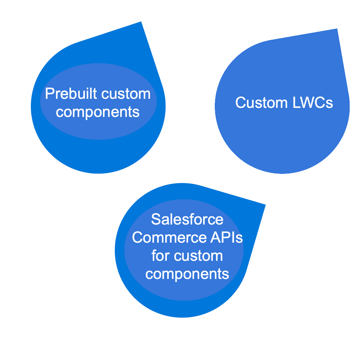
Here are some of the ways you can add components.
Tool |
Description |
|---|---|
Prebuilt custom D2C components |
Use prebuilt display components to customize your store. The components, optimized for mobile, fetch JSON payloads for store pages via embedded API calls and are ready for custom theming in Experience Builder. |
Custom D2C LWCs |
Custom LWCs are easy to build and perform well in the web browser that hosts your store. |
B2B2C Commerce APIs for custom components |
Use Salesforce Commerce component API methods for custom branding and theming. |
Wei uses Visual Studio (VS) Code to create a custom LWC component and an SFDX project in which to store it. She also uses VS Code to authorize the org to which SFDX deploys her custom objects. This streamlines deployment.
Custom Lightning Web Components
Lightning web components (LWC) are skeletal files that provide a quick start for creating a variety of custom components for Experience Builder. Access them to get a quick start on creating your components. Custom LWCs consist of these file types.
-
HTML provides the structure for the component.
-
JavaScript defines the core business logic, event handling, API calls to fetch page data, and related metadata.
-
CSS provides the look, feel, and animation.
Prebuilt Custom Components
Wei can download prebuilt display components and deploy them to her store. The components, optimized for mobile, fetch JSON payloads for store pages via embedded API calls and are ready for custom theming in Experience Builder.
Here are some of the components.
-
customCommerceFooter: A footer for custom-themed content that uses the SessionContext interface to update cached data.
-
customCommerceHeader: A header container for placing a banner, logo, navigation, search, and cart badge. The component uses the SessionContext interface to update cached data.
-
cartBadge: Use this component to extend store theming to the cart summary badge, which uses a wire adapter API to display the number of items in the cart.
-
horizontalNavigation, verticalNavigation: After deployment to a store, you can drag these menu container components into a header, footer, or another component.
-
navigationMenu: A hamburger menu container for mobile presentation.
-
linksList: A container to add links to related products, and so on.
-
searchBox: A search box container.
-
storeLogo: A container to receive and display a logo.
Custom Component APIs
Wei can use APIs for data-driven custom theming such as from user IDs or cart summary data. Salesforce Commerce includes a Commerce namespace that supports these component API methods for fetching and displaying data. Here are some of them.
-
getAppContext(): A component that retrieves the application context that doesn’t rely on the current user session, such as the web store ID, or other application-related parameters.
-
getSessionContext(): A component that retrieves session-related context, such as user ID and mode.
-
CartSummaryAdapter: A wire adapter that retrieves the current cart summary.
A component can also use any Experience Cloud APIs, including:
-
getCommunityNavigationMenu(): A component that retrieves menus for display in banner headers and footers.
-
cmsDeliveryApi: A wire adapter that retrieves published CMS content versions for an Experience Builder site.
Create a Custom Component
Here’s how to build a custom component.
- Create an HTML file and a JavaScript file with the same name in a shared folder, also with the same name.
- Deploy the component to Experience Builder with Sales Commerce-specific metadata. This metadata includes critical statements to ensure your component runs smoothly and safely.
- In Experience Builder, combine the components to create custom theming and shopper-friendly features. For example, banners, store logos, navigation menus, search boxes, and linked lists for related products.
The Salesforce Lightning web runtime resolves, compiles, and bundles these files and constructs the component automatically.
Here’s Wei’s checklist to create and deploy a custom component.
Step |
Task |
|---|---|
1 |
Create an SFDX project. |
2 |
Authorize the org for testing. |
3 |
Create an LWC. |
4 |
Deploy the custom component. |
5 |
Add the component to your D2C Commerce store. |
Create an SFDX Project
Wei creates a Salesforce Developer Experience (SFDX) project to store her custom component files. Here’s how she does it.
- In the VS Code editor, open the Command Palette by pressing Ctrl+Shift+P (Windows) or Cmd+Shift+P (macOS).
- Enter
SFDX.
- Select SFDX: Create Project.
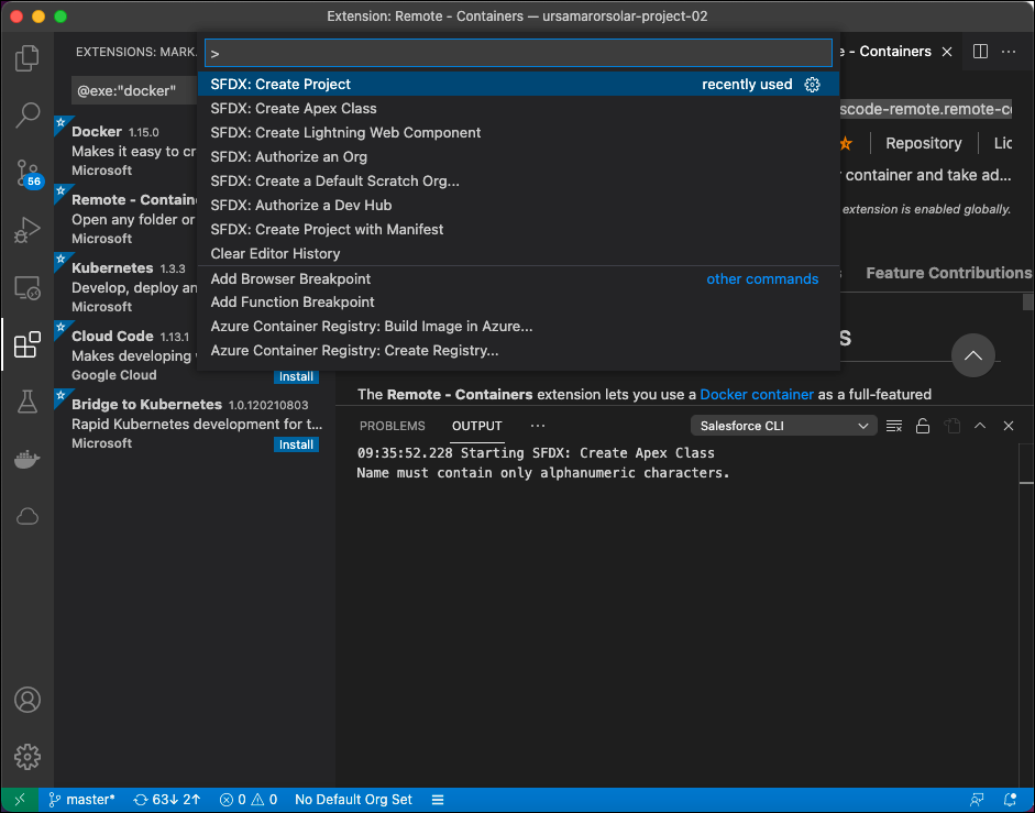
- Click Enter.
- Select Standard.
- Name the project
ursamajorsolar-project-02and click Enter.
- Select or create a folder to store the project.
- Click Create Project.
Authorize the Org for Testing
Wei streamlines deployment by authorizing the org to which SFDX deploys custom objects. Here’s how she does it.
- In the VS Code editor, open the Command Palette.
- Enter
SFDX.
- Select SFDX: Authorize an Org.
SFDX opens the Salesforce login portal to your org in a separate browser window.
- Log in using your admin credentials.
- If you're prompted to allow access, click Allow.
After you authenticate in the browser, the CLI remembers your credentials.
Create an LWC
Wei creates a sample custom component to deploy from SFDX to an authorized org. She creates a Lightning web component (LWC) file structure where she can copy and paste content from a component in a GitHub repository. Here’s how she does it.
- In the VS Code editor, open the Command Palette.
- Enter
SFDX.
- Select SFDX: Create Lightning Web Component.
Don’t select SFDX: Create Lightning Component, which creates an Aura component.
- Name the component:
ursamajorsolar-component-01 - To accept the default
force-app/main/default/lwc location, press Enter.
- To view the new files in VS Code Explorer, press Enter.
- Open the HTML file (
ursamajor-component-01.html) then copy and paste the code from the corresponding GitHub template HTML file that corresponds to your project.
- Save the file.
- Open the JavaScript file (
ursamajor-component-01.js) then copy and paste the code from the corresponding GitHub template JavaScript file that corresponds to your project.
- Save the file.
- Open the XML file (
ursamajor-component-01.js-meta.xml) then copy and paste the code from the corresponding GitHub template JavaScript file that corresponds to your project.
Deploy a Custom Component to Your Org
Here’s how to deploy the LWC you just created to use it on your store pages
- Open the VS Code editor.
- From the component project directory, right-click the default folder under
force-app/main, and select SFDX: Deploy Source to Org.
- On the Output tab of the integrated terminal, view the results of your deployment.
SFDX displays a deployment status notice that includes an exit code, such as “SFDX: Deploy Source to Org ... ended with exit code 0”.
Exit code 0 means that the command ran successfully.
Add a Component to Your D2C Store
When you add a component to your canvas in Experience Builder, you can edit its properties to customize it.
- In the VS Code editor, open the Command Palette.
- Enter
SFDX.
- Select SFDX: Open Default Org.
Your store opens in a separate browser.
- In the left Navigation panel, click Components.
The custom component displays under Components | Custom Components.
- From the Custom area of the Lightning Components list, drag your LWC to the page canvas.
- To edit the component properties, select the component on the page canvas, and enter changes in the floating component property editor.

Next Steps
In this unit, you learned how to customize a Salesforce Commerce store by creating a custom LWC. Next, let’s explore the shadow DOM.
Resources
- Trailhead: Package Development Model
- Salesforce: AppExchange
- Salesforce Help: B2B2C Commerce Developer Guide
- Salesforce: Salesforce Extensions for Visual Studio Code
- Trailhead: Quick Start: Salesforce DX
- Trailhead: Develop an App with Salesforce DX
- Salesforce: Salesforce Extensions for VS Code Overview
- Salesforce Help: LWR Store Components
- Salesforce Help: Storefront APIs