Explore Aggregation
Learning Objectives
After completing this unit, you’ll be able to:
- Define aggregation.
- Apply different types of aggregation.
What Is Aggregation?
Aggregation refers to a collection of quantitative data and can show large data trends. For example, summing all web searches for a particular campground or taking the average income of all wage earners in a city.
In many analysis tools, quantitative variables are aggregated by default, but can be disaggregated (broken down by category) to show data points for every value in every row of the data source.

Here are some common aggregations.
Aggregate |
Description |
Example: 3, 3, 6 |
|---|---|---|
Sum |
The arithmetic total of the values |
3 + 3 + 6 = 12 Sum = 12 |
Average |
The arithmetic mean of the values (that is, the Sum divided by the number of values) |
3 + 3 + 6 = 12 12/3 = 4 Average = 4 |
Median |
The middle value in a list of values sorted from least to greatest (or greatest to least) |
3, 3, 6 Median = 3 |
Minimum |
The smallest value |
3, 3, 6 Minimum = 3 |
Maximum |
The largest value |
3, 3, 6
Maximum = 6 |
Count |
The number of values (in a data table, the number of rows or records) |
There are three values
Count = 3 |
|
Count Distinct (or Count Unique) |
The number of distinct values, where each unique value is counted only once (in a data table, the number of unique rows of records) |
There are two unique values, 3 and 6
Count Distinct (or Count Unique) = 2 |
Examples of Aggregation
Let’s look at some examples of aggregations and the impact they have on data analysis. We’ll use survey data associated with an online vocabulary test. Each participant took an online vocab quiz, and then answered some demographic questions about themselves.
View a Visualization with an Aggregated Quantitative Variable
Look at the Age quantitative variable in the following visualization. Notice the aggregation of Sum adds up all the values in the Age variable for a total of 420,085 years.

In the chart above, a single bar summarizes all of the data (12,168 rows) in the data set together as a single number.
This Sum ofAge can be broken down by the highest level of education, which results in a bar showing the total age for each education level. (If you add up each of these values, it’s the same as the total for the single bar. 116,602 + 160,542 + 120,351 + 22,092 + 498 = 420,085.)
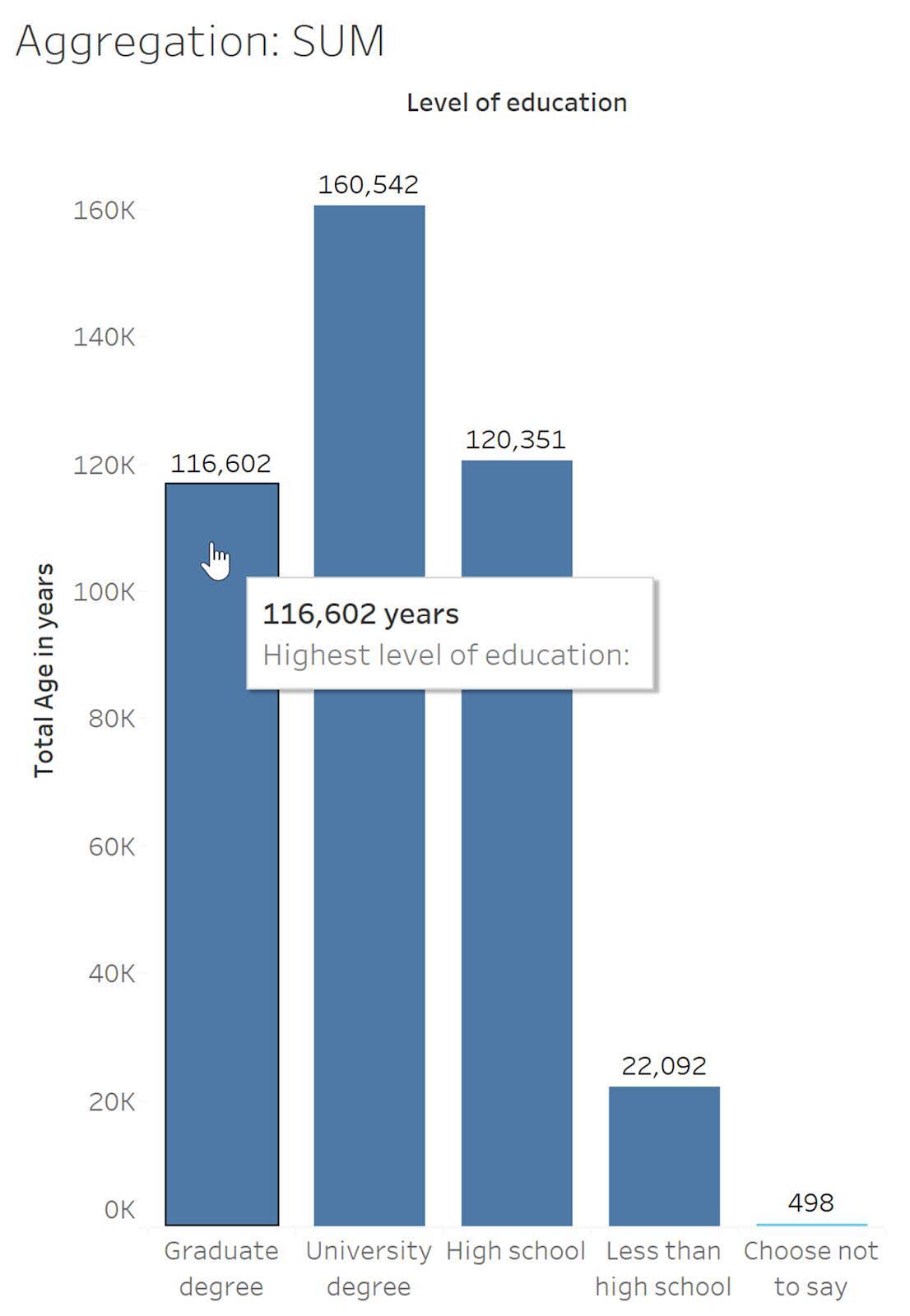
Important: Sum isn’t an appropriate aggregation here since an age of 116,602 years isn’t meaningful. For some variables, such as age in this example, using the Sum aggregation isn’t a useful or appropriate representation of the data. (In other examples, sum may be an appropriate aggregation.) When creating or viewing visualizations, it’s important to pay attention to the aggregations that are used in analyses and charts.
View Underlying Data
To better understand what values are being totaled, let’s look at the raw data. When you examine the row-level data, you see a row for each participant and their education level and age.

Looking at the education level Choose not to say, the sum of Age is 498.
13 + 13 + 13 + 13 + 15 + 16 + 16 + 16 + 17 + 17 + 18 + 20 + 20 + 23 + 37 + 45 + 53 + 65 + 68 = 498 years
View Impact of Average Aggregation
Let’s look at the same bar chart as before, but change the aggregation to average. Instead of adding up all the ages and displaying that value, now the height of the bars is its arithmetic average. For each education level, all the ages are added up and divided by the number of values.
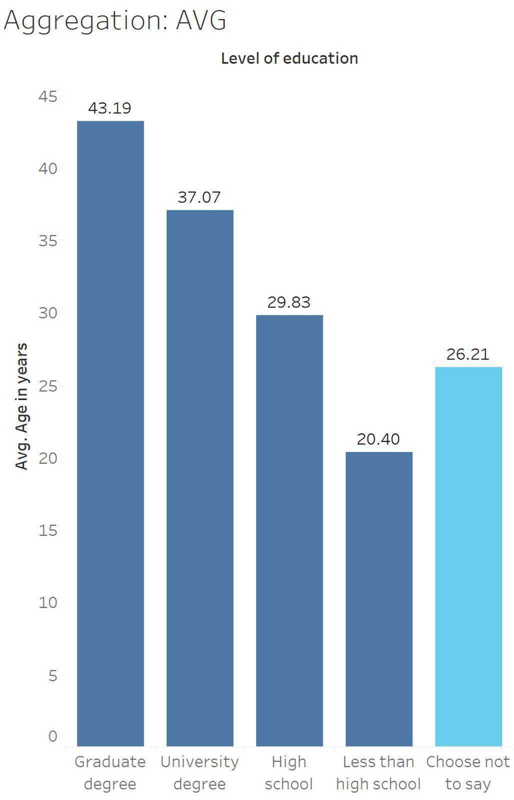
Looking at the education level Choose not to say (shown in light blue), the average is 26.21 years.
13 + 13 + 13 + 13 + 15 + 16 + 16 + 16 + 17 + 17 + 18 + 20 + 20 + 23 + 37 + 45 + 53 + 65 + 68 = 498
498 ÷ 19 = 26.21
Now the numbers are ages that seem realistic for a person (approximately 20 to 43 years old). And on average, younger respondents have less education.
View Impact of Median Aggregation
Let’s explore when Age is aggregated as a median (or middle) value in a data set. Averages can be stretched or skewed by extreme values. For example, if one person who was 103 years old took the quiz, their age might make it look like their education category had older participants overall. To avoid the issue of skew due to extreme values, the MEDIAN aggregation ranks all the values in order (from greatest to least or least to greatest) and returns the middle value.

Looking at the education level Choose not to say (shown in light blue), the median age is 17 years.
13 , 13 , 13 , 13 , 15 , 16 , 16 , 16 , 17 , 17 , 18 , 20 , 20 , 23 , 37 , 45 , 53 , 65 , 68
From this chart, we can see the median ages are a little bit lower. Lower medians might be expected because there’s no age limit on how old you can be to take the quiz, while participants need to be at least 13 years old to participate. This means there can’t be any young extreme values to bring the average down. And the overall trends still appear—the more education, the older the participants.
View Impact of Minimum and Maximum Aggregations
The minimum aggregation returns the smallest value in the selected data, and the maximum aggregation returns the greatest value.

Looking at the education level Choose not to say (shown in light blue), the minimum Age (years) is 13.
13 , 13 , 13 , 13 , 15 , 16 , 16 , 16 , 17, 17 , 18 , 20 , 20 , 23 , 37 , 45 , 53 , 65 , 68
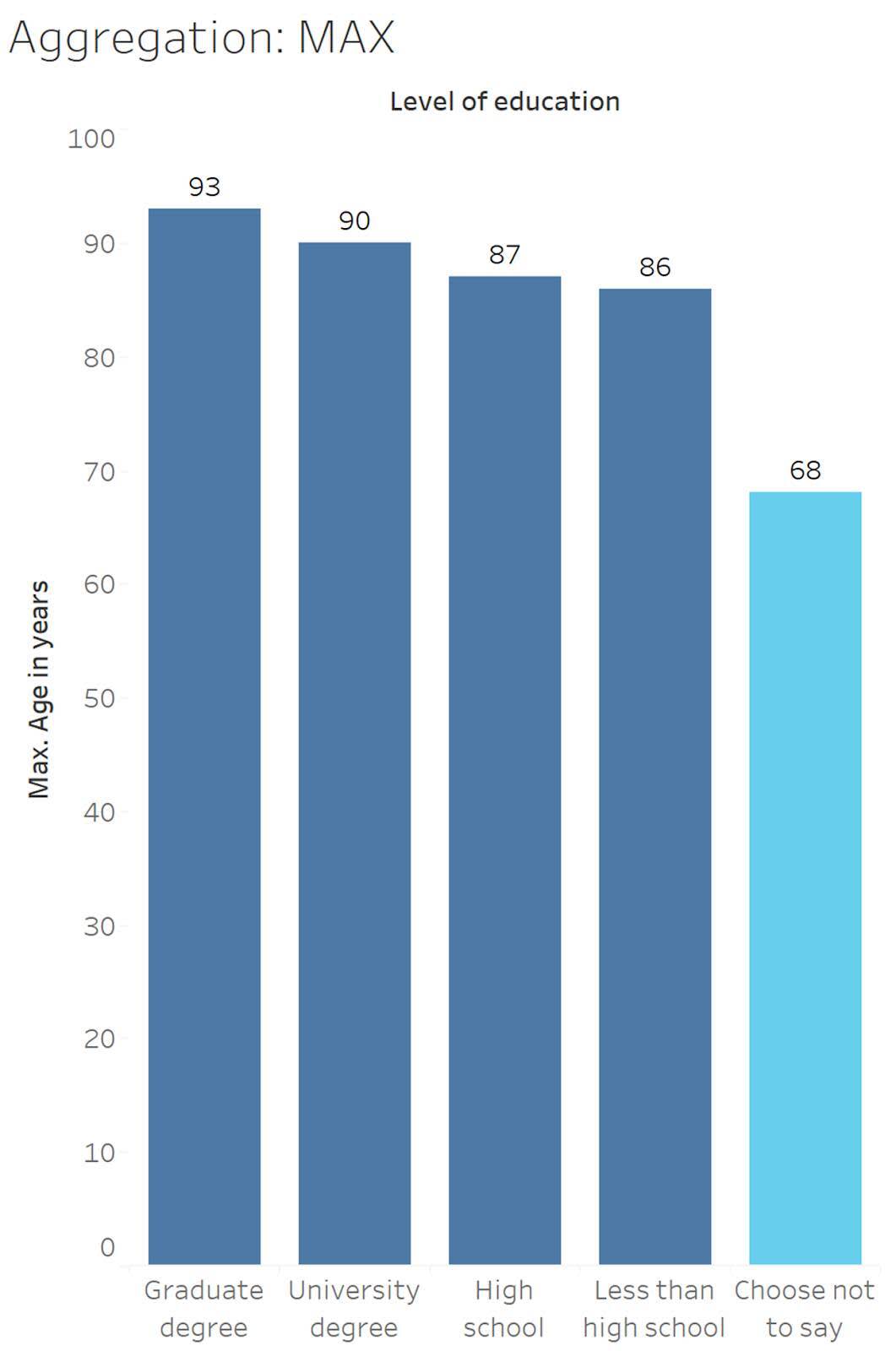
Looking at the education level Choose not to say (shown in light blue), the maximum Age (years) is 68.
13 , 13 , 13 , 13 , 15 , 16 , 16 , 16 , 17, 17 , 18 , 20 , 20 , 23 , 37 , 45 , 53 , 65 , 68
View Impact of Count Aggregation
Now, let’s explore what happens if Age is aggregated as a count. A count returns the number of values in the data for the selected category. This means we’re no longer looking at age, and instead we’re looking at the number of participants.
Looking at the education level Choose not to say, the count is 19 and count distinct is 12. Count distinct is 12 because four participants were 13 years old, two participants were 16, and two were 20 years old. We count 12, 13, and 20 only once because the count distinct aggregation only counts unique values.
|
The count is 19 13 13 13 13 15 16 16 16 17 17 18 20 20 23 37 45 53 65 68 |
Whereas the count distinct is 12 13 15 16 17 18 20 23 37 45 53 65 68 |
|---|
The counts show us that there are very few participants who declined to provide their education level.
Example of Disaggregation
The first chart you looked at was a completely aggregated view of the data—there was one value, the overall Sum. Then, the complete data set was disaggregated by Level of Education to show the breakdown of the sum of ages for each education level. Instead of looking at the sum (or average, or minimum) of all ages in the data set, each bar is aggregated to the level of each education category. The data is still aggregated, but at a more detailed level.
|
|
|---|


Now, let’s consider the original data again.

Each row represents a participant. If we wanted to see each participant's age instead of an aggregated value, we could fully disaggregate the data, or plot each point in the data set.
View Impact of Disaggregating Data

This chart uses jitter to spread out the data points, or marks. Jitter refers to randomly placing the marks along an axis that doesn’t have intervals (here, the x-axis) to help reveal the density of the data. If there was no jitter, the marks would all be stacked on a single vertical line per level of education. In a jitter plot, the horizontal location of a mark is random and doesn't convey any particular meaning.
In this visualization, we can see that there are more participants with younger ages, and fewer participants as the ages go up. We can also see that although there are some older participants in the Less than high school category, the majority are quite young—under twenty. The High school category has the most ages right around the early 20s—which could indicate they’re current university students. There are also very few participants with graduate degrees who are less than 20. The disaggregated data matches pretty well to realistic expectations based on what we know about age and level of education.
Try It!
Challenge: You have the following table with three rows of data about newspaper readership per week.
Name |
Newspapers read per week |
|---|---|
Brooklyn |
2 |
Morgan |
3 |
Vaida |
7 |
How would the values of the Newspapers read per week variable (2, 3, and 7) be aggregated as a sum, an average, a median, a minimum, a maximum, and a count? Take a moment to think about it, and then check your answers using the interactive flashcards below.
Read the aggregation type on each card, think what the value would be for that aggregation, and then click the card to reveal the correct answer. Click the right-facing arrow to move to the next card and the left-facing arrow to return to the previous card.
You’ve explored how aggregations impact data and the effect of disaggregating data. In the next unit, you build on these concepts by learning about granularity.
Resources