Get Familiar with Relationship Design
Learning Objectives
After completing this unit, you’ll be able to:
- Describe the tools used to build a better information app.
- Articulate the relationship between persona building and the Jobs to Be Done framework.
Tools of the Trade
In unit one, we talked through the importance of putting your users at the center of any product or experience you’re designing. We also looked at the mindsets and design phases at the heart of relationship design, and the guiding principles of designing great apps with Lightning Design System.
You’ve got a basic philosophical foundation for understanding the whats and whys of building better user experiences. Excellent! Now it’s time to open up the relationship design toolbox to get familiar with some of the tools you’ll be doing all that building with.

Persona Building and Jobs to Be Done
Persona building is a tool many UX designers are familiar with. Many great user experiences have been built using personas, but we’ve shifted our focus to something we think works even better: The Jobs to Be Done framework. In the spirit of that old TV PSA favorite, The More You Know, here’s a quick look at both tools.
A persona is a fictional character based on real, aggregated data that represents a group of users based on shared behavior, motivations, goals, pain points, or other characteristics. Think of a persona as a composite of a certain type of user who’s important to your work.
Personas help you keep your key user groups at the front of your mind when making decisions about your product. Effective personas are created based on research to ensure that they reflect the real people who use your product. In fact, we usually give each persona a name to make it easier for the team to track who’s who when working with more than one user group at a time.
You can also use the Jobs to Be Done (JTBD) framework to look at things from a slightly different perspective. Rather than focusing on types of users, JTBD asks, “What job is this solution being hired to do?” For example, most of the time when somebody buys a shovel, what they really need is a hole in the ground. In this case, the job to be done is digging the hole—the shovel is the product that’s bought to help do the job.
Seeing your product or experience through this lens provides a framework for discovering and defining jobs and needs. JTBD ties those jobs and needs to measurable outcomes defined in terms of success for the users who share those jobs.
As mentioned, many designers still use personas in their work, but we at Salesforce believe JTBD is a great framework that’s becoming the standard when it comes to designing superlative user experiences. Interested? The Jobs to Be Done Framework for Designers Trailhead module is a great place to learn more.
The next pair of tools can help define a solution more clearly: path of inquiry and journey mapping.
Path of Inquiry
The path of inquiry is a logical progression of questions that takes you from your user's goals through an assessment and prioritization of the information needed to meet those goals in meaningful ways. We use this tool to counteract the natural inclination to universalize our own priorities. That is, to avoid designing based on key performance indicators (KPIs) and other metrics we might be used to as default metrics—and to help us orient our information design around the needs of a specific organization, user group, and purpose.
Journey Mapping
Journey maps are visualizations of customers’ step-by-step experiences achieving specific goals or JTBD. While the maps are oriented from the users’ point of view, they highlight touchpoints with, and opportunities for, a business or organization. A journey map can help you assess your current experience or paint a picture of a future one.
Journey maps are valuable in aligning an organization around experience wins and pain points; operational inefficiencies involving people or technology, and the impact of all these factors on real customers. Good journey maps are based on research and may expose a need for further understanding.
For more on getting started with journey mapping, check out the Journey Mapping Trailhead module.
Design Studio Workshop
Conversations are a huge part of the relationship design process. Product developers need to talk to users, decision makers, and other stakeholders to develop a full understanding of who’ll be using the product, what they need to get from it, and how it might best fit into their workflows and daily lives. Everyone who will be building, managing, or using the end product should be involved to form a shared understanding and build relationships with one another.
Workshops are a great way to facilitate these conversations in a structured way that directly informs design decisions. And, get this: Running workshops up front saves you time in the long run! How? Asking questions and uncovering requirements and misalignments early—before a single line of code is written or pixel is designed—saves product teams from tedious updates later, when new requirements are discovered after coding has begun.
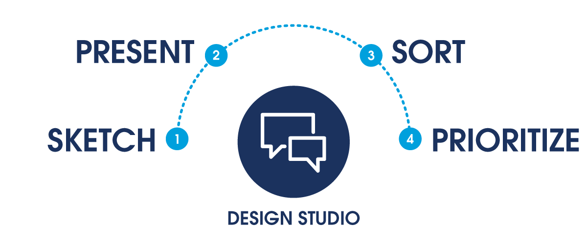
Our workshop format of choice for this dashboard design exercise is the design studio. It’s straightforward, it’s fun, and it’s all about generating ideas in a collaborative environment.

Length: 60 to 90 minutes
Materials Required: An open mind! (Also, paper, markers, and stickies)
Steps:
-
Sketch. The team goes through multiple rounds of timed sketch sessions. Each participant sketches one or more ideas per session for solutions to key moments along the path of inquiry. Artistic skills are not required! Remember, it’s not about how well you draw, it's about the story you share. Rapid sketching is a fun and effective way to get people sketching. See below for details.
-
Present. Each participant gives a 3-minute presentation of their sketch.
-
Sort. As group sketches are discussed, ideas are grouped and sorted.
-
Prioritize. Sketches are prioritized based on how well they answer user goals and questions. Typically, we prioritize by way of a silent vote, to ensure that all opinions are heard.
The idea behind design studio is to get the team to inspire one another and collaborate together on ideas—as many ideas as possible!
Rapid Sketching

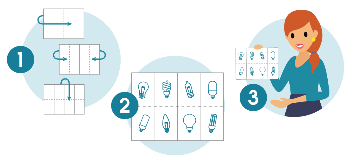
Rapid sketching is a faster, less structured take on getting ideas flowing in a group setting. You can do rapid sketching on its own or use it as a structured way to sketch in a design studio workshop. The steps are simple.
- Take a piece of paper and fold it in half three times (so you wind up with your paper folded into eight sections).
- Sketch eight quick, high-level visual ideas, one per section.
- Share with your group!
With these tools in hand, we’re ready to dig into applying relationship design to UX development. The next unit looks at how one of our customers, custom sneaker maker Cloud Kicks, applied relationship design to redesign a sales dashboard that suffered from having way too much of everything all in one place.
