Get Started with Flexcard Designer
Learning Objectives
After completing this unit, you’ll be able to:
- Explore the Flexcard Designer.
- Describe the UI features of the Flexcard Designer.
- Explain the different display and input elements and how they work.
Tour the Flexcard Designer
The Flexcard Designer is a visual, drag-and-drop tool in Omnistudio that helps you build interactive Flexcards without coding. The Flexcard Designer simplifies the creation of engaging, context-aware Flexcards that can show relevant information and provide quick actions within various Salesforce experiences. You can arrange elements, connect them to data sources, define actions, and style their appearance, all from a simple and intuitive interface.
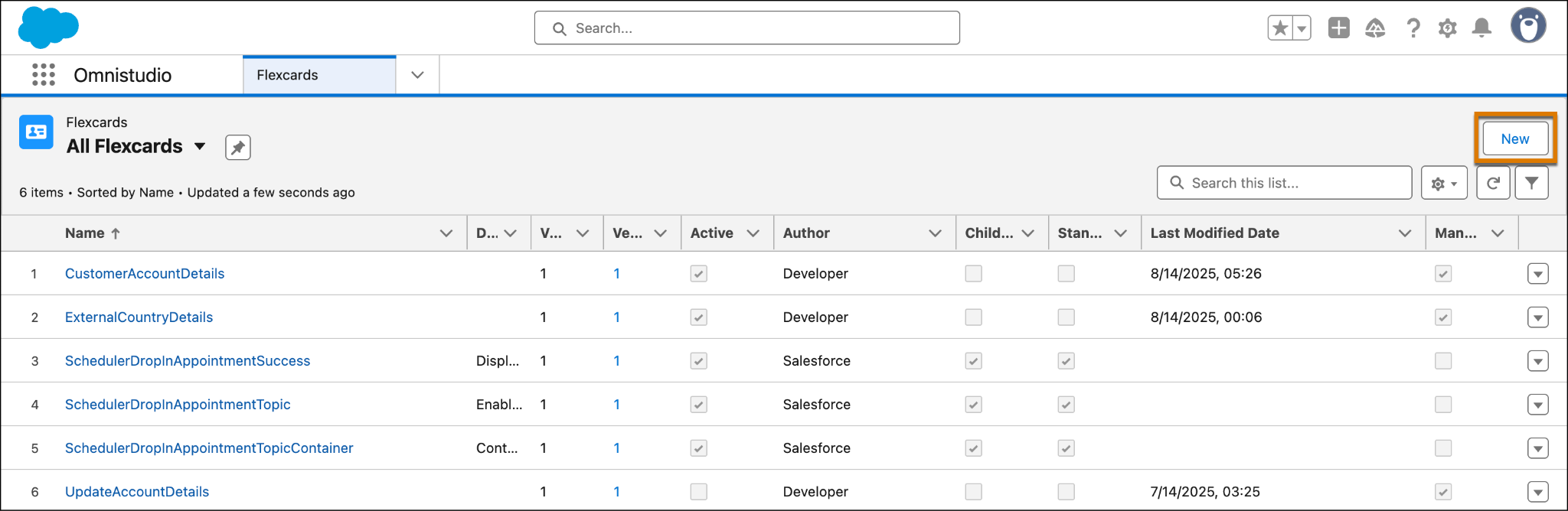
To open the Flexcard Designer, select  and find and select Flexcards. Alternatively, from the App Launcher, find and select Omnistudio. Then, from the app navigation menu, find and select Flexcards.
Omnistudio components are now available as part of Salesforce standard list view page. On the Flexcards list view page, either select an existing Flexcard or create one to open it in the designer.
You can now create Flexcards faster using the two step creation process. Here’s how:
- On the Flexcards list view page, click New.
- On the Flexcards Details window, enter the required details and click Save. The new Flexcard opens in the standard designer.
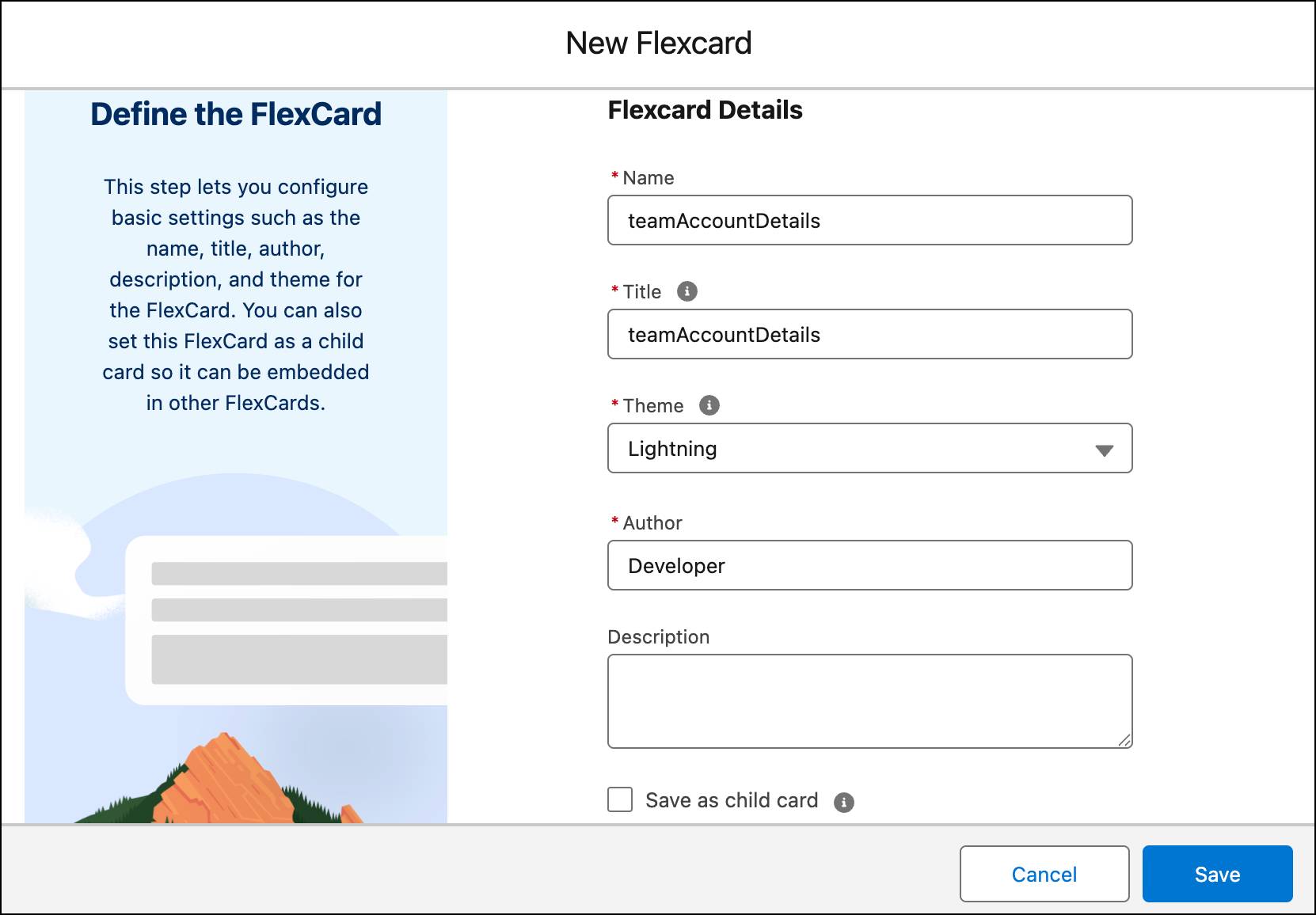
You can also choose to make the Flexcard a child Flexcard during the creation process by selecting the Save as child card checkbox.

Now that you know how to locate the designer, it’s time to take a tour of the designer layout. Here’s a screenshot of the Flexcard designer interface.
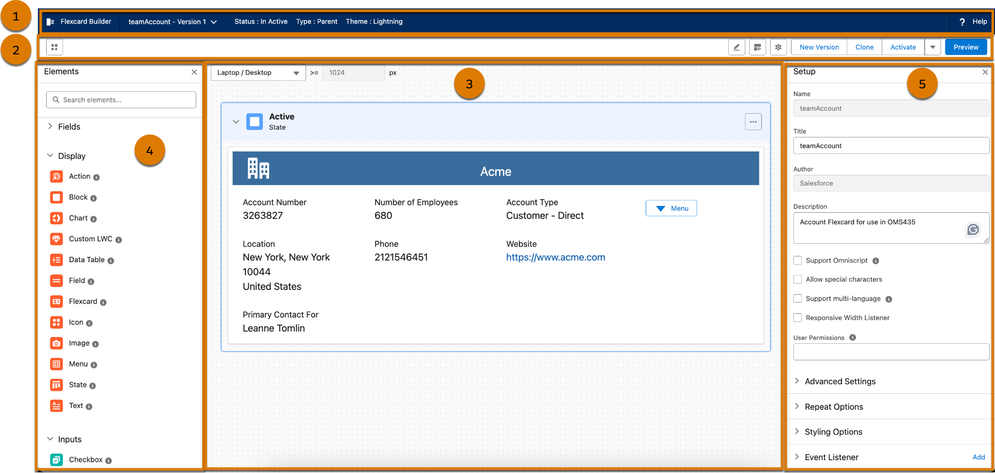
The Flexcard Designer layout consists of these sections.
- The header (1) shows Flexcard’s name and version. Select the name to quickly switch between versions.
- The toolbar (2) includes icons to show and hide elements, Design Assistant, Properties, and Setup panels in the designer. It also has buttons to create a new version, clone, activate, and switch to Preview mode. The Elements panel appears on the left side of the canvas. The Design Assistant, Properties, and Setup panels appear on the right side of the canvas.
- The canvas (3) is where you build your Flexcard. Everything you see here is included in the Flexcard. You can drag elements into the canvas. Click
 on an element to duplicate or delete it.
- The Elements panel (4) is where you can find all of the elements that make up your Flexcard. You simply drag them onto the canvas and position them in the sequence you want.
- The Setup panel (5) is where you configure details about the Flexcard. You can add attributes, variables, and data sources to the Flexcard.
- The Properties panel (not shown in the image) is where you configure the details of each element on the canvas. Select an element on the canvas to view and change its properties.
Now that you understand the designer, explore the elements that make up your Flexcards.
Combine Elements to Build Your Flexcard
The Flexcard Designer provides a variety of elements that you can drag onto the canvas to build interactive UI components. These elements are broadly categorized to help you construct the functionality and user experience you want.
You can use these elements to:
- Add data fields, display, and input elements to your Flexcard.
- Show data generated from the Flexcard’s data source, or add static information.
- Rearrange, clone, delete, and adjust the widths of your elements as needed.
- Style an element and configure its properties in the Flexcard designer.
Next, explore each category and types of Flexcard elements in detail.
Display Elements
Display elements show relevant information on the Flexcards such as data fields, actions, states, data tables, and more. The table describes each element type.
Display Element Type |
Description |
|---|---|
Block |
Combines logical groups of elements in a collapsible container. For example, group an account's basic information in one block, and group the account's contact information in another block. |
Action |
Enables users to interact with the Flexcard, such as launching or updating Omniscripts, navigating to URLs or Salesforce pages, displaying flyouts, and firing events. |
Chart |
Displays data visually in various formats like bar, pie, and donut charts. |
Custom LWC |
Embeds components to which you add custom styling and functionality. For example, embed an existing carousel component in a Flexcard and then configure its attributes. |
Data Table |
Shows data in a sortable table format, allowing for representation of multiple records. For example, show all the cases associated with an account as a sortable table. |
Field |
Displays data fields returned from a data source. The Field section shows the available data fields in the Elements panel as well. |
Flexcard |
Shares data between Flexcards by embedding a Flexcard as a child in another Flexcard. The child Flexcard can have its own data source, or the parent can override the child's data source with its own data source. |
Icon |
Add Salesforce SVG or custom icons to a Flexcard. These icons can also have actions associated with them. |
Image |
Add images to a Flexcard from an existing library or use your own. These images can also have actions associated with them. |
Menu |
Groups actions into a dropdown list, providing a way to organize multiple functions. |
State |
Displays different interactions and layouts based on specific conditions. |
Text |
Displays static text combined with information from data sources using merge fields, with formatting options using a rich text editor. |
Input Elements
Input elements provide data or make selections, which can then update the Flexcard’s underlying data JSON and trigger actions. They enable interactivity and data entry within the Flexcard interface. Take a look at the various types of input elements.
Input Element Type |
Description |
|---|---|
Checkbox |
A Boolean input control allowing users to select or deselect an option |
Currency |
An input field for entering currency amounts, with formatting options |
Date |
A field for selecting dates, often using a date picker |
Date/Time |
A field for selecting both date and time |
An input field specifically for email addresses |
|
Multi-Select |
A list of multiple options displayed in various formats (checkboxes, buttons, images, dropdown) |
Number |
A field for entering numeric input, with potential mask constraints |
Radio |
A circular button to select one option from a limited set, displayed vertically, horizontally, as images, or as colors |
Range |
A field allowing users to select a number within a specified range using a slider |
Select |
A dropdown button that displays a menu of selectable values |
Telephone |
An input field for phone numbers, with potential format masks |
Text |
A single-line input field for text |
Text Area |
A multiline input field for larger text entries |
Time |
A field for selecting a time, often from a list |
Toggle |
A switch-like control that typically represents a boolean choice or triggers an action |
Typeahead |
A field that provides suggestions as users type, often used for lookups or searches |
Apart from the display and input elements categories, the elements panel also has a Fields category. Fields display data fields generated from the Flexcard's data source. For example, display policy information for an account.
What’s Next
In this unit, you explored the standard Flexcard designer and its interface properties. You also got to know the various elements that you can use to build Flexcards. In the next unit, dive into the Omnistudio Flexcard configuration and styling options.