应用可视化属性和原则
学习目标
完成本单元后,您将能够:
- 识别用于读取和创建图表的必要属性和原则
- 介绍问题、比较和数据类型如何帮您确定该使用的最佳图表。
- 解释为什么条形图是一种重要且常见的可视化类型。
设计图表的指导原则
通过数据传达信息时,有许多可视化设计指导原则可以帮助您查看和理解所显示的数据。理解这些原则可以帮助您有效地解释和创建图表。
前注意属性
前注意属性是可视化属性,如长度、颜色或位置,几乎可以立即处理。
请看下面的图。您在第一个图片中看到了几个 9?现在跟用颜色突出显示 9 的图片进行比较。注意在第二个图片中找到 9 的个数的速度和准确性的差异。
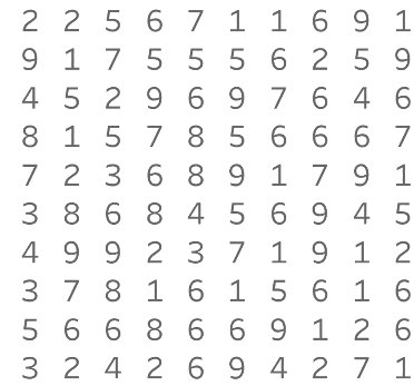

现在看第三个图片。如果用条形图的长度来显示每个数字的个数,并用颜色来突出显示 9 的数量,您可以看到 6 和 1 比 9 多。使用前注意属性位置可以让您看到,与其他数字相比,9 排名第三。
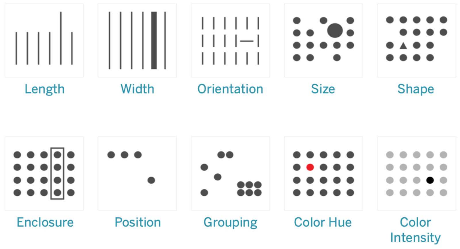
您几乎立即在视觉上处理了前注意属性,这发生在大脑注意力中心处理这些属性之前。这意味着您可以快速看到使用这些属性表示的信息片段之间的区别。下图显示了 10 个前注意属性,包括前面讨论的 3 个,可以用来帮助读者快速理解数据。呈现数据时使用这些属性意味着读者可以立即看到差异或模式,而无需大量的认知提升。
用图形表达数据
数据类型决定了图形类型
如果您已完成数据素养基础模块,那么您已经知道数据由定性和定量变量组成。定性变量是不可数的变量,比如类别或特征。定量变量是可数的变量,比如高度英寸数值。一些前注意属性在比较定量数据时效果更好,而另一些则在比较定性数据时效果更好。图表中的特定形状,如条形、方框、点或线,使用不同的前注意属性,更适合在比较不同类型的数据时使用。这个表显示了适用于定性或定量数据的属性分别有哪些。
类型 |
属性 |
定量感知? |
类别(定性)感知? |
|---|---|---|---|
|
表单
|
长度
|
卓越 |
差 |
|
宽度
|
受限制 |
差 |
|
|
方向
|
差 |
差 |
|
|
大小
|
差 |
差 |
|
|
形状
|
差 |
卓越 |
|
|
圈起
|
差 |
受限制 |
|
|
颜色
|
色调
|
差 |
卓越 |
|
强度
|
受限制 |
差 |
|
|
空间
|
二维位置
|
卓越 |
差 |
|
空间分组
|
差 |
卓越 |


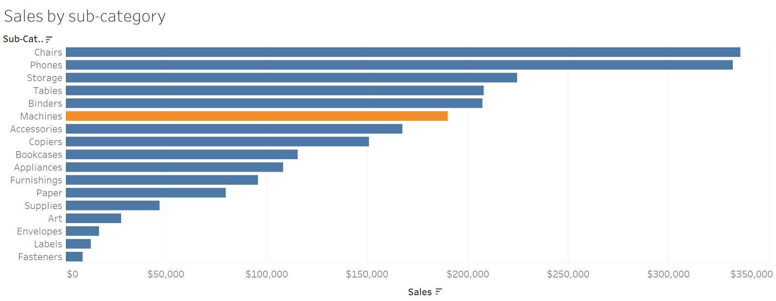
请看下面的图表。比较条形图中的定量值时,您使用长度属性进行比较。您可以很容易地确定最大值和值之间的任何微小差异。当查看使用大小属性、通过气泡图表示的相同数据时,比较这些值会更加困难。


比较是图表的基础
正如上一单元所提到的,提出好的问题是数据分析的一个重要(许多人可能会说最重要)部分。当您在探索我们的数据时提出问题时,您在比较变量。从去年到今年,销售额有什么变化?哪个产品最受客户青睐?
数据的类型(定量或定性)和您所做的比较决定了将使用的最好的图表类型。这些“最佳图表类型”基于人类大脑使用定量或定性数据类型的特定属性来感知差异的程度。
数据可视化专家经常争论哪种图表最适合以不同的方式呈现数据。以下对照表中分享的建议,是基于 Stephen Few 在其著作《Show Me The Numbers》中的研究,以及《金融时报》创建的图表选择资源。复选标记表示最常见的图表类型。您将在本模块后面了解有关每种图表的更多信息。

|
比较
|
表达值的对象
|
||||
|---|---|---|---|---|---|
|
|
点
|
线
|
条形
|
箱型
|
形状
|
|
名义
比较类别 |
点图 |
线条上的颜色或强度用于比较类别 |
✅ 条形图(垂直或水平) |
多个箱用于比较类别分布 |
|
|
时间序列
通过时间比较值。 每年,每月等 |
点图 |
✅ 折线图、面积图 |
仅垂直条形图 |
仅垂直箱型图 |
|
|
排名
按升序或降序对值进行排序 |
点图 |
凹凸图 |
✅ 条形图(垂直或水平) |
||
|
部分和整体
值作为整体的一部分(或一定比例)进行比较 |
折线图 |
✅ 堆叠条形图(垂直或水平),多个条形图 |
饼图,树图 |
||
|
偏差
值与基准进行比较,通常是零或其他设定值。 |
点图 |
✅ 折线图 |
✅ 发散的条形 |
||
|
分布
显示值在数据集中出现的频率。可以决定一系列值的形状。 |
✅ 带状图 |
✅ 频率多边形 |
✅ 柱状图 |
✅ 箱型图 |
|
|
相关性
比较两个或多个值集以确定它们之间的关系。 |
✅ 散点图 |
趋势线 |
表格透镜 |
不同大小的形状或气泡可用于向散点图添加第三个变量。 |
|
|
地理空间
按位置比较数值,通常使用地图。 |
点表示存在于地图上的位置。 |
路线 |
✅ 形状表示识别出的区域。 不同大小的形状或气泡可以显示额外的变量。 |
||


条形并不无聊
查看前面的比较矩阵图时,请注意,条形图的建议使用频率高于其他形状。在许多用例中,条形图是最合适的图表。如图所示,使用长度属性时,您可以很容易地感知到数量上的差异。由于许多用例都是比较定量值,所以使用长度属性的条形图可以帮助图表的读者以最有效的方式理解信息。虽然制作奇特或不寻常的图表很有趣,但普通的条形图通常是读者最容易使用和理解的选择。
资源
- 书籍:Stephen Few (2012):《展示数据:设计图表和图形以启迪》。Analytics Press。
- 金融时报网站:有用的图表:《金融时报》视觉词汇
- 网站:为您的数据选择正确的图表类型
- Trailhead:数据素养基础
- Trailhead:变量和字段类型
- Tableau 网站:为什么要进行可视化分析?
准备进行小测验
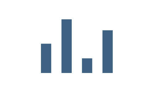
用此图回答小测验第一题。