Create Features with Purpose
Learning Objectives
After completing this unit, you’ll be able to:
- Express an app’s purpose as a set of features.
- Determine the high-level design requirements for your app’s features.
- Implement a simple design fix to The Motivator app.
Turning Purpose to Features over Pizza
Now you understand your app’s audience and purpose, you can come up with design ideas for The Motivator that will become its features. You do that with the smaller group that stepped forward at the last meeting to keep working with you.
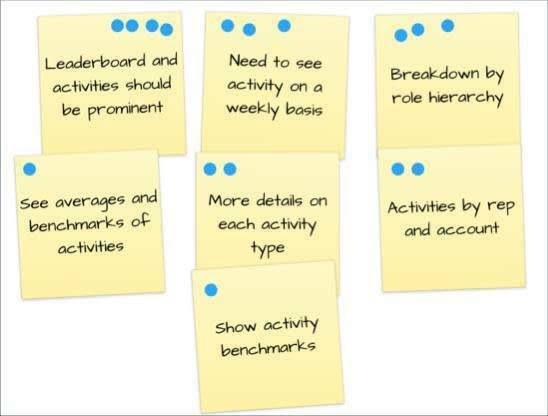
Without further ado, you convene a session with them over a long lunch the next day. Over pizza and salad, you start with the comments from the previous meeting, which you put into a short presentation and share with the team. Everyone at the meeting takes turns going to the whiteboard, leading a discussion about a comment or two, and then writing or sketching key takeaways. In the end, you review all the ideas together and vote on how to prioritize them. You take the team’s notes and sketches and organize them into another set of slides.
Here at CRM Analytics when we run design workshops, we have folks write their feature ideas on yellow stickies and put them on the whiteboard. Everyone says a few words about their idea, and we group them as we go along. Then, we have folks vote on the ones they’d like to see in the app. We move them up and down based on the number of votes.
Here’s what you and the team come up with, ordered by priority.
- The most important things to have are a leaderboard and activity totals, along with completed and overdue activities. Make those really prominent.
- You need to see each type of activity on a weekly basis.
- Make sure you can break things down by role hierarchy. That is, you need to see activities as they roll up to each level of management, from sales manager to regional manager to sales VP.
- You need to quickly see activities for each rep and each account.
- You need separate data for each activity, that is separate sections for emails, calls, and so on.
- You’ll use average activity levels as a benchmark.
- You want more details for each activity type. For example, for calls, you need inbound and outbound to see if reps or customers initiate contact. For emails, you want a sense of priority. And for tasks and events, whether they’re complete or open.
You look at the first version of The Motivator, and it’s easy to see where it doesn’t measure up. First, there are some issues upfront that stand in the way of the app’s purpose.
- There’s no concept of time. Managers can’t see when their reps’ activities take place. For all they know, The Motivator is showing activities from the start of time until now. You’ve got to fix that, right?
- There are no benchmarks, and there is no leaderboard. Without them, there’s no way to know which reps are above or below average, and no good way to determine who’s doing well.
There are other issues, too, some relating to the structure and organization of the dashboard, others more related to polish and surface issues. We get to those parts of design later in the module.
- Totals are at the bottom (as you noticed before).
- There’s no way to view activities rolled up under each level of management.
- You can see activities by account using the Account Name menu. But wouldn’t it be great to see a list view of all the accounts?
- You can only see totals for each activity. We can’t see activities by time, in this case by week.
- You can’t see the level of detail about activities we need.
- Type size is inconsistent.
- Some parts of the dashboard run into each other, even though they don’t belong together. For example, why is the Owner Name above all the metrics on the left?
- The colors and sizes of the sections showing totals don’t make sense.
Validate Your Ideas and Start Building Your Dashboard
Now you have real requirements from the team, and you’re almost ready to start building your dashboard. All that’s left is to review the statement of purpose and the list of ideas and features with the team one last time to validate them.
That was some fast work with a great result. What led to that? Let’s review.
To determine the purpose of your app and its dashboard, you followed a process that looks like this:
-
Empathize. You understood your audience, what they need, and why they need it.
-
Develop ideas. With the team, you collaborated on ideas to serve that audience.
-
Turn ideas into features. You came up with features that represent ideas for the dashboard.
Not too hard, right? And similar to the process that we, the CRM Analytics design team, follow when working on apps with our development team or customers.
As part of that process, we also typically hold informal workshops, not unlike the meeting you had with the team, to come up with specific ideas and features. At those workshops, we follow a process that looks a little like this.
-
Sketch. In several short, timed sessions each member draws ideas for what could go in the app.
-
Present. One at a time, each team member quickly presents their ideas: three minutes or less for each idea.
-
Sort. As the ideas are discussed and prioritized, yellow stickies representing each idea are categorized and sorted.
-
Prioritize. The team organizes the ideas from most to least relevant for meeting their needs.
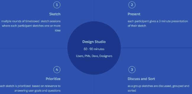
Look familiar? Like we said, pretty close to what you did over pizza, right? Again, not too hard, and pretty much common sense. But, in our rush to develop and deliver, it’s easy to skip basics like this.
Now that you have a foundation, let’s get to the fun part and fix The Motivator. You start by making a small adjustment to help the app meet its larger purpose. Later, you do more fine-tuning related to structure and surface (polish).
My Motivator Makeover, Step 1: It’s About Time
When you opened The Motivator, you noticed it. And when the team looked at it, they jumped on it, too: There’s no way to see when the team’s activities took place. Pretty much defeats the purpose of the app, which is to provide up-to-the-minute key performance indicators (KPIs) about sales rep activities. How can the KPIs be up to the minute when the dashboard can’t measure time?
- In the Analytics Studio home page, in the Recently Updated section of For You, find and open the My Motivator dashboard—the copy you just made.
- Click the Edit button. The dashboard designer opens.
- Select the Filters container.
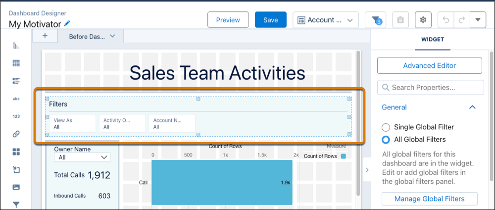
- In the widget properties panel on the right, click Manage Global Filters.
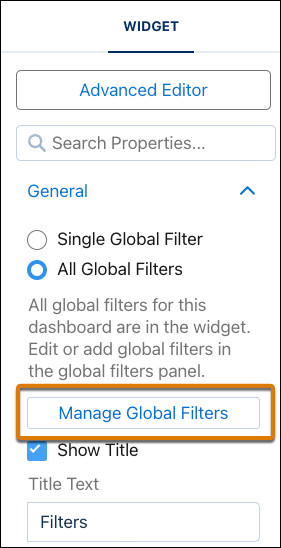
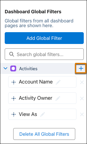
- For the Activities dataset, click
 .
.
- To find date fields to filter by, enter date in the search box.
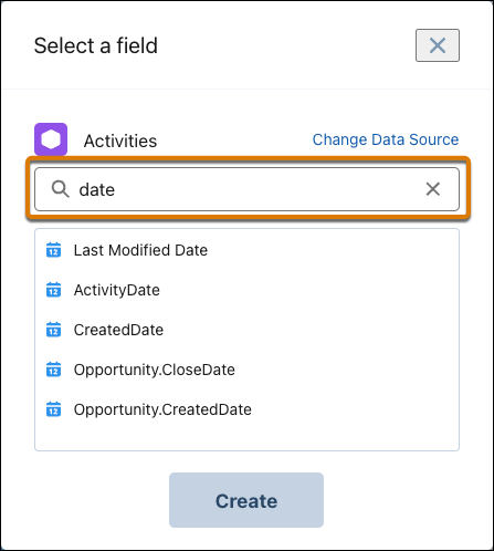
- Select ActivityDate and click Create.
- Click the Save button and save the dashboard.
- Click the Preview button.
Cool, you’ve added a date filter. Simple, right?
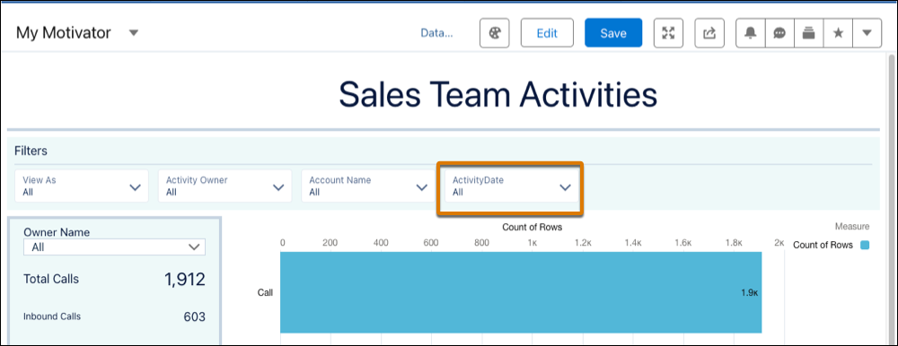
Now, give it a try.
- Click the new ActivityDate filter.
- Select Current Fiscal Year To Date.
- Click Apply.
The dashboard shows activities just for the selected time period.
With that simple fix, you’ve addressed one of the main problems that prevented the dashboard from serving its intended purpose. Congrats.
From Purpose to Structure
You still have a long way to go. You fixed only one of the purpose-related issues. This Trailhead module is about the design process, not dashboard building, so you’re not going to fix all the dashboard’s problems. But when you added the filter, you saw that Analytics Studio gives you powerful tools to bring your designs to life and build dashboards. You can explore the CRM Analytics dashboard-building tools in-depth yourself by reviewing the resources included at the end of this unit.
Where are we in the design process? You understand your app’s audience and purpose, and you’ve come up with design and feature ideas. You’re ready to move into the next phase of design: determining the structure of the dashboard and fixing how its parts are organized.
First, keep making your progress toward your badge by testing what you’ve learned with these questions.
Resources
-
CRM Analytics Dashboard Building Basics Trailhead module.
-
Build CRM Analytics Dashboards from Salesforce Help.
-
Add a Global Filter Panel Widget to Filter Data from the Dashboard from Salesforce Help.