Get Started with CRM Analytics Dashboards
Learning Objectives
Meet CRM Analytics Dashboards
The magic begins with CRM Analytics dashboards. They’re made up of data visualizations and comparisons that weren’t possible with tools you used before. A dashboard is an interactive collection of widgets that show query results from your data, whether that data comes from inside or outside Salesforce. Dashboards tell a multifaceted story about your business from different angles.
The CRM Analytics dashboard isn’t just a static picture; it invites you to dig deeper into the underlying data. You explore dashboards by clicking displayed elements. Key metrics are calculated with fresh data from the last dataflow run. Every chart shows an interactive picture of a filtered database query.
It’s easy to filter data displayed in the dashboard by selecting from drop-down lists, switching toggles, and clicking in charts. View details in tables, drill in, and take action. You can also use dashboards to collaborate with colleagues and to set goals for yourself. We get to all that in the following units.
You can use CRM Analytics dashboards to keep up with all the data that’s being generated by your colleagues and customers. Track activities of sales, service, marketing personnel. Collect, analyze, and distribute insights to your team. By putting all your data sources together into a single view, CRM Analytics makes it easier to create new data-based strategies to increase business.
Sounds magical, doesn’t it?
Follow Along with Trail Together
Want to follow along with an expert as you work through this step? Take a look at this video, part of the Trail Together series.
No Training Required
In the CRM Analytics Basics module, you signed up for a special CRM Analytics-enabled Developer Edition org and created your first app. In this module, you’ll use an app that’s already set up in your org. The Salesforce admin at DTC Electronics created an app called “My DTC Sales” and gave it dashboards designed for sales managers. Now you’ll learn how to make those dashboards work for you.
But you’re the first to admit that you’re no analyst. You know the admin put in some hours with the Sales Operations team to understand what was needed in the dashboards. You’re worried they might have created complex visualizations that will be hard to interpret. You don’t want to be lost in a wilderness of data! But when you asked about CRM Analytics training, the admin just smiled and said, "Oh, you don't need training.”
In fact, for this module, we’ll do some of the work in the Analytics tab that’s integrated into Salesforce. This will let you experience CRM Analytics as a typical business user. The next few steps will get you ready.

- If needed, launch your CRM Analytics-enabled Developer Edition org again now. If you’ve just completed the first module of this trail and still have your Developer Edition org open, move from Analytics Studio to the tab with Lightning Experience.
- From the App Launcher (
 ), select Sales. If you don't see it in the list, click View All.
 - Open the App Launcher again, click View All, and under All Items, select Analytics (not Analytics Studio).
Now you’re viewing the CRM Analytics home page in the Analytics tab of Lightning Experience.
Prepare for the Meeting
- In the Analytics tab, click Browse in the left panel, and then click the Apps filter.
- In its dropdown menu, each app has a Browse option. That’s because in the Salesforce environment, clicking an app opens the app’s first asset and starts it running. In contrast, clicking an app in the Analytics Studio opens the browse mode of the app so you can see its assets. In both environments, it’s easy to switch from run to browse and back as needed, but each is set up with the optimal work flow for that environment.
- Since you’re in the Salesforce environment and you want to run the app, simply click My DTC Sales.
Note: If the app doesn't load on your first attempt, close the tab and log in again with this link: login.salesforce.com.
The app opens with the first dashboard or lens on the navigation list, in this case “DTC Sales.” - In the running app, you have access to all the app’s dashboards and lenses from the navigation list. Click the down arrow next to the name to open the list.
 Here you can see all the dashboards and lenses in the app, in the suggested order for exploring them.
The first dashboard, DTC Sales, is an overview of the key business indicators, a sort of “big picture.” The other dashboards provide different avenues to details about your data. For example, Opportunity Details lets you sort and zoom in on opportunities so you don’t miss anything. Regional Sales lets you see opportunity amounts by region. - Start by changing the big picture. In the toggle at the upper-right corner of the DTC Sales dashboard, click 2020 and watch what happens.
 Did you see that all the numbers changed and the line chart shifted dramatically? You filtered the data being used by the dashboard according to the year. All the widgets in the dashboard are connected, and if you make a change in one place, that change is reflected throughout. That’s called faceting.
 - Now click the refresh button (
 ) to return the dashboard to its original state. Or remove the 2020 filter by clicking it again.
Notice that the numbers go up to reflect the totals over both 2020 and 2021.
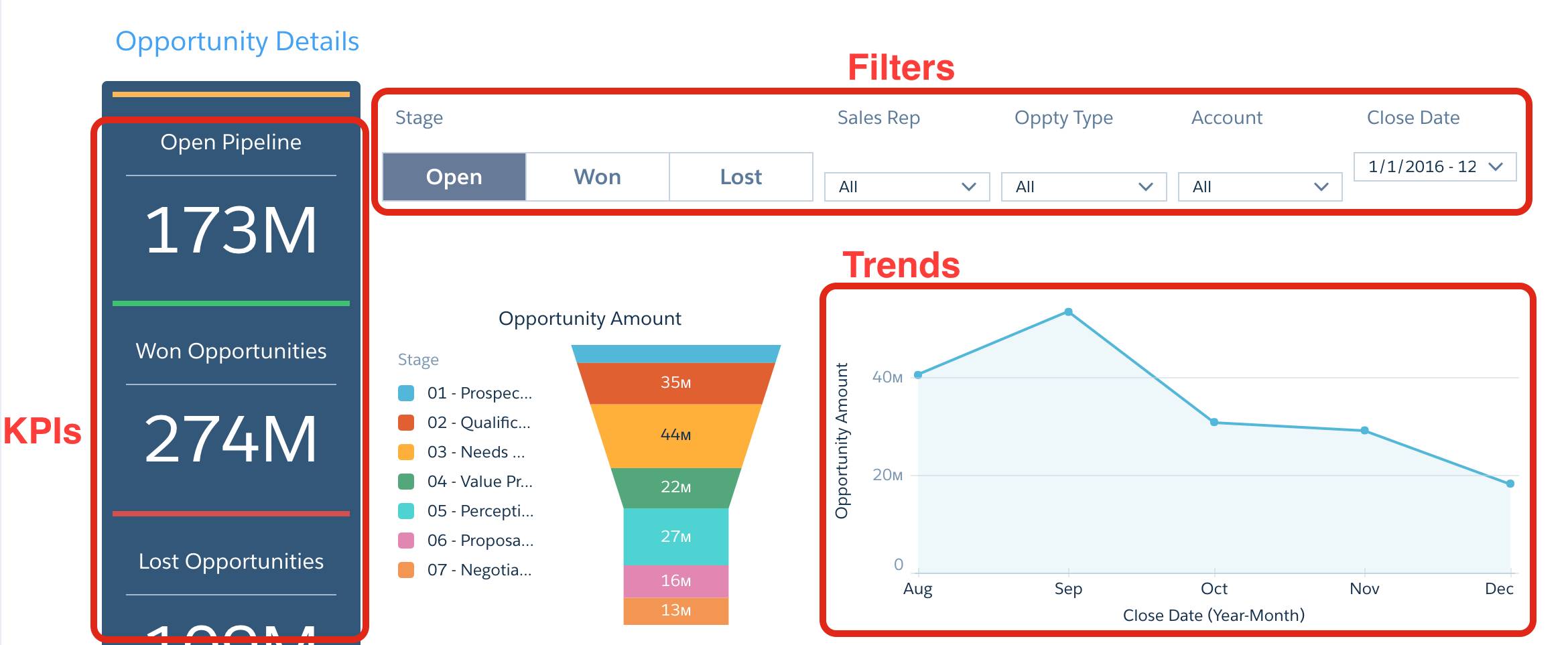
Get Down to Details
- Open the navigation list and select Opportunity Details.
Right away you note the Open Pipeline KPI—this is something you want to keep an eye on. The funnel chart is an easy-to-read indication of which percentage of your business is in which stage. The line chart shows you the business over time. The stacked bar chart gives you an overview of each rep’s opportunities, and how they’re doing against quota. The table below the charts shows details.
This is actually making a lot of sense. You’re feeling that you’ll find your way through the data wilderness after all. - Click Won in the Stage toggle, and then click Open. Notice the dashboard comes alive as all the widgets change, thanks to faceting.
 Now you can clearly see the promising 39M in the Perception Analysis stage in the funnel chart. But the line chart shows a major downward trend in opportunity amount since last September. You’re going to want to discuss both of these with your manager.
 - Locate the Oppty Type widget, which lets you break out opportunities by type. Click the down arrow, and select New Business.
Now the dashboard has two filters. It shows you only open opportunities that are new business. Looking at the Sales Rep bar chart, you see that Nicolas Weaver has the most open new business. But what you really want to know is who’s holding the most in the Perception Analysis stage? - Click the Perception Analysis section in the funnel chart and watch the names in the bar chart move.
 So it’s really Johnny Green who’s on the front lines with the highest amount in the Perception Analysis stage.
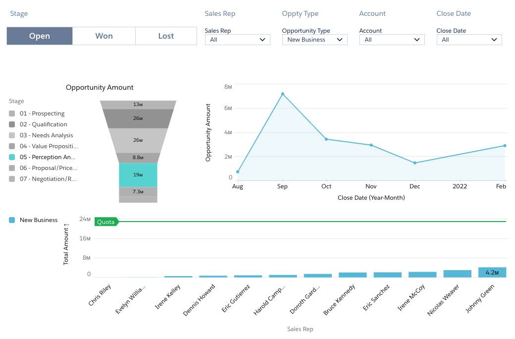
Just for fun, let’s see if you get the same results looking at the data from another angle. - To refresh the dashboard to its original state, click .
- Find Johnny Green in the stacked bar chart, and click the New Business segment of his bar.
 Notice that all of the charts in the dashboard now show only results for Johnny Green. His Perception Analysis number, 4.2M, is the same, even though you approached it from a different exploration of the dashboard.
 - Finally, scroll down to see the table below the bar chart.
Notice that it’s filtered for your current selection, giving you only details of Johnny Green’s new business in the Perception Analysis stage.
Sort and Drill In
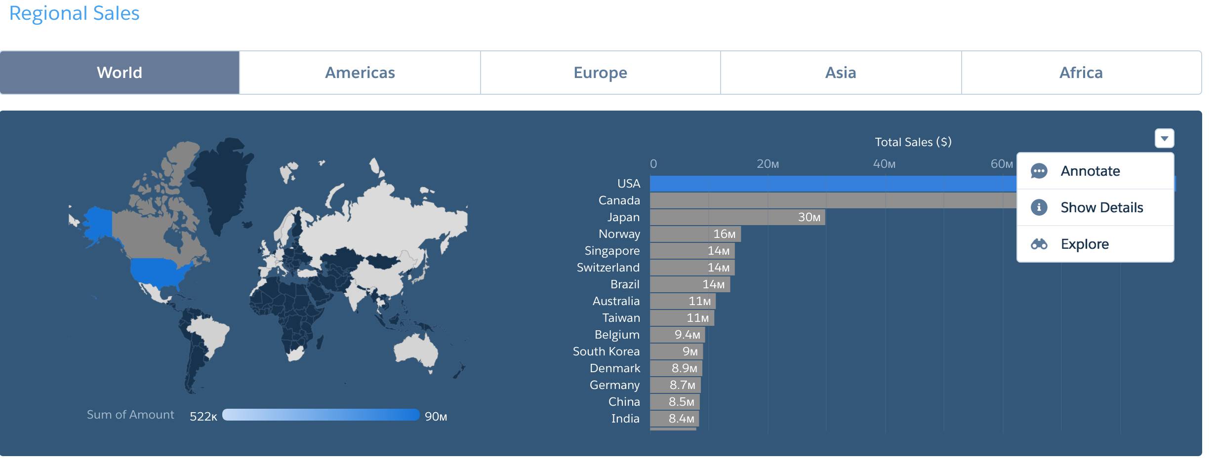
- Open the navigation list and select Regional Sales.
- To filter the dashboard, click the USA bar in the Total Sales bar chart.
If you scroll down, you see that all the entries in the table now have USA as the Billing Country. - To sort the table by amount, click Amount in the column heading. A down arrow appears in the heading. The values in the column are sorted in descending order, and you can answer the question, “What are the top amounts?”
- To switch to ascending order, click Amount again. Then click a third time to return to the original order.
 It looks like a variety of reps are contributing to the large USA number.
 - Hover at the corner of the bar chart to locate its menu, click to open it, and select Explore.
 This changes the view to a lens, which lets you learn more about these deals by drilling in to see the data behind that long bar.
 - Click the USA bar to select it, and then click
 to open the Drill menu. In the menu, select Account Owner.
 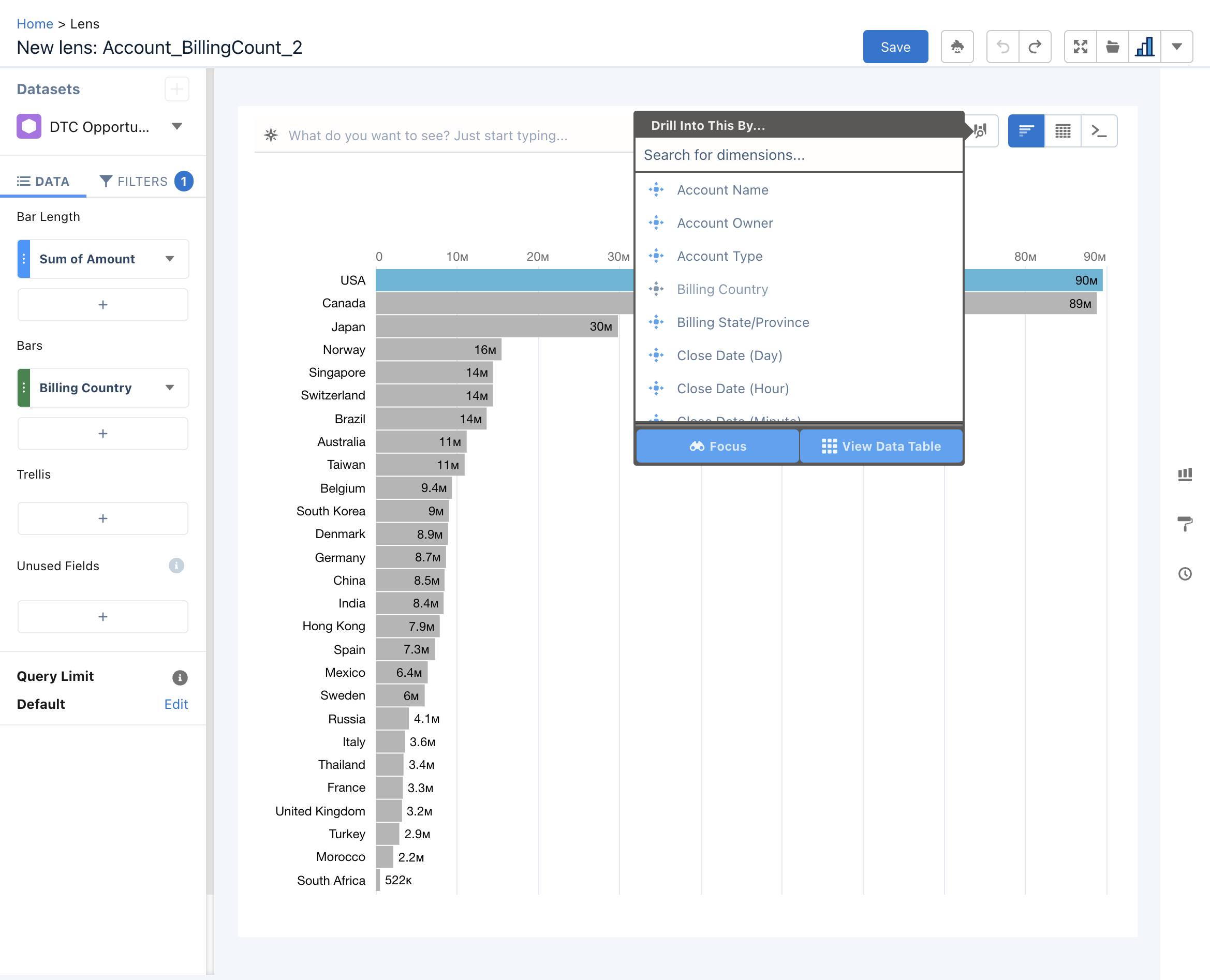 This view lets you quickly see your team’s leaders. Although there were many names in the table, you couldn’t compare each person’s totals until you reached this view.
  Can you drill in again to learn which products Laura Garza's team is selling to get the largest amount? Yes!
 - To open the menu, click Laura Garza’s bar to select it, and then click
 . In the menu, select Product Family.
 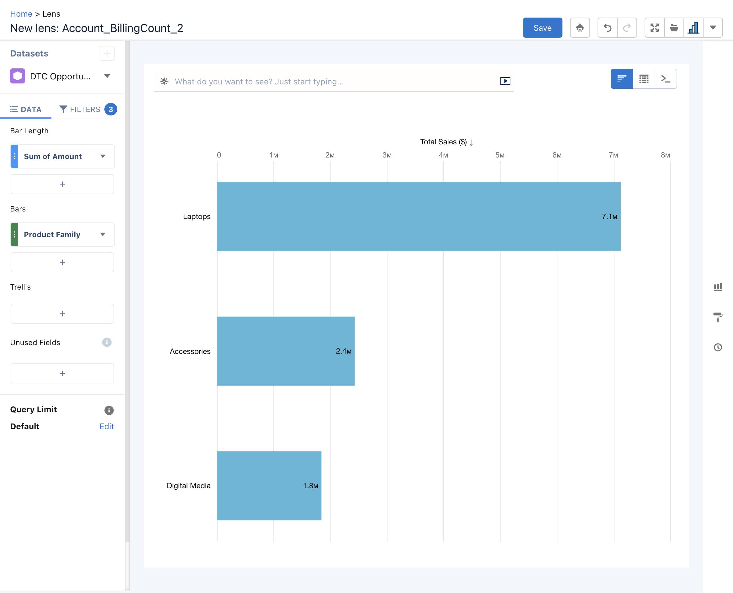 Looks like laptops are the big seller among Laura's accounts. Good to know before the meeting!
Well on Your Way with CRM Analytics Dashboards
In the next unit, you learn how to personalize your app to make it even more useful. You can’t wait! But first, take the challenge and earn your points.