Use Service Analytics to Manage Your Team's Case Load
Learning Objectives
Get the Answers You Need from Service Analytics
Thanks to Service Analytics on mobile and its fully functional dashboards, you’ve got a big jump on your day before you even get to your desk. Now it’s time to take a close look at your team’s tablet support cases and make sure that you’re doing everything possible to support the product launch. Service Analytics can help you make short work of it.
Quickly reviewing what you’ve learned so far, the tablet case load doesn’t look too bad, and most cases are related to breakdowns. You’ve also seen that some cases are taking a while to resolve, and you’ve asked an agent about one case to find out why. You’re not yet clear on what your team’s doing to resolve cases, and you haven’t learned much about customer satisfaction with tablet cases. You open Service Analytics on the desktop, confident that all its dashboards can tell you what you need!

Look for Trouble Spots in Your Service Channels
The first thing you decide to find out is what’s happening with tablets in your various service channels—email, web, phone, and so on. One channel not functioning smoothly could cause the backlog to build up—the last thing you want when launching a new product.
- If you’re not there already, open the Service Manager Overview dashboard. From the App Launcher (
 ), find and select Analytics Studio, then click All Items.
 - Then click Run App to the right of My First Service App. (If you see large icons on the page representing your apps, Run App appears underneath the icon.)
- Under Channel Review, you see that your team’s first contact resolution results (the blue line that goes up or down) look good. They’re close to, even a bit above, your benchmark (the horizontal line). Make note of the benchmark number because you want to use that later as you drill down into the data.
- Change the time period filter from Last 180 Days to Last 30 Days to see more recent activity—that is, during the time around the tablet launch.
 Looks like first contact resolution numbers are bouncing around. But this number is for your overall product offering, and you want to find out about tablets.
 - Open the Channel Review dashboard by clicking Review Channels to learn more.
- Click Last 180 Days under the Date Range filter at the top right and change it to Last 30 Days to coincide with the date of the tablet launch.
- Scroll down to the By Product widget and click the Tablets bar.
- Now the dashboard shows recent channel activities involving tablets. This uses the faceting feature which filters all related widgets in the dashboard by your selection.
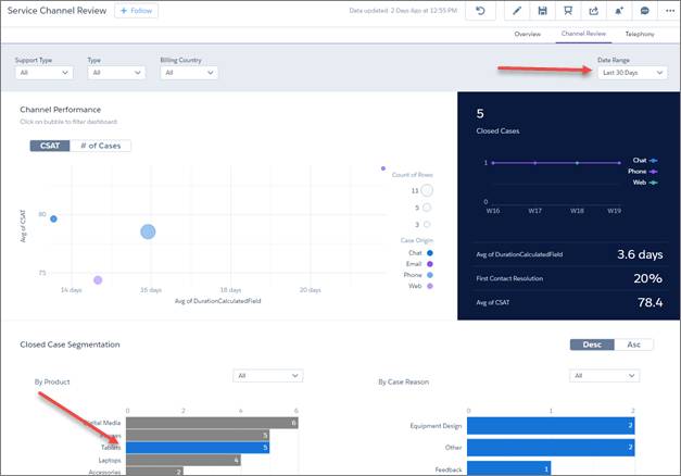
- Look at First Contact Resolution. Tablets look a little lower than the benchmark you saw on the overview dashboard—not a great sign.
- Now look at the bubble chart. It shows CSAT and average duration for tablet cases from each of your four channels. The picture is clear: More tablet cases come in by phone than over any other channel. And they have relatively low CSAT ratings and long case duration. But roll over the bubble for phone. You don’t have many tablet phone cases. In fact, in the By Product widget, you don’t see many recent tablet cases at all.
With the small sample size, not much of a concern for now. But this dashboard includes only closed cases, as you can tell by looking at the detail chart at the bottom. You’re concerned that these few cases are the tip of an iceberg waiting to tank the launch. So you decide to dig deeper.
Zero in on Agents To Give Them What They Need
You start by checking to see if any agents have issues resolving tablet cases. Just a couple of agents who don’t have what they need could stand in the way of a great product launch. And you figure that whatever you learn can help you arm the team for future success. Data is close at hand—in the Agent Performance dashboard.
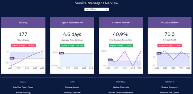
- Go back to the overview dashboard, and click Review Agents under the Agent Performance widget.
- Change the Date Range filter to Last 30 Days.
- Scroll down to the Segmentation area of the dashboard, find the By Product widget, and click the Tablets bar.
 Wow—you see everything that you could possibly want to know about how your agents are doing with recent tablet cases! At the top, you can see agent performance with bubbles representing CSAT and average case duration for everyone on the team. To the right, you can see a summary of the entire team’s performance.
 - The Open/Closed filter at top left shows that you’re looking at all cases. Open it and change the filter to Open just to look at unresolved cases.
Get into the Nitty-Gritty with Action Menus
Now you’re getting down to the nitty-gritty! You can see how each of your agents is doing with recent tablet cases, and it’s not quite what you’d like. Too many agents with long call durations, or low CSAT, or both! What can you do? Get in touch with a few of those agents and find out what’s going on.
To do that, you can take advantage of one of a handy CRM Analytics feature: Action Menus that let you take action right from dashboards!
- Click the bubble for the team member with the lowest CSAT score to look at just that agent’s cases.
- Scroll down to the Case Details chart.
- Position your cursor over the right side of the Case Number field and click there to open the Actions menu for the case. You have several options, and you decide a Chatter post is probably the best way to get what you want.

- Select Post to open a Chatter window, type “Can you get in touch with me? I want to find out more about this case and how I can help you with it! Thanks!”, and click return.
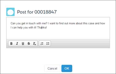
You figure that’s a gentle way to start finding out if agents have issues resolving tablet cases. Once you know what’s going on, coaching the agent along to success is a great way to get the case on track. You could take the same steps with a few other cases with either low CSAT or long duration. And what you learn can help you define best practices other agents can apply to other cases.
Before you know it, your team will be completely on top of tablets cases. Then you can assure the VP that there won’t be any surprise hiccups. Nice!
You’re feeling good about your tablet support—you’ll soon have the info you need to help your team successfully resolve cases more quickly. And you’re feeling even better about Service Analytics. The app just helped you spot a potential problem with agents before it became a big deal. It also helped you take action in advance to help ensure smooth delivery of product support. You can tell the Sales VP that you’re not seeing huge problems right now, and that you’ve been able to anticipate potential problems and head them off before they materialize. You’ve done that with a quick look at a few mobile and desktop dashboards. It’s been a good day so far!
Knock It Out of the Park with CSAT
But you’re not finished yet. You remember going to a bit of extra trouble to be sure that customer satisfaction data appeared correctly in the app. And you’ve seen customer satisfaction numbers in some of the dashboards you’ve looked at. You decide that you need to know more about tablet support customer satisfaction, so you dive back into Service Analytics.
- Go to the overview dashboard, change the date range filter to Last 30 days, and look at your recent top-level CSAT score. It’s under Account Review, on the right.
- Not a whole lot there—it’s hovered above and below your benchmark. And it shows results for cases about all products, not just tablets. You need to dig deeper.
- Open the Customer Satisfaction dashboard by clicking Review CSAT Drivers under the Account Review widget. Have a look at the bubble chart, which shows CSAT by product.
 Your heart skips a beat as you notice that tablet cases have both the lowest CSAT ratings and longest average case duration. What are you going to tell the VP now?
 - Hope springs eternal when you remember you only need to look at recent activity. You change the Date Range filter to Last 30 Days to capture data about just the new tablets. Big relief! Tablet cases now have the highest average CSAT and nearly the lowest case duration scores.
 You can breathe again!
Your team is knocking it out of the park, and you’ve got great news for the VP.! What’s more, you now have a tool that can give you as much detail as you want about support customer satisfaction. You can quickly filter CSAT data by time, product, reason, and other factors. Think of how hard this used to be when you had to go into a spreadsheet or some other tool and sort results manually. Or create complex formulas to sort data in meaningful ways. With your new app, those days are gone.
Service Analytics helps in another way, too. We all know that CSAT can be a little elusive. We depend on support customers completing surveys after cases are resolved, and typically survey response rates are low. It can take some time to build up a large enough sample to give us conclusive CSAT results. But the app helps that. It shows the CSAT rating of the moment, based on time periods we can select. And it updates that rating as soon as new responses are available. That way, you can track changes to those ratings and see how they change. If CSAT scores go up—as they are for DTC tablet cases—you can rest easy. If they don’t, you can look deeper and take action to find out why.
Do the Right Thing for Customers with Service Analytics
Thinking over the whirlwind that’s been the past 24 hours or so, you can’t believe how much you’ve been able to accomplish thanks to Service Analytics. You started off knowing almost nothing about your team’s support of the new tablet. But now you know a whole lot more, and you’re excited! The app’s dashboards gave you quick insights into how your team’s doing. Where you needed more, you took action right from the dashboards. The app boosted your confidence in your team’s ability to make the tablet launch a success.
You’re feeling better about your role as service manager, too—whether you’re supporting a strategic initiative or handling business as usual. Service Analytics gives you a great way to understand where your team is at any given moment at a granular level. With Service Analytics dashboards, you can filter data according to almost any aspect you can think of. Because the dashboards are so interactive, you can answer many questions in just a few minutes. Those answers take the form of easy-to-read charts—visualizations of data that are worth a thousand words. And they quickly help you and your team do the right thing for your customers.
You’ve seen what Service Analytics can do out of the box, but you can make it your own by customizing it. You can adapt it quickly as you use it and learn more about how it works and what you need. Start by fine-tuning your wizard answers. After the app is created, supplement datasets and add to dashboards to augment what’s shown in the app. Insert dashboards in their own tabs and add logos and colors to reflect your corporate identity. You can also change data security settings.
And you can embed Service Analytics dashboards right where you and your agents work in Salesforce every day. Put a dashboard in a case record detail page, a custom Visualforce page, or even right in the Salesforce console. For example, here’s the Service Agent Sidebar dashboard (on the right) embedded in the agent’s console. It shows case breakdown and CSAT scores for the account the agent’s working on. Insights, right where you look, and right when you need them!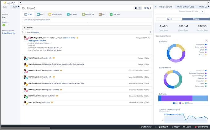
For now, answer the challenge questions to complete the Service Analytics App badge. You’ve certainly earned it!