Customize Compact Layouts
Learning Objectives
After completing this unit, you'll be able to:
- Explain why it’s important to customize compact layouts.
- Create a new compact layout.
- Assign a compact layout to users.
More Fun with Mobile Customization
Now that you have your black belt in quick actions, we can move on to the next mobile customization tool. In this unit, we introduce you to compact layouts.
Before diving in, we just want to acknowledge that the whole “layout” thing can be confusing. Action layouts...global publisher layouts...page layouts…compact layouts. For crying out loud, must everything have a layout?
Well...yes. That’s part of what makes Salesforce such a flexible CRM platform. You can customize the appearance of so much stuff that we’re literally bursting at the seams with layouts. But don’t worry. Once you get comfortable with all the customization tools, you won’t even think about the terminology anymore.
So what the heck is a compact layout?
Compact Layouts
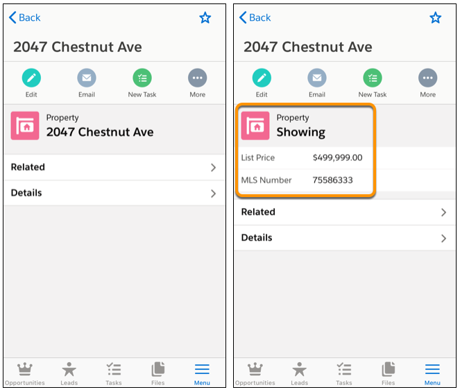
When you open a record in the Salesforce mobile app, you see highlights about that record in the header of the page. Compact layouts control which fields appear in the header. For each object, you can assign up to 10 fields, including the Name field, to display in that area.
Creating and customizing compact layouts for your objects isn’t required because system defaults are provided out of the box. However, we recommend using compact layouts to put important fields into record headers to help your mobile users get the information they need quickly.
Let’s look at an example from DreamHouse Realty. D’Angelo has been experimenting with compact layouts for the Property object, and he’s pleased with the results. Check out screenshots of a property header in the mobile app before and after he customized the object’s compact layout.

If you put key fields on an object’s compact layout, mobile users can see important details at a glance.
Create a Compact Layout
D’Angelo already took care of the compact layout for the property object, but he’s not done customizing his record headers yet. He also wants to improve the appearance of the contact detail page, so he’ll create a compact layout for the contact object. Then brokers can get information about prospective buyers as fast as possible.
- From the Object Manager, enter
Contactin the Quick Find box, then select Contact .
- From the Contact object management settings, go to Compact Layouts and click New .
- In the Field Label field, enter
Mobile Contact Layout.
- Add the following fields to the layout: Name, Phone, Stage, Email. You can include up to 10 fields, including the Name field. Not all fields appear in the list. Compact layouts don’t support text areas, long text areas, rich text areas, or multi-select picklists.
- Sort the fields by selecting them and clicking Up or Down . Be sure to put the object’s Name field first to provide context for your users when they view a record.

- Click Save.
Assign the Compact Layout to Users
Even though we created a compact layout, the Salesforce mobile app will continue to use the system default until we tell it otherwise. So now we just need to set our new layout as the primary one for the contact object. Here’s something to keep in mind: Unlike with page layouts where you can assign a different layout to each profile, one compact layout is applied to all users.
- Click Compact Layout Assignment.
- Click Edit Assignment.
- In the Primary Compact Layout dropdown list, select Mobile Contact Layout.

- Click Save.
Tip: If an object has more than one record type, you’ll see a Record Type Overrides section when you select the primary layout. With it, you can assign specific compact layouts to different record types.
Test the Compact Layout in the Salesforce Mobile App
Now it’s time to switch over to the mobile app so we can enjoy the fruits of our labor. Let’s check out the new contact detail page for our prospective buyers.
- Open Salesforce on your device.
- Tap
 to open the navigation menu, then tap Contacts .
- Select the contact you created earlier.
- Pull down to refresh the record page.

Ta-dah! The contact record page has some new key details. Sure, it’s a minor change. But that’s how the customization process works. All those little changes add up, and they make a world of difference to mobile users.
Resources