Import a Spreadsheet into CRM Analytics
What You’ll Learn
This project introduces you to creating CRM Analytics datasets and producing useful charts from those datasets. You’ll learn how to:
- Load a CSV file into CRM Analytics and create a dataset from that file.
- Choose the right data for what you're trying to communicate.
- Find the best chart for visualizing your data.
- Create the appropriate exploration (or lens) for the chart.
From Spreadsheet Smarts to Chart Intelligence
Sometimes looking at a table of data is helpful, and other times it's difficult to take it all in, see the bigger picture, or draw meaningful insights from those rows of numbers. With CRM Analytics charts, you can transform tables of data into beautiful and informative visualizations that won't require your audience to do math in their heads. They'll get the insights quickly, and you'll spend less time explaining. What's not to like?
But how do you go from a table of data to a chart? Which chart should you choose? And what's the right data to visualize? Before we can answer these questions, let's first ask: What's the overall goal?
We want to create visualizations that are useful and provide insights that your team can act on.
Imagine you're a business analyst keeping track of opportunities for your United States based electronics distribution company. Like many people, you've been using a spreadsheet to tabulate opportunities in the current fiscal year and to keep an eye on the product pipeline.
Here's what your spreadsheet looks like:

You create reports from this spreadsheet, but you often find yourself having to explain the numbers to colleagues and managers. You wish there was an easy way to create eye-catching, informative graphics that can be easily presented and shared. That wish is our command.
First we need to get the spreadsheet data into CRM Analytics. Start by signing up for a special kind of Developer Edition Org that has CRM Analytics enabled.
Sign Up for an CRM Analytics-enabled Developer Edition Org
For this project, you can’t use an existing Developer Edition org or a Trailhead Playground org. Follow the steps below to get a CRM Analytics-enabled Developer Edition that comes with a limited TCRM Analytics Plus Platform license and contains the sample data required for this project.
- Go to trailhead.salesforce.com/promo/orgs/analytics-de.
- Fill out the form using an active email address.
- After you fill out the form, click Sign me up. A confirmation message appears.

- When you receive the activation email, open it and click Verify Account.
- Complete your registration, and set your password and challenge question.
- Click Change Password. You’ll be logged in to your new CRM Analytics-Enabled Developer Edition org. If you see the Welcome to Lightning Experience window, close it.
To log in to the CRM Analytics-enabled developer org when you take the challenge at the end of this page, select Connect Org from the connection menu. To log in and play any time, go to login.salesforce.com.
Upload a CSV File to CRM Analytics
Normally you'd export the spreadsheet to a CSV file, then import the file into CRM Analytics as a dataset, but we've already created a CSV file for this project. Click here – Download the CSV File – to get the file ready on your computer.
To upload the CSV file to CRM Analytics:
- In your Developer Edition org, from the App Launcher (
 ), find and select Analytics Studio.
- In Analytics Studio, click Create in the upper-right of the screen and choose Dataset.
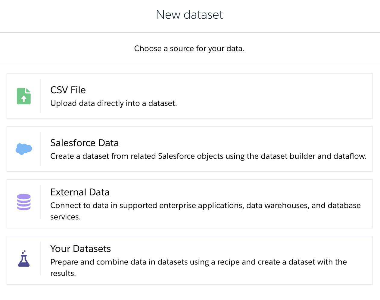
- Click CSV File as the source of the data.

- In the New Dataset screen, click Select file or drag file here.
- In the file-selection window that opens, select the ProductPipelineUSA.csv file that you downloaded and click Open (or the correct button in your operating system to upload the file). Then click Next.
- Verify that the Dataset Name is ProductPipelineUSA and click Next.
- In Edit Field Attributes, click Upload File. The upload begins and a new dataset is created.
Give it several seconds. When the dataset is ready, its information page will appear in a new tab in the Analytics Studio.
Before we learn how to use this dataset, let's decide what to use it for. In our scenario, there are certain insights your company wants you to provide:
- A breakdown of the current product pipeline by stage
- Information on the geographic distribution of opportunities
- A comparison of the different products by opportunity values
Until now, you had to extract and communicate these insights from your spreadsheet data using rows of numbers, but now you have the power of CRM Analytics charts at your mouse clicks! #micdrop
The Right Chart for the Job
There are more than a dozen types of CRM Analytics charts available, but not all charts are created equal. Some are just better at visualizing data in a way that pops out the specific insights you're trying to communicate. In CRM Analytics, each chart has certain characteristics that determine the type of data it can display.

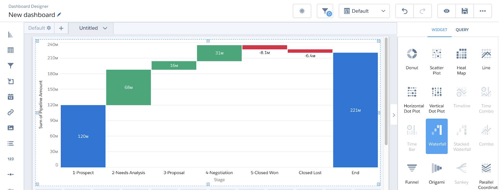
Charts vary the number of dimensions (columns with categorical data) and measures (columns with numerical data) required to use the chart. For example, the Waterfall chart above requires 1 measure and at least 1 grouping.
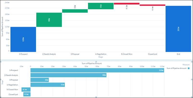
But even if two different charts could display the same types of data, one might do a better job at conveying the insights you're looking to find and communicate. For example, you could show pipeline stages using a bar chart or a waterfall chart.

Notice anything? The bar chart doesn't display the total value of opportunities. Visually, too, the waterfall chart does a better job of separating out the stages or outcomes, letting you see each stage as it contributes to (or takes away from) total opportunities. The waterfall chart also highlights the relative relationships between the stages in terms of how opportunities flow toward a close.
Next, you'll create a waterfall chart out of the dataset you just uploaded to break down the dollar value of pipeline opportunities by stage.