Apply Conditional Formatting and Annotate a Saved Dashboard View
Follow Along with Trail Together
Want to follow along with an expert as you work through this step? Take a look at this video, part of the Trail Together series.
(This clip starts at the 20:48 minute mark, in case you want to rewind and watch the beginning of the step again.)
Introduction
With conditional formatting, you can use rules to automatically highlight charts, tables, and number widgets in your dashboard. In this step, you save a view of your dashboard with conditional formatting applied. Then you annotate the saved view, and share your data insights with others in your org.
Use Color to Highlight Numbers
Highlight high and low values based on ranges and colors that you specify. You’re going to add a rule to the table widget that makes it easy to see numbers above and below a threshold.
- Return to the My Amazing Dashboard tab.
- Click the Opportunity Name table widget to select it.
- In the Properties panel on the right, click Column.
Note: If you don’t see the Column properties tab, click away, and then click the table again.
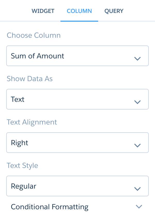
- Click Conditional Formatting.
- Click Add Rule.
- Under Coloring Method, if it’s not already selected, select Specify range (Bins).
- In the < field, enter
5000000.
- Click the down arrow under Required, click the down arrow under Text Color, and select the red square (left column, middle row). Then click the arrow next to Text Color again to close the palette.
- In the ≥ field, verify that
5000000was automatically entered, open its Text Color, and select the green square (4th column, middle row).
- Click Apply.
- Click the Save button in the dashboard header controls, and then click Save in the dialog.
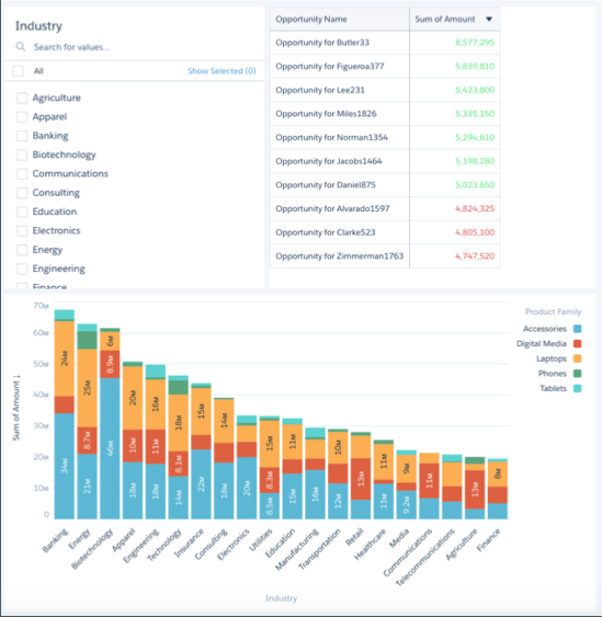
Your dashboard should look like this, but with the widgets sized and arranged in the way you chose.
Save a View of Your Dashboard
Now, set dashboard filters and save your view of the dashboard. Only you can see your views—other users still see the original dashboard. You can create multiple views and choose one as the default that shows when you open the dashboard. You can also share the URL to your saved view so that when users open the link, they see your view of the dashboard.
- Switch to dashboard preview mode by clicking the Preview button.
- From the Industry list widget, select Apparel, Biotechnology, and Education.
- Near the name of your dashboard, click Modified, and select Save View.
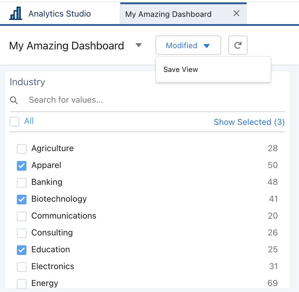
- For the View Name, enter
My Amazing View, and then click Create.
- Click the Save button in the dashboard header controls, and then click Save in the dialog.
Give Users Access to Your App
CRM Analytics assets can be shared across users, groups, or roles. To enable others to see a lens, dashboard, or dataset, share the app it’s in. You can grant Viewer, Editor, or Manager access to apps that you manage. After you grant access to the project manager in your org (Laura Garza), she can see the amazing data you share with her.
- Click the Analytics Studio tab, and then click Browse.
- Click Apps, and click My Amazing App.
- On the app page, click Share.
- On the Give Access tab:
- Verify that User is selected.
- Start typing Laura Garza in the search field, and select her name when it appears.
- In the access dropdown (which defaults to Viewer), select Editor.
- Click Add.
- Click Save, and then close the dialog box.
Annotate Your Dashboard
Post Chatter comments directly on the dashboard using the annotation feature. With annotations, you can hold conversations about your data and how it’s visualized, with the dashboard right there for reference.
- Click the My Amazing Dashboard tab.
- Hover in the upper-right corner of your Stacked Bar chart, click the dropdown menu, and then select Annotate.
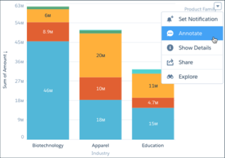
- In the New Annotation panel, enter
@Laura Garza, and then add a note for Laura.
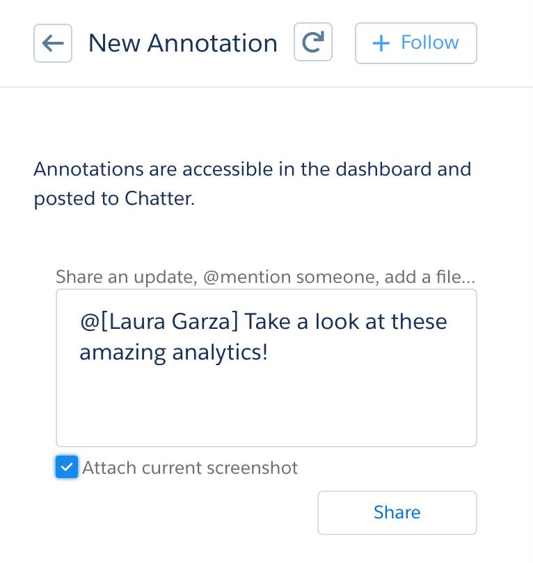
- Click Attach current screenshot, and then click Share.
Congratulations! You now have first-hand experience creating data visualizations and building CRM Analytics dashboards and apps. You’re on your way to becoming a CRM Analytics expert!

Resources
- Salesforce Help: Automatically Highlight Data with Conditional Formatting
- Salesforce Help: Save Your Filtered View of a Dashboard
- Salesforce Help: App-Level Sharing
- Salesforce Help: Collaborate with Dashboard Annotations