Take Analytics Dashboards to the Next Level
Learning Objectives
In this project, you’ll:
- Learn new ways to improve the readability and engagement of a dashboard.
- Apply conditional formatting to highlight values in widgets.
- Break up the dashboard content into separate, animated pages.
- Add an interaction to dynamically set a reference line based on a calculated average.

Where to Next?
You've mastered the basics of building CRM Analytics dashboards. You built dashboards with key metrics, charts, tables, and filters. You designed different layouts for mobile and desktop.
Now it's time to up your game! Let’s learn about some advanced features that can make your dashboard more dynamic and easier to read.
Ready? Let’s do this!
Your Next Project at ABC Seeds
ABC Seeds is a nonprofit organization that provides funding to build schools in poverty-stricken areas around the world. They hired you as their Salesforce admin to help build a system to track fundraising.
A few months ago, the program director came to you asking if she can see metrics about donations, donors, and account owners in a single place. So, after getting everyone going with Salesforce’s Nonprofit Success Pack, you quickly threw together the Worldwide Fundraising dashboard. The director took one look at it and was impressed. She then asked you to share it with the fundraising team, which you did.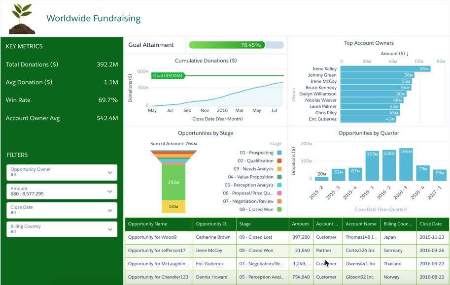
But the director came into your office this morning and said, "We love your dashboard, but there's so much on it that we're having trouble reading it. I'm afraid a few account owners overlooked some huge potential donors. Maybe as much as a few million dollars we could have raised just last month.” Yikes!
After brainstorming some ideas, you and your program director agreed to make the following enhancements.
Clarify the data. Make large potential donations jump off the page by automatically highlighting opportunities worth more than $1 million. Make data actionable. Show high (and lower) performing members of the team by grouping them into high, medium, and low performer buckets. That way, the director can quickly see whose achievements to call out, and who needs coaching. Make data contextual. Help business users quickly zero in on key metrics and trends that impact donations by reorganizing the dashboard into smaller, more focused chunks. We don’t want to miss any more large donations, right? Set benchmarks. Quickly identify how the team’s doing by showing how each account owner’s performance compares to the average. Account owners are responsible for managing all donor accounts, including both individual and corporate donors.
Sign Up for a Developer Edition Org with CRM Analytics
To complete this module, you need a special Developer Edition org that contains CRM Analytics and our sample data. Get the free Developer Edition and connect it to Trailhead now so you can complete the challenges in this module. Note that this Developer Edition is designed to work with the challenges in this badge, and may not work for other badges. Always check that you’re using the Trailhead Playground or special Developer Edition org that we recommend.
- Sign up for a free Analytics-enabled Developer Edition org.
- Fill out the form:
- For Email, enter an active email address.
- For Username, enter a username that looks like an email address and is unique, but it doesn't need to be a valid email account (for example, yourname@example.com).
- For Email, enter an active email address.
- After you fill out the form, click Sign me up. A confirmation message appears.
- When you receive the activation email (this might take a few minutes), open it and click Verify Account.
- Complete your registration by setting your password and challenge question. Tip: Save your username, password, and login URL in a secure place—such as a password manager—for easy access later.
- You are logged in to your Developer Edition.
Now connect your new Developer Edition org to Trailhead.
- Make sure you're logged in to your Trailhead account.
- In the Challenge section at the bottom of this page, click the org name and then click Connect Org.
- On the login screen, enter the username and password for the Developer Edition you just set up.
- On the Allow Access? screen, click Allow.
- On the Want to connect this org for hands-on challenges? screen, click Yes! Save it. You are redirected back to the challenge page and ready to use your new Developer Edition to earn this badge.
Create a Safe Work Area
To start, let’s clone the existing Worldwide Fundraising - Starter dashboard. It’s always best to work on a copy just in case you want to revert to the original.
- Log into your new Analytics-enabled Developer Edition org.
- From the App Launcher (
 ), find and select Analytics Studio.
- Locate the ABC Seed app and open the Worldwide Fundraising - Starter dashboard. NOTE: If the dashboard displays an error that says “Can’t display this widget,” wait a minute or two, and then refresh this page. This error happens if the underlying dataset for the widget hasn’t been created yet. When you sign up for an Analytics DE org, this dataset is created for you.
- Select the Edit button.
- Select the more options
 button and select Clone in New Tab.
- Save the dashboard.
- Name the cloned dashboard Worldwide Fundraising In Progress and save it in My Private App.
- Close the Worldwide Fundraising - Starter dashboard so you don’t accidentally update it.
Great! Now you have a copy of the dashboard in your private work area. You can update the copy and make tweaks until it’s ready—and you don’t have to worry about affecting the day-to-day business since your original is still available to users. In the next project step, you edit the dashboard to draw users’ attention to specific results by dynamically highlighting table cells and chart segments.
Resources
- Trailhead: Analytics Dashboard Building Basics