Engage Users with Animated Pages
Break Up the Dashboard Content
How many times have you seen a dense dashboard with so much information that you didn’t know where to focus your attention? Or one that had information that was irrelevant to you? In Analytics, you can break up dashboards into multiple pages, each with a specific focus and audience.
Pages offer some useful capabilities. When you split dashboard content into multiple pages, the dashboard renders faster because each page has fewer widgets. You can reuse widgets across pages in the same dashboard so that you only have to create them once. And when you navigate between pages, you’ll witness some really neat animation. You might add pages just for the animation alone!
Next on your agenda is to break up the Worldwide Fundraising In Progress dashboard so that it’s not so overloaded. You apply some best practices while breaking the content into separate pages.
Create the Donations Page
First, let’s help the team focus on donations with a Donations page. So that we don’t lose any existing work, let’s make the current page our primary page. To create the Donations page, we clone the primary page and remove any widgets that we don’t need. You can save a lot of time by cloning pages instead of creating pages and their widgets from scratch.
- Go to the Worldwide Fundraising In Progress dashboard. It should still be in edit mode.
- Click the dropdown next to the Untitled tab, select Rename, change the page name to Primary, and click Apply.
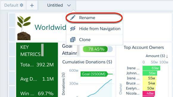
- To clone the Primary page, click the dropdown next to the Primary tab and select Clone.
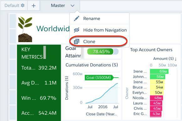
- Rename the cloned page to Donations. Great! Now you have two pages: Primary and Donations. Currently, you’re viewing the Donations page.
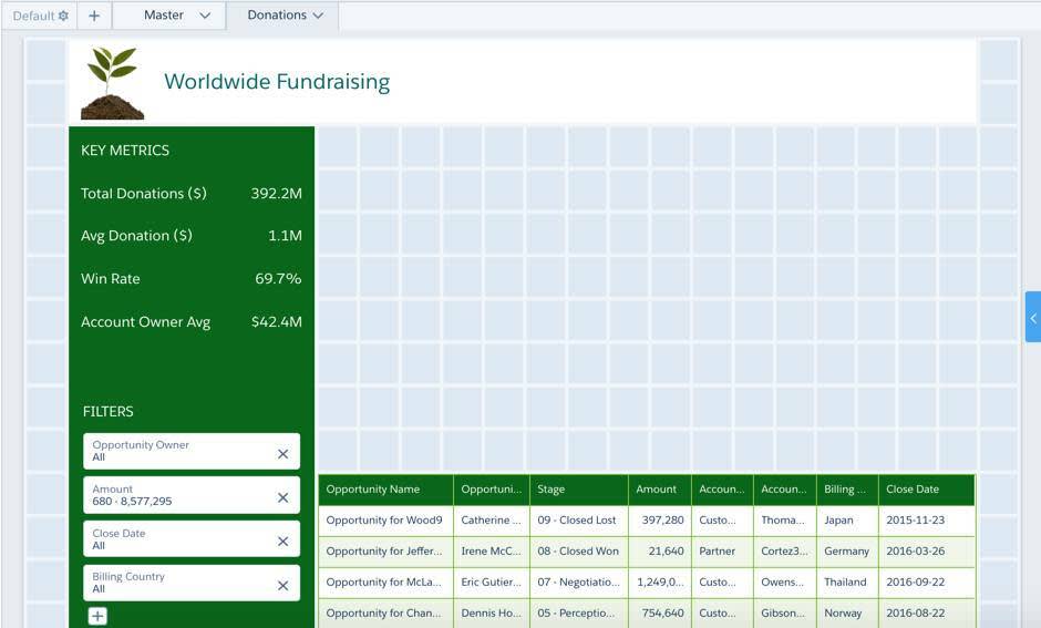
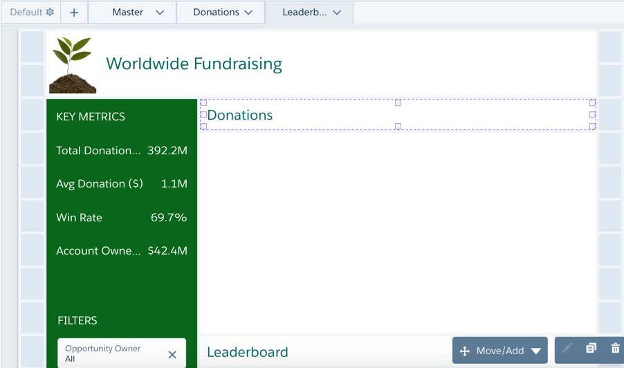
- Delete all widgets from the Donations page except the following widgets.
- Container widget with the dashboard title and company logo that goes horizontal across the top
- Container widget with the key metrics and global filter panel widget—the vertical column on the left
- Table widget
- The Donations page should look like this.
 Because the deleted widgets still exist on the Primary page, they aren’t deleted permanently from your dashboard. Later, you add a few of them back to the Donations page.
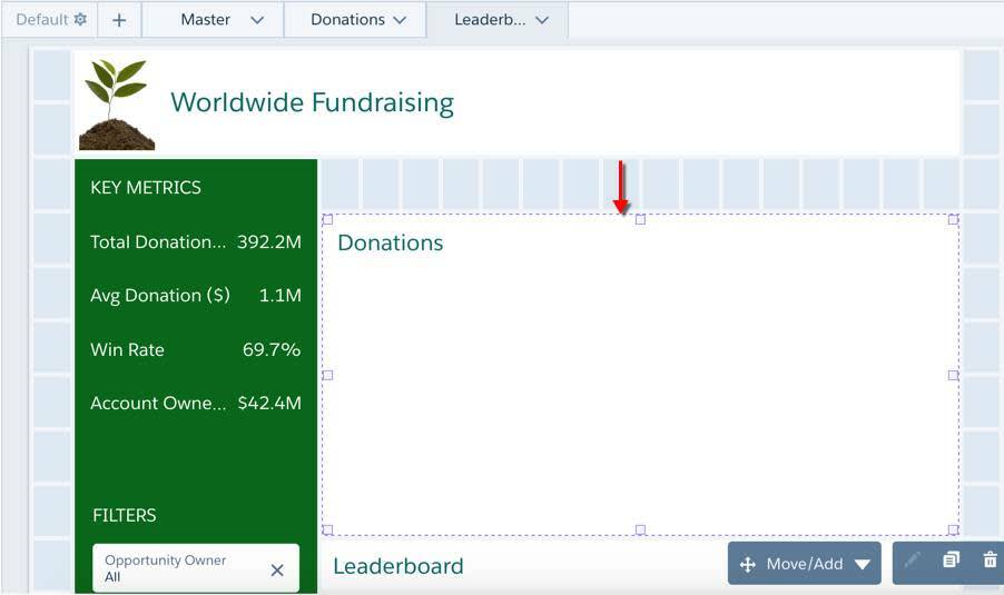
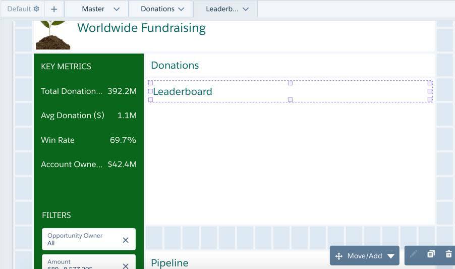
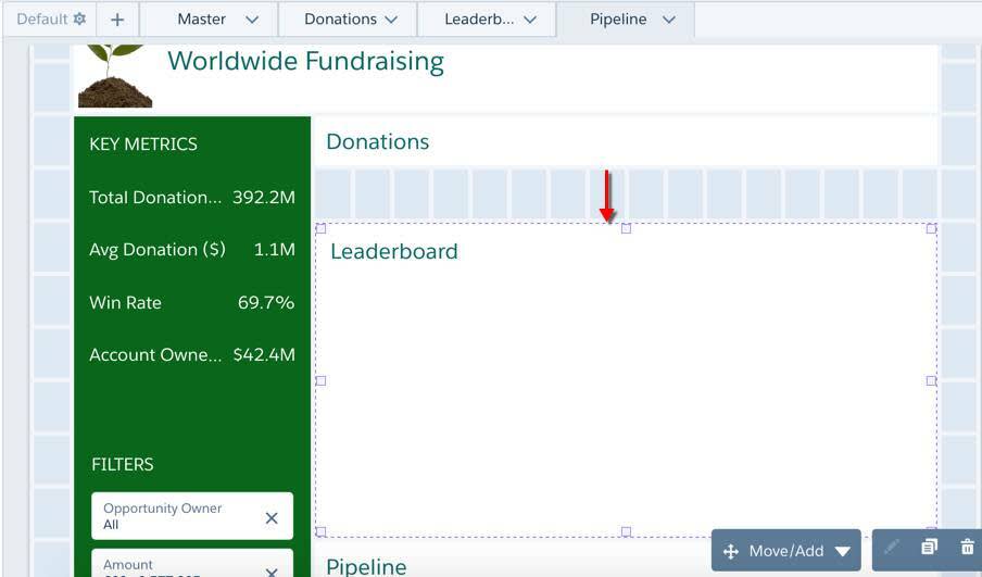
- Add a 16x6 container widget to the right of the Key Metrics container, directly below the Worldwide Fundraising title widget. Do this by selecting
 , dragging it into place, and then resizing it.
 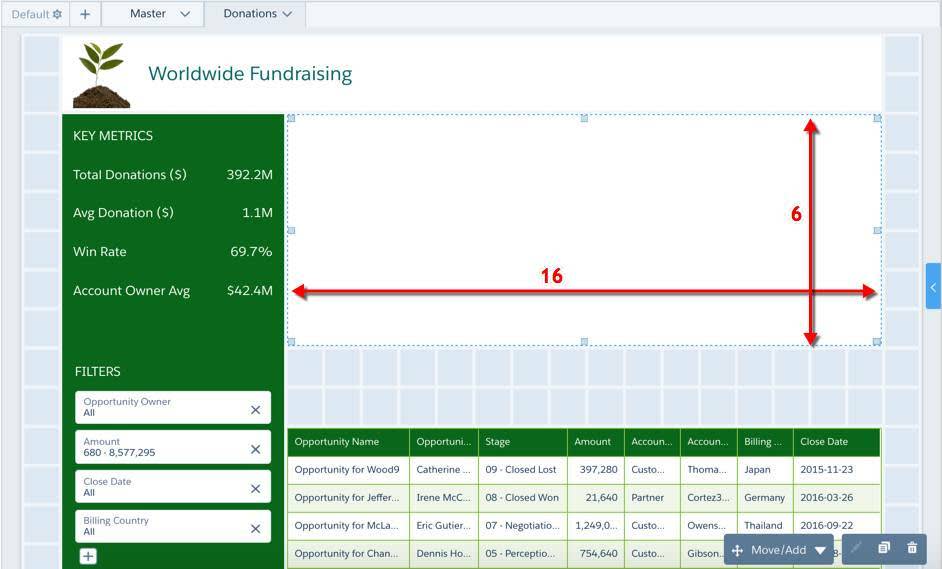 We’re going to reuse this container widget for each page to ensure we have similar size pages for an animation effect.
- Add a Leaderboard link widget by completing the following tasks.
- Add a 16x1 link widget (
 ) below the container widget and set the link name to Leaderboard.
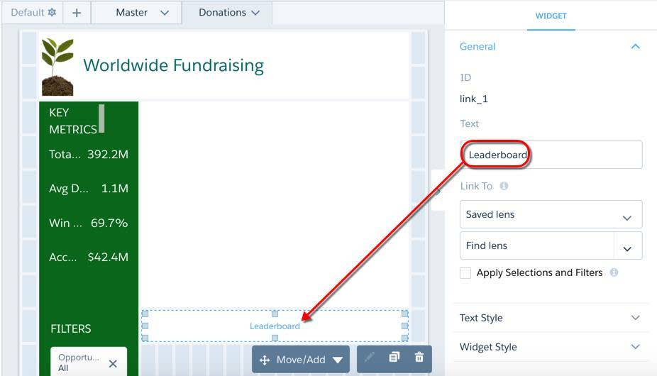
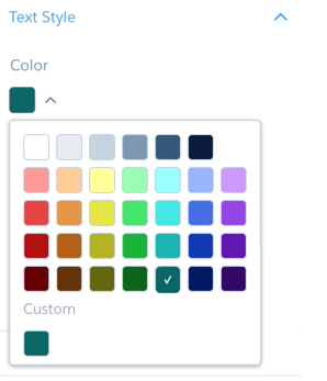
- Set the following Text Style widget properties for the link widget.
Text Style
Setting
Color
Size
20
Alignment
Left
-
Nice work. Don’t worry about linking to anything yet. We’ll set up the links in a bit.
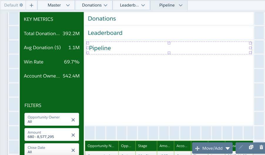
- To quickly create two more link widgets, select the Leaderboard link widget, and click the Duplicate Widget button
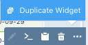 twice. Two copies of the Leaderboard link widget appear at the bottom of the dashboard.
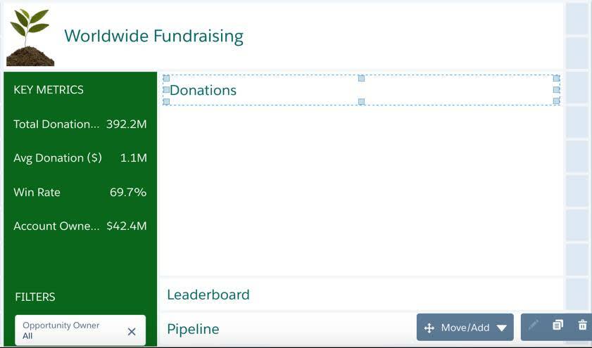
- Name the last two link widgets Donations and Pipeline.
- Place the Donations link widget at the top of the empty container widget.
- Move the Pipeline link widget directly below the Leaderboard widget.
- Save the dashboard.
- Click the Primary tab, and then select all the following widgets on that page.
- Goal Attainment text widget
- Flat gauge chart
- Cumulative Donations chart
- To select multiple widgets, hold down Ctrl for Windows or Cmd for Mac while making your selections.
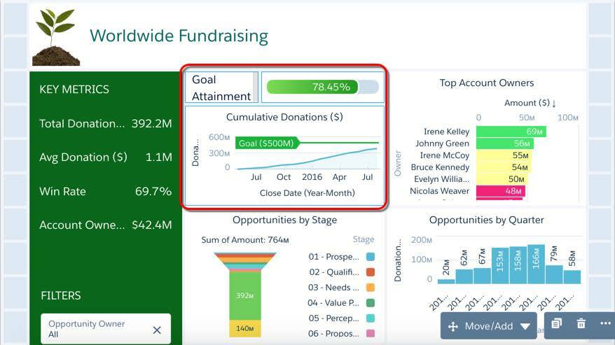
- Add the three selected widgets to the Donations page.
- With the three widgets selected, click Move/Add at the bottom of the page.
- Click Add to Page.
- Select the Donations page as the destination.
- Select Apply.
- The widgets are added to the bottom of the Donations page, which now opens.
- In the Donations page, move the newly added widgets into the container widget (under the Donations link widget), and then stretch them to the right to fit.
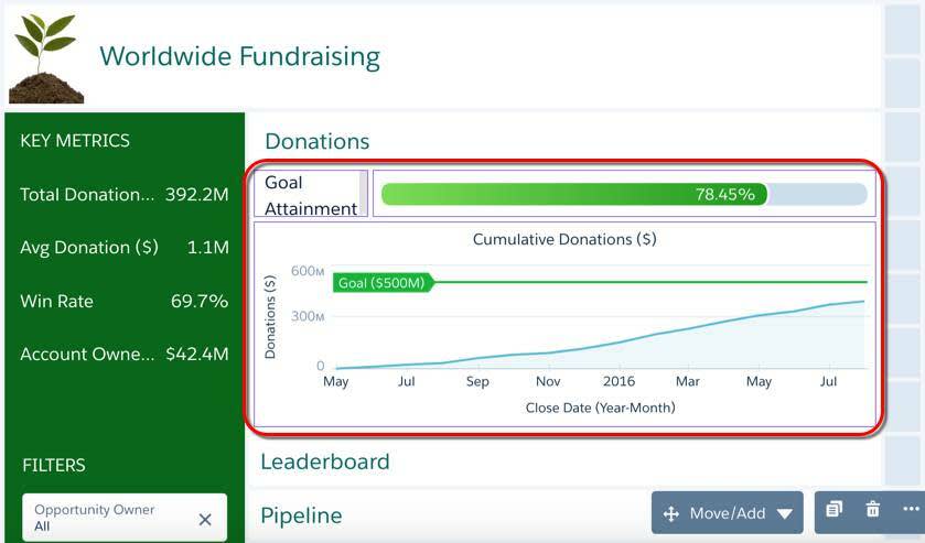
- Save the dashboard.
Nice work. You now have two pages: one with all the widgets and another specific to donations. The Donations link widget serves as the title for the area inside the container widget. Next, let’s build the Leaderboard page to evaluate account owner performance. We’ll use the Leaderboard link widget as the title for the container widget on this page.
Create the Leaderboard Page
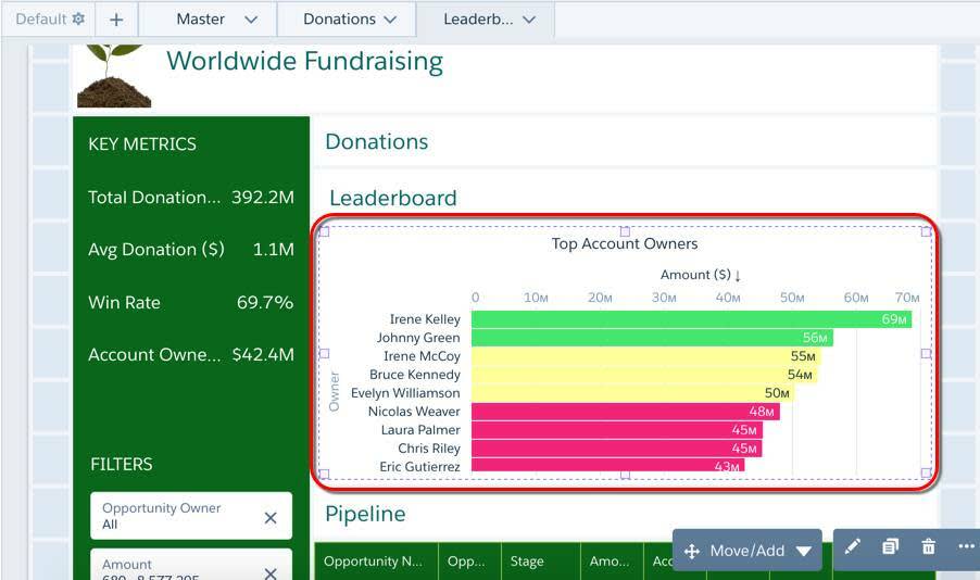
To analyze account owners and compare their performance with others, let’s create a leaderboard. A Leaderboard page can rank account owners. If the director would like to spark some friendly competition, account owners can use this board to see who’s the top performer.
To build the page, we clone the Donations page, remove the donation widgets, and then add the Top Account Owners chart from the Primary page.
- Clone the Donations page and call it Leaderboard.
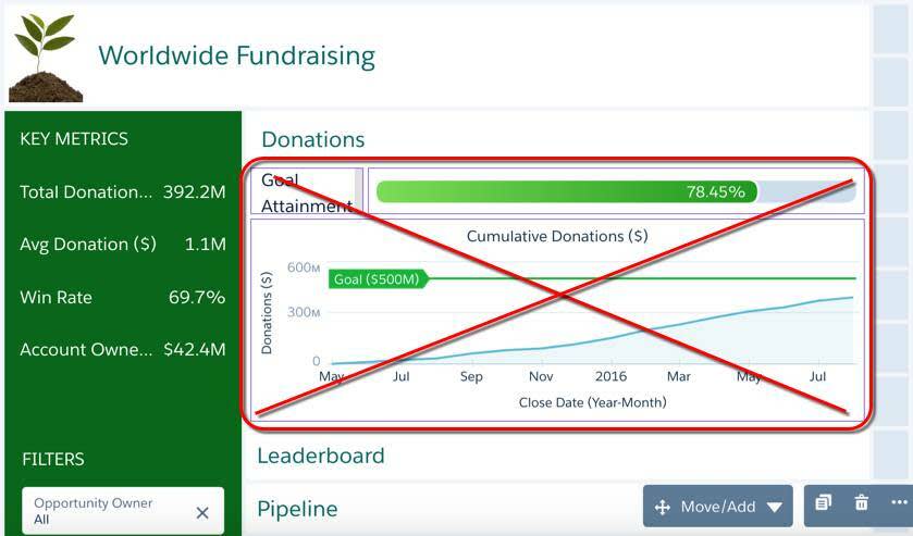
- In the Leaderboard page, remove the three donations widgets, but keep the Donations link widget.
- Move the container widget down one row. To move the other widgets out of the way, press Shift while moving the container.
- Move the Donations link widget up one row, just above the container widget.
- Move the Leaderboard link widget to top of the container widget to serve as its new title.
- To close the gap, move the Pipeline link widget and table up one row.
- Add Top Account Owners chart from the Primary page to the Leaderboard page and expand it to fit inside the container.
- Save the dashboard.
Great—now you have the Leaderboard page! Next, you finish by creating a Pipeline page. With each step in the process, you make it easier for the team to get value from the dashboard.
Create the Pipeline Page
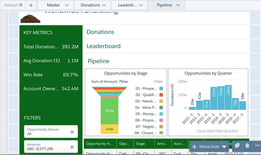
Using the same process, create the Pipeline page by cloning the Leaderboard page, remove the existing chart and add the pipeline charts.
- Clone the Leaderboard page and name the new page Pipeline.
- Remove the Top Account Owners chart.
- Move the container widget down one row.
- Move the Leaderboard widget up one row, above the container widget.
- Place the Pipeline link widget at the top of the container.
- Move the table up one row to close the gap.
- Add Opportunities by Stage and Opportunities by Quarter charts from the Primary page to the Pipeline page.
- Place them in the container widget and resize them to fit.
- Save your dashboard.
Click, click, click—simple. You’re done with the Pipeline page! Now you just need to build a way for users to navigate between pages. Let’s take care of that now.
Make Analytics Fun with Animation
You can use a Navigation widget to allow users to toggle between pages. But to create custom links and a cool, dynamic accordion effect, let’s use the link widgets we created.
In the Donations page, connect the Leaderboard link widget to the Leaderboard page by modifying the link widget properties.
- In the Donations page, select the Leaderboard link widget.
- In the Link To field in the widget properties, select Page in Layout and in the Page field, select Leaderboard.
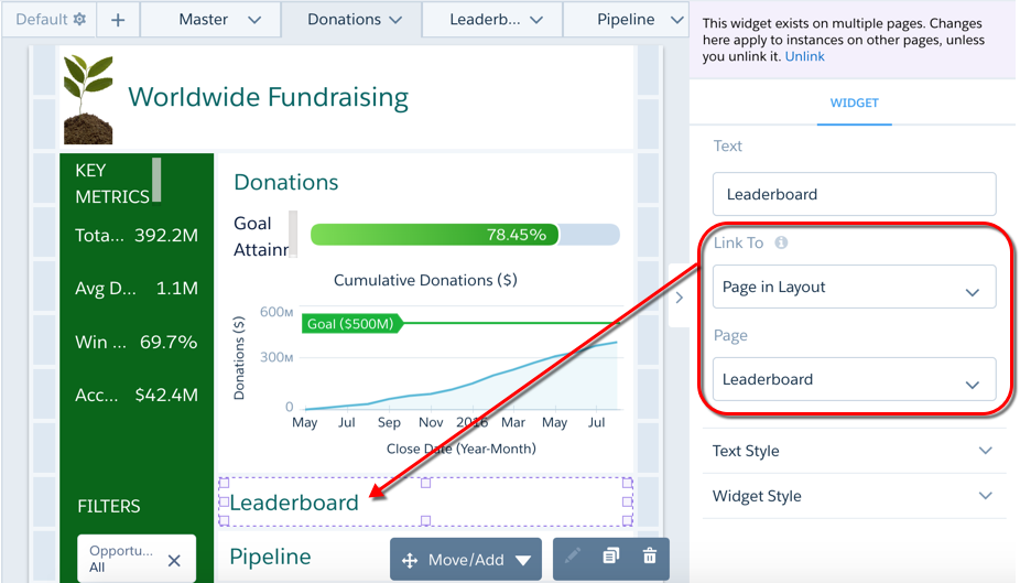
- Similarly, connect the Pipeline link widget to the Pipeline page.
- Then, connect the Donations link widget to the Donations page. Why do we need to connect the Donations link if we are already on the Donations page? That’s because the link widget is reused on the Leaderboard and Pipeline pages. We need to link those pages back to the Donations page.
- Save the dashboard.
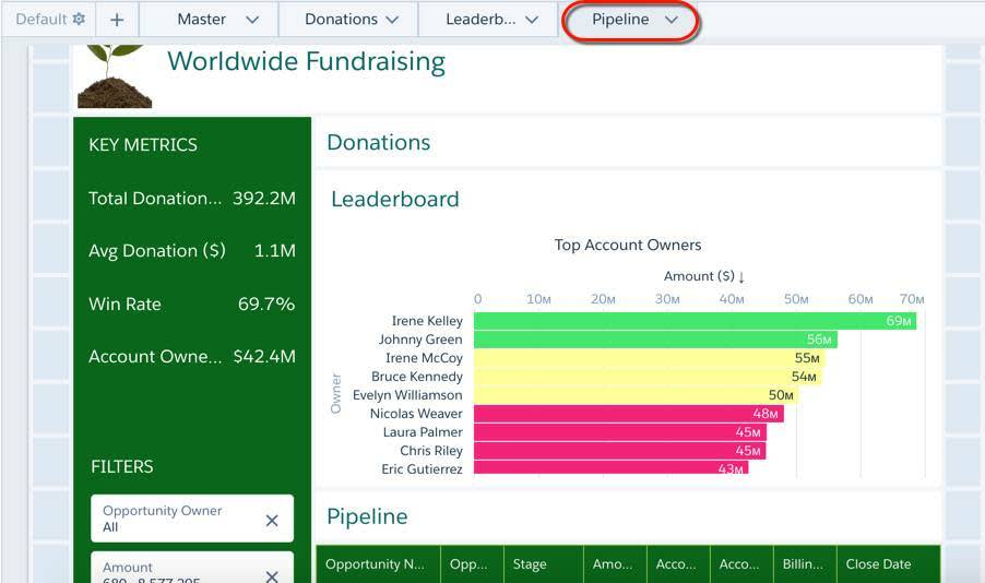
- To test out the links, click Preview, and then click the Donations, Leaderboard, or Pipeline links. Notice how the sections expand and collapse as you select each one—that’s the accordion effect!
- Click the Edit button to continue editing the dashboard. When you first open a multipage dashboard, by default, the dashboard shows the first page. In this case, it’s Primary. We don’t want users to see the Primary page since all of its content is now available on the other pages. Let’s move the Primary page from the first position so that the Donations page opens by default.
- Click the dropdown next to Primary, and click Move Right. Repeat this step two more times to make Primary the last tab. Because the Donations page appears first when you open a dashboard and there’s no link to the Primary page, users can’t access the Primary page while viewing the dashboard. Neat trick, right?
- Save the dashboard.
Excellent! Instead of creating three separate dashboards, we used three pages, which allowed us to reuse widgets. We used similar layouts on the pages to create a neat accordion effect that shows and hides widgets.
What’s next? The director wants a way to quickly compare each account owner against the team’s average performance. Head to the next step to learn how to accomplish this task.
Resources
- Help: Create Dashboard Pages
- Help: Create and Manage Dashboards with Reusable Components
- Help: Manage Widgets on a Page
- Help: Add a Link Widget to Link to Other Assets